
In this article, Anant JAIN (ESSEC Business School, Grande Ecole – Master in Management, 2019-2022) talks about the difference between Milton Friedman and Archie Carroll’s take on corporate social responsibility (CSR).
Introduction
The understanding of CSR has undergone significant transformation over the decades, reflecting a shift in societal values and expectations regarding the role of businesses. Milton Friedman’s influential 1970 article, “The Social Responsibility of Business is to Increase Its Profits,” argues for a profit-centric approach. Conversely, Archie B. Carroll’s 1991 work, “The Pyramid of Corporate Social Responsibility: Toward the Moral Management of Organizational Stakeholders,” introduces a more nuanced framework that extends beyond mere profit. This analysis delves into the progression from Friedman’s profit-oriented stance to Carroll’s more inclusive approach, highlighting key case studies that illustrate these concepts.
Milton Friedman’s Perspective
A. Core Argument
- Focus On Shareholder Value
Friedman posits that the primary duty of business leaders is to maximize shareholder value. He views businesses primarily as economic entities, with profit generation being their principal aim. - Scope Of Social Issues
According to Friedman, addressing societal or environmental concerns falls outside the proper scope of business activities. He argues that these issues should be tackled by governments and non-profits rather than by businesses.
B. Justification For Friedman’s View
- Agent-Principal Dynamics
Friedman’s perspective is based on the principle-agent relationship. Executives, as agents, are tasked with prioritizing shareholder returns, provided they operate within legal and ethical boundaries. - Legal & Ethical Boundaries
While Friedman supports profit maximization, he insists that it must be pursued within legal and ethical limits. Nonetheless, he believes these considerations should not detract from the primary goal of profitability. - Economic Contribution
Friedman contends that profit maximization leads to economic efficiency and overall societal benefits, including job creation and innovation, which contribute to general economic growth.
C. Case Study: Enron Corporation
- Overview: Enron, once a prominent American energy company, exemplified an intense focus on profit maximization. Its aggressive strategies aimed at boosting financial performance were initially lauded.
- Alignment With Friedman’s View: Enron’s practices were consistent with Friedman’s emphasis on profit. However, the company’s pursuit of financial gains led to severe ethical breaches, including fraudulent accounting practices designed to artificially inflate earnings.
- Outcome: The exposure of Enron’s fraudulent activities in 2001 led to its collapse, resulting in substantial losses for shareholders and employees. This case underscores the potential dangers of prioritizing profit over ethical standards.
Archie B. Carroll’s Perspective
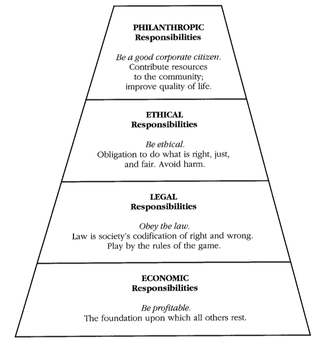
A. The Pyramid Of Corporate Social Responsibility
- Economic Responsibility (Base Level)
Carroll acknowledges the fundamental need for businesses to be profitable, placing this as the foundation of his CSR pyramid. Profitability is crucial for business sustainability. - Legal Responsibility (Second Level)
On top of economic responsibilities, Carroll stresses the importance of adhering to laws and regulations. Businesses are expected to operate within legal boundaries. - Ethical Responsibility (Third Level)
Carroll introduces the concept of ethical responsibility, where businesses must uphold ethical norms that go beyond mere legal compliance. This includes fairness and respect for stakeholders. - Philanthropic Responsibility (Top Level)
At the peak of the pyramid is philanthropic responsibility. Carroll advocates for voluntary efforts by businesses to contribute positively to society through charitable activities and community engagement.
B. Rationale Behind Carroll’s Model
- Comprehensive Approach
Carroll’s model marks a shift from a narrow focus on profits to a broader understanding of CSR. By incorporating legal, ethical, and philanthropic responsibilities, it reflects the multifaceted role of businesses in society. - Moral Obligations
Carroll’s framework acknowledges that businesses have moral duties that extend beyond financial performance. This perspective aligns with the growing recognition of businesses’ roles in addressing social and environmental issues. - Strategic Integration
According to Carroll, CSR should be an integral part of business strategy. Companies adopting this comprehensive approach are better equipped to build stakeholder trust and enhance their overall reputation.
C. Case Study: Patagonia
- Overview: Patagonia, an American outdoor apparel company, is noted for its strong commitment to environmental and social responsibility. The company integrates CSR into its core operations and practices.
- Alignment With Carroll’s Model: Patagonia’s approach embodies Carroll’s multi-dimensional model of CSR:
1. Economic Responsibility: The company remains profitable and operationally sound.
2. Legal Responsibility: It complies with relevant environmental and labor laws.
3. Ethical Responsibility: Patagonia adheres to high ethical standards, including transparency in its supply chain and fair labor practices.
4. Philanthropic Responsibility: The company actively participates in charitable activities and environmental advocacy, such as its 1% for the Planet initiative, which donates a portion of sales to environmental causes.
- Outcome: Patagonia’s dedication to a broad CSR approach has strengthened its reputation, fostered customer loyalty, and made a positive impact on environmental and social issues. The company’s practices illustrate the benefits of aligning profit with a commitment to broader societal responsibilities.
Evolution of Thought
A. From Profit Maximization To Broader Responsibility
- Friedman’s Profit-Centric View: Friedman’s perspective emphasizes profit maximization as the central business objective, with limited consideration for broader social or ethical issues.
- Carroll’s Comprehensive Model: Carroll’s Pyramid of CSR represents a significant shift, incorporating economic, legal, ethical, and philanthropic responsibilities. This model recognizes the need for businesses to balance profit with social and ethical obligations.
B. Impact On Modern CSR Practices
- Changing Societal Expectations: The transition from Friedman’s profit-focused approach to Carroll’s broader framework reflects changing expectations, highlighting the importance of businesses contributing positively to society and the environment.
- Influence OSn Business Behavior: Carroll’s model has influenced contemporary CSR practices by encouraging a more integrated and strategic approach. Companies are increasingly engaging in CSR initiatives that align with their values and address stakeholder concerns.
- Corporate Governance: The shift towards Carroll’s model has impacted corporate governance by emphasizing ethical leadership, stakeholder engagement, and long-term value creation.
Conclusion
Milton Friedman’s and Archie B. Carroll’s perspectives represent distinct phases in the evolution of corporate social responsibility. While Friedman’s focus on profit maximization underscores a traditional business objective, Carroll’s Pyramid of CSR introduces a comprehensive framework that includes economic, legal, ethical, and philanthropic responsibilities. This evolution highlights a growing recognition of the broader role businesses play in society and the need for a balanced approach to corporate responsibility.
Personal Opinion
The transition from Milton Friedman’s profit-centric view to Archie B. Carroll’s multi-dimensional model of CSR marks a significant shift in how businesses understand their societal role. Friedman’s approach, with its emphasis on profit maximization, represents a traditional view where financial performance is paramount. While this perspective underscores the importance of economic efficiency and shareholder returns, it often overlooks broader social and ethical responsibilities.
In contrast, Carroll’s Pyramid of Corporate Social Responsibility offers a more comprehensive approach. By integrating economic, legal, ethical, and philanthropic responsibilities, Carroll’s model acknowledges that businesses operate within a complex societal framework. This holistic perspective aligns with contemporary values and recognizes that businesses have a crucial role in addressing social and environmental challenges.
From a modern standpoint, Carroll’s model seems more in tune with the needs and expectations of today’s stakeholders. In an era where corporate behavior is under heightened scrutiny, adopting a balanced approach to CSR can enhance a company’s reputation, build stakeholder trust, and ensure long-term success. Companies that embrace Carroll’s framework are better equipped to navigate complex social and ethical landscapes, foster meaningful community relationships, and drive positive change.
In summary, while Friedman’s focus on profit remains a core element of business, Carroll’s expanded view represents a more progressive understanding of CSR. This evolution reflects a necessary and beneficial shift towards more responsible and impactful business practices.
Related Posts On The SimTrade Blog
▶ Anant JAIN Analysis Of “The Social Responsibility Of Business Is To Create Value For Stakeholders” Article By Freeman And Elms
▶ Anant JAIN Deep Dive On The Article “The Social Responsibility of Business is to Increase Its Profits” By Milton Friedman
▶ Anant JAIN Stakeholder
▶ Anant JAIN Shareholder
▶ Anant JAIN Mission Statement
▶ Anant JAIN Writing A Mission Statement
Useful Resources
“The Social Responsibility of Business is to Increase Its Profits” by Milton Friedman
Harvard Business Review: How Patagonia Is Leading the Way in Corporate Responsibility
Stanford Social Innovation Review: The Evolution of Corporate Social Responsibility
Business & Society: A Strategic Approach to Corporate Social Responsibility
Bebchuk L, and Tallarita, R. 2020, The illusionary promise of stakeholder governance, Cornell Law Review, 106: 91-177.
About The Author
The article was written in October 2024 by Anant JAIN (ESSEC Business School, Master in Management, 2019-2022).
▶ Read all articles by Anant JAIN.