How to download financial data with R

Hadrien Puche

Any financial analysis starts with data. Whether you want to analyze a stock, build a portfolio, measure risk, create a valuation model or develop trading strategies, the first step is always the same: obtaining financial data.

You could download data manually from websites such as Yahoo! Finance or Investing.com, but this quickly becomes tedious and time-consuming. It also limits the amount of data you can work with.

R allows us to automate this process and retrieve large amounts of financial information in just a few lines of code.

In this article, Hadrien PUCHE (ESSEC Business School, Grande École Program, Master in Management, 2023-2027) will help you to:

  • Download historical stock prices and market indices with R
  • Explore, clean, and visualize xts time-series data
  • Compute basic statistics and historical distributions
  • Compare multiple securities
  • Build the foundation needed for more advanced financial analysis

But first, what financial data can we actually download?

Financial professionals use many different categories of data across individual assets as well as portfolios and funds.

Market data (Easily downloadable for free via Yahoo! Finance)

  • Individual asset prices (e.g., individual stocks, corporate bonds)
  • Portfolios and funds (e.g., ETFs, mutual funds)
  • Currency exchange rates (e.g., EUR/USD)
  • Market indices (e.g., S&P 500)

Macroeconomic data (Available via the St. Louis Fed – FRED)

  • Inflation and Consumer Price Index (CPI)
  • Interest rates and bond yields
  • GDP growth and unemployment

Not all data sources are freely available. Many professional investors rely on paid platforms such as Bloomberg or FactSet to access fundamental accounting data (revenue, cash flows) and alternative data (satellite imagery, sentiment). Fortunately, market prices and macroeconomic indicators can easily be accessed for free using R for research and learning purposes.

While you can download macroeconomic data using specialized packages like fredr, we will keep things simple in this article and focus purely on extracting and modeling market prices using the open-source quantmod package.

A step-by-step guide

Follow the next steps to download your first financial dataset with R.

Step 1: Instal the required packages

If you have not yet installed R, refer to the setup guide published earlier in this series to configure your execution environment (RStudio).

Once your environment is ready, install the required packages by running this in your console (you only need to do this once):

install.packages(c("quantmod", "PerformanceAnalytics"))

Here is what these packages do:

  • quantmod: Short for Quantitative Financial Modelling Framework, it is a widely used R package for downloading and analyzing financial market data, including data from Yahoo! Finance.
  • xts: Short for eXtensible Time Series, this package is automatically installed with quantmod. It provides data structures specifically designed for time-indexed data.
  • PerformanceAnalytics: A package of econometric functions used to calculate returns and risk metrics.

Step 2: Import your R packages

Most financial analysis scripts begin by loading the packages required for the analysis using the library() function.

Create a new R script file. You can also save it wherever you want. Paste the following script and run it (as a reminder, you need to select the code you want with your mouse before running it):

library(quantmod)
library(PerformanceAnalytics)

Step 3: Download your first data

To download financial data, we use ticker symbols, which identify securities or market instruments within a given exchange or data provider. For example, AAPL represents Apple.

We will use the getSymbols() function. By passing arguments to the function, we can customize the output. Setting auto.assign = FALSE assigns the dataset directly to a variable that we can name aapl_data.

Let us download daily data for Apple’s stock price over the last five years (from 01/01/2019 to 31/12/2024 at that time)t.

# Download historical Apple stock data
aapl_data <- getSymbols("AAPL", src = "yahoo", from = "2019-01-01", to = "2024-01-01", auto.assign = FALSE)
 
# Display the first 5 rows
head(aapl_data, 5)

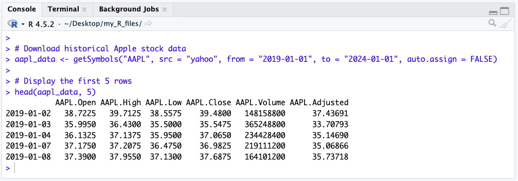
You will obtain this xts table with the following columns:

  • Open: opening price at the beginning of the trading day
  • High: highest price during the trading day
  • Low: lowest price during the trading day
  • Close: closing price at the end of the trading day
  • Volume: transaction volume during the trading day
  • Adjusted: closing price adjusted for stock splits and dividends

A screenshot from RStudio showing the output table of the getSymbols query

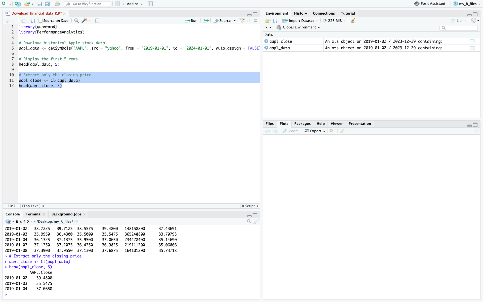
To keep things simple for this guide, we will focus strictly on the raw Close price. quantmod provides a convenient helper function called Cl() that instantly extracts just the closing price column from the dataset.

# Extract only the closing price
aapl_close <- Cl(aapl_data)
head(aapl_close, 3)

Add this code to your script, then highlight it with your mouse, and press run. Your RStudio should now display this:

A screenshot from RStudio showing the new output

Step 4: Use more precise queries for historical context

As financial analysts, we routinely extract specific timeframes to understand how assets behave under macroeconomic stress. Because our data is stored as an xts object, R makes it incredibly easy to slice time-series data using date ranges.

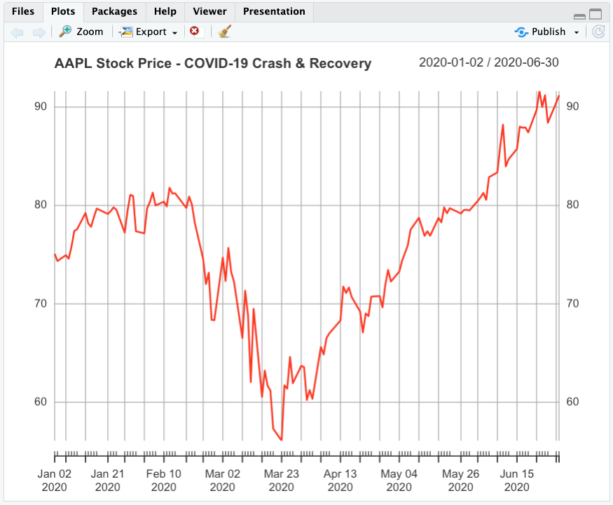
For example, examining the COVID-19 market shock in early 2020 provides a useful illustration of extreme market volatility. Let’s isolate Apple’s stock specifically during the COVID-19 market shock and initial recovery (January to June 2020):

# Isolate the COVID-19 crash using xts date subsetting (YYYY-MM-DD/YYYY-MM-DD)
covid_crash <- aapl_close["2020-01-01/2020-06-30"]
 
# Plot the isolated data
plot(covid_crash, main = "AAPL Stock Price - COVID-19 Crash & Recovery", col = "red", lwd = 2)

The output of the previous code cell showing the COVID crash

Step 5: Download the data for multiple stocks at the same time

Downloading multiple stocks is necessary for financial analysis that often requires comparing securities, analyzing sectors, or building a portfolio. Instead of issuing separate requests and risking misaligned dates, we can fetch all tickers at once.

Let’s download the data for six of the largest US banks: JPMorgan Chase, Bank of America, Wells Fargo, Citigroup, Goldman Sachs, and Morgan Stanley. Analyzing this sector is a classic way to measure the impact of interest rates on the broader economy.

# Define the major US bank tickers
bank_tickers <- c("JPM", "BAC", "WFC", "C", "GS", "MS")
 
# Download data into the global environment
getSymbols(bank_tickers, src = "yahoo", from = "2019-01-01", to = "2024-01-01")
 
# Extract only the closing prices and merge them into a single matrix
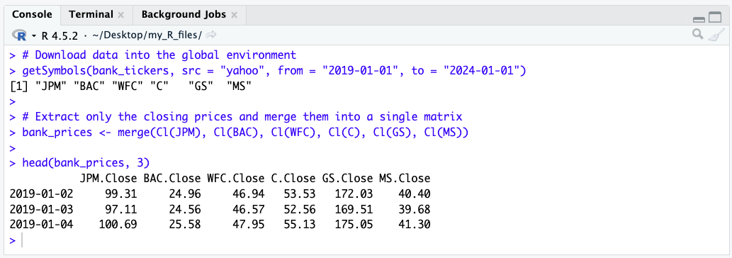
bank_prices <- merge(Cl(JPM), Cl(BAC), Cl(WFC), Cl(C), Cl(GS), Cl(MS))
 
head(bank_prices, 3)

The result is an xts object in which each column represents a stock and each row corresponds to a trading date.

Screenshot of the output of the previous cell showing the US Banks matrix

This table format is ideal for portfolio analysis and benchmarking. To save it for external use, you can export it as a CSV file:

# Save the data frame as a CSV file
write.csv(as.data.frame(bank_prices), file = "us_banks_data.csv")

Now that you have successfully downloaded your financial data, let’s see how you can clean it and then use it.

Inspecting and cleaning the dataset

Financial datasets may contain missing values (NA) for various reasons, including trading suspensions, differences in trading calendars, listing dates, or data-provider issues. Missing observations should be identified before computing returns or risk measures, as they may affect subsequent calculations. For this introductory example, we simply remove rows containing missing values using na.omit(). In applied financial analysis, however, the appropriate treatment depends on the source of the missing data and the objective of the analysis.

In R, we can easily remove any rows containing missing data using the na.omit() function.

# Check for missing values (returns the total count)
sum(is.na(aapl_close))

# Clean missing values by dropping rows with NAs
aapl_close <- na.omit(aapl_close)

# View the last few rows of the cleaned data
tail(aapl_close, 5)

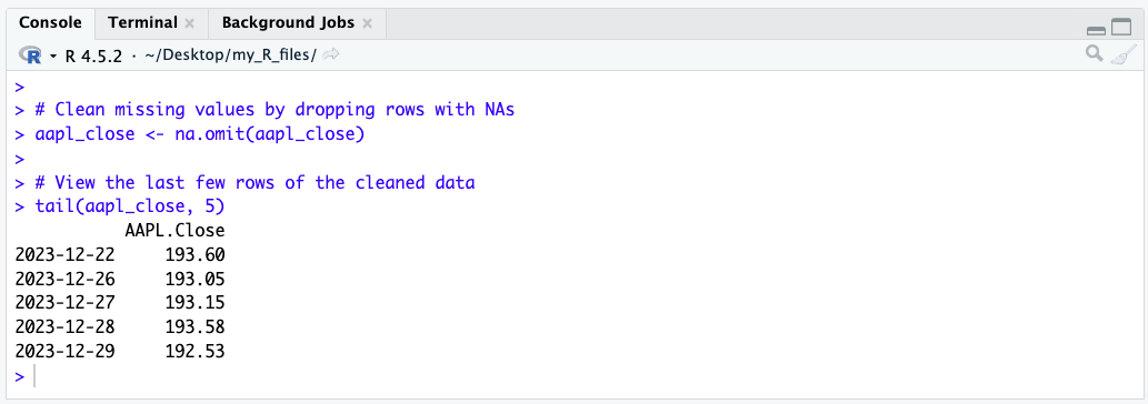
A screenshot from RStudio showing the output of the tail function

Vizualizing your data

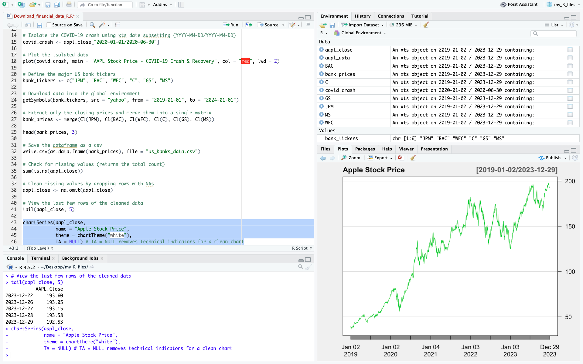
Let’s create our first chart to visualize the evolution of Apple’s stock price using the chartSeries() function, which is built specifically for financial time series.

chartSeries(aapl_close, 
            name = "Apple Stock Price", 
            theme = chartTheme("white"), 
            TA = NULL) # TA = NULL removes technical indicators for a clean chart

A screenshot of RStudio with the stock price visualization chart output

We have now:

  • Downloaded market data from Yahoo! Finance
  • Extracted the closing price and cleaned the data
  • Created a time-series plot to visualize stock prices

These core steps form the basis of empirical financial research and quantitative models.

Computing basic statistics and historical distributions

To evaluate stock performance and risk, we compute basic descriptive statistics. First, we calculate daily returns using the Return.calculate() function from the PerformanceAnalytics package.

# Calculate daily percentage returns (and remove the first NA row)
aapl_returns <- Return.calculate(aapl_close)
aapl_returns <- na.omit(aapl_returns)
 
# Compute summary statistics
mean_return <- mean(aapl_returns)
volatility <- sd(aapl_returns)
skew <- skewness(aapl_returns)
kurt <- kurtosis(aapl_returns)

print(paste("Mean Daily Return:", round(mean_return, 5)))
print(paste("Daily Volatility (Std Dev):", round(volatility, 4)))

Plotting historical distributions

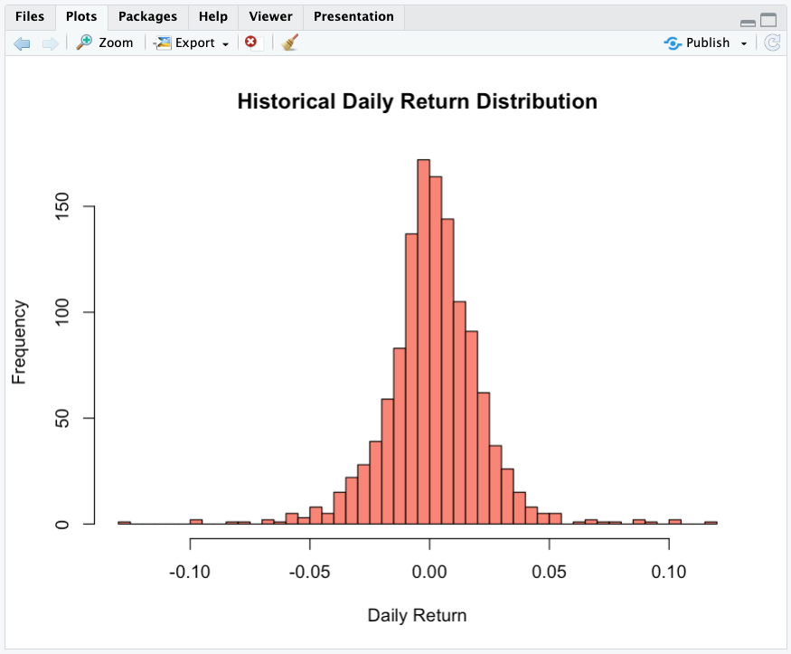
Histograms display the frequency distribution of daily returns, helping us inspect distribution symmetry and tail risks.

# Return distribution histogram
hist(aapl_returns, breaks = 50, col = "salmon", main = "Historical Daily Return Distribution", xlab = "Daily Return")

The output of the previous cell – distribution histogram

Normalizing stock prices and computing returns

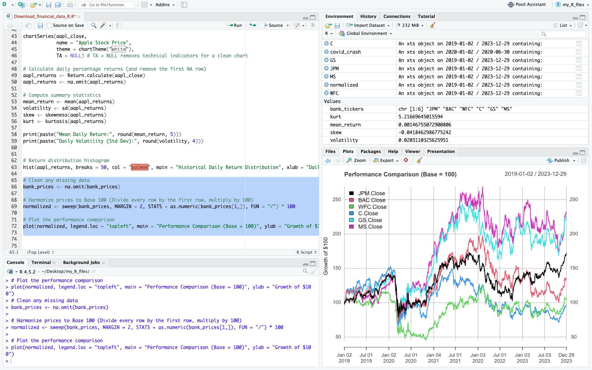
All stocks have different nominal prices. If Tesla trades at $350 and Nvidia at $220, it does not mean that Tesla performed better. To establish an accurate comparison, we execute two fundamental computations:

  1. Price normalization: We normalize all historical time series to a base index of 100, ensuring a standardized starting point.
  2. Return calculation: We compute periodic returns to measure performance independently of the nominal price level.
# Clean any missing data
bank_prices <- na.omit(bank_prices)

# Harmonize prices to Base 100 (Divide every row by the first row, multiply by 100)
normalized <- sweep(bank_prices, MARGIN = 2, STATS = as.numeric(bank_prices[1,]), FUN = "/") * 100
 
# Plot the performance comparison
plot(normalized, legend.loc = "topleft", main = "Performance Comparison (Base = 100)", ylab = "Growth of $100")

The output of the previous cell showing normalized prices

We can also compute daily returns across all stocks in one line:

bank_returns <- na.omit(Return.calculate(bank_prices))
head(bank_returns, 3)

This is a standard technique used by portfolio managers and equity analysts to compare growth trajectories.

Common pitfalls

When working with market data in R, beginners often run into the same issues:

  • Using the wrong ticker symbol
  • Comparing stocks without normalizing prices (Base 100)
  • Forgetting that markets are closed on weekends and holidays
  • Failing to clean and handle missing values (NA) using na.omit()
  • Using raw closing prices when adjusted prices are required: for long-term performance analysis, adjusted prices are generally preferable because they account for stock splits and dividends.

Overall, don’t forget to always inspect and clean your data before starting your analysis.

Exercises

Exercise 1: Basic data retrieval and price visualization (RACE)

Ferrari N.V. (RACE) presents an interesting case study in market dynamics: it is a car manufacturer that acts as a high-end luxury franchise. Its deliberate production scarcity, multi-year order backlogs, and immense pricing power decouple it from typical automotive boom-and-bust cycles.

Using the ticker symbol RACE, download the last five years of daily market data.

Your tasks:

  • Use the appropriate R functions to display the first 5 rows and the last 5 rows of the dataset to verify data integrity.
  • Extract the closing price and generate a line chart plotting the price over the entire 5-year period. Observe how its price trajectory reflects Ferrari’s distinctive positioning at the intersection of the automotive and luxury industries.

Exercise 2: time-series extraction and volume analysis on Tesla (TSLA)

Tesla is renowned for its high historical volatility and massive retail trading interest. The 2022-2024 window was particularly eventful for growth and electric vehicle stocks, marked by shifting supply chains and a rapid rise in interest rates.

Using the ticker symbol TSLA, extract the market data for the precise calendar period from January 1, 2022, to December 31, 2024 (using the from and to parameters).

Your tasks:

  • Identify the peak (highest closing price) and the trough (lowest closing price) over this period using the max() and min() functions.
  • Extract the Volume column (using Vo()) and calculate the average daily trading volume, a fundamental metric used by analysts to assess market liquidity.

Exercise 3: Comparative performance and risk profiling on Chinese tech companies

Chinese technology stocks often experience unique market cycles driven by distinct domestic regulatory environments and macroeconomic factors. Using the last five years of daily market data, compare the performance and risk characteristics of the following three US-listed ADRs:

  • Alibaba (BABA)
  • Baidu (BIDU)
  • PDD Holdings (PDD)

Questions:

  1. Which stock achieved the highest total cumulative return?
  2. Which stock was most volatile (highest standard deviation of daily returns)?
  3. Which one offered the best risk-adjusted profile over the period? Use the harpe ratio or any risk-adjusted measure

Download the solutions

To help you check your work and experiment further, you can download the complete R Script containing the full code, charts, and commentary for all exercises.

Download Solutions (.R Script)

What’s next?

Now that you know how to download financial data, compute returns, and analyze basic performance and risk measures in R, you are ready to delve into more advanced quantitative and corporate finance topics.

If you want to learn more about other programming languages, check out these two articles to learn how to install Python on your computer and use it to download financial data:

   ▶ Hadrien PUCHE How to Install and Run Python on Your Computer (A Step-by-Step Guide)

   ▶ Hadrien PUCHE How to download and model financial data with Python

About the Author

This article was written in September 2026 by Hadrien PUCHE (ESSEC Business School, Grande École Program, Master in Management, 2023-2027).

   ▶ Discover all posts by Hadrien PUCHE

How to install and run R on your computer (A step-by-step guide)

Hadrien Puche

Understanding and writing R code can be a valuable skill for your career. While general-purpose programming languages such as Python are more widely used, R is particularly well suited to statistical analysis, data visualization, and quantitative research.

In this article, Hadrien Puche (ESSEC Business School, Grande École Program, Master in Management, 2023-2027) will help you to:

  • Understand the core components of the R statistical ecosystem for finance
  • Compare development setups (RStudio Desktop vs. Visual Studio Code)
  • Install R alongside essential build tools (RTools / Xcode)
  • Set up RStudio Desktop as a purpose-built workspace
  • Install econometric packages via CRAN (like quantmod)
  • Run a test script

But first, what is R exactly?

Historically, R was created in 1993 as an open-source implementation of the S language, developed at Bell Labs for statistical computing.

Setting up your R workspace can be straightforward. We will rely on CRAN (the Comprehensive R Archive Network), R’s main public repository for packages, to install the packages required for our analysis and their dependencies. Let’s walk through deploying a professional quantitative workspace for R.

Quick vocabulary for beginners

Before we dive in, let’s define a few technical terms you will encounter frequently:

  • Package: A collection of reusable R functions, data, and documentation designed for a specific purpose. For example, quantmod provides tools for quantitative financial analysis and financial data retrieval.
  • Library: A directory on your computer, where your installed packages are stored. You will use the library() command in your code to load them. While developers often use the terms package and library interchangeably, technically you install a package into your library.
  • Dependency: A package that another package requires in order to work properly. R manages these dependencies automatically, so you do not have to take care of them, but do not be surprised if R installs many more packages than you initially requested.
  • Build Tools (Rtools / Xcode): Background software required by your computer to translate (or “compile”) raw source code into executable instructions. R frequently compiles financial packages directly on your machine, making these essential to prevent errors.

Choosing your development environment: RStudio or Visual Studio Code?

You generally have two choices when it comes to writing R code: RStudio Desktop and Visual Studio Code (VS Code).

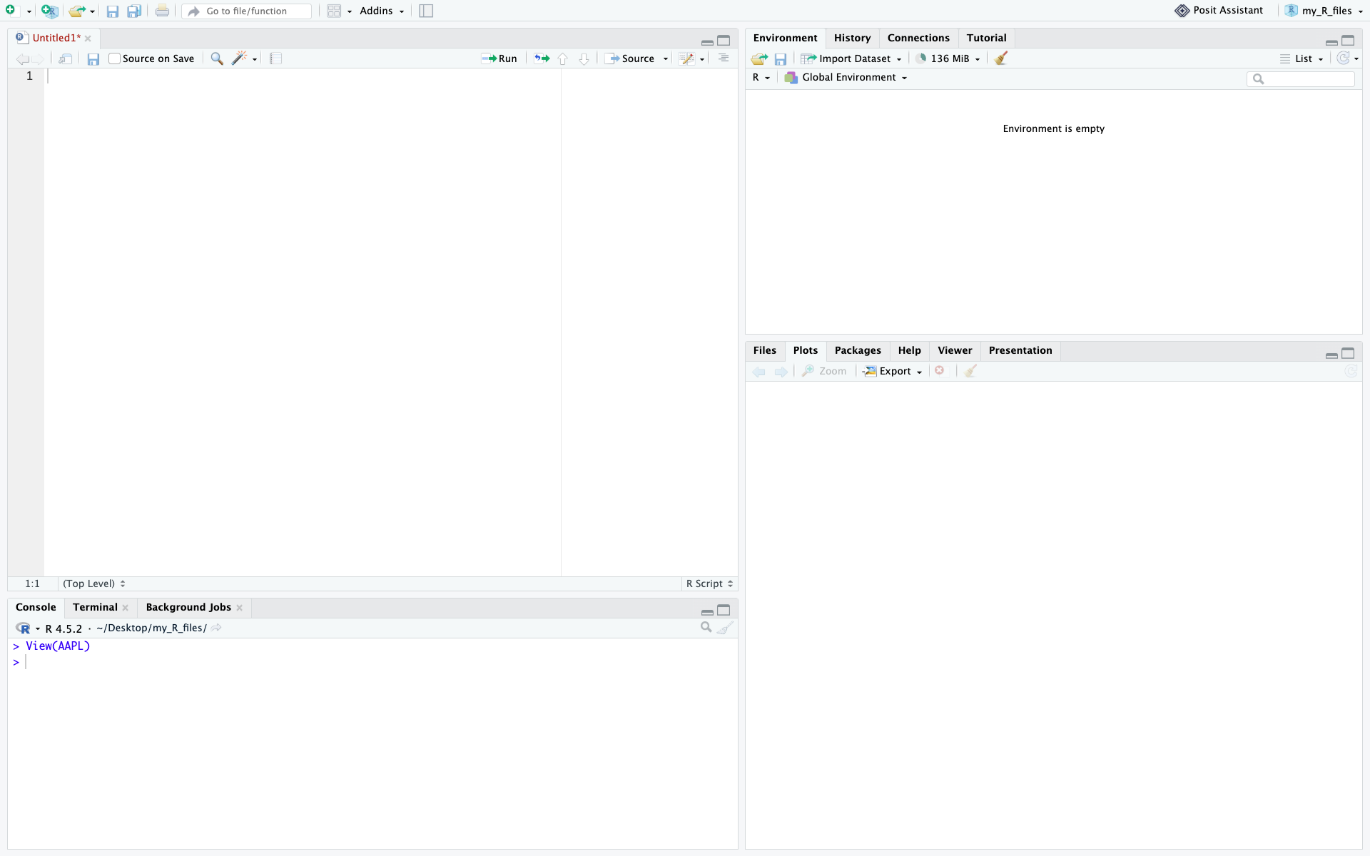
  • RStudio Desktop: An Integrated Development Environment (IDE) built specifically for R. It features a 4-pane layout that lets you simultaneously view your scripts, console, environment variables (data frames loaded in memory), and charts.
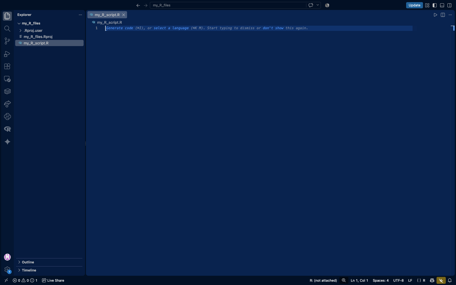
  • Visual Studio Code: VS Code is a highly versatile code editor. You can run R in VS Code by installing the R extension and configuring the required R packages. This is a good choice if you plan to mix multiple programming languages in the same project, though configuring VS Code for R requires a bit more effort than RStudio.

RStudio Desktop 4-pane layout
RStudio Desktop Interface

Visual Studio Code running R
Visual Studio Code configured for R

For this guide, we will focus on setting up R and integrating it with RStudio, as it offers a purpose-built user experience for R.

Understanding the R architecture

The R architecture operates as follows:

  • Base R: The underlying computational engine that calculates the math and runs the logic.
  • Build tools (RTools / Xcode):oftware required to compile R packages from source when precompiled binary versions are not available. Most beginners will install packages from binaries, but having these tools available can prevent installation problems with packages that require compilation.
  • CRAN: The Comprehensive R Archive Network. This is the centralized, strictly regulated global repository for R packages.

Step-by-step installation guide

Step 1: Install R and build tools

First, we must install R. RStudio will not function without it.

  1. Go to the official CRAN Download Page.
  2. For Windows:
    • Click Download R for Windows > base > Download the latest R executable and install it using default settings.
    • Go back to the Windows page, click Rtools, and install the version matching your R installation. This is critical for compiling quantitative packages later.
  3. For macOS:
    • Click Download R for macOS and select the .pkg matching your chip (Apple Silicon or Intel).
    • To ensure packages compile correctly, open your Mac Terminal and run xcode-select --install to get the necessary developer tools.

Step 2: Install RStudio

Now, we install the integrated development environment (IDE) that we will use to write and execute R code.

  1. Head to the Posit RStudio Desktop website.
  2. Download the free version corresponding to your operating system (Windows or macOS).
  3. Run the installer. RStudio will normally detect the R installation completed in Step 1 automatically.

Step 3: Install packages from CRAN

Because R uses centralized package repositories such as CRAN, we can install the packages required for our financial analysis directly from the R console in RStudio.

  1. Launch RStudio.
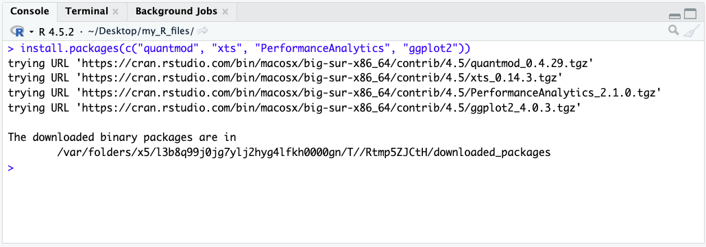
  2. In the Console pane (bottom-left), type the following command and press Enter. This will reach out to CRAN and download the essential tools for market data and time-series analysis:

# Install quantmod for data retrieval, xts for time-series, and PerformanceAnalytics for risk metrics
install.packages(c("quantmod", "xts", "PerformanceAnalytics", "ggplot2"))

💡 Quick fix tip: R may occasionally ask whether you want to install a package from source when a binary version is also available. For beginners, the binary version is usually the simplest option. Installing from source may require Rtools on Windows or the Xcode Command Line Tools on macOS.

a screenshot of the output of the script when downloading the packages

Checking that everything is working as intended

Let’s verify your infrastructure by writing a short script that pulls actual market data.

  1. In RStudio, go to File > New File > R Script.
  2. Paste the following quantitative code into the top-left editor pane.
  3. Highlight all the text and press Ctrl+Enter (Windows) or Cmd+Enter (macOS) to run it.
# Load the quantitative financial modeling library
library(quantmod)
 
# Download historical financial data for Apple via Yahoo Finance API
getSymbols("AAPL", src = "yahoo", from = "2023-01-01", to = "2024-01-01", auto.assign = TRUE)
 
# Display the first 5 rows of the time-series array in the console
print(head(AAPL))
 
# Generate a financial chart with volume and Bollinger Bands for volatility analysis
chartSeries(AAPL, 
            name = "Apple Inc. (AAPL) Historical Prices", 
            theme = chartTheme("white"), 
            TA = c(addVo(), addBBands()))

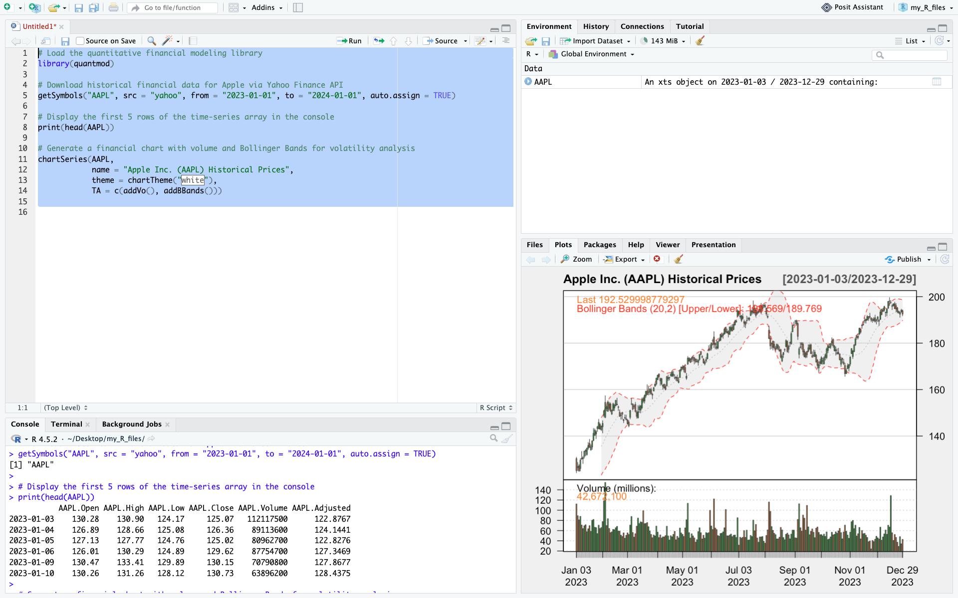
A screenshot of RStudio after running the test script
After running the script, your RStudio should look like this

If the AAPL dataset appears in your top-right Environment pane, the data prints in your Console, and a professional candlestick chart renders in your bottom-right Plots pane, your R setup is fully operational.

Next steps & use cases

With R correctly configured, you are now equipped to tackle complex econometric and financial challenges. A good next step would be to learn how to download financial data with R.

You can learn how to do so in this article: How to download financial data with R

Useful resources

   ▶ CRAN (The Comprehensive R Archive Network): The main public repository for R packages, R distributions, and documentation. CRAN provides a centralized infrastructure for distributing and maintaining thousands of R packages used in statistical computing, econometrics, and quantitative research.

About the author

This article was written in September 2026 by Hadrien PUCHE (ESSEC Business School, Grande École Program, Master in Management, 2023-2027).

   ▶ Discover all articles by Hadrien PUCHE

How to download and model financial data with Python

Hadrien Puche

Any financial analysis starts with data. Whether you want to analyze a stock, build a portfolio, measure risk, create a valuation model or develop trading strategies, the first step is always the same: obtaining financial data.

You could download data manually from websites such as Yahoo! Finance or Investing.com, but this quickly becomes tedious and time-consuming. It also limits the amount of data you can work with.

Python allows us to automate this process and retrieve large amounts of financial information in just a few lines of code.

In this article, Hadrien Puche (ESSEC Business School, Grande École Program, Master in Management, 2023-2027) will help you understand how to:

  • Download historical stock prices with Python
  • Explore and visualize market data
  • Compute basic statistics and historical distributions
  • Compare multiple securities
  • Learn more about the CAPM
  • Build the foundation needed for more advanced financial analysis

What financial data can we download?

Financial professionals use many different categories of data across individual assets as well as portfolios and funds.

Market data

  • Individual asset prices (e.g., individual stocks, corporate bonds)
  • Portfolios and funds (e.g., ETFs, mutual funds)
  • Currency exchange rates
  • Commodity prices
  • Bond yields

Company fundamentals

  • Revenue
  • Earnings
  • Margins
  • Cash flows

Macroeconomic data

  • Inflation
  • Interest rates
  • GDP growth
  • Unemployment

Alternative data

  • News
  • Social media sentiment
  • Satellite imagery
  • Credit card spending

Not all data sources are freely available. Many professional investors rely on paid platforms such as Bloomberg, FactSet, Capital IQ or Morningstar to access standardized, high-frequency, and point-in-time data.

Fortunately, stock market data specifically can easily be accessed for free using Python for research and learning purposes.

In this article, we will use the open-source yfinance library to download historical market data that you will then be able to model and use for any financial analysis project you may have.

A step-by-step guide

Follow the next steps to download your first financial data with Python 🙂

Step 1: Installing the required libraries

If you have not yet installed Python, refer to the setup guide to configure your execution environment (such as Jupyter Notebook or Anaconda).

Once your environment is ready, install the required packages:

pip install yfinance pandas numpy matplotlib

or inside Jupyter Notebook:

!pip install yfinance pandas numpy matplotlib

We will use:

  • yfinance to retrieve market data
  • pandas to manipulate data structures
  • numpy for financial and mathematical operations
  • matplotlib to create charts

Step 2: Import our Python packages

Most data analysis scripts begin by importing the packages required for the analysis. In Python, packages provide reusable code and functionality that extend Python’s core capabilities.

import yfinance as yf
import pandas as pd
import numpy as np
import matplotlib.pyplot as plt

The aliases (yf, pd, np, plt) make the code shorter and easier to read.

Step 3: Download our first data set

To download financial data, we use ticker symbols, which identify securities or market instruments within a given exchange or data provider. For example, AAPL represents Apple.

When calling a Python function, we can customize its behavior by passing arguments such as period (e.g., "5y" for 5 years) or specific start and end dates.

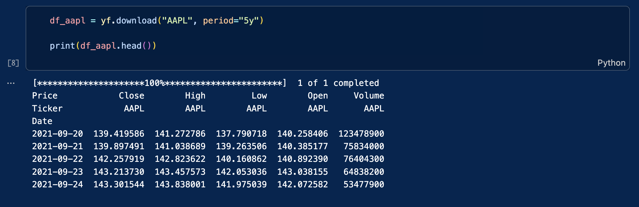
As an example, let us download daily data for Apple stock price over the last five years (Yahoo! Finance ticker: AAPL). The data will be stored in a data frame (df) that we can name df_apple.

df_aapl = yf.download("AAPL", period="5y")

print(df_aapl.head())

You will obtain this table with the following columns:

  • Close: closing price at the end of the trading day
  • High: highest price during the trading day
  • Low: lowest price during the trading day
  • Open: opening price at the beginning of the trading day
  • Volume: transaction volume during the trading day

An screenshot from VSC showing the output table of this Yfinance query

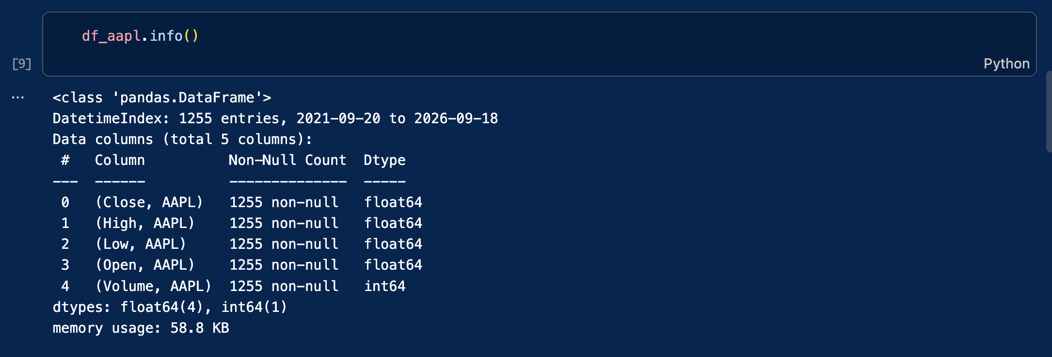
The data is stored in a Pandas DataFrame. This is a popular two-dimensional, tabular data structure with labeled axes (rows and columns).

To inspect its structure, type the following code:

df_aapl.info()

A screenshot from VSC showing the output of df_aapl.info()

Step 4: Using more precise queries for historical context

Instead of downloading a rolling period (like “5y”), we can isolate specific market events by passing exact start and end dates to the download function. As financial analysts, we routinely extract specific timeframes to understand how assets behave under macroeconomic stress.

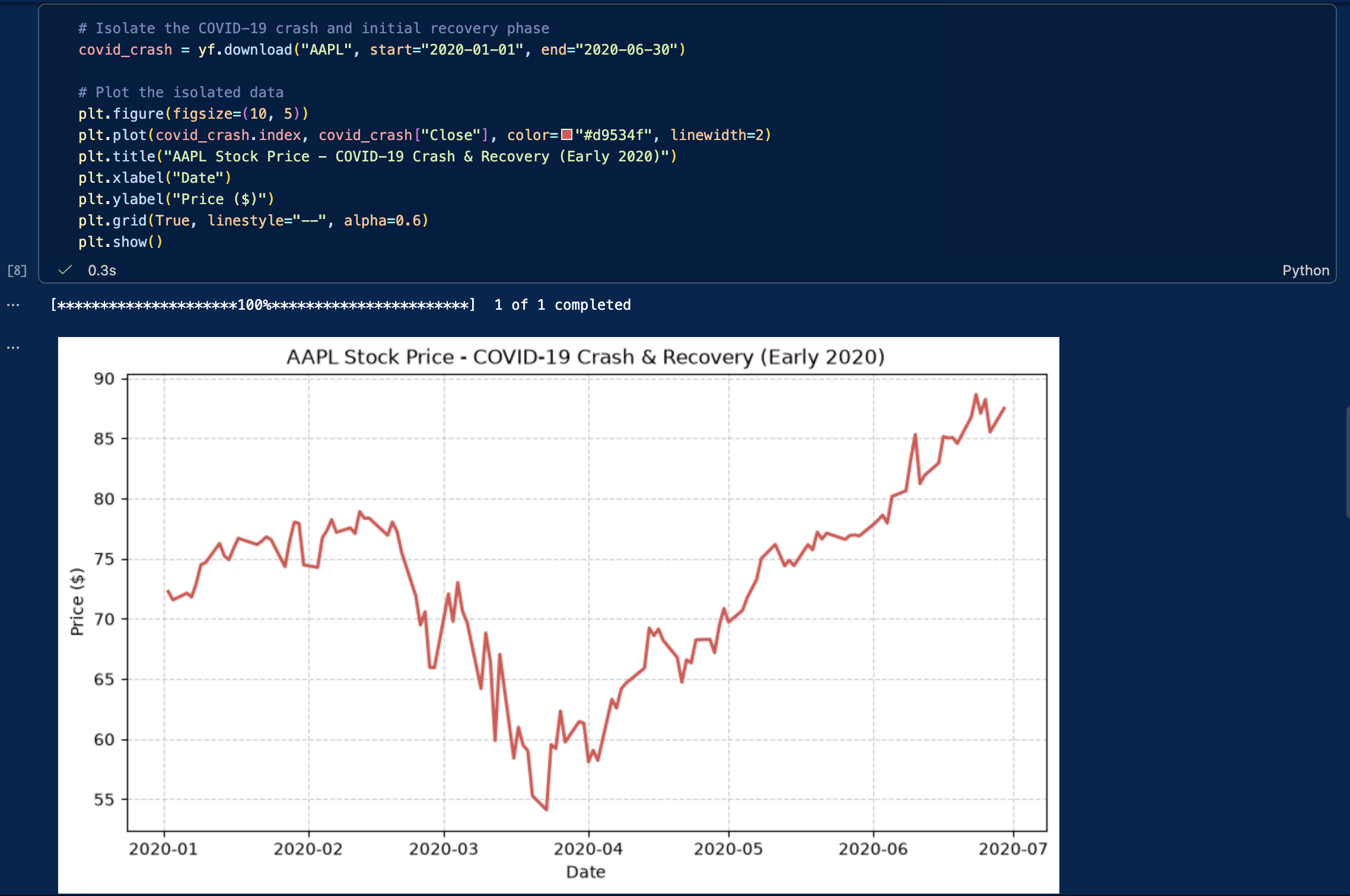
For example, analyzing the COVID-19 market crash in early 2020 offers invaluable insights into extreme volatility, liquidity crunches, and rapid V-shaped recoveries. Let’s download and plot Apple’s stock specifically during the height of the pandemic shock (January to June 2020):

# Isolate the COVID-19 crash and initial recovery phase
covid_crash = yf.download("AAPL", start="2020-01-01", end="2020-06-30")

# Plot the isolated data
plt.figure(figsize=(10, 5))
plt.plot(covid_crash.index, covid_crash["Close"], color="#d9534f", linewidth=2)
plt.title("AAPL Stock Price - COVID-19 Crash & Recovery (Early 2020)")
plt.xlabel("Date")
plt.ylabel("Price ($)")
plt.grid(True, linestyle="--", alpha=0.6)
plt.show()

The output of the previous code cell

We could use this same technique to analyze other pivotal periods, such as:

  • A central bank interest rate tightening cycle (e.g., the Fed’s 2022-2023 rate hikes)
  • The 2008 Global Financial Crisis (if analyzing older datasets)
  • Specific earnings announcement windows

Step 5: Downloading multiple stocks at the same time

Downloading multiple stocks is necessary for financial analysis that often requires comparing securities, building a portfolio, or testing trading strategies like pairs trading.

Instead of issuing separate requests for each stock (which risks hitting API rate limits or misaligning dates), it is far more efficient to fetch all tickers at once in a single batch query.

To make this practical, let’s download the data for the “Magnificent Seven”. These seven mega-cap tech companies (Apple, Microsoft, Alphabet, Amazon, Meta, Nvidia, and Tesla) have heavily dominated market capitalization and driven a massive portion of the S&P 500’s returns in recent years.

# Define the Magnificent 7 tickers
mag7_tickers = ["AAPL", "MSFT", "GOOGL", "AMZN", "META", "NVDA", "TSLA"]

# Download the closing prices for all 7 stocks simultaneously
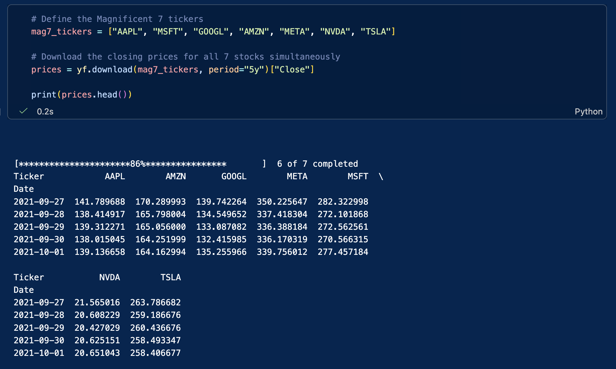
prices = yf.download(mag7_tickers, period="5y")["Close"]
 
print(prices.head())

The result is now again a matrix where each column represents a stock, and each row represents a trading day.

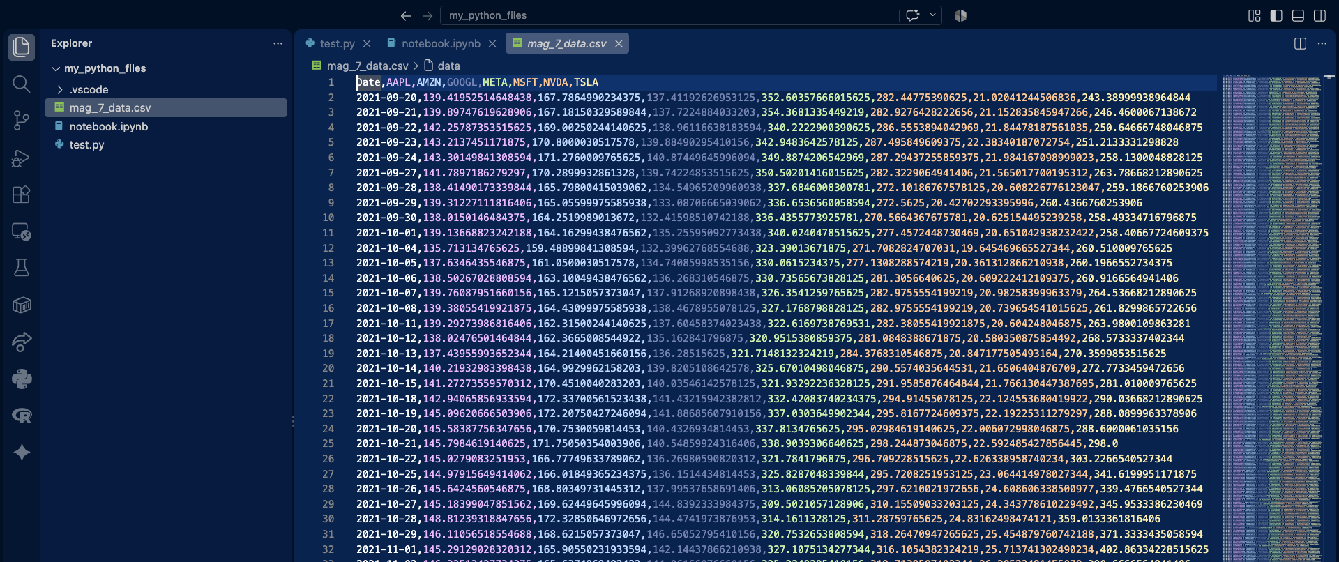
Screenshot of the output of the previous cell

This table format is ideal for portfolio analysis, benchmarking, and performance comparisons, and can be used to draw any kind of graphs.

Note that the table’s columns are displayed in two groups. Depending on the display width, Jupyter Notebook or VS Code may wrap or truncate wide DataFrames. You can export the DataFrame to a CSV file if you prefer to inspect the complete dataset in a spreadsheet application.

# save the dataframe as a csv
prices.to_csv('mag_7_data.csv')

Screenshot of the output of the previous cell

Now that you successfully downloaded your financial data, let’s see how you can clean it and then use it.

Inspecting and cleaning the dataset

Financial datasets may contain missing values (NaN) for various reasons, including differences in trading calendars, trading suspensions, listing dates, or data-provider issues. Missing observations should be identified before computing returns or risk measures. For this introductory example, we simply remove rows containing missing values. In applied financial analysis, however, the appropriate treatment depends on the source of the missing data and the objective of the analysis.

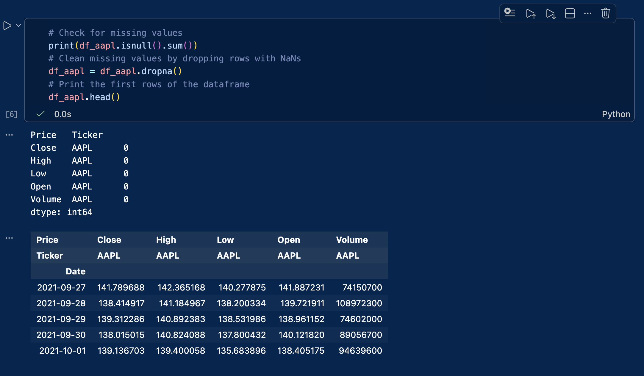
If left unaddressed, these missing data points will break your mathematical functions and severely distort your return and volatility calculations. The code below checks how many missing values exist in each column, and then removes (drops) any rows containing them. In some situations you might want to forward-fill these gaps to preserve the timeline, but dropping them is the safest thing to do for now.

# Check for missing values
print(df_aapl.isnull().sum())
# Clean missing values by dropping rows with NaNs
df_aapl = df_aapl.dropna()
# Print the first rows of the dataframe
df_aapl.head()
df_aapl.head()

A screenshot from VSC showing the output of the cleaning code cell

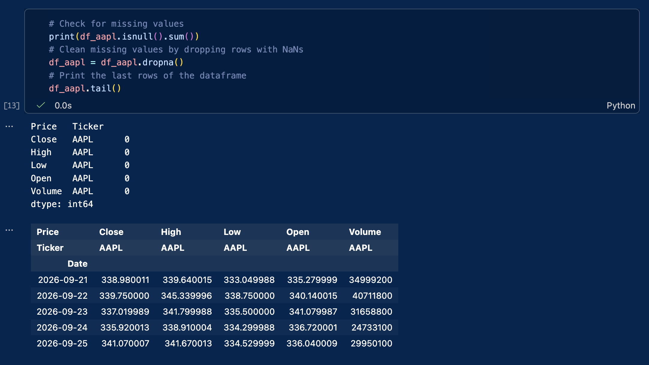
To view the last rows of the dataframe, replace head() by tail():

Output of the VSC cell when we switch to tail()

Visualizing the stock price with graphs or charts

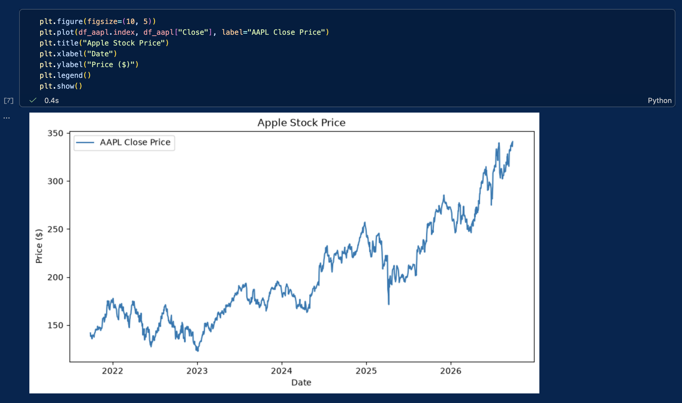
Let’s create our first graph to visualize the evolution of Apple’s stock price.

plt.figure(figsize=(10, 5))
plt.plot(df_aapl.index, df_aapl["Close"], label="AAPL Close Price")
plt.title("Apple Stock Price")
plt.xlabel("Date")
plt.ylabel("Price ($)")
plt.legend()
plt.show()

A screenshot of VSC with the stock price visualization cell output

We have now:

  • Downloaded market data from Yahoo! Finance
  • Stored and cleaned the data in a dataframe
  • Created a time-series plot to visualize stock prices

These core steps form the basis of empirical financial research and quantitative models.

Computing basic statistics & historical distributions

To evaluate stock performance and risk, we compute basic descriptive statistics for both prices and financial returns: minimum, maximum, mean, variance, standard deviation, skewness, and kurtosis. Although descriptive statistics can also be computed for price levels, risk analysis generally focuses on returns, whose distributions are more economically meaningful.

# Calculate daily percentage returns
df_aapl['Return'] = df_aapl['Close'].pct_change()

# Compute summary statistics for Price and Returns
stats_df = pd.DataFrame({
    'Metric': ['Min', 'Max', 'Mean', 'Variance', 'Std Dev', 'Skewness', 'Kurtosis'],
    'Price ($)': [
        df_aapl['Close'].min().item(),
        df_aapl['Close'].max().item(),
        df_aapl['Close'].mean().item(),
        df_aapl['Close'].var().item(),
        df_aapl['Close'].std().item(),
        df_aapl['Close'].skew().item(),
        df_aapl['Close'].kurtosis().item()
    ],
    'Daily Return': [
        df_aapl['Return'].min().item(),
        df_aapl['Return'].max().item(),
        df_aapl['Return'].mean().item(),
        df_aapl['Return'].var().item(),
        df_aapl['Return'].std().item(),
        df_aapl['Return'].skew().item(),
        df_aapl['Return'].kurtosis().item()
    ]
})

print(stats_df)

Plotting historical distributions

Histograms display the frequency distribution of prices and daily returns, helping us inspect price trends, distribution symmetry, and tail risks.

fig, axes = plt.subplots(1, 2, figsize=(14, 5))

# Price distribution
axes[0].hist(df_aapl['Close'].dropna(), bins=30, color='skyblue', edgecolor='black')
axes[0].set_title('Historical Price Distribution')
axes[0].set_xlabel('Price ($)')
axes[0].set_ylabel('Frequency')

# Return distribution
axes[1].hist(df_aapl['Return'].dropna(), bins=50, color='salmon', edgecolor='black')
axes[1].set_title('Historical Daily Return Distribution')
axes[1].set_xlabel('Daily Return')
axes[1].set_ylabel('Frequency')

plt.tight_layout()
plt.show()

Normalizing stock prices and computing returns

All stocks have different nominal prices. If Tesla trades at $350 and Nvidia at $220, it does not mean that Tesla is worth more than Nvidia or performed better.

To establish an accurate comparison across these assets, we must execute two fundamental computations:

  1. Price harmonization: we normalize all historical time series to a base index of 100, to ensure a standardized starting point.
  2. Return calculation: we compute the periodic returns to get the actual performance in % rather than the absolute variation.
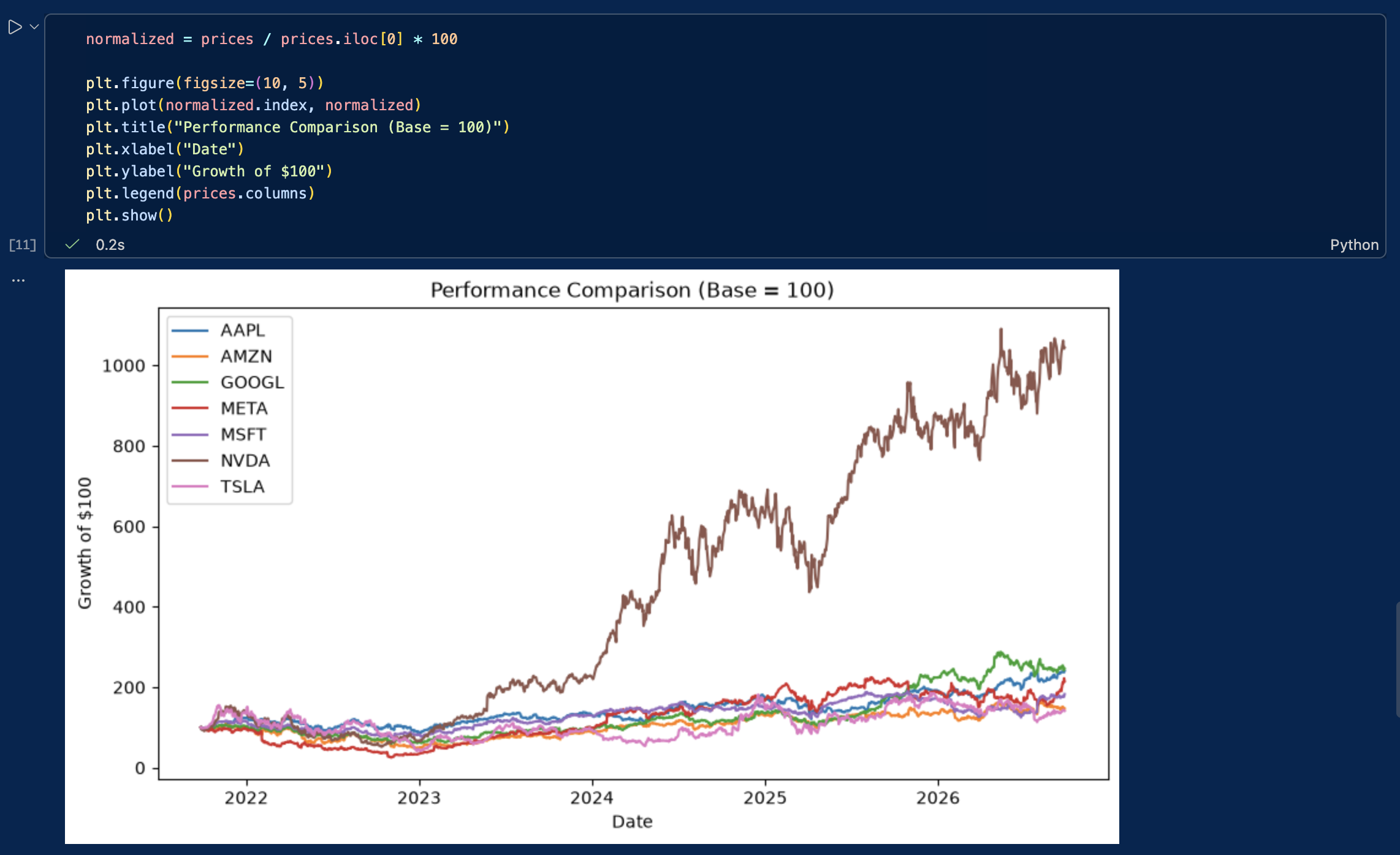
normalized = prices / prices.iloc[0] * 100

plt.figure(figsize=(10, 5))
plt.plot(normalized.index, normalized)
plt.title("Performance Comparison (Base = 100)")
plt.xlabel("Date")
plt.ylabel("Growth of $100")
plt.legend(prices.columns)
plt.show()

the output of the previous cell

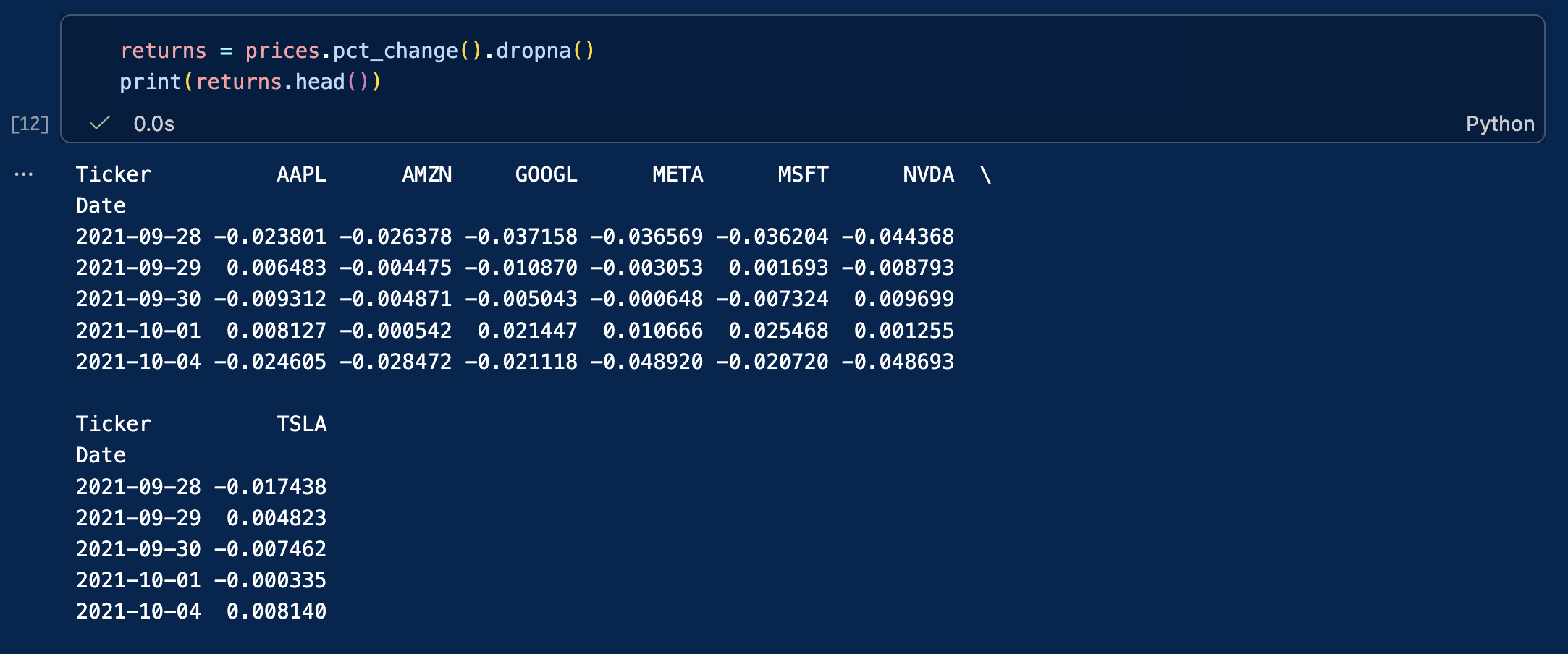
We can also compute daily returns across all stocks:

returns = prices.pct_change().dropna()
print(returns.head())

the output of the previous cell

The chart now shows how much each investment would have grown from the same starting value.

This is a standard technique used by portfolio managers and equity analysts.

Case study: the Capital Asset Pricing Model (CAPM)

In empirical finance, evaluating an individual asset requires isolating the return generated by the broader market from the return specific to the company itself. The Capital Asset Pricing Model (CAPM) provides the foundational framework to decompose this risk.

The model decomposes the return of an individual asset over a given time period into three components: the risk-free rate, a market systematic factor and a firm-specific factor. The model is expressed through the following equation:

rt = rf + β(rm – rf) + εt

Where:

  • rt is the return of the stock (e.g., Apple).
  • rf is the risk-free interest rate (e.g., the 13-week Treasury Bill, ^IRX).
  • β (Beta) represents the stock’s sensitivity to market movements (systematic risk).
  • rm – rf is the excess return of the market index (e.g., the S&P 500, ^GSPC).
  • εt (Epsilon) represents the idiosyncratic return associated with firm-specific risk not explained by the market.

By downloading these three time series simultaneously, we can calculate the stock’s Beta and isolate its firm-specific residual risk.

# Download asset (AAPL), market benchmark (S&P 500), and risk-free rate (13-week T-Bill)
market_data = yf.download(["AAPL", "^GSPC", "^IRX"], start="2022-01-01", end="2024-12-31")["Close"].dropna()

# Compute daily percentage returns for the stock and the market
returns_df = market_data[["AAPL", "^GSPC"]].pct_change().dropna()
 
# Convert the annualized risk-free yield (^IRX) to a daily rate
daily_rf = (market_data["^IRX"] / 100) / 252
returns_df["Rf"] = daily_rf
 
# Calculate the excess returns: (r_t - r_f) and (r_m - r_f)
excess_aapl = returns_df["AAPL"] - returns_df["Rf"]
excess_market = returns_df["^GSPC"] - returns_df["Rf"]
 
# Compute Market Beta: Covariance(stock, market) / Variance(market)
cov_matrix = np.cov(excess_aapl, excess_market)
beta = cov_matrix[0, 1] / cov_matrix[1, 1]
 
# Isolate Epsilon (the firm-specific residual risk)
# Rearranging the CAPM equation: epsilon = (r_t - r_f) - beta * (r_m - r_f)
epsilon = excess_aapl - (beta * excess_market)
 
print(f"Calculated Beta: {beta:.4f}")
print(f"Mean Firm-Specific Return (Epsilon): {epsilon.mean():.6f}")
print(f"Idiosyncratic Risk (Epsilon Std Dev): {epsilon.std():.4f}")

Common pitfalls

When working with market data, beginners often run into the same issues:

  • Using the wrong ticker symbol
  • Comparing stocks without normalizing prices
  • Forgetting that markets are closed on weekends and holidays
  • Failing to clean and handle missing values (NaN) in the dataset
  • Failing to check whether price series are raw or adjusted for stock splits and dividends

Overall, always inspect and clean your data before starting your analysis.

Exercises

Exercise 1: Basic data retrieval and price visualization (MSFT)

Microsoft is a mature mega-cap technology company, and a cornerstone of most global equity portfolios. Retrieving and inspecting its historical data is a perfect starting point to practice basic YFinance commands.

Using the ticker symbol MSFT, download the last five years of daily market data.

Your tasks:

  • Use the appropriate pandas functions to display the first 5 rows and the last 5 rows of the dataset to verify data integrity (checking for correct start/end dates).
  • Generate a line chart plotting the closing price over the entire 5-year period to visualize its long-term market trend.

Exercise 2: time-series extraction and volume analysis on Tesla (TSLA)

Tesla is renowned for its high historical volatility and massive retail trading interest. The 2022-2024 window was particularly eventful for growth and electric vehicle stocks, marked by shifting supply chains and a rapid rise in interest rates. Isolating this exact timeframe allows us to analyze the stock’s behavior under changing macroeconomic conditions.

Using the ticker symbol TSLA, extract the market data for the precise calendar period from January 1, 2022, to December 31, 2024 (using the start and end parameters).

Your tasks:

  • Identify the peak (highest closing price) and the trough (lowest closing price) over this period to grasp the magnitude of the stock’s price swings.
  • Calculate the average daily trading volume, a fundamental metric used by analysts to assess market liquidity and ongoing investor interest.

Exercise 3: Comparative performance and risk profiling on Chinese tech companies

Chinese technology stocks often experience unique market cycles driven by distinct domestic regulatory environments and macroeconomic factors. Using their US-listed ADRs (American Depositary Receipts), compare the performance and risk characteristics of three major players over the last five years:

  • Alibaba (BABA)
  • Baidu (BIDU)
  • PDD Holdings (PDD)

Questions:

  1. Which stock achieved the highest total cumulative return?
  2. Which stock was most volatile (highest standard deviation of daily returns)?
  3. Which one offered the best risk-adjusted profile (e.g., highest Sharpe ratio) over the period?

Download the solutions

To help you check your work and experiment further, you can download the complete Jupyter Notebook containing the full code, charts, and commentary for all exercises.

Download Solutions (.ipynb)

Once downloaded, change the file’s extension from .txt to .ipynb and open it in Visual Studio code.

What’s next?

Now that you know how to download financial data, perform basic computations, and control for market risk, you are ready to delve into advanced quantitative and corporate finance topics.

About the author

This article was written in September 2026 by Hadrien PUCHE (ESSEC Business School, Grande École Program, Master in Management, 2023-2027).

   ▶ Discover all posts by Hadrien PUCHE

How to Install and Run Python on Your Computer (A Step-by-Step Guide)

Hadrien Puche

In finance, the ability to rapidly acquire, clean, and manipulate data is a key skill that can help you gain an edge over other students and job applicants. While Excel (with VBA) remains widely used and is sufficient for most basic financial modeling, such as a DCF valuation, Python offers far more scalability, automation, and mathematical power than Excel.

In this article, Hadrien PUCHE (ESSEC Business School, Grande École Program, Master in Management, 2023-2027) will help you to:

  • Understand the core components of a Python environment for finance
  • Choose the most secure and efficient development setup for financial data
  • Install Miniconda and manage isolated virtual environments
  • Set up Visual Studio Code (VS Code) as your primary coding workspace
  • Run a test script to download and visualize real stock market data

No computer science background is required to start using Python.

Quick vocabulary for beginners

Before we dive in, let’s demystify a few technical terms you will encounter frequently:

  • Python: A popular, high-level programming language created in 1991 by Guido van Rossum (and named after the BBC comedy series Monty Python’s Flying Circus). Today, Python is widely used in quantitative finance and data science because of its simple syntax and vast ecosystem of financial tools.
  • Library / Package: A collection of pre-written code created by other developers so you don’t have to reinvent the wheel (e.g., pandas for data tables, yfinance for downloading stock market prices).
  • Dependency: A package that another package needs in order to work properly.
  • Environment: An isolated “sandbox” on your computer containing a specific version of Python and specific libraries, preventing projects from interfering with one another.
  • IDE (Integrated Development Environment): The visual software app where you write, edit, and test your code (e.g., Visual Studio Code).
  • Extension: An add-on (like an app from an App Store) that adds extra features to your IDE.

In this first article, we will focus on helping you set up Python on your computer so that you can start learning how to use it. We will guide you step by step through setting up a professional local workspace and testing that everything is working properly. Once that is done, you will find a list of follow-up articles at the end to explore real-world financial use cases.

Choosing your development environment

A development environment is simply the ecosystem of software tools you use to write, manage, and execute your code. When selecting a workspace for Python, you have three main choices:

  • Local workspaces (like Visual Studio Code): The standard choice for finance. Running your code locally (on your own computer) gives you full control over your local file systems, execution speed, and (most importantly) data privacy. In finance, working with proprietary trading algorithms or confidential client data means you cannot upload sensitive information to unvetted third-party servers.
  • Cloud notebooks (like Google Colab): Cloud platforms are convenient for quick experiments because they require zero installation. However, they are generally unsuitable for professional financial workflows. You do not have full control over code execution or environment stability, and uploading confidential financial datasets or proprietary logic to public cloud infrastructure poses significant security and compliance risks.
  • AI-native code editors (like Cursor or Windsurf): These editors heavily integrate AI to generate code automatically. While powerful for experienced developers, relying on AI tools too early prevents beginners from learning core programming logic, syntax, and debugging skills. It is far better to understand the core mechanics manually first.

In this article, we will focus exclusively on establishing a local workspace using Visual Studio Code (VS Code),which is a widely used tool to get comfortable with professional Python coding.

We will also use Jupyter Notebooks (files ending in .ipynb). Unlike traditional Python scripts (files ending in .py) that execute the entire code at once, Jupyter Notebooks allow you to write and run code in individual “cells.” This block-by-block structure is especially powerful in finance for several reasons:

  • Isolating code: You can work on and execute specific parts of your code independently (e.g., downloading data once, then tweaking the math in a separate cell without re-downloading).
  • Immediate feedback: Data tables, charts, and outputs are displayed directly below the specific cell you just ran, and you do not have to execute the entire code each time.
  • Easier debugging: By testing your logic piece-by-piece, identifying and fixing errors becomes significantly faster.
  • Better examples, tutorials, or exercises: You can mix executable code with explanatory text and financial formulas, making it the perfect format for case studies and tutorials.

As your code grows, using a Jupyter Notebook will be more and more useful.

What you need to install (and why)

Before installing anything, let’s understand how the different components of your workspace fit together:

  • Miniconda (which includes Python & Conda): Python comes with a comprehensive standard library, but financial and data analysis typically require additional packages such as pandas, NumPy, matplotlib, and yfinance. To perform financial analysis, you need external packages/libraries like pandas or yfinance. Conda is a tool that manages these packages and isolates them into dedicated virtual environments.
    Note on Anaconda vs. Miniconda: Anaconda is a big download that comes bundled with hundreds of packages you may never use. I suggest using Miniconda because it is a lightweight version, containing only Conda and Python, allowing us to keep your setup clean and fast.
  • Virtual Environments: Why do we need them? If you install every package into one single base Python installation, different projects will eventually require conflicting versions of the same library (a “dependency collision”), causing your scripts to crash. Virtual environments keep each project’s tools safely separated.
  • Visual Studio Code (VS Code): A clean user interface where you write, edit, and debug your code. VS Code connects seamlessly to your Conda virtual environment to execute your scripts.

How the architecture works

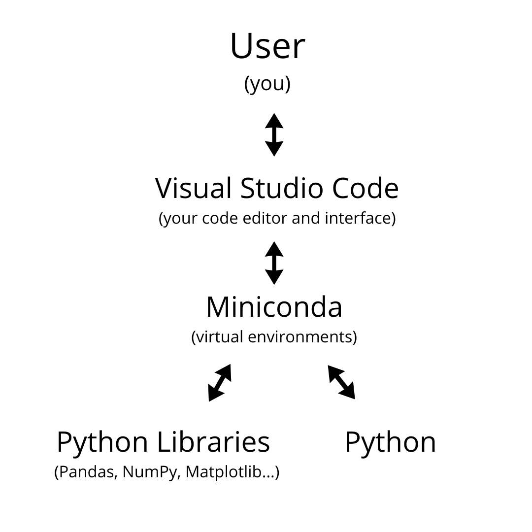
The diagram below illustrates how your development setup functions:

A graph showing the links between the user, VS Code, Miniconda, and Python.
Figure 1: How the User, VS Code, Miniconda Environment, and Python Engine interact.

  • You (the User) interact directly with VS Code to write commands and inspect results.
  • VS Code sends your code to your isolated Miniconda Virtual Environment (e.g., my_environment that you can create to store the packages that you will use in your own code).
  • Inside this environment, the Python Engine processes the math and logic, drawing upon the installed financial libraries (like yfinance and pandas).
  • The execution results (tables, charts, output logs) are sent back to VS Code for you to view.

As a fun side note: you can technically write code in almost any text editor! For a fun take on how far you could take this, check out this video.

Step-by-step installation guide

Step 1: Install Miniconda (Python + Conda)

Conveniently, downloading and installing Miniconda automatically installs Python, so this will be our first step.

Head to the official Miniconda Download Page, select the installer for your operating system (Windows or macOS), and complete the installation using the recommended default settings.

Step 2: Install Visual Studio Code and Extensions

Visual Studio Code (VS Code) will serve as your Integrated Development Environment (IDE). As a quick reminder, an IDE is the main visual software application, where you will actually write, edit, test, and debug your code. You can think of it as the central command dashboard for all your financial programming projects.

  1. Download & Install: Go to the official VS Code website, download the installer for Windows or macOS, and follow the standard installation instructions.
  2. Install Essential Extensions: Launch VS Code. Click on the Extensions icon on the left-hand Activity Bar (or press Ctrl+Shift+X on Windows / Cmd+Shift+X on Mac). Think of extensions as add-ons from an app store that give VS Code superpowers. Search for and install:
    • Python (by Microsoft) – Provides syntax highlighting, code completion, and interpreter selection.
    • Jupyter (by Microsoft) – Enables interactive execution of code cells inside .ipynb notebook files.

VS Code Extensions Marketplace showing Python extension by Microsoft
Make sure to install the official Python and Jupyter extensions in VS Code.

Step 3: Create your virtual environment via the Terminal

Now, we will create a clean, isolated Conda environment named my_environment where our financial packages will live.

  1. Open your command line interface:
    • Windows 11 / 10: Open the Start menu, search for Anaconda Prompt, and click to open it. (Alternatively, you can open Windows Terminal / PowerShell, but Anaconda Prompt automatically initializes Conda for you).
    • macOS: Open the Terminal app (press Cmd + Space, type “Terminal”, and press Enter).
  2. Run the following Conda & pip commands one by one:
# 1. Create an isolated environment named ‘my_environment’ with Python 3.11 conda create –name my_environment python=3.11 -y # 2. Activate your new environment conda activate my_environment # 3. Upgrade pip and install core financial analysis libraries pip install –upgrade yfinance pandas numpy matplotlib notebook –no-cache-dir

Pro-tip: Whenever you need to install additional packages in the future, open your terminal, activate your environment (conda activate my_environment), and run pip install [package_name].

Step 4: Connect VS Code to your environment

Now that your environment and libraries are ready, you need to tell VS Code to use my_environment to run your code.

  1. Open a workspace folder: In VS Code, go to File > Open Folder… and select or create a dedicated folder on your computer (e.g., finance_python). It does not matter where it is, you simply need somewhere to store your code files.
  2. Create your files: Click the New File icon in the Explorer sidebar to create two files:
    • test.py (.py file is to store Python code)
    • notebook.ipynb (.ipynb is the file extension name used for Jupyter notebooks)
  3. Select the Python interpreter: Open test.py. Press Ctrl+Shift+P (Windows) or Cmd+Shift+P (macOS) to open the Command Palette, type Python: Select Interpreter, and press Enter.
    • VS Code should automatically list my_environment. Click on it.
    • If it doesn’t appear automatically: Click Enter interpreter path… > Find… and navigate directly to the executable file:
      • Windows: C:\Users\YourUsername\miniconda3\envs\my_environment\python.exe
      • macOS: /Users/YourUsername/miniconda3/envs/my_environment/bin/python3
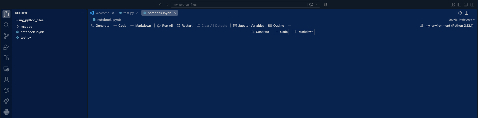
  4. Select Jupyter Kernel: Open notebook.ipynb. Click Select Kernel in the top-right corner of the window, choose Python Environments…, and select your my_environment path.

An image of the VS Code menu with notebook.ipynb and test.py created
Once this is done, your IDE should look just like this.

Quick Troubleshooting Tips:
  • “No matching commands” error: If typing Python: Select Interpreter gives no results, click inside the test.py editor window first to wake up the Python extension, or click Select Python Interpreter in the bottom-right status bar.
  • Environment missing from the list: Make sure you activated the environment in terminal at least once, or use the direct path navigation detailed above.

Testing your installation

Now that VS Code is connected to my_environment, let’s run a simple test script to confirm that our setup can successfully fetch market data and display a stock chart. Open test.py or notebook.ipynb, paste the code below, and execute it:

# Import yfinance to download stock market data directly from Yahoo Finance
import yfinance as yf

# Import matplotlib.pyplot (aliased as 'plt') to create financial charts and plots
import matplotlib.pyplot as plt

# Download historical stock data for Apple Inc. (AAPL)
print("Fetching financial data from Yahoo Finance using yfinance...")
df = yf.download('AAPL', start='2023-01-01', end='2024-01-01')

# Display the first 5 rows of the downloaded data in the terminal / output window
print("\nFirst 5 rows of AAPL market data:")
print(df.head())

# Plot historical closing prices
plt.figure(figsize=(10, 5))
plt.plot(df['Close'], label='AAPL Close Price', color='#1d4ed8', linewidth=1.5)
plt.title('Apple Inc. (AAPL) Historical Close Prices - 2023')
plt.xlabel('Date')
plt.ylabel('Price ($)')
plt.grid(True, linestyle='--', alpha=0.5)
plt.legend()
plt.show()

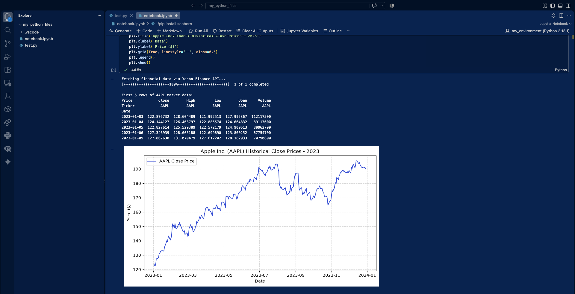
If the market dataset downloads and a clean line chart of Apple’s stock price appears, congratulations! You have successfully configured a professional, local Python environment for financial engineering.

This is how the output should look like if everything is working correctly:

An image of the VS Code menu with notebook.ipynb and test.py created

Congratulations! You have successfully configured a professional, local Python environment, ready for financial engineering

A quick tip for installing additional packages

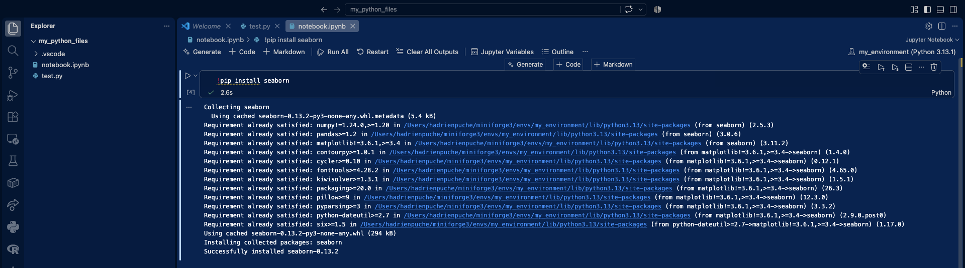
As you have seen, packages such as yfinance, matplotlib, and pandas extend Python with useful functionality for financial analysis. If you need to install an additional package while working in a Jupyter Notebook, you can use the %pip command directly in a notebook cell, provided that the appropriate Python environment is selected as the active kernel. For example, the following command installs seaborn, a high-level statistical data visualization library built on top of Matplotlib:

%pip install seaborn

An image of the VS Code menu with notebook.ipynb and test.py created

Next steps & financial use cases

Now that your environment is fully operational, you are ready to start applying Python to quantitative finance. Explore this article to learn how to use Python to download and use financial market data.

   ▶ Hadrien Puche How to download and model financial data with Python

If you are interested in programming languages and would like to learn another useful skill, explore these two articles about how you could use the programming language R to help you in your financial analysis:

   ▶ Hadrien Puche How to install and run R on your computer (A step-by-step guide)

   ▶ Hadrien Puche How to download financial data with R

About the Author

This article was written in September 2026 by Hadrien PUCHE (ESSEC Business School, Grande École Program, Master in Management, 2023-2027).

   ▶ Discover all posts by Hadrien PUCHE

AMM: Market Making in Decentralized Finance

Calculateur AMM

Constant-Product Automated Market Maker (AMM): Price Calculator

This application calculates the average transaction price and the final price (marginal price after the transaction) for a constant-product AMM defined by x × y = k. The following convention is used: buy means that the user buys asset x and pays with asset y, while sell means that the user sells asset x and receives asset y.

Pool Parameters

Transaction

Results

Chart

VIX Data and Statistical Properties

Saral BINDAL

In this article, Saral BINDAL (Indian Institute of Technology Kharagpur, Metallurgical and Materials Engineering, 2024-2028 & Research assistant at ESSEC Business School) examines the statistical properties of historical VIX data and applies statistical methods to model its dynamics.

Introduction

The Chicago Board Options Exchange (CBOE) Volatility Index, or VIX, is a real-time market index designed to measure the market’s expectation of 30-day forward-looking annualized volatility in the US equity market. It is option-based, calculated using the market prices of S&P 500 index options to gauge expected volatility. The VIX construction methodology can be found in the article CBOE Volatility Index

In this article, we analyze the VIX index using historical market data to study its statistical properties, and discuss the methods used to model its dynamics in quantitative finance.

Historical Data

The VIX Index Historical data is publicly available from the Chicago Board Options Exchange (CBOE) and is updated on a daily basis. The analysis in this article is based on daily closing values of the VIX obtained from this data.

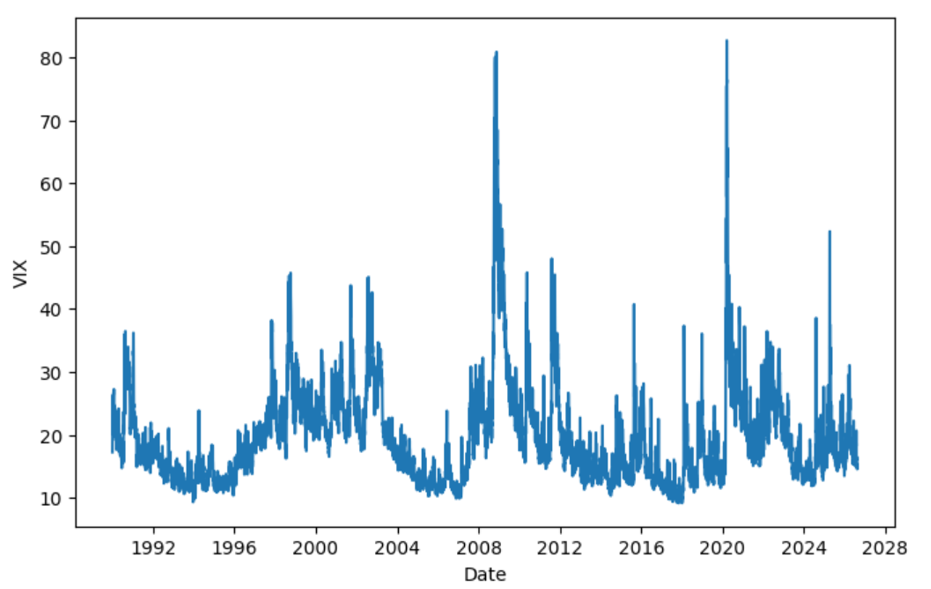
Figure 1 below illustrates the time series plot of VIX daily closing values from January 1990 to August 2026. From the figure, we can observe that during periods of high uncertainty, the VIX tends to rise significantly, as seen during the Global Financial Crisis (2007–2009) and the COVID-19 pandemic (2019–2020). We can also see the VIX rising as of now amid the ongoing Middle East crisis, although not to the same extent as observed during previous periods of heightened uncertainty.

Figure 1. VIX Index Historical Data (1990-2026)
VIX Index Historical Data (1990-2026)
Source: computation by the author.

Distributional Characteristics

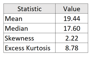
Using historical VIX data from 1990 to 2026, Figure 2 illustrates the empirical distribution of daily VIX closing values. The histogram, overlaid with a kernel density estimate (KDE), provides a visual representation of the distribution’s underlying probability density. The corresponding first four moments of the distribution are reported below:

Table 1. VIX Distribution Statistics
Table of VIX Distribution Statistics
Source: computation by the author.

From the above table, we can observe that the data is right-skewed, which indicates that volatility tends to remain relatively low under normal market conditions but can rise sharply during periods of financial stress. The long right tail therefore reflects the occurrence of volatility shocks and tail-risk events, such as the Global Financial Crisis (2007–2009), the COVID-19 market shock (2020), and other episodes of significant financial or geopolitical uncertainty. Moreover, a high excess kurtosis indicates fatter tails compared to a normal distribution, implying a higher probability of observing extreme VIX levels. From the histogram, we observe that the VIX is concentrated around a level of 15 for a large proportion of the sample. This suggests that, under normal market conditions, the VIX tends to fluctuate around this level, which can be interpreted as its long-term level of the market uncertainty

Figure 2. Historical Distribution and Kernel Density Estimation of the Daily VIX levels
Historical Distribution of the Daily VIX levels
Source: computation by the author.

Time-Series Properties

The VIX exhibits several well-documented time-series properties that distinguish it from traditional financial asset prices. Unlike equity prices, whose levels are generally characterized by non-stationary dynamics, the VIX exhibits pronounced mean reversion and persistence, together with sharp spikes during episodes of market stress. The mean-reverting behaviour of the VIX is particularly noteworthy because it resembles a fundamental feature of interest-rate dynamics, which has long been incorporated into models such as the Vasicek (1977) and Cox, Ingersoll, and Ross (1985). The mean-reverting specifications have similarly been used to capture the tendency of volatility to return toward a long-run level.

However, the two processes differ substantially in their temporal dynamics. Interest-rate persistence typically reflects gradual adjustments in response to macroeconomic conditions and monetary policy, with mean reversion occurring over relatively longer horizons. In contrast, the VIX responds rapidly to changes in market expectations: episodes of financial stress can trigger abrupt upward spikes, followed by relatively rapid mean reversion toward lower levels. Thus, while both exhibit persistent and mean-reverting dynamics, the VIX is distinguished by its faster adjustment, pronounced asymmetry, and sharp responses to market stress.

Methods to Model VIX Dynamics

VIX dynamics exhibit several distinctive characteristics, particularly mean reversion and persistence, which require different modelling approaches. This section examines how various econometric models capture these features, ranging from mean-reverting and Log-VIX models to HAR, ARCH/GARCH, and stochastic volatility models.

Mean-Reverting Models

Early approaches to modelling volatility indices treated volatility as a mean-reverting stochastic process. A commonly used specification is the Cox-Ingersoll-Ross (CIR) process, originally developed for interest-rate modelling by Cox, Ingersoll and Ross (1985) and subsequently applied to volatility derivatives by Grünbichler and Longstaff (1996). Grünbichler and Longstaff modelled the volatility index using a mean-reverting square-root process and derived pricing formulas for volatility futures and options.

The dynamics are given by


CIR Formula

  • Vt represents the volatility index at time t
  • κ is the speed of mean reversion
  • θ is the long-run level towards which the process tends to revert
  • σ is the diffusion parameter controlling the magnitude of random fluctuations
  • Wt is a standard Brownian motion

The term κ(θ − Vt)dt represents the mean-reverting component, which pulls the process towards its long-run level θ, while σ√VtdWt represents the diffusion component, capturing random fluctuations in the volatility index.

The CIR framework was subsequently examined empirically in the context of VIX futures by Zhang and Zhu (2006). They estimated a stochastic variance model using historical VIX data and used it to derive and evaluate VIX futures prices.

An alternative mean-reverting modelling approach is the Ornstein-Uhlenbeck (OU) process (Uhlenbeck and Ornstein, 1930), which assumes a constant diffusion coefficient:


OU Formula

Unlike the CIR process, the OU process is Gaussian and can theoretically take negative values. This makes the OU process unsuitable for modelling the VIX level directly, since the VIX is strictly positive. A common way to retain the mean-reverting OU structure while ensuring a positive VIX is therefore to model log(VIX) rather than the VIX level itself.

Log-VIX Models

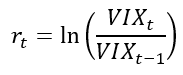
A natural way to address the possibility of negative values is to model the logarithm of the VIX. Let


VIX Log-Change Formula

A mean-reverting logarithmic process can then be written as


Mean Reverting Log Formula

or equivalently,


Mean Reverting Log Formula

Since


VIX Formula

the resulting modelled VIX is strictly positive. The logarithmic transformation therefore preserves the mean-reverting structure while avoiding the negative-value problem associated with modelling the VIX level using a Gaussian process.

Mean-reverting in the log models were studied by Detemple and Osakwe (2000) in the context of volatility option valuation. Their model provides an early theoretical foundation for modelling volatility through a log-normal mean-reverting process. The approach was subsequently applied directly to the VIX by Bao (2013), who developed a mean-reverting logarithmic model for the spot VIX and extended it to incorporate jumps and stochastic volatility.

Heterogeneous Autoregressive Model

Although continuous-time mean-reverting models capture the tendency of volatility to move towards a long-run level, empirical evidence indicates that the VIX also exhibits substantial persistence across different time horizons. Fernandes, Medeiros and Scharth (2014) conducted a detailed analysis of the time-series properties of the VIX and found evidence of long-range dependence. They therefore employed Heterogeneous Autoregressive (HAR) models to model and forecast the VIX.

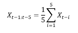
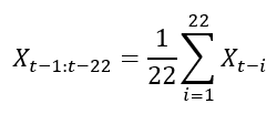
The HAR framework captures persistence by allowing past VIX observations over different horizons to affect the current value. A simplified HAR model can be expressed as


HAR Formula

where


HAR Weekly Component Formula

and


HAR Monthly Component Formula

The three components represent information from daily, weekly, and monthly horizons, respectively. This allows the HAR-VIX model to capture the persistence of the VIX across different time horizons while remaining relatively simple and parsimonious. The HAR framework was originally introduced by Corsi (2009) to model the heterogeneous dynamics of realized volatility. Fernandes, Medeiros and Scharth (2014) adapted this framework to the VIX and showed that its multi-horizon structure provides a useful representation of the strong persistence and long-range dependence in the VIX.

Stochastic Variance of the VIX

The volatility of the VIX itself can vary over time. Rather than assuming that the diffusion coefficient is constant, stochastic-volatility models allow the volatility governing VIX fluctuations to evolve as a separate stochastic process.

Kaeck and Alexander (2013) investigate continuous-time models of VIX dynamics that explicitly incorporate stochastic volatility of volatility. Their analysis considers several one- and two-factor continuous-time models, including affine and non-affine specifications and models with jumps, using VIX data over an extended period.

Conceptually, the model can be represented as


Stochastic Volatility VIX Formula

where

  • VIXt represents the VIX index
  • Vt represents the instantaneous variance governing movements in log-VIX and is itself stochastic
  • κ controls the mean-reversion speed of log-VIX
  • θ represents the long-run level of log-VIX
  • Wt is a Brownian motion driving log-VIX
  • Zt represents the size of a jump in log-VIX
  • Jt is a jump-counting process, with dJt representing the occurrence of jumps


Stochastic Variance Formula

  • κv controls the mean-reversion speed of the variance process
  • θv represents the long-run level of the variance process
  • σv controls the volatility of the variance process, representing the volatility-of-volatility
  • Wtv is a Brownian motion driving the variance process

The key distinction is therefore that the variance of VIX fluctuations is no longer constant. It becomes a state variable that evolves over time.

This additional source of randomness allows the model to capture changes in the intensity of VIX fluctuations and provides a more flexible representation of the sharp and persistent movements observed during periods of financial stress. Kaeck and Alexander’s analysis specifically examines whether stochastic volatility of volatility improves the ability of continuous-time models to describe VIX dynamics.

ARCH and GARCH Models

The VIX also exhibits volatility clustering, where periods of high volatility tend to be followed by high volatility, while periods of low volatility tend to be followed by low volatility. This suggests that the variance of log change in VIX is not constant over time. ARCH and GARCH models capture this feature by allowing the conditional variance of log change in VIX to evolve over time.

Let the log change in the VIX be defined as


VIX Log Change Formula

An ARCH or GARCH model can then be used to model the conditional variance of these changes. The standard GARCH(1,1) specification is


GARCH Formula

where

  • rt represents the log change in the VIX at time t
  • μ represents the conditional mean of the VIX log change
  • εt represents the innovation or shock at time t
  • σt2 represents the conditional variance of the VIX log change
  • ω represents the long-run variance component
  • α measures the immediate effect of new shocks on conditional variance
  • β measures the persistence of conditional variance over time

The αεt−12 term captures the immediate impact of a new shock, while the βσt−12 term captures the persistence of previously elevated variance. A high value of β therefore indicates that periods of high variation in the VIX tend to persist.

The ARCH model was introduced by Engle (1982), while Bollerslev (1986) extended it to the more general GARCH framework. For the VIX, these models are useful for studying time-varying conditional variance and volatility clustering in VIX changes, rather than the mean-reverting behaviour of the VIX level itself.

Empirical Analysis of VIX

We use the complete historical daily VIX closing values (1990 – 2026) to estimate the parameters of the CIR model described above. Since the CIR model is specified in continuous time while the data are observed at daily intervals, the process is first discretized using the Euler-Maruyama approximation:


Discretized CIR Formula

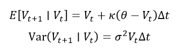
where Δt; = 1/252 for daily observations and εt+1 ∼ N(0,1). This discretization implies that, conditional on the previous day’s VIX value, the expected value and variance of the next observation are:


Conditional Expected Value and Variance Formula

Assuming the discretized process is conditionally normally distributed, these expressions allow us to construct a likelihood for the observed VIX data. The log-likelihood is:


Log Likelihood Formula

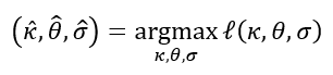
The CIR parameters are then estimated by choosing the values that maximize this log-likelihood:


Maximum Likelihood Estimator Formula

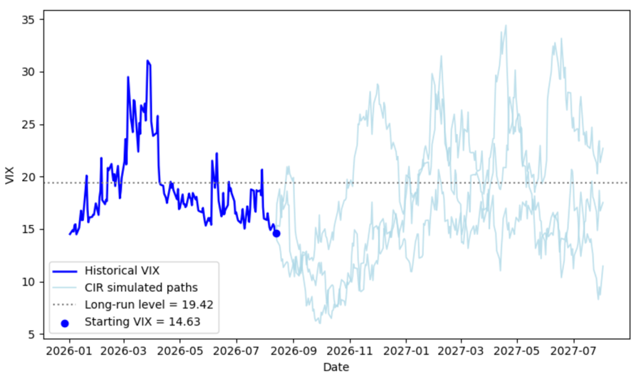
This gives an estimated mean-reversion speed of κ = 4.8618, a long-run VIX level of θ = 19.4237, and a diffusion parameter of σ = 5.1952.

These estimated parameters are then used to simulate a possible future path of the VIX. The simulation starts from the observed VIX value of 14.63 on 13th August 2026 and projects the VIX forward over 252 trading days using the CIR dynamics. The mean-reverting component pulls the process towards the estimated long-run level, while the diffusion component introduces random fluctuations around this tendency.

Figure 3 compares the historical VIX with one simulated path generated by the estimated CIR model. The historical series shows the large fluctuations and sharp spikes observed in the VIX over the sample period, while the simulated path represents one possible future realization starting from the current VIX level of 14.63. The dotted line at 19.42 represents the estimated long-run level of the VIX. The simulated path fluctuates around this level and exhibits a tendency to move towards it, illustrating the mean-reverting behavior implied by the CIR model.

You can download the Excel file with complete historical data used for the above calculations below.

Download the Excel file with complete historical VIX data

Figure 3. Historical Path and Multiple CIR Simulated Paths for the VIX
CIR Simulated Paths
Source: computation by the author.

You can download the Python code below to reproduce the CIR parameter estimation and simulated VIX paths presented above.

Download the Python to simulate the CIR paths.

Alternatively, you can download the R code below with the same functionality as in the Python file.

Download the R code to simulate the CIR paths.

Why should I be interested in this post?

For anyone interested in finance or a career in trading, understanding the statistical properties of VIX and how it is modelled is very important. As one of the most widely used measures of market uncertainty and expected volatility, it serves as an important tool for market analysis, risk assessment and numerous volatility-based trading strategies.

Related posts on the SimTrade blog

   ▶ Akshit GUPTA Options

   ▶ Jayati WALIA Black-Scholes-Merton Option Pricing Model

   ▶ Jayati WALIA Implied Volatility

   ▶ Saral BINDAL Implied Volatility and Option Prices

   ▶ Saral BINDAL Volatility curves: smiles and smirks

   ▶ Youssef LOURAOUI VIX index

Useful resources

Academic research on option pricing

Black F. and M. Scholes (1973) The pricing of options and corporate liabilities. Journal of Political Economy, 81(3), 637-654.

Black, F. (1976), “Studies of Stock Price Volatility Changes”, Proceedings of the Business and Economics Section of the American Statistical Association, 177-181.

Cox J. C., J. E. Ingersoll and S. A. Ross (1985) A theory of the term structure of interest rates. Econometrica, 53(2), 385-407.

Hull J.C. (2022) Options, Futures, and Other Derivatives, 11th Global Edition, Chapter 15 – The Black-Scholes-Merton model, 338-365.

Merton R.C. (1973) Theory of rational option pricing. The Bell Journal of Economics and Management Science, 4(1), 141-183.

Uhlenbeck G. E. and L. S. Ornstein (1930) On the theory of the Brownian motion. Physical Review, 36(5), 823-841.

Academic research on VIX

Bao Q. (2013) Mean-Reverting Logarithmic Modelling of VIX. MPRA Paper, No. 46413.

Bollerslev T. (1986) Generalized autoregressive conditional heteroskedasticity. Journal of Econometrics, 31(3), 307-327.

Corsi F. (2009) A simple approximate long-memory model of realized volatility. Journal of Financial Econometrics, 7(2), 174-196.

Cox J. C., J. E. Ingersoll and S. A. Ross (1985) A theory of the term structure of interest rates. Econometrica, 53(2), 385-407.

Detemple J. and C. Osakwe (2000) The valuation of volatility options. European Finance Review, 4(1), 21-50.

Engle R. F. (1982) Autoregressive conditional heteroscedasticity with estimates of the variance of United Kingdom inflation. Econometrica, 50(4), 987-1007.

Fernandes M., M. C. Medeiros and M. Scharth (2014) Modelling and predicting the CBOE market volatility index. Journal of Banking & Finance, 40, 1-10.

Grünbichler A. and F. A. Longstaff (1996) Valuing futures and options on volatility. Journal of Banking & Finance, 20(6), 985-1001.

Jiang G. J. and Y. S. Tian (2005) The model-free implied volatility and its information content. The Review of Financial Studies, 18(4), 1305-1342.

Kaeck A. and C. Alexander (2013) Continuous-time VIX dynamics: On the role of stochastic volatility of volatility. International Review of Financial Analysis, 28, 46-56.

Uhlenbeck G. E. and L. S. Ornstein (1930) On the theory of the Brownian motion. Physical Review, 36(5), 823-841.

Whaley R. E. (2009) Understanding the VIX. Journal of Portfolio Management, 35(3), 98-105.

Zhang J. E. and Y. Zhu Y. (2006) VIX futures. Journal of Futures Markets, 26(6), 521-531.

VIX Data

CBOE Global Markets (2026) VIX Historical Data.

About the author

The article was written in September 2026 by Saral BINDAL (Indian Institute of Technology Kharagpur, Metallurgical and Materials Engineering, 2024-2028 & Research assistant at ESSEC Business School). His interests include tracking geopolitical developments and analyzing their direct impact on macroeconomic factors such as inflation, trade balances, and currency volatility, with a focus on using data to quantify these global economic ripple effects.

Discover all posts written by Saral BINDAL.

Delta Hedging Explained: How Traders Stay Market Neutral

Abel ARAYA

In this article, Abel ARAYA (ESSEC Business School, Master in Finance, 2025) takes a detailed and practical look at delta hedging, a core concept in options trading. Far from being just a mathematical tool, delta hedging is a real-world technique that allows traders to manage market risk dynamically and stay focused on what they actually want to trade: volatility and relative value.

Understanding the challenge of options trading

When a trader buys or sells options, they are taking a view not only on the direction of the market but also on how much the market might move. The value of an option changes constantly, influenced by multiple factors such as the price of the underlying asset, time decay, volatility, and interest rates. Without active management, these continuous changes can make an options book risky and unpredictable.

Delta hedging addresses this by adjusting the position in the underlying asset to neutralize the impact of small price movements. The trader aims for a portfolio that reacts as little as possible to minor changes in the underlying price so that risk is concentrated on the variables they intend to trade, such as volatility.

What exactly is delta?

Delta is one of the key Greeks that measure how the price of an option responds to changes in market variables. It tracks the sensitivity of the option value to the underlying price.

Δ = ∂V / ∂S

Here, V is the option value and S is the price of the underlying asset. For example, if a call option has a delta of 0.60, a rise of 1 euro in the underlying increases the option value by about 0.60 euro. A delta close to 1 behaves like the underlying, while a delta near 0 barely reacts to price moves.

The principle of delta neutrality

Suppose a trader has sold call options on a stock. If the stock rises, the calls gain value and the short position loses money. To offset this exposure, the trader buys shares of the underlying. The goal is to hold a number of shares that compensates the option’s delta so that small moves in the stock price do not change the portfolio value.

Δportfolio = Δoption + Δhedge = 0

The trader dynamically buys or sells the underlying to keep the combined delta close to zero.

The dynamic nature of delta

Delta changes as markets evolve, time passes, or volatility shifts. The speed of this change is captured by gamma, which measures the curvature of the option value with respect to the underlying price.

Γ = ∂²V / ∂S²

A high gamma means delta changes quickly, which forces more frequent rebalancing. Large options books can require several adjustments per day during volatile periods. In episodes of market stress, hedging flows can increase significantly as deltas move rapidly.

Hedging a single option versus a book of options

So far we have described delta hedging for a single option, but a trader on a derivatives desk rarely manages one position in isolation. In practice, the desk holds a book of hundreds or thousands of options across many underlyings, strikes and maturities. Hedging each one separately would be inefficient and very costly in transaction fees.

Instead, the trader looks at the net risk of the entire book. All the individual deltas are aggregated into a single net delta for the portfolio, and only that net exposure is hedged in the underlying. Long and short positions offset each other, so the desk usually needs far fewer hedging trades than the number of options it holds. The same logic applies to the other Greeks: the book is managed at the level of its net delta, gamma and vega rather than option by option. This portfolio approach is what makes running a large options book possible, and it is one of the core skills of a derivatives trader.

Re-hedging and trading costs

Each rebalancing operation generates transaction costs, including bid-ask spreads and slippage. Skilled traders balance precision and efficiency, deciding when to rebalance and when to tolerate a small residual exposure. Frequent re-hedging reduces risk but can erode profits through costs. The optimal approach depends on liquidity, volatility, and position size.

Why delta hedging matters

Delta hedging allows traders to isolate the risks they want to trade. By neutralizing directional exposure, they can focus on volatility, time decay or interest rate sensitivity. For instance, a volatility trader may be long options but delta-hedged, seeking to profit if realized volatility exceeds implied volatility rather than from market direction.

Securing the bank’s margin

For a bank acting as a market-maker, delta hedging is not only a risk-management tool: it is also what allows the desk to secure its margin. When the bank sells an option to a client, it charges a price that is slightly above the option’s theoretical, or fair, value given by its pricing models. That difference between the price paid by the client and the theoretical value is the bank’s margin.

By delta hedging the position dynamically, the bank replicates the payoff of the option at a cost close to its theoretical value while neutralizing the impact of market direction. If the hedging is done well, the bank is no longer betting on whether the underlying goes up or down: it has locked in that initial margin regardless of how the market moves. In other words, delta hedging turns a directional exposure into a controlled activity whose objective is to capture and protect the spread between the price sold to the client and the theoretical value of the option.

A practical example

Consider a trader who sells 5 million euros of call options on the EuroStoxx 50 with an average delta of 0.4. To stay neutral, the trader buys 2 million euros of EuroStoxx 50 futures, which offsets the option delta. If the index rises and delta increases, the trader buys more futures. If it falls, they reduce the hedge. The objective is to end the day with minimal unhedged exposure despite continuous fluctuations.

Although the mechanics look simple, judgment matters. On quiet days, fewer adjustments are needed. In unsettled markets, hedging becomes more frequent. Delta hedging therefore blends quantitative discipline with trader intuition.

Common misconceptions

Delta hedging does not eliminate all risk. It removes first-order sensitivity to small price moves. Sudden jumps in price or volatility introduce residual risks captured by higher-order Greeks such as gamma and vega. Effective options risk management considers these dimensions together.

Conclusion

Delta hedging is a practical cornerstone of modern options trading. By continuously adjusting exposure, traders can focus on pricing, volatility and liquidity rather than guessing direction. Understanding delta hedging provides a clearer view of market neutrality in practice.

Why should I be interested in this post?

If you are a student in finance interested in derivatives, trading, or risk management, delta hedging is one of the most fundamental concepts you will encounter in practice. It bridges the gap between option pricing theory and what traders actually do every day on the floor. Understanding delta hedging will give you a concrete language for discussing risk with traders and structurers in interviews, and it directly underpins roles in equity derivatives, rates options, and exotic products desks.

More broadly, the logic of delta hedging, isolating a risk you want to trade from one you do not, applies far beyond options. It is central to how banks and hedge funds manage their books across all asset classes. Whether you are targeting a front-office internship, a quant role, or a risk management position, mastering this concept will give you a genuine edge.

Related posts on the SimTrade blog

   ▶ Jayati WALIA Black-Scholes-Merton option pricing model

   ▶ Akshit GUPTA Option Greeks: Delta

   ▶ Akshit GUPTA Option Greeks: Gamma

   ▶ Akshit GUPTA Option Greeks: Vega

   ▶ Jayati WALIA Implied Volatility

   ▶ Saral BINDAL Implied Volatility and Option Prices

Useful resources

Hull J.C. (2022) Options, Futures, and Other Derivatives, Pearson, 11th Edition.

Black F. and Scholes M. (1973) The Pricing of Options and Corporate Liabilities”, Journal of Political Economy, 81(3), 637-654.

Merton R.C. (1973) Theory of Rational Option Pricing Bell Journal of Economics, 4, 141–183.

Bank for International Settlements — OTC Derivatives Statistics

About the author

The article was written in July 2026 by Abel ARAYA (ESSEC Business School, Master in Finance, 2025).

   ▶ Discover all articles by Abel ARAYA

The Implied Volatility Surface as a Decision-Support Framework for Systematic Cash-Secured Put Strategies

Frédéric Valognes

In this article, Frédéric VALOGNES, lecturer, author and Certified European Financial Analyst (CEFA®), examines whether the dynamics of the implied volatility surface may provide a decision-support framework for systematic cash-secured put strategies.

Abstract

The Black-Scholes-Merton model remains one of the most influential developments in modern financial economics. Whilst its mathematical formulation continues to provide the benchmark for pricing European options, one of its central assumptions — namely that volatility remains constant throughout the life of an option — is persistently contradicted by observed market prices.

Rather than constituting a weakness of the model, these discrepancies reveal valuable information regarding investors’ expectations, market sentiment and the pricing of downside risk. The resulting volatility skews and smiles have therefore become essential components of both academic research and professional option trading.

This paper argues that the implied volatility surface should not be viewed solely as a pricing adjustment. Its geometry and, more importantly, its evolution over time may provide additional information capable of assisting investment decisions. Attention is devoted to cash-secured short put strategies, for which the level of implied volatility alone frequently proves insufficient.

Drawing upon preliminary observations obtained from listed CAC 40 index options across several maturities, the article explores whether the dynamics of the implied volatility surface may constitute a useful decision-support indicator. Rather than proposing a predictive pricing model, the objective is to examine whether changes in the shape, slope and term structure of implied volatility can contribute to a more disciplined framework for identifying favourable market environments in which to initiate systematic cash-secured put strategies.

Introduction

Within option markets, implied volatility occupies a rather singular position. Originally introduced as the unknown parameter required to reconcile observed option prices with the Black-Scholes-Merton valuation model, it has progressively evolved from a purely technical pricing input into one of the most closely monitored indicators in financial markets. Today, implied volatility is commonly interpreted not simply as a pricing parameter, but as a market-based measure of uncertainty, reflecting the aggregate expectations of thousands of market participants.

For investors employing cash-secured short put strategies, that is, selling put options while maintaining sufficient cash reserves to purchase the underlying asset if assignment occurs, implied volatility plays an obvious practical role. Higher implied volatility generally translates into higher option premiums, thereby increasing the potential income associated with selling options. This simple observation has encouraged many practitioners to associate elevated implied volatility with favourable selling opportunities.

Experience, however, suggests that such a conclusion is frequently incomplete. Periods characterised by exceptionally high implied volatility often coincide with episodes of considerable financial stress, during which uncertainty continues to increase and option premiums expand further. Entering short option positions solely because implied volatility appears elevated may therefore expose investors to significant mark-to-market losses before market conditions eventually stabilise.

The question addressed in this article is therefore slightly different.

Rather than asking whether implied volatility is high, it may be more appropriate to ask whether the behaviour of the implied volatility surface itself contains additional information capable of assisting investment decisions.

More specifically, can the dynamics of the implied volatility surface, particularly the evolution of the downside volatility skew, provide useful information regarding changing market conditions? Since deep out-of-the-money put options typically incorporate a substantial premium reflecting institutional demand for portfolio insurance, does a progressive flattening of the skew signal that market stress is easing while option premiums remain comparatively attractive?

If such behaviour can be observed consistently, the volatility surface ceases to be merely an output of an option pricing model. Instead, it becomes a potential decision-support framework, capable of complementing more traditional criteria such as premium level, strike selection or time to maturity.

The purpose of the present article is not to challenge the theoretical foundations of the Black-Scholes-Merton model. On the contrary, the model remains indispensable, since implied volatility itself is extracted from its pricing equation. The objective is rather to investigate whether the systematic departures observed between theoretical assumptions and market prices may themselves convey exploitable information through the dynamics of the implied volatility surface, thereby supporting decisions regarding option selection, strike prices, market conditions and the implementation of systematic cash-secured put strategies.
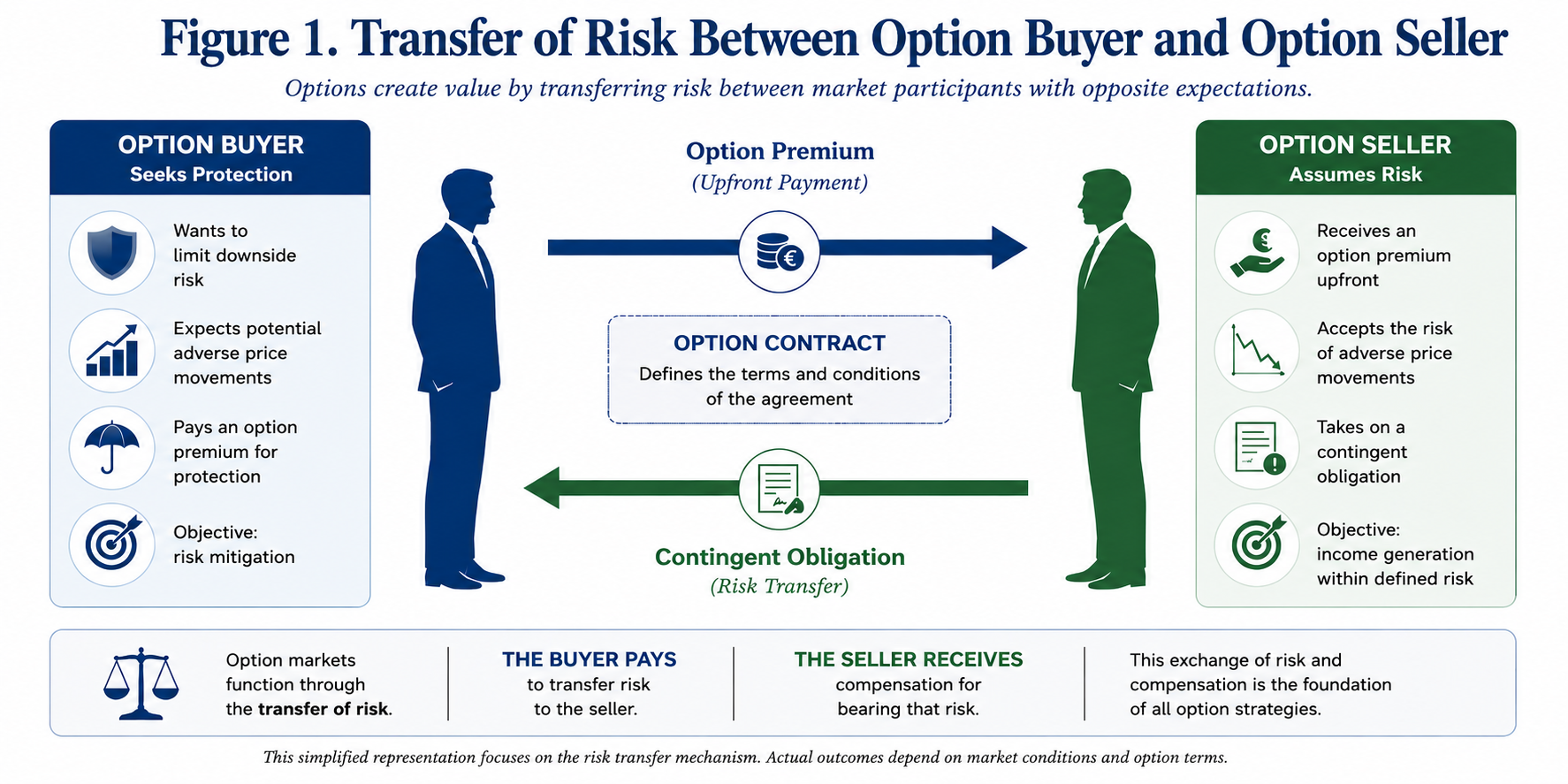
Figure 1. Transfer of Risk Between Option Buyer and Option Seller

Figure 1. Options transfer market risk between two counterparties with fundamentally different expectations. Whilst the buyer acquires protection against adverse price movements, the seller receives an option premium in exchange for assuming the corresponding contingent obligation. This transfer of risk constitutes the economic foundation upon which option markets operate and explains the central role played by option premiums in systematic short-put strategies.

The following sections revisit the theoretical foundations of implied volatility before examining why market observations systematically depart from the assumptions of constant volatility. Attention is subsequently devoted to the informational content embedded within volatility skews and smiles, leading to the introduction of a practical analytical framework intended to investigate whether changes in the implied volatility surface may contribute to the identification of favourable environments for systematic cash-secured put-selling.

The Black-Scholes-Merton Framework: An Elegant Model Built upon Simplifying Assumptions

Since its publication in 1973, the Black-Scholes-Merton model has become one of the most influential achievements in financial economics. Beyond providing a closed-form solution for the valuation of European options, it established a rigorous mathematical framework linking derivative prices to the stochastic behaviour of the underlying asset. More than half a century later, despite the emergence of increasingly sophisticated numerical models, Black-Scholes remains the common language of option markets.

Its enduring success stems from the remarkable intuition underlying the model. Rather than attempting to forecast future prices directly, Black-Scholes demonstrates that an option may be replicated through a continuously adjusted portfolio combining the underlying asset and a risk-free investment. Under a specific set of assumptions, this replication argument leads to a unique theoretical option value independent of investors’ individual expectations.

These assumptions are well known. Asset prices are assumed to follow a geometric Brownian motion with constant volatility. Markets are perfectly liquid and frictionless, allowing continuous trading without transaction costs or taxes. Interest rates remain constant throughout the life of the contract, whilst European options can only be exercised at maturity. Finally, market participants are assumed to behave rationally and possess homogeneous expectations.

From a practical perspective, few of these assumptions are fully satisfied in real financial markets. Transaction costs exist, volatility varies continuously, liquidity fluctuates and investors frequently react in heterogeneous ways to new information. Nevertheless, the model remains extraordinarily useful because it provides a coherent reference framework from which market observations may subsequently be interpreted.

One of its most significant contributions lies in the concept of implied volatility. Rather than treating volatility as an observable market variable, the Black-Scholes equation can be solved inversely. By inserting the observed option premium together with the remaining market parameters, it becomes possible to determine the level of volatility required for the theoretical model to reproduce the market price exactly. This inferred quantity is known as implied volatility.

Implied volatility therefore represents considerably more than a simple mathematical parameter. It embodies the level of uncertainty collectively embedded within option prices by market participants. Every quoted option premium implicitly reflects the market’s assessment of future price variability, making implied volatility one of the most informative indicators available to option traders.

Yet an important observation immediately follows. If the assumptions of the Black-Scholes model were perfectly satisfied, every option sharing the same maturity would exhibit the same implied volatility, irrespective of its strike price. Reality tells a rather different story.
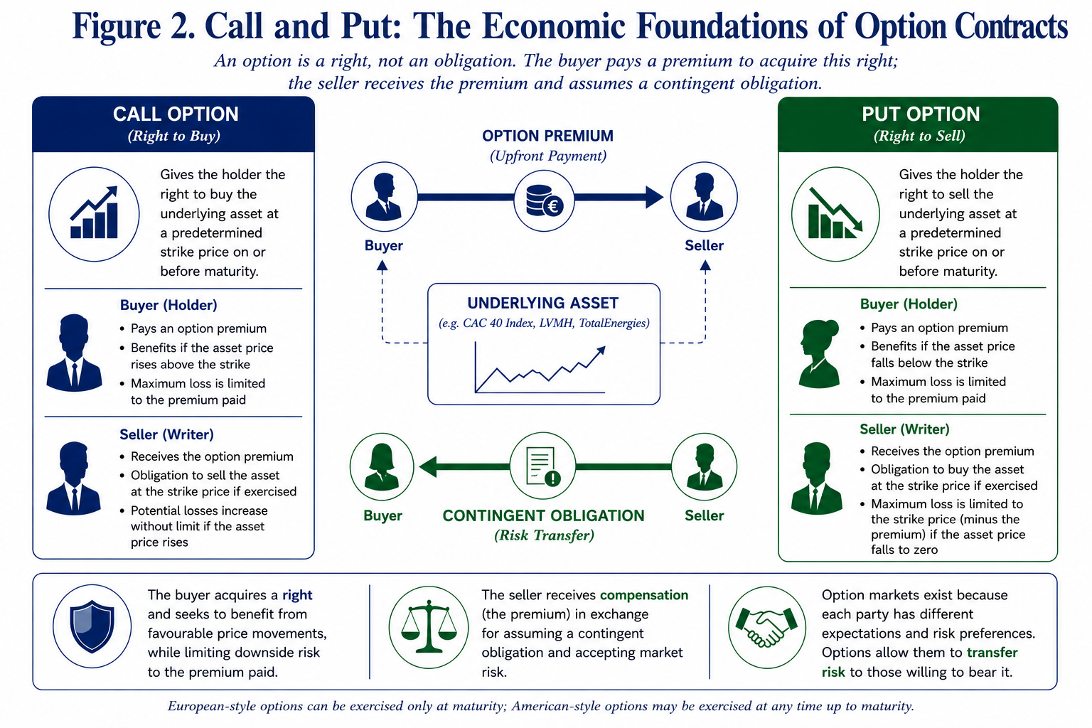
Figure 2. Call and Put: The Economic Foundations of Option Contracts

Figure 2. A call option grants its holder the right, but not the obligation, to purchase the underlying asset at a predetermined strike price. Conversely, a put option grants the right to sell the underlying asset under identical contractual conditions. In both cases, the buyer acquires a right by paying an option premium, whilst the seller receives that premium in exchange for assuming the corresponding contingent obligation.

Implied volatility: From a Single Parameter to a Market Indicator

The original formulation of Black-Scholes implicitly assumes that volatility constitutes a characteristic of the underlying asset itself. If this were strictly true, every option written on the same asset and sharing an identical maturity would produce the same implied volatility once observed market prices are introduced into the valuation equation.

Empirical evidence has demonstrated otherwise. When implied volatilities are computed across a range of strike prices, they rarely remain constant. Instead, they exhibit systematic patterns whose shape varies according to both the underlying asset and prevailing market conditions. These observations, initially regarded as anomalies, have gradually become recognised as fundamental characteristics of option markets. The discrepancy is not accidental. It reflects the collective behaviour of investors rather than any mathematical imperfection within the pricing equation itself.

Institutional investors, pension funds and asset managers frequently purchase out-of-the-money put options to protect equity portfolios against severe market declines. This persistent demand for downside insurance increases put premiums relative to those predicted under constant volatility assumptions. Consequently, implied volatilities extracted from these option prices become progressively higher as strike prices decrease.

The resulting asymmetry gives rise to what practitioners commonly describe as the volatility skew. Rather than representing a flaw in Black-Scholes, the skew reveals how financial markets collectively price extreme downside events. It therefore provides direct insight into investors’ perception of risk, their appetite for protection and the relative scarcity of option sellers willing to assume such exposure.

Viewed from this perspective, implied volatility ceases to be merely an intermediate calculation. It becomes a market variable, capable of conveying valuable information regarding the balance between fear and confidence prevailing amongst market participants.

From the Volatility smile to the Volatility skew

When implied volatilities are calculated across a range of strike prices for a given maturity, the resulting profile rarely corresponds to the horizontal line predicted by the Black-Scholes-Merton model. Instead, distinct empirical patterns emerge according to both the underlying asset and prevailing market conditions.

The earliest observations concerned currency and commodity options, where implied volatility frequently followed a symmetrical U-shaped profile. Deep in-the-money and deep out-of-the-money options exhibited higher implied volatilities than contracts whose strike prices were close to the prevailing market price. This phenomenon rapidly became known as the volatility smile, reflecting the characteristic curvature obtained when implied volatilities were plotted against strike prices.

The market crash of October 1987 marked a decisive turning point in option pricing. Following the unprecedented decline in global equity markets, practitioners observed that the Black-Scholes-Merton assumption of constant volatility no longer matched market prices. Implied volatilities began to differ substantially across strike prices, particularly for downside put options, reflecting investors’ increased demand for protection against extreme losses. Rather than attempting to force market prices into a single volatility parameter, traders progressively adopted the implied volatility surface itself as the practical input for option valuation. Since then, the smile and, even more prominently, the volatility skew have become standard features of option markets and indispensable tools for pricing, hedging and risk management.

Although initially regarded as an anomaly, the volatility smile gradually became recognised as a natural consequence of market behaviour rather than a failure of financial theory. Financial returns do not follow the perfectly lognormal distribution assumed by the Black-Scholes-Merton framework. Instead, empirical distributions exhibit heavier tails, occasional jumps and varying degrees of asymmetry, all of which contribute to systematic differences in implied volatility across strike prices.

Equity index options, however, generally display a markedly different pattern. Rather than producing a symmetrical smile, implied volatility typically increases as strike prices decrease. Conversely, call options with higher strike prices tend to exhibit progressively lower implied volatilities. The resulting profile no longer resembles a smile but rather a downward-sloping curve commonly referred to as the volatility skew.

This asymmetry is far from accidental. It reflects the structural demand for downside protection that characterises modern equity markets. Pension funds, insurance companies, institutional asset managers and other long-term investors regularly purchase out-of-the-money put options to protect diversified equity portfolios against severe market downturns. Such contracts effectively operate as insurance policies against extreme market events.

As demand for these protective puts increases, their market prices rise beyond the levels predicted by constant-volatility models. Once these prices are translated back into implied volatilities through the Black-Scholes equation, lower strike prices systematically exhibit higher implied volatility. The volatility skew therefore represents considerably more than a graphical curiosity. It provides a direct visual representation of how financial markets collectively price downside risk.

Rather than indicating that the Black-Scholes model has failed, the skew demonstrates that investors attribute different probabilities to upward and downward market movements. In practice, the cost of insuring against a sharp decline is significantly greater than the cost of participating in an equally pronounced upward movement. For option sellers, this distinction is of particular importance.

The additional premium associated with out-of-the-money put options constitutes the primary source of return for many systematic short-put strategies. Yet this additional premium simultaneously reflects the market’s perception of elevated downside risk. The option seller is therefore continuously confronted with a fundamental trade-off: richer premiums are generally accompanied by greater uncertainty.

Understanding this relationship represents the first step towards interpreting implied volatility not merely as a pricing parameter, but as a genuine source of market information.
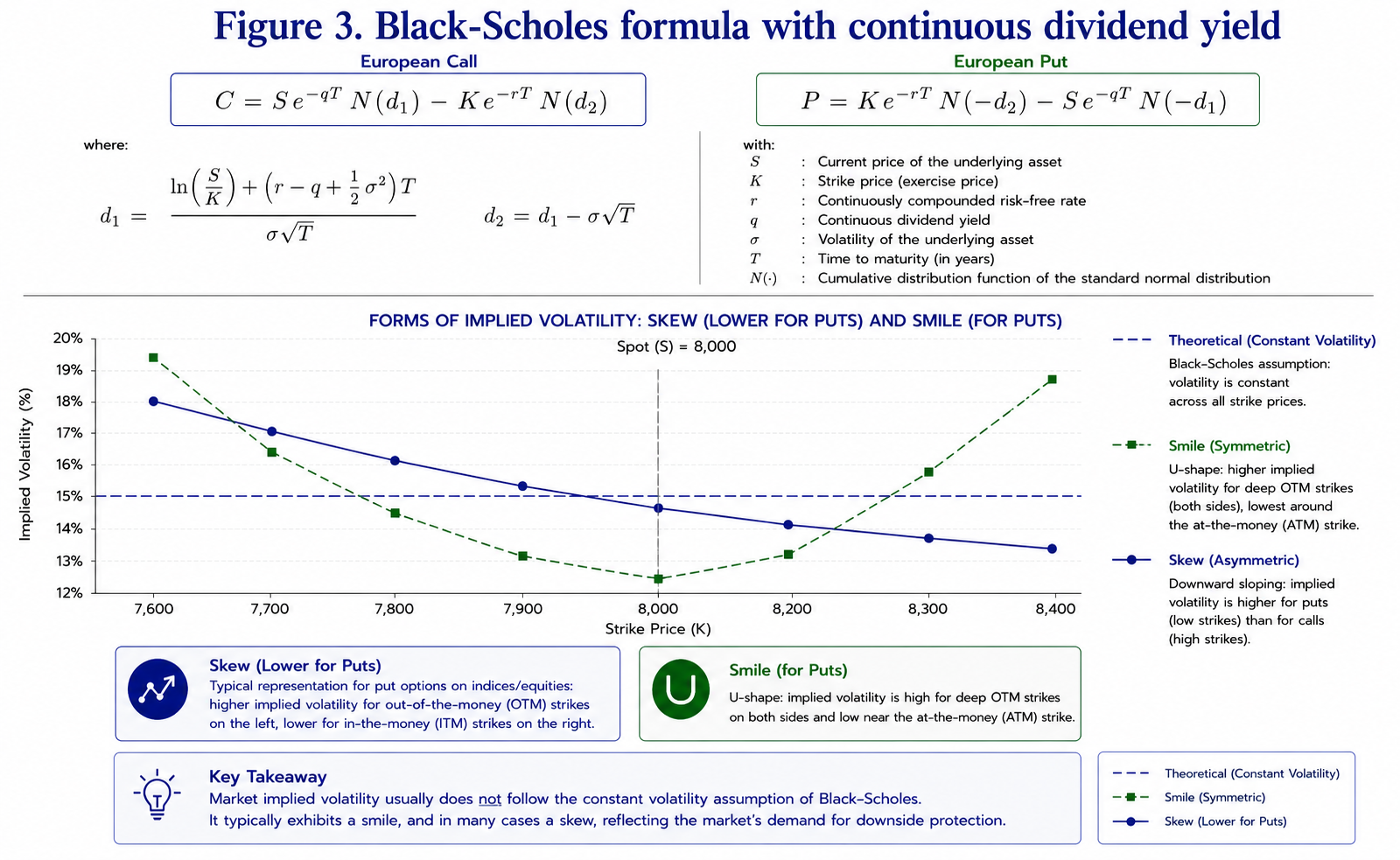
Figure 3. Black-Scholes-Merton Model with Continuous Dividend Yield

Figure 3. Under the Black-Scholes assumption of constant volatility, implied volatility should remain identical across strike prices. Empirical observations reveal two distinct market structures: the volatility smile, historically observed in several currency option markets, and the downward volatility skew that characterises most equity index options.

The Volatility skew as a Measure of Collective Risk Perception

Traditional option pricing theory treats implied volatility as a parameter required to value derivative contracts. Market practitioners increasingly adopt a rather different perspective. For many traders, implied volatility has progressively become an observable market variable.

Its level reflects the price investors collectively assign to uncertainty, whilst its distribution across strike prices reveals how that uncertainty is allocated between favourable and unfavourable market scenarios. This distinction is fundamental.

If all future price movements were regarded as equally probable, the volatility surface would remain broadly symmetrical. The persistent existence of a downward skew instead demonstrates that investors consistently attribute a greater economic significance to adverse market movements than to equivalent upward fluctuations. In this respect, the volatility skew may be interpreted as a continuously updated measure of collective risk aversion.

Unlike conventional market indicators, which frequently rely upon historical observations, implied volatility incorporates forward-looking expectations embedded directly within option prices. Every transaction reflects the judgement of buyers and sellers regarding future uncertainty. The resulting volatility surface therefore aggregates thousands of independent market assessments into a single observable structure. From the perspective of a systematic put seller, the implications are immediate.

Periods during which the skew becomes exceptionally steep frequently coincide with heightened demand for downside protection. Conversely, a gradual flattening of the skew may indicate that the market is beginning to reassess the likelihood of extreme adverse scenarios.

The central hypothesis explored throughout the remainder of this article is based precisely upon this observation. Rather than considering implied volatility in isolation, greater attention may usefully be devoted to the evolution of the entire volatility surface.

Looking Beyond Implied volatility: Can the Volatility surface Become a Decision-Support Tool?

For most option practitioners, implied volatility is primarily regarded as a pricing variable. Whether calculated directly from market quotations or displayed by professional trading platforms, it is generally interpreted as a measure of the market’s expectation of future uncertainty. Consequently, trading decisions often rely upon a relatively simple observation: higher implied volatility produces higher option premiums.

For investors writing cash-secured puts, this relationship is naturally attractive. Selling options during periods of elevated implied volatility allows the collection of larger premiums whilst maintaining identical contractual obligations. Yet this apparent advantage immediately raises a practical difficulty.

Periods characterised by elevated implied volatility rarely occur in isolation. They are frequently associated with deteriorating market sentiment, increasing downside risk and heightened investor demand for protection. In such circumstances, high option premiums merely compensate sellers for assuming substantially greater uncertainty. The absolute level of implied volatility therefore provides only a partial description of market conditions. A more informative question may instead concern the behaviour of implied volatility itself.

Is the volatility surface continuing to steepen? Has it reached a plateau? Or has it begun to return progressively towards more stable market conditions?

These questions introduce an important distinction between two different approaches to option selling. The first consists simply of identifying expensive options based on their implied volatility. The second seeks to determine whether market conditions themselves have begun to evolve in favour of the option seller. The distinction is subtle but potentially significant.

A market characterised by high implied volatility, and an increasingly steep volatility skew reflects persistent demand for downside protection. Under such circumstances, option premiums may continue to increase despite already appearing historically elevated.

Conversely, if implied volatility remains relatively high whilst the overall structure of the volatility surface begins to normalise, market expectations may be undergoing a gradual transition. Although uncertainty remains elevated, the balance between buyers and sellers of protection may already be changing.

From the perspective of a systematic option seller, such an environment appears fundamentally different. The option premium remains attractive, yet the dynamics of market expectations may already be evolving towards greater stability. This observation forms the central hypothesis explored in the present work.

Rather than evaluating implied volatility solely through its absolute level, the proposed approach investigates whether the progressive normalisation of the implied volatility surface may itself constitute useful information capable of assisting the timing of cash-secured short put strategies.

Importantly, this hypothesis should not be interpreted as an attempt to forecast future market prices. No volatility model can predict future market movements with certainty. Instead, the objective is considerably more modest.

The purpose is to investigate whether the collective information continuously embedded within option prices can be organised into a coherent analytical framework capable of improving the selection of favourable option-selling environments.
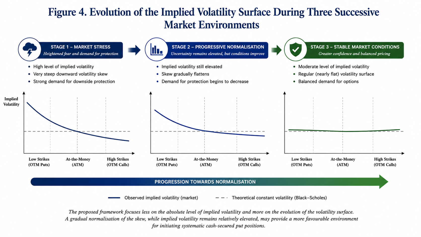
Three Market Environments for Systematic Put Selling

Figure 4. The proposed framework focuses less on the absolute level of implied volatility than on the evolution of the volatility surface itself. A gradual normalisation of the skew whilst option premiums remain comparatively elevated may provide a more favourable environment for initiating systematic cash-secured put positions.

Towards a Decision-Support Framework Based on Volatility surface Dynamics

The preceding discussion naturally raises a practical question: if the geometry of the implied volatility surface reflects the collective assessment of market risk, can its evolution also provide useful information regarding the timing of option-selling strategies?

This question forms the starting point of the present investigation. Rather than considering implied volatility as a static variable observed at a single point in time, the proposed framework examines the volatility surface as a dynamic structure whose characteristics evolve continuously in response to changing market expectations. The distinction is important.

Most market participants focus primarily on the absolute level of implied volatility. Elevated implied volatility is generally interpreted as an opportunity to collect richer option premiums, whilst low implied volatility often discourages option-selling strategies. Such reasoning, however, overlooks an essential aspect of market behaviour.

Two market environments may exhibit comparable average implied volatilities whilst reflecting fundamentally different underlying conditions.

In the first case, implied volatility may still be increasing, accompanied by a progressively steeper volatility skew and a persistent demand for downside protection. In the second, implied volatility may remain elevated, but the volatility surface itself may already be beginning to stabilise, suggesting that market participants are gradually reassessing the probability of extreme downside events.

From the perspective of a systematic put seller, these two situations should not necessarily be regarded as equivalent. Although option premiums may appear imilarly attractive, the evolution of collective market expectations differs substantially.

The working hypothesis explored throughout this study is therefore deliberately modest. Rather than attempting to predict future market prices, the objective is to determine whether the progressive normalisation of the implied volatility surface may provide additional information capable of assisting the selection of favourable market environments for initiating cash-secured short put positions.

In this respect, the volatility surface is not viewed as a forecasting instrument. Instead, it is interpreted as a continuously updated representation of market sentiment whose evolution may contribute to a more disciplined investment process.
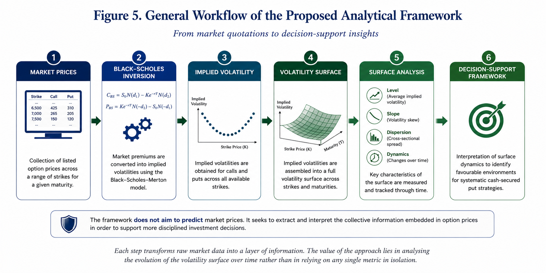
Decision-Support Framework

Figure 5. General workflow of the proposed analytical framework. Market option prices are first converted into implied volatilities using the Black-Scholes-Merton model. The resulting volatility surface is subsequently analysed through a series of descriptive indicators before being interpreted within a decision-support framework for systematic cash-secured put strategies.

Methodological Approach

The methodology developed in this work follows a sequence of analytical steps intended to transform raw market quotations into interpretable market indicators.

The process begins with the systematic collection of listed option prices for a given underlying asset and maturity. Preference is given to highly liquid option contracts to minimise distortions resulting from wide bid-ask spreads or infrequent trading activity.

Observed market premiums are then converted into implied volatilities through the inverse application of the Black-Scholes-Merton pricing equation. Once computed across the available strike prices, these implied volatilities collectively define the observed volatility surface for the selected maturity.

Rather than analysing each implied volatility independently, several global characteristics of the surface are examined simultaneously.

Attention is devoted to:

  • the overall level of implied volatility;
  • the slope of the volatility skew;
  • the degree of cross-sectional dispersion across strike prices;
  • the temporal evolution of these characteristics between successive market observations.

The purpose of this multidimensional approach is to characterise market conditions more comprehensively than would be possible through the observation of implied volatility alone. Naturally, not all option markets exhibit comparable behaviour.

The preliminary investigations presented in this article suggest that market liquidity and option maturity play a decisive role in determining the regularity of the resulting volatility surface. Highly liquid equity index options with medium- to long-term maturities appear particularly well suited to this type of analysis, whereas shorter maturities or less actively traded underlying assets may generate substantially noisier implied volatility structures.

These observations should not be interpreted as definitive conclusions. Rather, they provide an empirical motivation for the exploratory analyses presented in the following section.
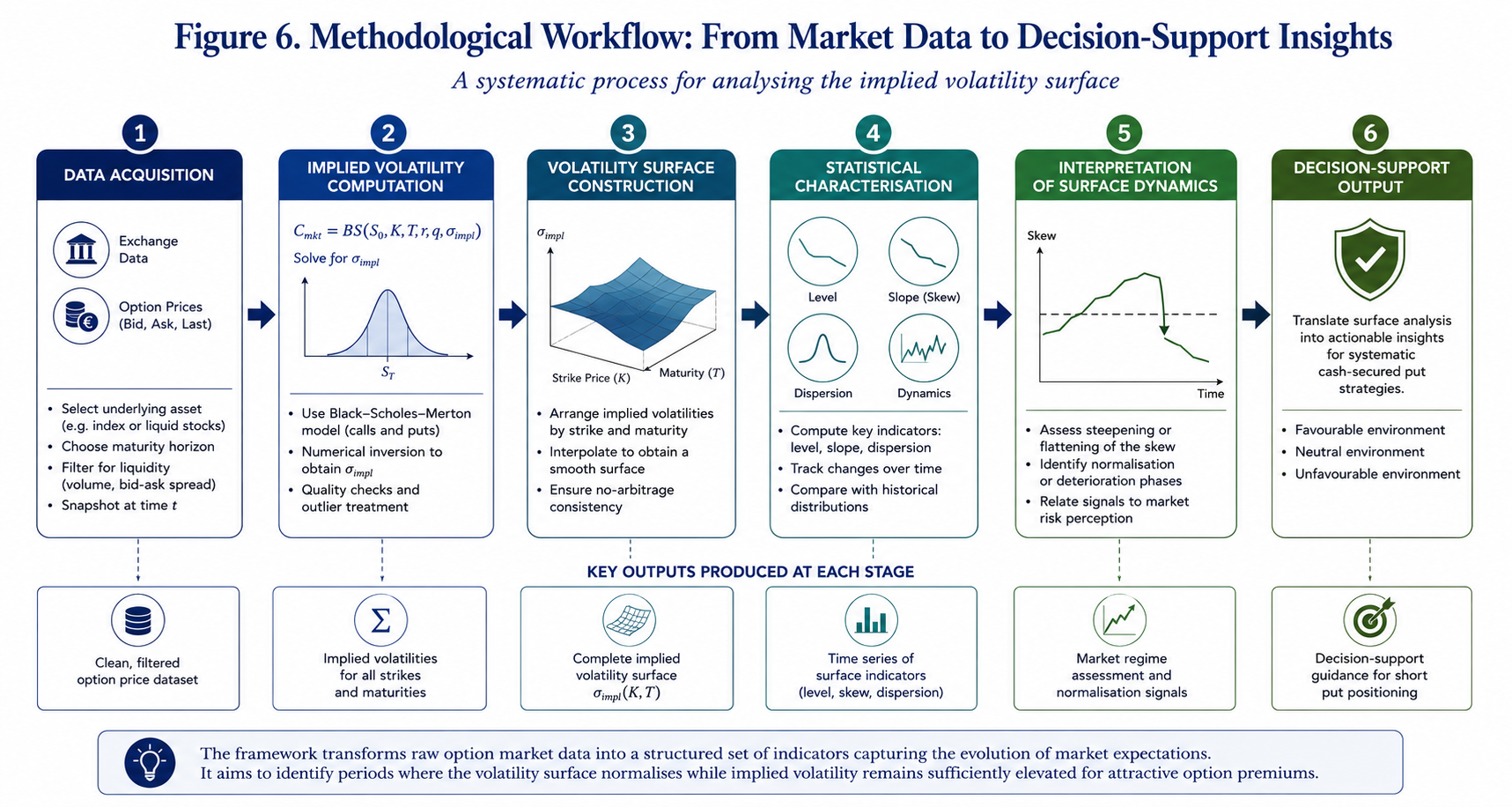
Methodological Approach

Figure 6. Illustrative workflow describing the successive stages of the proposed methodology: market data acquisition, implied volatility computation, volatility surface construction, statistical charac-terisation and decision-support interpretation.

Preliminary Empirical Observations

The analytical framework presented above was subsequently applied to listed option data to examine whether the proposed interpretation of the implied volatility surface could be observed under actual market conditions.

At this stage, the objective was not to perform an exhaustive statistical validation of the methodology. Rather, the purpose was to investigate whether the dynamics of the implied volatility surface exhibited sufficiently regular behaviour to justify further quantitative analysis.

Several option chains were therefore examined, covering different underlying assets and maturities.

Attention was devoted to the CAC 40 index, whose option market offers a high level of liquidity across a broad range of strike prices. Additional observations were conducted on selected individual equities to assess the robustness of the approach under different market conditions.

The first observation concerns the influence of option maturity.

Short-dated options, particularly those approaching expiration, frequently generated irregular implied volatility profiles. Individual quotations occasionally produced local distortions, whilst relatively small pricing discrepancies resulted in disproportionately large variations in calculated implied volatility. Such behaviour appears consistent with the increasing influence of time decay and the reduced amount of remaining time value as maturity approaches.

Consequently, short maturities should be interpreted with caution when constructing continuous volatility surfaces. A markedly different picture emerged for longer maturities.

Options with approximately six months to one year remaining until expiration generally produced substantially smoother implied volatility structures. The resulting volatility skews exhibited the regular downward slope commonly described in the empirical literature, with only limited local distortions across neighbouring strike prices.

These observations proved particularly apparent for the CAC 40 index.

The high liquidity of the option market appeared to facilitate a more stable estimation of implied volatility, thereby providing a significantly more coherent representation of the underlying volatility surface. An equally important observation concerns the distinction between index options and individual equity options.

Whilst the CAC 40 generated relatively stable and interpretable volatility structures, several individual equities produced substantially noisier results. In certain cases, isolated market quotations generated implausibly high or even negative implied volatility estimates, suggesting either temporary pricing inconsistencies or insufficient market liquidity.

Such observations reinforce an important practical consideration.

The proposed methodology appears particularly well suited to highly liquid option markets where quoted premiums reflect continuous interaction between buyers and sellers. Conversely, less liquid markets may introduce local pricing distortions capable of obscuring the global characteristics of the volatility surface.

These preliminary observations do not constitute definitive statistical conclusions.

Nevertheless, they suggest that both liquidity and maturity represent essential prerequisites when analysing implied volatility surfaces for decision-support purposes.
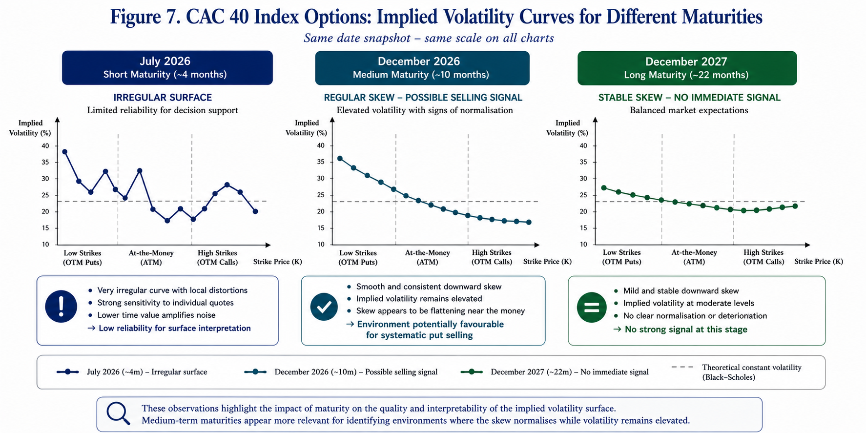
Implied Volatility Curves

Figure 7. Comparison of implied volatility curves obtained for different maturities. Short-dated maturities frequently exhibit irregular local behaviour owing to limited time value and increased pricing sensitivity. Longer maturities generally produce smoother volatility skews, thereby facilitating the interpretation of surface dynamics.

A further observation emerged during the analysis: although several volatility surfaces displayed the expected downward skew, not all of them generated identical decision-support signals.

Certain maturities exhibited a progressive flattening of the skew whilst implied volatility remained at comparatively elevated levels. Others retained a persistent steep slope despite similar average volatility levels. This distinction proved particularly informative. If confirmed through broader empirical investigation, it suggests that the overall geometry of the volatility surface may contain additional information beyond the absolute level of implied volatility alone. From the perspective of systematic option selling, this observation may prove significant.

A market characterised by elevated implied volatility, and a progressively normalising volatility surface appears fundamentally different from one in which both implied volatility and downside protection demand continue to increase simultaneously.

The former may correspond to a market gradually returning towards equilibrium. The latter may still reflect an environment dominated by uncertainty.

Consequently, analysing the dynamics of the volatility surface rather than its static characteristics alone may provide a richer description of prevailing market conditions.

The following section illustrates how these observations may be translated into a practical decision-support framework for systematic cash-secured put strategies.

Discussion

The preliminary observations presented above suggest that the practical usefulness of the implied volatility surface depends upon two essential conditions: the quality of market data and the maturity of the option contracts under consideration.

The first point appears relatively intuitive.

Implied volatility is not directly observable. It is inferred from quoted option prices through the inverse application of the Black-Scholes-Merton model. Consequently, any inconsistency in market quotations is immediately reflected in the calculated implied volatilities.

This phenomenon proved particularly evident during the exploratory analyses conducted on individual equities.

Whilst certain option chains generated coherent volatility structures, others produced isolated implied volatility values that were incompatible with neighbouring strike prices. In a limited number of cases, implausible or unstable implied volatility estimates were obtained despite apparently valid market quotations. Such behaviour most likely reflects temporary liquidity deficiencies, unusually wide bid-ask spreads or isolated transactions executed outside normal market conditions.

These observations underline an important methodological requirement.

The proposed framework should preferably be applied to option markets characterised by sufficient liquidity and a broad distribution of actively traded strike prices. Under such conditions, quoted premiums are more likely to represent the consensus valuation of market participants rather than isolated transactions.

The second observation concerns option maturity.

Short-dated contracts frequently produced irregular volatility profiles whose local fluctuations appeared dominated by pricing noise rather than genuine changes in market expectations. As expiration approaches, the remaining time value becomes progressively smaller, and option prices exhibit increasing sensitivity to relatively minor changes in the underlying asset. Consequently, the resulting implied volatility estimates become substantially less stable.

Conversely, medium- and long-dated maturities generally generated considerably smoother volatility structures.

The downward skew remained clearly identifiable whilst local distortions became significantly less pronounced. This regularity considerably facilitated the interpretation of the surface and its evolution over successive market observations.

Among the datasets examined, listed CAC 40 index options consistently provided the most coherent results. Their combination of high liquidity, narrow bid-ask spreads and broad strike availability produced volatility surfaces whose overall geometry remained remarkably stable. This characteristic makes such instruments particularly well suited to exploratory research concerning the dynamics of implied volatility.

An additional observation deserves particular attention: not every regular volatility surface generated the same analytical conclusion.

Certain maturities displayed a progressive flattening of the volatility skew whilst implied volatility remained comparatively elevated. Others retained a persistent and pronounced downward slope despite exhibiting similar average volatility levels. This distinction appears especially interesting.

If future empirical analyses confirm these preliminary observations, the evolution of the volatility surface may provide information that cannot be obtained from the absolute level of implied volatility alone. Such a conclusion would carry practical implications for systematic option-selling strategies.

Rather than selecting opportunities exclusively according to premium levels or historical volatility, investors may benefit from incorporating the dynamics of the implied volatility surface into their broader decision-making process. Naturally, these findings should be interpreted with appropriate caution.

The present work remains exploratory in nature and does not claim to establish a predictive model. Instead, it proposes an analytical framework intended to organise market information already embedded within option prices into a more coherent decision-support process.

Further empirical investigation involving longer observation periods, multiple market regimes and additional underlying assets will naturally be required before more general conclusions may be drawn.

Evolution of the Implied Volatility Surface

Figure 8. Evolution of the implied volatility surface across successive market observations. The figure illustrates the conceptual distinction between a market in which the volatility skew continues to steepen and one in which the surface progressively normalises whilst implied volatility remains comparatively elevated.

Practical Implications for Systematic Put Sellers

From a practical perspective, the observations discussed throughout this article suggest that implied volatility should perhaps be interpreted less as an isolated numerical indicator and more as one component of a broader analytical framework.

Option sellers have traditionally focused on premium maximisation. Although this objective remains entirely legitimate, premium alone provides only a partial description of prevailing market conditions.

The same premium may arise under markedly different market environments. One may correspond to an increasingly stressed market characterised by rapidly rising demand for downside protection. Another may reflect a market in which uncertainty remains elevated but has already begun to stabilise.

Distinguishing between these situations may prove particularly valuable when implementing systematic cash-secured put strategies. Rather than attempting to forecast market direction, the proposed framework encourages a more disciplined interpretation of the information continuously embedded within option prices.

In this respect, the implied volatility surface becomes considerably more than a graphical representation of option quotations. It evolves into a dynamic indicator describing the collective perception of risk within financial markets.

Conclusion

The Black-Scholes-Merton model remains the fundamental reference upon which modern option pricing is built. Although one of its central assumptions — constant volatility — is systematically contradicted by market observations, these apparent discrepancies have progressively become one of the richest sources of information available to option practitioners.

The implied volatility surface should therefore not merely be regarded as a technical consequence of option pricing theory. It reflects the collective judgement of market participants regarding future uncertainty, the asymmetrical pricing of downside risk and the continuously evolving balance between buyers and sellers of financial protection. The purpose of the present study has been to explore whether this information may be exploited beyond its traditional pricing function.

Rather than concentrating exclusively on the absolute level of implied volatility, this article has proposed a broader analytical perspective based upon the dynamics of the entire volatility surface. Attention has been devoted to the progressive evolution of the volatility skew, whose gradual normalisation may provide additional insight into changing market conditions.

The preliminary empirical observations presented throughout this paper suggest practical conclusions.

First, market liquidity appears to constitute a fundamental prerequisite for obtaining sufficiently stable implied volatility surfaces. Highly liquid option markets, such as listed CAC 40 index options, produce considerably more coherent structures than many individual equity options, whose implied volatilities may occasionally be distorted by isolated transactions or limited trading activity.

Secondly, option maturity also plays a decisive role. Medium- and long-dated contracts generally generate smoother volatility surfaces that appear more suitable for structural analysis than very short-dated maturities, where the increasing influence of time decay frequently introduces substantial local irregularities.

Finally, and perhaps most importantly, the observations suggest that two markets exhibiting comparable average implied volatility levels may nevertheless convey markedly different information through the geometry of their respective volatility surfaces. This distinction may prove particularly relevant for systematic cash-secured put strategies.

Whilst elevated implied volatility undoubtedly increases option premiums, the progressive normalisation of the volatility surface may provide complementary information regarding the evolution of collective market expectations. The proposed framework should therefore not be interpreted as a predictive model. Financial markets remain inherently uncertain, and no analytical methodology can eliminate investment risk.

Instead, the approach presented here seeks to organise information already embedded within option prices into a structured decision-support framework capable of complementing more traditional valuation techniques. Viewed from this perspective, the implied volatility surface ceases to be merely a graphical representation of option prices. It becomes a dynamic description of market behaviour.

Understanding how this structure evolves through time may ultimately prove as informative as measuring its absolute level at any single observation date.

Limitations and Future Research

The present study should be regarded as an exploratory investigation rather than a definitive empirical validation. Several limitations naturally remain.

The observations reported here are based upon a limited number of underlying assets and observation dates. Broader empirical investigations covering multiple market regimes, longer historical periods and additional asset classes will be required before more general conclusions may be established. Future research could also investigate whether quantitative indicators describing the geometry of the implied volatility surface — such as skew slope, local curvature or cross-sectional dispersion — may be systematically incorporated into algorithmic decision-support models for option-selling strategies.

Another promising avenue concerns the comparative behaviour of implied volatility surfaces across different asset classes, including equity indices, individual equities, exchange-traded funds and commodity options.

Finally, machine learning techniques may eventually provide complementary tools capable of identifying recurring patterns within the evolution of volatility surfaces. Such approaches, however, should be viewed as extensions of the present analytical framework rather than substitutes for the economic interpretation of market behaviour. Ultimately, the principal contribution of this work lies less in proposing a new pricing model than in suggesting an alternative way of interpreting information already contained within option markets. If the geometry of the implied volatility surface indeed reflects the collective perception of financial risk, then monitoring its evolution may offer valuable additional insight into the timing of systematic option-selling strategies.

Download the Summary Infographic

Readers wishing to retain a concise visual summary of the concepts presented throughout this article may download the accompanying high-resolution infographic below.

Download the Summary Infographic (High-Resolution PDF)

Related posts on the SimTrade blog

   ▶ Jayati WALIA Brownian Motion in Finance

   ▶ Jayati WALIA Black-Scholes-Merton option pricing model

   ▶ Saral BINDAL Implied Volatility and Option Prices

   ▶ Saral BINDAL Volatility curves: smiles and smirks

   ▶ Saral BINDAL Implied Volatility Surface: Smiles, Smirks and Term Structure

Useful resources

Black, F., & Scholes, M. (1973). The Pricing of Options and Corporate Liabilities. Journal of Political Economy, 81(3), 637-654.

Gatheral, J. (2006). The Volatility Surface: A Practitioner’s Guide. John Wiley & Sons.

Hull, J. C. (2024). Options, Futures and Other Derivatives (11th ed.). Pearson.

Merton, R. C. (1973). Theory of Rational Option Pricing. The Bell Journal of Economics and Management Science, 4(1), 141-183.

Natenberg, S. (2015). Option Volatility and Pricing (2nd ed.). McGraw-Hill Education.

Rebonato, R. (2004). Volatility and Correlation: The Perfect Hedger and the Fox. John Wiley & Sons.

Taleb, N. N. (1997). Dynamic Hedging: Managing Vanilla and Exotic Options. John Wiley & Sons.

About the Author

Tis article was written in July 2026 by Frédéric VALOGNES , who is a lecturer in corporate finance, financial analysis, financial markets and derivatives, with more than twenty-five years of professional experience spanning financial management, higher education, research administration and executive training. He is a Certified European Financial Analyst (CEFA®), a professional designation awarded by the European Federation of Financial Analysts Societies (EFFAS), Frankfurt.

Author’s Note

This article is intended solely for educational and research purposes. It presents the author’s personal reflections on implied volatility, option pricing and systematic option-selling strategies. It should not be construed as investment advice or as a recommendation regarding any financial instrument or trading strategy.

The ideas developed in this article are the result of many years of teaching, professional practice and ongoing research in corporate finance, financial analysis, financial markets and derivatives. They have also been enriched by numerous discussions with academics, finance professionals and market practitioners, whose expertise, critical insights and constructive exchanges have played an important role in shaping the analytical framework presented here.

The author wishes to express his sincere gratitude to all those who have contributed, directly or indirectly, to the development of these ideas. Their encouragement, intellectual generosity and commitment to rigorous financial analysis have been a constant source of inspiration.


Implied Volatility Surface: Smiles, Smirks and Term Structure

Saral BINDAL

In this article, Saral BINDAL (Indian Institute of Technology Kharagpur, Metallurgical and Materials Engineering, 2024-2028 & Research assistant at ESSEC Business School) explains the implied volatility surface: its characteristic shapes, static arbitrage constraints, and application using S&P 500 index options data.

Introduction

In financial markets characterized by uncertainty, volatility is a crucial factor in the valuation of derivative securities. For options traders, an option price is essentially volatility. Although options are traded at monetary prices, professionals routinely quote and compare them in terms of implied volatility (%), making volatility the common language of options markets. Moreover, in a reverse way, implied volatility occupies a central role as a forward-looking indicator that reflects the market’s expectations of future price fluctuations embedded in option prices.

Under the Black-Scholes-Merton (BSM) model, volatility is assumed to be constant and independent of option characteristics like the strike price (K) and the time to maturity (T). Empirical evidence, however, reveals that implied volatility varies across option contracts and especially depends on both parameters K and T of the option.

Implied volatility curves: the strike dimension

Volatility curves represent a cross-sectional view of the implied volatility surface (IVS), depicting the relationship between implied volatility and strike price for a fixed maturity. They are constructed by plotting implied volatility as a function of strike while holding time-to-maturity constant.

The volatility curves are commonly observed in two distinct shapes, most notably the volatility smile and the volatility smirk. A detailed discussion of the empirical relationship between implied volatility and option moneyness, the associated stylized facts, and their economic interpretation can be found in the article Volatility curves: smiles and smirks.

Figure 1 below illustrates the implied volatility smile (1a) and smirk (1b).

Figure 1a and 1b. Implied Volatility Smile and Smirk
 Implied Volatility Curves (smile and smirk)
Source: computation by the author (with python).

Term structure of implied volatility: the maturity dimension

While volatility curves describe the strike dependence of implied volatility, the maturity dimension captures how implied volatility varies across expiration dates for a given strike. This relationship is commonly referred to as the term structure of implied volatility.

Using daily implied volatility data for S&P 100 index options (December 1983 to September 1987), Stein (1989) documented that volatility shocks are transmitted across maturities more strongly than predicted by standard rational expectations theory. Under this standard theoretical framework, because implied volatility is strongly mean-reverting, a near-term shock should naturally decay over time, causing long-dated implied volatilities to change by only a fractional amount. However, following an increase in short-dated implied volatility, long-dated implied volatilities tend to rise by a disproportionately large amount, indicating that changes in near-term uncertainty heavily influence market expectations over a broad range of maturities.

Using data for options on the S&P 500, FTSE 100, DAX 30, CAC 40, and Nikkei 225 stock indexes spanning the period May 9, 1994 to October 12, 2001, Mixon (2007) suggested mean reversion as a key characteristic of the implied volatility term structure. While short-dated implied volatilities exhibit substantial sensitivity to changes in market conditions, long-dated implied volatilities remain comparatively stable, reflecting expectations of convergence toward a long-run volatility level. Consequently, the term structure is generally upward sloping (contango) during periods of low market uncertainty but may become inverted (backwardation) during episodes of market stress, when short-term volatility rises sharply.

Figure 2 illustrates an upward-sloping (2a) and a downward-sloping (2b) implied volatility term structure.

Figure 2a and 2b. Implied Volatility Term Structure
Implied Volatility Term Structure
Source: computation by the author (with python).

Christoffersen, Heston, and Jacobs (2009) demonstrate that the volatility term structure is not necessarily monotonic, arguing that capturing its true dynamics requires multifactor stochastic volatility frameworks. Evaluating European S&P 500 call options from 1990 through 2004, their empirical evidence reveals that implied volatility frequently displays significant curvature across maturities. This non-monotonic curvature is difficult to reconcile with traditional single-factor specifications like the benchmark Heston (1993) model, which restricts the term structure of implied volatility because it relies on only a single variance factor to model volatility over time.

Volatility Surface

The volatility surface provides a three-dimensional representation of implied volatility across strike prices and maturities. It is represented by the function σ(K,T), which assigns an implied volatility to each combination of strike price K and time to maturity T that reproduces the observed market option prices under the Black-Scholes-Merton (BSM) model.


Call option price formula under the BSM

Constructed from a cross-section of traded options, the volatility surface provides a comprehensive description of how the market prices uncertainty across both strike price (K) and maturity (T).

Arbitrage constraints

In practice, market option quotes are available only for a discrete set of strikes and maturities. Constructing a continuous volatility surface therefore requires interpolation and smoothing techniques. To ensure economic consistency, we must have σ(K,T) ≥ 0 for all strikes K and expirations T and the resulting surface must satisfy the static no-arbitrage conditions: namely the absence of butterfly arbitrage across strikes and calendar-spread arbitrage across maturities. (see, Breeden & Litzenberger, 1978; Gatheral, 2006)

The absence of butterfly arbitrage requires option prices to remain convex with respect to strike. Equivalently, the risk-neutral probability density implied by option prices must remain non-negative across all strikes, this condition can be expressed as:


Conditon for the absence of butterfly arbitrage

A violation of this condition implies a negative risk-neutral probability density over some range of strikes and leads to arbitrage opportunities.

The absence of calendar-spread arbitrage states that with increase in maturity of an option, it should not result in a reduction of its value, since a longer-dated option provides all the rights of an otherwise identical shorter-dated option together with additional time for favourable price movements to occur. In volatility surface modelling, this condition is typically expressed in terms of the total implied variance


Total implied variance formula

where σBS(K,T) denotes the Black-Scholes-Merton implied volatility for strike K and maturity T. Total implied variance measures the total accumulated expected variance over the entire life of the option

For a fixed strike, total implied variance must be non-decreasing with maturity


Conditon for the absence of calendar-spread arbitrage

A violation would imply that a longer-dated option embeds less cumulative uncertainty than a shorter-dated option at the same strike, resulting in an arbitrage opportunity.

Together, the butterfly-arbitrage and calendar-spread-arbitrage constraints ensure that the interpolated volatility surface produces arbitrage-free option prices and a valid risk-neutral distribution.

An Empirical Analysis of the S&P 500 Implied Volatility Surface

In this section, we discuss how an implied volatility surface can be estimated from the S&P 500 index observed market option prices using a parametric model to fit the data and how the parameters can be adjusted to represent different macro-economic stress conditions.

Data collection and filtration

To construct the implied volatility surface, we import the S&P 500 index option chain (set of call and put options across various strikes and maturities) directly from Yahoo! Finance. Because raw market data often contains stale quotes and asynchronous prices, we apply a robust set of filtering techniques to clean the dataset before model estimation.

First, we apply illiquidity filters, removing any option contracts with zero trading volume or zero open interest. Second, we filter the dataset to retain only Out-of-the-Money (OTM) options (OTM puts where K < S0, and OTM calls where K > S0). This is a standard practice, as implied volatility is theoretically independent of option type due to Put-Call Parity, focusing strictly on OTM contracts ensures we utilize the most liquid instruments (liquidity being measured by the bid-ask spread) to minimize pricing noise.

Third, we enforce intrinsic value and no-arbitrage boundary conditions. Any contracts with mispriced or economically impossible quotes are filtered out by verifying the upper and lower price bounds for the option contracts as given below


Call and Put option mid-price bounds

where:

  • K: strike price of the option
  • S0: spot price of the underlying asset
  • T: time to maturity
  • C: mid-price of a call option
  • P: mid-price of a put option
  • r: risk-free rate
  • q: continuous dividend yield

Finally, we check for vertical (strike) arbitrage to ensure the data adheres to fundamental shape restrictions. We sort the contracts by time-to-maturity and then by strike price in ascending order. We then verify shape monotonicity: for any given maturity, call prices must strictly decrease as the strike price increases, and put prices must strictly increase as the strike price increases. Applying these standard empirical filters ensures a clean, arbitrage-free dataset ready for surface estimation.

Methodology

To model and plot the implied volatility surface as shown below in Figure 1, we implement a parametric approach originally proposed by Dumas, Fleming, and Whaley (1998). This technique fits a deterministic volatility function (DVF) directly through the observed option market data. Under this framework, the implied volatility function is expressed as a second-order polynomial function across log-moneyness (M) and time-to-maturity (T):


DVF Formula

where:

  • α0 : Measures the baseline implied volatility level where both log-moneyness and time-to-maturity are equal to zero. Geometrically, this shifts the entire surface straight up or down uniformly
  • α1 : Measures the rate of change of volatility across different strikes. Geometrically, this rotates the surface along the moneyness axis, tilting the left wing (puts) up and the right wing (calls) down.
  • α2 : Measures the rate of change of the curvature across strikes, defining how sharply the volatility curve bends. Geometrically, this bends the surface into a U-shaped bowl or flattens it into a smooth plane.
  • α3 : Measures the rate of change of volatility across the horizon, establishing the slope of the term structure. Geometrically, this tilts the surface front-to-back, altering the premium difference between short-term and long-term contracts.
  • α4 : Measures the rate of change of the curvature in the volatility in the term structure across different maturities. Geometrically, this creates a non-linear bend along the time horizon axis.
  • α5 : Measures the co-dependency between moneyness and time-to-maturity, modelling how the skew changes as maturity extends. Geometrically, this causes the corners to bend upward or downward simultaneously.

In the polynomial function above, we utilize the log-forward moneyness (M), defined as:


Log-forward moneyness formula

where F0 is the forward price of the underlying asset, calculated as:


Forward price formula

This is usually done in practice because it is F0, and not S0, that represents the expected stock price on the option’s maturity date in a risk-neutral world. Consequently, traders often define an “at-the-money” option as a contract where K = F0, rather than an option where K = S0.

To fit this model, we first apply a numerical root-finding algorithm to invert the Black-Scholes-Merton (BSM) pricing model against observed market prices (mid prices defined as the average of bid and ask prices) to extract the market implied volatilities. We restrict our sample to contracts with maturities under one year (T < 1.0) and a log-moneyness of |M| < 0.45. This filters out deep Out-of-the-Money (OTM) options, which typically suffer from low trading volumes and wide bid-ask spreads, as they are primarily held for structural tail-hedging by institutional investors.

Finally, we apply Ordinary Least Squares (OLS) regression to the filtered dataset to solve for the six α parameters simultaneously. Once estimated, these parameters can be used to generate the implied volatility curves, term structures, and 3D surfaces under various macroeconomic stress scenarios, as discussed below.

Empirical Results

Figure 3 illustrates the estimated implied volatility surface of the S&P 500 index using options data collected on June 18, 2026. The market environment at the time of collection was defined by an index spot price (S0) of $7496.04, a risk-free interest rate (r) of 3.658%, and a continuous dividend yield (q) of 1.04%. Based on these inputs, the resulting empirical surface is presented below.

Figure 3. Implied Volatility Surface of the S&P 500 index options (June 18, 2026)
 Implied Volatility Surface of the S&P 500 options (June 18, 2026)
Source: computation by the author (with python).

From the surface, we can observe that amid ongoing US-Iran tensions in the Middle East, out-of-the-money (OTM) put options exhibit high implied volatility for short-term maturities. This reflects panic buying of downside protection due to fears of conflict escalation and immediate uncertainty in the market. Toward the far end of the maturity, however, the surface balances out with OTM call options. This indicates that while near-term sentiment is dominated by risk aversion, long-term market expectations are highly speculative, positioning for a potential recovery once the geopolitical uncertainty resolves. To isolate and observe these market dynamics more precisely, the individual implied volatility smiles (by strike) and term structures (by maturity) are plotted below.

Figure 4 illustrates the implied volatility curves for three distinct maturities. As discussed above, we can clearly observe the steep downside skew flattening out and transitioning into a asymmetric smile as maturity increases.

Figure 4. Implied Volatility Curves of the S&P 500 options (June 18, 2026)
 Implied Volatility Curves of the S&P 500 options (June 18, 2026)
Source: computation by the author (with python).

Figure 5 illustrates the implied volatility term structure (up to 1 year) for three different strike prices. For out-of-the-money (OTM) call options, we can observe that the term structure is upward-sloping, indicating a long-term uncertainty alongside expectations of an upward market movement. Conversely, the OTM put option term structure is inverted and reflecting high short-term panic and uncertainty. Over the time horizon, this near-term panic subsides, balancing out with the OTM call options in the long run.

Figure 5. Implied Volatility Term Structure of the S&P 500 index options (June 18, 2026)
Implied Volatility Term Structure of the S&P 500 index options (June 18, 2026)
Source: computation by the author (with python).

The at-the-money (ATM) option term structure exhibits a shallow, non-monotonic U-shape, characterized by elevated short-dated volatility, a flattened middle region, and higher long-term volatility. This reflects that, in the short-to-medium term, the curve demonstrates the classic mean-reversion, where the immediate geopolitical shock dissipates and flattens out over a 3-to-6-month horizon. Conversely, the upward drift at the longer end of the mature horizon reflects the structural term premium demanded by investors to account for broader, open-ended macroeconomic uncertainties, as discussed above in the stylized facts section.

Structural Shifts under Macroeconomic Stress: A Comparative Scenario Analysis

Figure 6 provides a compelling visual framework for observing how the implied volatility surface structurally shifts under different stress conditions. The surface on the left (a) represents the systemic crash caused by the COVID-19 pandemic (2020), while the surface on the right (b) illustrates the hypothetical impact on index options if the ongoing US-Iran conflict were to escalate significantly. These surfaces are constructed by adjusting the values of the six model parameters estimated in the preceding section; as such, they serve as illustrative examples of structural shifts rather than exact numerical forecasts.

Figures 6a and 6b. Implied Volatility Surface of the S&P 500 options under different stress environments
Implied Volatility Surface of the S&P 500 options under different stress environments
Source: computation by the author (with python).

Note: In both figures, the lightly shaded surface serves as the baseline, representing the actual market implied volatility surface as of June 18, 2026.

From Figure 6a, we can observe a massive surge in overall implied volatility across the board, driven by widespread panic buying of both out-of-the-money (OTM) puts and calls. This systemic shock resulted in a relatively flatter skew but severe inversion across the maturity spectrum, reflecting the acute, immediate fear of economic collapse as global lockdowns were implemented.

In contrast, Figure 6b models a scenario where the US-Iran conflict escalates into a full-scale regional crisis. Such an event would severely disrupt global oil supply chains, acting as a prolonged macroeconomic drag that hits S&P 500 corporate earnings over many months. Because this represents a lingering economic threat rather than an overnight liquidity freeze, the market’s response is highly asymmetric: demand is heavily concentrated in OTM puts for long-term downside protection and a steady increase in long-term implied volatility across the maturity.

While these stress scenarios represent extreme events, day-to-day movements follow structured patterns. Cont and Da Fonseca (2002) showed that daily dynamic deformations of the S&P 500 volatility surface are not chaotic. Instead, using principal component analysis, they demonstrated that surface movements are driven by just a few common statistical factors: parallel shifts, changes in the strike slope (skew), and twists in the maturity curvature.

You can download the Python code provided below, for the construction of the implied volatility curves, term structures and surfaces under different stress conditions as discussed above.

 the construction of the implied volatility curves, term structures and surfaces.

Alternatively, you can download the R code below with the same functionality as in the Python file.

Download the R code for the construction of the implied volatility curves, term structures and surfaces.

You can download the cleaned S&P 500 index options data for 18 June 2026, as used in the above Python and R codes to make the plots as discussed before.

Download the cleaned S&P 500 index options data

Volatility Surface Models

A volatility surface determines the risk-neutral distributions implied by option prices (see Option Implied Risk-Neutral Distribution), but it does not uniquely specify the underlying stochastic process governing asset-prices. As highlighted by Cont (2006), this introduces significant model uncertainty: different mathematical frameworks can calibrate perfectly to the exact same market volatility surface today, yet yield wildly divergent prices and hedges for exotic options because they imply different future surface dynamics. Consequently, a substantial body of research has focused on developing models capable of reproducing both the observed shape of the volatility surface and its evolution through time.

The principal modelling approaches include local volatility models, stochastic volatility models, parametric surface models and, more recently, rough volatility models.

Local Volatility Models

In the standard BSM formula, volatility is assumed constant, which however does not correspond to reality, as markets exhibit volatility smile and skews. Local volatility model, extends the BSM, by assuming that volatility is a function of stock price (St) and time (t), and the instantaneous local volatility is given by σt( St,t).

The Dupire (1994) formula that links the instantaneous local volatilities, to the implied volatility surface is given as follows:


Local volatility formula

Stochastic Volatility Models

Stochastic volatility refers to the modelling of volatility using time-dependent stochastic processes, in contrast to the constant volatility assumption made in the standard BSM model. These models are better able to capture the observed features such as volatility clustering and mean reversion. One of the most widely used stochastic volatility models is the Heston (1993) model. The model describes the dynamics of the underlying asset price and its variance using a system of two coupled stochastic differential equations (SDEs), given by:


Stochastic volatility formula

Where:

  • St: is the asset price
  • vt: is the instantaneous variance
  • r: is the risk-free interest rate
  • q: is the continuous dividend yield
  • κ: is the speed of mean reversion
  • θ: is the long-run variance level
  • σ: is the volatility of variance (volatility-of-volatility)
  • ρ: is the correlation between shocks to the asset price and variance

Parametric Surface Models

Parametric volatility surface models are used to interpolate and extrapolate implied volatility across strikes and maturities, for sparse or illiquid strikes and ensure the resulting surface is free from static arbitrage (butterfly and calendar arbitrage).

Among the most widely used approaches is the SVI (Stochastic Volatility Inspired) parametrization, developed by Gatheral and Jacquier (2014), which is commonly applied to equity and index volatility surfaces. It models the total implied variance as a function of log-moneyness, providing a parsimonious representation of the volatility smile.

Other important parametric frameworks include the SABR model (Stochastic Alpha, Beta, Rho), which is widely used in interest rate and FX markets, and SSVI (Surface SVI), which extends the SVI framework to ensure arbitrage-free surface dynamics across maturities.

Rough Volatility Models

Rough volatility models represent one of the most important recent developments in volatility modelling. Gatheral, Jaisson, and Rosenbaum (2018) provided the empirical evidence that log-volatility behaves essentially as a fractional Brownian motion with Hurst exponent H of order 0.1, at any reasonable timescale.

The Hurst exponent (H) is a statistical parameter that characterises the roughness of a stochastic process: when H = 0.5, the process reduces to a standard Brownian motion with no memory, corresponding to a random walk. Whereas, values of H > 0.5 indicate persistent behaviour, while H < 0.5 imply anti-persistence, where increments tend to reverse direction more frequently, leading to rougher sample paths.

This observation, led to adoption of the fractional stochastic volatility (FSV) model of Comte and Renault (1998). The Rough FSV (RFSV) in contrast to FSV, is remarkably consistent with financial time series data. Compared to classical stochastic volatility models, it better captures the extremely rough nature of volatility paths and enables improved forecasting of realized volatility.

Why should I be interested in this post?

Implied volatility surfaces are among the most important tools in modern quantitative finance. They play a central role in the pricing and hedging of derivatives, particularly exotic options, and are widely used in risk management, stress testing, and scenario analysis. A good understanding of volatility surfaces is therefore essential for students, practitioners, and anyone seeking a career in derivatives, quantitative finance, trading, or risk management.

Related posts on the SimTrade blog

   ▶ Saral BINDAL Historical Volatility

   ▶ Saral BINDAL Implied Volatility and Option Prices

   ▶ Saral BINDAL Volatility curves: smiles and smirks

   ▶ Saral BINDAL Option Implied Risk-Neutral Distribution

Useful resources

Academic research on Option pricing

Black, F., & Scholes, M. (1973). The pricing of options and corporate liabilities. Journal of Political Economy, 81(3), 637-654.

Breeden, D. T., & Litzenberger, R. H. (1978). Prices of state-contingent claims implicit in option prices. Journal of Business, 51(4), 621-651.

Hull J.C. (2015) Options, Futures, and Other Derivatives, Eleventh Edition, Global Edition, Chapter 15 – The Black-Scholes-Merton model, 338-369.

Merton, R.C. (1973). Theory of rational option pricing. The Bell Journal of Economics and Management Science, 4(1), 141-183.

Academic Research on Stylized Facts on Option Volatility

Christoffersen, P., Heston, S., & Jacobs, K. (2009). The shape and term structure of the index option smirk: Why multifactor stochastic volatility models work so well. Management Science, 55(12), 1914-1932.

Heston, S. L. (1993). A closed-form solution for options with stochastic volatility with applications to bond and currency options. The Review of Financial Studies, 6(2), 327-343.

Mixon, S. (2007). The implied volatility term structure of stock index options. Journal of Empirical Finance, 14(3), 333-354.

Stein, J. C. (1989). Overreactions in the options market. Journal of Finance, 44(4), 1011-1023.

Academic Research on Empirical Analysis of Implied Volatility Surfaces

Cont, R., & Da Fonseca, J. (2002). Dynamics of implied volatility surfaces. Quantitative Finance, 2(1), 45-60.

Gatheral, J. (2006). The Volatility Surface: A Practitioner’s Guide. John Wiley & Sons, Chapter 2 – Implied Volatility Surface, 25-42.

Hull J.C. (2015) Options, Futures, and Other Derivatives, Eleventh Edition, Global Edition, Chapter 20 – Volatility smiles and volatility surfaces, 451-467.

Dumas, B., Fleming, J., and Whaley, R.E. (1998). Implied volatility functions: Empirical tests. The Journal of Finance, 53(6), 2059-2106.

Academic Research on Implied Volatility Surface Models

Comte, F., & Renault, E. (1998). Long memory in continuous-time stochastic volatility models. Mathematical Finance, 8(4), 291-323.

Cont, R. (2006). Model uncertainty and its impact on the pricing of derivative instruments. Mathematical Finance, 16(3), 519-547.

Dupire, B. (1994). Pricing with a smile. Risk, 7(1), 18-20.

Gatheral, J., & Jacquier, A. (2014). Arbitrage-free SVI volatility surfaces. Quantitative Finance, 14(1), 59-71.

Gatheral, J., Jaisson, T., & Rosenbaum, M. (2018). Volatility is rough. Quantitative Finance, 18(6), 933-949.

Heston, S. L. (1993). A closed-form solution for options with stochastic volatility with applications to bond and currency options. Review of Financial Studies, 6(2), 327-343.

About the author

The article was written in June 2026 by Saral BINDAL (Indian Institute of Technology Kharagpur, Metallurgical and Materials Engineering, 2024-2028 & Research assistant at ESSEC Business School). His interests include tracking geopolitical developments and analysing their direct impact on macroeconomic factors such as inflation, trade balances, and currency volatility, with a focus on using data to quantify these global economic ripple effects.

Discover all posts written by Saral BINDAL.

CBOE Volatility Index

Saral BINDAL

In this article, Saral BINDAL (Indian Institute of Technology Kharagpur, Metallurgical and Materials Engineering, 2024-2028 & Research assistant at ESSEC Business School) explains the CBOE methodology for the construction of the volatility index or ‘VIX’.

Introduction

The Chicago Board Options Exchange (CBOE) Volatility Index, or VIX, is a real-time market index designed to measure the market’s expectation of 30-day forward-looking annualized volatility. It is option-based, calculated using the market prices of S&P 500 index options to gauge expected volatility.

History

In 1993, CBOE Global Markets introduced the CBOE Volatility Index (VIX Index). Originally designed by Robert E. Whaley (1993) to measure the market’s expectation of 30-day volatility, the index was calculated using an option-pricing model to derive the implied volatility of at-the-money S&P 100 index (OEX Index) options. The VIX Index quickly became the premier benchmark for U.S. stock market volatility and is widely referred to as the market’s “fear gauge”.

Ten years later in 2003, CBOE partnered with Goldman Sachs to completely overhaul the index. This update introduced a methodology independent of option-pricing models, adapting the seminal theoretical framework for model-free implied variance established by Britten-Jones and Neuberger (2000) alongside the practical replication insights of Demeterfi et al. (1999). This modern version of the VIX shifted its underlying base to the broader S&P 500 index. Rather than tracking a narrow selection of options, it estimates market expectations by aggregating a heavily weighted cross-section of SPX puts and calls across a wide range of strike prices.

Academic research confirms that this model-free aggregation method captures more information and provides a more efficient forecast of future realized volatility than individual Black-Scholes implied volatilities (Jiang & Tian, 2005).

Market Behavior

While VIX is often regarded as the market’s fear index, it might give one a false impression that it moves opposite to the S&P 500. Mathematically it has no directional bias, and only measures the magnitude of expected volatility. Instead, the real-world inverse relationship is driven by corporate capital structures and asymmetric investor behavior. As Black (1976) pointed out, when a stock price drops, a company’s financial leverage automatically increases, making the equity riskier and naturally driving up volatility.

Furthermore, market sell-offs trigger a sudden panic where investors rush to buy portfolio insurance (put options) all at once. Because the supply of this insurance is limited, options market makers must aggressively raise prices to protect themselves. Gârleanu et al. (2009) formalize this mechanism, demonstrating that because market makers cannot perfectly hedge their positions, concentrated investor demand directly drives option pricing and inflates implied volatility premiums. Since the VIX is calculated directly from these option prices, this demand-pressure mechanically forces the index to spike.

This same demand explains why the S&P 500 and the VIX occasionally rise together. During massive market rallies, investors experience FOMO (Fear of Missing Out) and rush to buy upside call options, or quickly buy puts to lock in their rapid gains. Just like during a market crash, this sudden increase in demand for options overwhelms market makers. To protect themselves, they hike option prices, which mechanically forces the VIX up even as the stock market climbs.

Option Selection Procedure

Selecting Eligible Expiration Dates

The VIX is designed to measure the market’s expectation of volatility over the next 30 calendar days. However, listed S&P 500 options rarely expire exactly 30 days from the calculation date. To address this, the methodology selects two option maturities: a near-term maturity of less than 30 days and a next-term maturity of more than 30 days remaining. Variance estimates are calculated for both maturities and subsequently interpolated to obtain a constant 30-day measure of expected volatility.

In the CBOE volatility index calculation methodology, time to expiration of a constituent option series, is calculated by dividing the number of minutes until expiration (MTime to Expiry) of the selected options (rounded down to the nearest minute) by the number of minutes in a year (M365).


VIX Time to Expiration Formula

Estimating the Forward Index Level

The next step is to estimate the forward index level of the S&P 500 using option markets prices. It represents the market’s expectation of the index value at expiration under the risk-neutral measure and serves as the reference point for selecting the relevant option contracts used in the calculation.

It is calculated using the principle of put-call parity, specifically by finding the unique strike price where the price difference between the call and the put option is at its absolute minimum.


VIX Forward Price Formula

Where:

  • F: The forward index level
  • K: The smallest strike price at which the absolute difference between the call price and the put price is the smallest (|C – P| is minimized).
  • C: The market price (midpoint of the bid-ask spread) of the call option at the strike price Kmin.
  • P: The market price (midpoint of the bid-ask spread) of the put option at the strike price Kmin.
  • R: The risk-free interest rate (typically based on U.S. Treasury bills matching the option’s maturity).
  • T: The time to expiration (expressed as a fraction of a calendar year).

Determining K0

Once the forward index level has been estimated, we then identify K0, defined as the first strike price equal to or immediately below the forward index level (F). This strike acts as a reference point for the option selection process, separating the out-of-the-money put options from the out-of-the-money call options used in the calculation.

Selecting Out-of-the-Money Options

The VIX methodology uses a wide range of out-of-the-money (OTM) put and call options. OTM options are sensitive to changes in expected future volatility and provide information about the market’s expectations across a broad range of potential future outcomes. By incorporating both downside and upside option prices, the methodology captures the entire market-implied distribution of future index values rather than relying on a single option contract.

Variance Calculation

The Contribution of Individual Options Contracts

Each selected option contributes unique information about the market’s expectation of future variance. The weight of this contribution depends on three key factors: the option’s mid-price (Q(Ki)), the strike spacing (ΔKi) between neighbouring contracts, and the inverse square of its strike price (1/(Ki)2). This precise weighting scheme ensures that information from the entire out-of-the-money option chain is integrated into the final variance estimate.


VIX Option Contribution Formula

where for:


Strike Spacing Formula

The VIX Variance Formula

The option selection and weighting procedure described above is formally represented by the VIX variance formula. Rather than estimating volatility from a single option, the formula aggregates information from all selected option contracts to produce an estimate of expected future annualized variance.


VIX Variance Formula

Where:

  • σ2: Annualized variance
  • T: Time to expiration (in years)
  • F: Option-implied forward price
  • Ki: Strike price of the ith out-of-the-money option
  • K0: First strike equal to or otherwise immediately below the forward index level, F
  • ΔKi: Strike spacing for ith out-of-the-money option
  • Q(Ki): The mid-price of an option with strike Ki
  • R: Risk-free interest rate (with maturity equal to option expiration date)

Variance Estimates for Near-Term and Next-Term Options

Applying the variance formula to both the near-term and next-term options produces two separate estimates of expected future variance. The methodology calculates variance first because option portfolios can replicate future variance directly. As demonstrated by Demeterfi et al. (1999), a continuously weighted portfolio of out-of-the-money options across all strikes can replicate the payoff of a log contract, which is a theoretical derivative whose payout is tied to the logarithm of an asset’s price, making its returns purely dependent on variance rather than direction. Because a log contract captures total realized variance regardless of the asset’s price path, this foundational result allows expected future variance to be inferred directly and purely from observable option prices.

Constructing a Constant 30-Day Variance Measure

The variance estimates obtained from the near-term and next-term option maturities are linearly interpolated to obtain a constant 30-day estimate of annualized variance. Taking the square root converts variance into volatility, while multiplying by 100 expresses the result as a percentage. The resulting value is reported as the VIX index. The formula used in the interpolated CBOE volatility index calculation is as follows:


Interpolation Formula

Where:

  • MT1: The number of minutes until expiration of the near-term options
  • MT2: The number of minutes until expiration of the next-term options
  • MCM: The number of minutes in the given constant maturity term (30 days)
  • M365: The number of minutes in a 365-day year
  • Ti: MTi / M365
  • σi2: Variance of the i-th term

Interpretation of the VIX

For this section, we consider the S&P 500 index options data collected on June 18, 2026, with a spot price of $7,496.04 and a risk-free rate of 3.66%. Excel file with complete data and VIX calculations can be downloaded below.

Download the Excel file with complete dataset and VIX calculation

Our calculations yield a VIX value of 13.69, reflecting the market’s expectation of a ±13.69% movement over the next year. In Figure 1, we map this percentage onto a standard bell curve, where this expected movement in the S&P 500 index prices represent one standard deviation. This allows us to visualize the market’s expected range of price movements under the 68%, 95%, and 99.7% confidence intervals over the next one year.

Figure 1. Market Expected Price Over the Next 1 Year
Market Expected Price Over the Next 1 Year
Source: computation by the author.

To calculate expected movements for shorter time frames, the VIX is scaled by dividing it by the square root of N, where N represents the number of periods in a year. For instance, N equals 12 to find a 1-month expected move, 52 for a 1-week move, and 252 trading days for a 1-day move.

Figure 2. Expected Movements for Shorter Time Frames
Expected Movements for Shorter Time Frames
Source: computation by the author.

You can download the Python code provided below, for VIX calculation using the modern CBOE methodology.

Download the Python code for VIX calculation.

Alternatively, you can download the R code below with the same functionality as in the Python file.

Download the R code for VIX calculation.

Why should I be interested in this post?

For anyone interested in finance or a career in trading, understanding how the VIX is constructed is crucial. As one of the most widely used measures of market uncertainty and expected volatility, it serves as an important tool for market analysis, risk assessment and numerous volatility-based trading strategies.

Related posts on the SimTrade blog

   ▶ Akshit GUPTA Options

   ▶ Jayati WALIA Black-Scholes-Merton Option Pricing Model

   ▶ Jayati WALIA Implied Volatility

   ▶ Saral BINDAL Implied Volatility and Option Prices

   ▶ Saral BINDAL Volatility curves: smiles and smirks

   ▶ Youssef LOURAOUI VIX index

Useful resources

Academic research

Black F. and M. Scholes (1973) The pricing of options and corporate liabilities. Journal of Political Economy, 81(3), 637–654.

Black, F. (1976), “Studies of Stock Price Volatility Changes”, Proceedings of the Business and Economics Section of the American Statistical Association, 177–181.

Britten-Jones, M. and A. Neuberger (2000) Option prices, implied price processes, and stochastic volatility. The Journal of Finance, 55(2), 839–866.

Demeterfi, K., Derman, E., Kamal, M., & Zou, J. (1999). A guide to volatility and variance swaps. The Journal of Derivatives, 6(4), 9-32.

Gârleanu, N., Pedersen, L. H., & Poteshman, A. M. (2009). Demand-based option pricing. The Review of Financial Studies, 22(11), 4259–4299.

Hull J.C. (2022) Options, Futures, and Other Derivatives, 11th Global Edition, Chapter 15 – The Black-Scholes-Merton model, 338–365.

Jiang, G. J. and Y. S. Tian (2005) The model-free implied volatility and its information content. The Review of Financial Studies, 18(4), 1305–1342.

Merton R.C. (1973) Theory of rational option pricing. The Bell Journal of Economics and Management Science, 4(1), 141–183.

Whaley, R. E. (1993). Derivatives on market volatility: Hedging tools long overdue. The Journal of Derivatives, 1(1), 71-84.

Business resources

Cboe Global Markets (February 26, 2026) Version 6.0 Cboe Volatility Index (VIX) Methodology.

Cboe Global Markets (February 26, 2026) Version 5.0 Cboe Volatility Index Mathematics Methodology.

About the author

The article was written in June 2026 by Saral BINDAL (Indian Institute of Technology Kharagpur, Metallurgical and Materials Engineering, 2024-2028 & Research assistant at ESSEC Business School). His interests include tracking geopolitical developments and analyzing their direct impact on macroeconomic factors such as inflation, trade balances, and currency volatility, with a focus on using data to quantify these global economic ripple effects.

Discover all posts written by Saral BINDAL.

Option Implied Risk-Neutral Distribution

Saral BINDAL

In this article, Saral BINDAL (Indian Institute of Technology Kharagpur, Metallurgical and Materials Engineering, 2024-2028 & Research assistant at ESSEC Business School) explains how option prices can be used to build an implied risk-neutral distribution.

Introduction

Derivative markets provide a rich source of information for market expectations. For example, a futures price is the market’s expectation of the future value of an asset. More interestingly, we can derive the moments of the statistical distribution of future asset values from the market prices of options, like the variance (second moment), the skewness (third moment) and the kurtosis (fourth moment). More generally, we can extract the ex-ante risk-neutral probability distribution of future asset prices at a given date from option market prices with the corresponding maturity date.

Physical vs Risk-Neutral Probability Measures

A real-world probability measure represents the statistical distribution of asset returns typically estimated using historical data. These measures incorporate risk premia, market frictions, and investor behaviour, and are primarily used for statistical inference and risk modelling.

In contrast, risk-neutral probability measure is a mathematical pricing measure used in no-arbitrage valuation of financial derivatives. Under this framework, asset prices are evaluated as discounted expected payoffs under an equivalent martingale measure. In this setting, the expected return of any risky asset is adjusted to the risk-free rate within the pricing measure, simplifying valuation by transforming uncertain future payoffs into present values computed via expectation (Hull, 2018; Shreve, 2004).

Historical vs Risk-Neutral Distributions

Historical Distributions are constructed from observed past returns under the physical measure (P-measure). They empirically capture the true statistical behaviour of asset prices, including fat tails, skewness, and volatility clustering driven by real market shocks and investor behaviour. These distributions exhibit higher variance and kurtosis, making them particularly valuable for stress testing, Value-at-Risk estimation, and portfolio risk management where realistic loss scenarios matter.

Risk-Neutral Distributions are derived from option market prices rather than historical data, under the implied measure by no-arbitrage pricing (Q-measure). They reflect market-implied expectations of future payoffs discounted at the risk-free rate resulting in smoother, less skewed densities. While highly effective for pricing derivatives and contingent claims, they tend to underestimate tail risk and do not directly represent the actual probabilities investors assign to future market outcomes.

Risk-neutral distribution: the Black–Scholes–Merton framework

Having distinguished between the physical and risk-neutral probability measures, it is useful to examine the risk-neutral distribution implied by the Black–Scholes–Merton (BSM) model, which is a standard model in quantitative finance. The BSM framework assumes that the underlying asset follows a geometric Brownian motion and provides a simple illustration of how the transition from the physical measure to the risk-neutral measure alters the distribution of future asset prices.

Under the BSM, the standard assumption is that the underlying asset follows a geometric Brownian motion given by the following expressions:


SDE for the geometric Brownian motion (GBM)

where:

  • St = asset price at time t t
  • μ = drift (growth rate of the asset price)
  • r = risk-free rate
  • σ = volatility (standard deviation)
  • dWt/dWtQ = infinitesimal increment of wiener process (N(0,dt)) under respective measures

Solving these stochastic differential equations over the interval [0, T] yields the terminal asset price:


Terminal asset price formulas

Taking logarithms shows that the terminal log-price is normally distributed:


Distributions under the BSM framework

Thus, under the Black–Scholes–Merton framework, the risk-neutral distribution of the terminal asset price is lognormal (as the physical distribution). Relative to the corresponding physical distribution, the volatility remains unchanged, while the drift parameter μ is replaced by the risk-free rate r. This is an important result as the risk-free rate r is known and easily observable while the drift parameter μ has to be estimated and is not directly observable.

Butterfly spread

To extract a continuous risk-neutral probability distribution from the market, we must first understand how to isolate the market’s view on a specific future asset price. The primary tool for this is a classic option trading strategy: the butterfly spread.

A butterfly spread is an options trading strategy designed to achieve limited profit with strictly bounded risk, typically in market environments where relatively small price movements are anticipated. The strategy may be implemented using either call or put options and can be established in either a long or short configuration. For example, a long call butterfly is constructed by purchasing one call option at a lower strike price, selling two call options at an intermediate strike price, and purchasing one call option at a higher strike price. Depending on the relative spacing between the strike prices, a butterfly spread may be either symmetric or asymmetric.
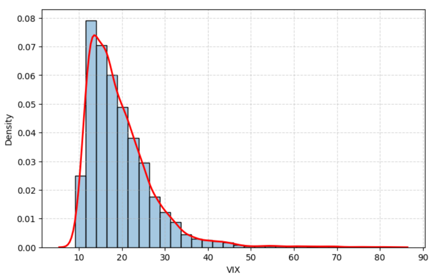
Cost of a Symmetric Butterfly Spread

To understand how option market prices encode the market’s expectations regarding the future distribution of the underlying asset price, we consider a symmetric butterfly. A symmetric butterfly spread is constructed using three European call options with a common maturity T and distinct strike prices. The strategy involves purchasing one call option with strike K – ΔK at a premium of C(K-ΔK,T), selling two call options with strike K at a premium of C(K,T) each, and purchasing one call option with strike K + ΔK at a premium of C(K+ΔK,T).

The price of the resulting butterfly spread is therefore given by


Butterfly spread cost

The net cost of the butterfly spread is obtained by summing the premia paid for the two long call positions and subtracting the premiums received from the two short call positions.

Payoff of a Symmetric Butterfly Spread

The payoff of a symmetric butterfly spread is centred around the strike (K) and can be expressed as


Butterfly spread payoff

Figure 1 illustrates the payoff profile of a symmetric butterfly spread centred at the strike K = 100 with strike spacing ΔK = 5. The payoff reaches its maximum when the terminal asset price ST equals the strike K and declines to zero as ST moves beyond the adjacent strikes K – ΔK and K + ΔK.

Figure 1. Symmetric Butterfly Spread Payoff at Maturity
Symmetric Butterfly Spread Payoff  at Maturity
Source: computation by the author.

As a result, the butterfly spread effectively isolates a narrow range of terminal asset prices, making it a useful instrument for extracting information about the market-implied probability distribution of the underlying asset price at maturity.

Stacked Butterfly Spreads

A stack of butterfly spreads refers to a collection of butterfly spreads constructed across a range of strike prices, such that the central strike of each butterfly is equally spaced from the next. The spacing between successive central strikes is equal to the strike spacing ΔK used in the construction of each individual butterfly spread, as discussed above.

Figure 2 illustrates that a collection of butterfly spreads across strikes at a fixed maturity converges to the market-implied probability density of the underlying asset. Each butterfly corresponds to a discrete approximation of the second derivative of option prices with respect to strike, and aggregating these across strikes recovers the risk-neutral density.

We construct seven butterfly spreads centered at strikes K = 85 to K = 115 in increments of 5, with strike spacing ΔK = 5. The weights are specified using a Gaussian distribution with mean μ = 100 and standard deviation σ = 10, reflecting an assumed market belief about the concentration of terminal prices. The payoff profile is scaled by a factor of 200 to improve visual readability, and it is normalized by ΔK2 to remain consistent with the second-order finite-difference interpretation of butterfly spreads as detailed below.

Figure 2. Approximating the Risk-Neutral Density Using Butterfly Spreads
Approximating the Risk-Neutral Density Using Butterfly Spreads
Source: computation by the author.

As the strike spacing ΔK is reduced, additional butterfly spreads can be constructed between existing butterfly spreads. Consequently, the stacked payoff profile becomes increasingly smooth and, in the limit, approaches a continuous representation of the implied probability distribution.

To better understand this limiting behaviour, it is useful to examine the properties of an individual butterfly spread. As the strike spacing ΔK decreases, the payoff of the butterfly spread becomes increasingly concentrated around its central strike. In the limit as ΔK → 0, the butterfly spread approaches an infinitesimally narrow peak centred at K.

Consequently, the value of the butterfly spread decreases as its payoff becomes increasingly concentrated around its central strike. To obtain a meaningful limiting quantity, the butterfly value must therefore be normalized by (ΔK)2. This normalization is motivated by a well-known result from calculus, central finite-difference approximation of the second derivative.


Normalized Butterfly spread cost

Comparing the two expressions above, reveals that the normalized butterfly value is precisely the finite-difference approximation of the second derivative of the call pricing function with respect to strike.


Second derivative of the call pricing function with respect to strike.

This observation forms the foundation of the Breeden-Litzenberger (1978) result, which establishes that the second derivative of the call pricing function with respect to strike is directly related to the market-implied risk-neutral probability density embedded in option prices, as demonstrated in the derivation below.

You can download the Excel file provided below to generate and visualize the payoff profiles of the butterfly spread and stacked butterfly spread at maturity, as discussed above.

Download the Excel file.

Option implied risk-neutral distribution

This section develops the analytical derivation of the risk-neutral distribution using the seminal Breeden-Litzenberger (1978) result. By exploiting the cross-sectional structure of option prices across strikes, we recover the market-implied risk-neutral density embedded in option market prices.

Analytical derivation

Under the risk-neutral measure, the value of a European call option is given by the present value of its expected payoff at maturity. For a strike price K, continuously compounded risk-free rate r, and time to maturity T, the call pricing function C(K,T) can be expressed as


Call option risk-neutral value.

To obtain a continuous representation of the call price, the expected payoff can be expressed as an integral over the probability density function of the terminal asset price, f(ST).


Call option risk-neutral value PDF.

Note: The integral starts at K because the payoff is zero when St≤K.

Taking the first derivative with respect to K, we get


Call option risk-neutral PDF first derivative

To obtain the risk-neutral probability density function, as shown by Breeden and Litzenberger (1978), we take an additional derivative with respect to the strike


Second derivative of call price with respect to strike.

Rearranging the above formula, we get the risk-neutral distribution


Rearranged Second derivative of call price with respect to strike.

Applying the second-order central difference approximation heuristically developed in the previous section using butterfly spreads, we obtain the following expression:


Implied risk-neutral distribution formula.

This expression shows that the risk-neutral probability density can be recovered directly from the second derivative of the call pricing function with respect to strike. In practice, however, option prices are observed only at a finite set of discrete strike prices, requiring numerical methods to approximate the derivatives and extract the implied risk-neutral distribution.

Numerical methods for extracting the risk-neutral distribution

Methods for extracting the risk-neutral distribution can be broadly classified into non-parametric (data-driven with minimal distributional assumptions), semi-parametric (partial structural assumptions, typically imposed on intermediate quantities such as implied volatility), and parametric or structural (explicit assumptions on the distribution or asset price dynamics) approaches. These methodologies differ in the degree of modelling assumptions imposed on the option pricing function and the terminal asset price distribution, leading to different trade-offs between flexibility, numerical stability, and economic interpretability.

Non-parametric methods

Non-parametric methods aim to recover the risk-neutral distribution directly from observed option prices without imposing any specific parametric structure on either the terminal asset price distribution or the stochastic process governing the evolution of the underlying asset price. Consequently, these methods are highly flexible, but they tend to be sensitive to market microstructure noise, sparse strike coverage, and interpolation error in option quotes.

Risk-neutral histograms: the most direct implementation of the Breeden–Litzenberger result constructs a discrete approximation of the implied risk-neutral density using finite differences across traded strikes (Breeden and Litzenberger, 1978; Neuhaus, 1995). Adjacent butterfly spreads may therefore be interpreted as local estimates of state-contingent probabilities.

Because option contracts are quoted only at discrete strike intervals, the recovered distribution resembles a histogram rather than a smooth continuous density, making the approach highly sensitive to strike spacing and pricing noise.

Kernel regression methods: to mitigate the instability of histogram-based estimates, subsequent research introduced non-parametric smoothing techniques that estimate a continuous option pricing function directly from observed market prices. A prominent example is the kernel regression framework of Aït-Sahalia and Lo (1998).

By reducing the influence of local pricing noise, kernel-based methods generally produce smoother and more stable estimates of the implied risk-neutral density.

Spline-based methods: another widely used class of non-parametric methods employs spline interpolation techniques to construct smooth and arbitrage-consistent call pricing functions across strikes (Bates, 1991). Once a sufficiently smooth pricing function has been obtained, the implied risk-neutral density can be recovered through numerical differentiation.

Spline-based approaches offer substantial flexibility but remain sensitive to data quality and sparse observations in the tails of the distribution.

Semi-parametric approaches

Semi-parametric approaches occupy a middle ground between purely data-driven and fully parametric methodologies. Rather than modelling the risk-neutral density directly, these methods impose structure on intermediate quantities, most commonly the implied volatility smile.

Implied volatility smile methods: in practice, many market participants smooth the implied volatility smile rather than the option prices directly. Observed option prices are first converted into implied volatilities, after which a smooth volatility smile is fitted across strikes using parametric specifications or spline-based interpolation techniques (Shimko, 1993).

The smoothed volatility smile is subsequently mapped back into option prices, allowing the implied risk-neutral density to be recovered through numerical differentiation. These methods generally exhibit greater numerical stability, although tail estimation remains sensitive to extrapolation assumptions in illiquid regions of the smile.
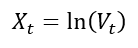
Parametric and structural approaches

Parametric and structural methodologies recover the implied risk-neutral distribution by imposing explicit assumptions on either the terminal distribution of asset prices or the stochastic process governing their evolution.

Parametric density models: a prominent class of methods assumes that the terminal risk-neutral distribution follows a particular parametric specification. One widely used approach models the distribution as a mixture of lognormal densities calibrated to observed option prices (Bahra, 1997; Melick and Thomas, 1997).

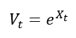
Parametric methods are computationally efficient and often yield economically interpretable measures of skewness, kurtosis, and tail risk. Their flexibility, however, is inherently constrained by the assumed functional form.

Dynamic option pricing models: rather than specifying the terminal distribution directly, structural approaches derive the implied density from an assumed stochastic process governing the evolution of the underlying asset price. Examples include stochastic volatility and jump-diffusion frameworks calibrated to observed option prices (Bates, 1995; Malz, 1995).

Within these models, the risk-neutral density emerges endogenously from the dynamics of the underlying asset under the risk-neutral measure. While theoretically appealing, such models are computationally intensive and sensitive to model misspecification.

Application

Implementing the Breeden and Litzenberger (1978) result in practice requires a continuum of European option prices written on the same underlying asset, all sharing a common maturity and spanning a continuous range of strike prices from zero to infinity. Under such idealized conditions, the risk-neutral density can be recovered directly from the cross-section of option prices (at a given maturity date).

In practice, however, listed option markets provide only a sparse and discrete grid of strike prices, typically concentrated around the at-the-money (ATM) region. The absence of a complete continuum of option strikes, particularly in the deep in-the-money and far out-of-the-money regions, necessitates the use of interpolation across observed strikes and extrapolation into the tails in order to recover a smooth and arbitrage-free implied risk-neutral distribution.

Required data

Constructing a risk-neutral distribution requires option chain data (a set of calls and/or puts) for a single maturity, along with the underlying asset price, the prevailing risk-free rate, dividend assumptions, at the exact observation time of the market data.

Such data can be obtained from both free and commercial data providers. One of the most accessible sources is Yahoo! Finance; however, freely available option data is often subject to inconsistencies such as wide bid–ask spreads, stale quotes, and incomplete cross-sectional coverage of strikes, all of which can materially distort empirical estimation of the risk-neutral distribution (RND).

For our application, we employ simulated option data to illustrate the derivation of the implied risk-neutral distribution from an option chain within a controlled and internally consistent setting. This ensures that the resulting distribution remains aligned with the theoretical framework developed above.

Extraction of the implied risk-neutral density

From the collected option chain data, we first apply a series of standard filtering procedures designed to remove illiquid and economically inconsistent observations. In empirical applications, this typically includes liquidity screens, moneyness and maturity filters, implied-volatility sanity checks, and no-arbitrage constraints to mitigate errors arising from stale quotes, asynchronous observations, and market microstructure noise. Since the dataset employed here is simulated and internally consistent by construction, these preprocessing steps can be largely omitted.

Figure 3 below presents the implied volatility smile obtained from the simulated European call option chain after numerical inversion of the Black–Scholes–Merton pricing model. The smile is interpolated using a natural cubic spline over a dense strike grid spanning the filtered strike range of 4,000 to 6,000, under the assumptions of an underlying spot price of $5,300, a continuously compounded risk-free interest rate of 5.2%, and a remaining time-to-maturity of 30 days. The resulting smooth volatility curve serves as the key intermediate input for constructing a continuous and differentiable call pricing function required for subsequent risk-neutral density extraction.

Figure 3. Implied Volatility Smile
Implied Volatility Smile
Source: computation by the author (with python)

The interpolated implied volatility smile is subsequently utilized to reprice European call options across a finely discretized strike grid, thereby constructing a smooth numerical approximation of the cross-sectional call price surface. The option implied risk neutral density is then recovered by applying the Breeden Litzenberger operator, corresponding to the second partial derivative of discounted call prices with respect to strike, to the smoothed pricing function. Figure 4 illustrates the resulting risk neutral density extracted from the simulated European call option chain under an underlying spot level of $5,300, a continuously compounded risk-free interest rate of 5.2%, and a remaining time to maturity of 30 days.

Figure 4. Implied Risk-Neutral Distribution
Implied Risk-Neutral Distribution
Source: computation by the author (with python)

You can download the Python code provided below for generating simulated call option chain data and the option-implied risk-neutral distribution, as discussed above.

Download the Python code.

Alternatively, you can download the R code below with the same functionality as in the Python file.

 Download the R code.

Empirical issues

A primary limitation in empirical recovery of the risk-neutral distribution is the discrete nature of listed option strikes. The Breeden–Litzenberger framework assumes a continuum over strike space, whereas traded options are observed only on a sparse and uneven grid concentrated around the at-the-money region.

A second limitation arises from the unobservability of the distribution tails. Deep in-the-money and far out-of-the-money options are often illiquid or not quoted, implying that tail behaviour of the risk-neutral density must be inferred through extrapolation rather than direct market observation.

A separate issue is asynchronous option quotes. Since option prices across strikes are not necessarily recorded simultaneously, the resulting cross-section may embed timing mismatches, introducing bias in the reconstructed pricing function. This is typically addressed using end-of-day settlement data or synchronized snapshots.

In addition, different levels of market liquidity (due to different levels of bid ask spreads for example) across strikes introduces noise and heterogeneity in observed quotes. Illiquid contracts may exhibit stale or unreliable prices, which can distort the implied volatility surface even after basic filtering.

Finally, the reconstruction procedure does not explicitly impose no-arbitrage conditions or global smoothness constraints across strikes. As a result, when option prices are interpolated to form a continuous surface, the fitted call price function may exhibit local violations of convexity in strike space (e.g., small regions where butterfly spreads imply negative prices or non-monotonic curvature). Such violations are problematic because they imply the possibility of arbitrage and can lead to risk-neutral probability estimates that are not economically consistent.

Despite these limitations, the framework remains a useful reduced-form tool for extracting risk-neutral densities, provided appropriate smoothing and arbitrage constraints are imposed.

Real-life applications

Central Bank Monetary Policy Monitoring

Bahra (1997) and Kim (2009) suggest that policymakers extract ex-ante risk-neutral distributions (RNDs) from interest rate, equity, and currency options to assess market-implied expectations and uncertainty around policy decisions. Unlike futures prices, which only reflect the conditional mean, RNDs incorporate higher-order information such as skewness and kurtosis, allowing for a more complete assessment of perceived tail risks and macro-financial stress. For example, during the February 2007 equity sell-off, the European Central Bank (ECB, 2007) used option-implied probability distributions (“fan charts”) to assess whether the move reflected extreme tail risk and to track the evolution of market expectations after stabilization.

Value-at-Risk (VaR) Forecasting

Risk management units in investment banks use quantiles derived from implied RNDs to forecast extreme portfolio losses in a forward-looking manner. Compared to traditional historical simulation methods, RND-based approaches incorporate market-implied expectations and have been shown to provide improved performance relative to standard volatility-based models such as GARCH(1,1) (Chang, Chang, Huang, & Hsieh, 2011).

Systemic Risk and Stress Testing Indicator

Macroprudential regulators transform option-implied volatility surfaces into arbitrage-consistent risk-neutral distributions to quantify system-wide financial vulnerabilities. By aggregating tail-risk measures across equities, currencies, and interest rates, these distributions can be used to construct time-series indicators of systemic stress and cross-asset fragility (Malz, 2014).

Market Risk Aversion and Investor Sentiment Estimation

By combining option-implied risk-neutral distributions with empirical (physical) distributions, researchers can infer the market’s implicit risk preferences and aggregate degree of risk aversion (Bliss & Panigirtzoglou, 2004). This allows for the identification of time variation in investor sentiment and risk pricing across different investment horizons (Bliss & Panigirtzoglou, 2004; Gemmill & Saflekos, 2000).

Why should you be interested in this post?

The risk-neutral distribution is one of the few tools in finance that reveals how the market prices uncertainty based on the entire distribution of possible future states implied by option prices. It is widely used in practice to understand how the market is pricing downside risk, fat tails, and asymmetry that is directly used in volatility modelling, pricing, and risk management frameworks. From a practical perspective, it is one of the standard tools used to extract forward-looking information from option prices in both research and industry settings.

Related posts on the SimTrade blog

   ▶ Saral BINDAL Historical Volatility

   ▶ Saral BINDAL Implied Volatility and Option Prices

   ▶ Saral BINDAL Volatility curves: smiles and smirks

Useful resources

Academic research on option pricing

Black, F., & Scholes, M. (1973). The pricing of options and corporate liabilities. Journal of Political Economy, 81(3), 637-654.

Hull J.C. (2015) Options, Futures, and Other Derivatives, Eighth Edition, Global Edition, Chapter 14 – The Black-Scholes-Merton model, 299-320.

Merton, R.C. (1973). Theory of rational option pricing. The Bell Journal of Economics and Management Science, 4(1), 141-183.

Academic research on risk neutral distribution

Aït-Sahalia, Y., & Lo, A. W. (1998). Nonparametric estimation of state-price densities implicit in financial asset prices. The Journal of Finance, 53(2), 499-547.

Bahra, B. (1997). Implied risk-neutral probability density functions from option prices: Theory and application. Bank of England Working Paper Series, 66, 1-42.

Bates, D. S. (1991). The crash of ’87: Was it expected? The evidence from options markets. The Journal of Finance, 46(3), 1009-1044.

Bates, D. S. (1995). Testing option pricing models. NBER Working Paper Series, w5135, 1-53.

Bliss, R. R., & Panigirtzoglou, N. (2004). Option-implied risk aversion estimates. The Journal of Finance, 59(1), 407-446.

Breeden, D. T., & Litzenberger, R. H. (1978). Prices of state-contingent claims implicit in option prices. Journal of Business, 51(4), 621-651.

Chang, Y. C., Chang, C. L., Huang, H. T., & Hsieh, T. H. (2011). Value-at-Risk forecasting via option-implied risk-neutral density. Journal of Risk and Financial Management, 4(1), 56-83.

European Central Bank (ECB). (2007). Gauging stock market uncertainty using option-implied distributions. ECB Monthly Bulletin, April, Box 4, 31–32.

Figlewski, S. (2010). Estimating the implied risk neutral density for the U.S. market portfolio. In T. Bollerslev, J. R. Russell, & M. W. Watson (Eds.), Volatility and Time Series Econometrics: Essays in Honor of Robert F. Engle (pp. 43-69). Oxford University Press.

Gemmill, G., & Saflekos, A. (2000). How useful are market-implied probabilities for forecasting sharp changes in asset prices? An application to the UK general election. Market Expectations and the Implications for Monetary Policy, 203-223.

Kim, K. (2009). Monetary policy announcements and market expectations under different monetary policy regimes: An options-based approach. International Finance Discussion Papers (Federal Reserve Board), 977, 1-45.

Malz, A. M. (1996). Using option prices to estimate realignment probabilities in the European Monetary System: the case of sterling-mark. Journal of International Money and Finance, 15(5), 717-748.

Malz, A. M. (2014). A VaR-based systemic risk indicator. Federal Reserve Bank of New York Staff Reports, 668, 1-47.

Melick, W. R., & Thomas, C. P. (1997). Recovering an asset’s pdf from option prices: An application to crude oil during the Gulf crisis. Journal of Financial and Quantitative Analysis, 32(1), 91-115.

Neuhaus, H. (1995). The informational content of derivatives for monetary policy. Deutsche Bundesbank Discussion Paper Series 1: Economic Studies, 1995(03), 1-34.

Shimko, D. (1993). Bounds of probability. Risk, 6(4), 33-37.

Shreve, S. E. (2004). Stochastic calculus for finance II: Continuous-time models. Springer Science & Business Media.

About the author

The article was written in June 2026 by Saral BINDAL (Indian Institute of Technology Kharagpur, Metallurgical and Materials Engineering, 2024-2028 & Research assistant at ESSEC Business School).

   ▶ Discover all articles by Saral BINDAL

The Rise of Algorithmic Trading: From Simple Strategies to Machine Learning

Anis MAAZ

In this article, Anis MAAZ (ESSEC Business School, Global Bachelor in Business Administration (GBBA), 2023-2027) explains how algorithmic trading works, from rule-based strategies like market making, arbitrage, and momentum to modern machine learning models and the systems that run them. The goal of this post is to give a clear, realistic overview of today’s algo landscape, its methods, data and infrastructure needs, and the risks and controls traders must understand before building or adopting an automated strategy.

What “algorithmic trading” means

Algorithmic trading is the use of computer programs to make and execute trading decisions according to predefined rules. These rules can be simple, such as splitting a large order into smaller pieces to reduce market impact, or more sophisticated, such as detecting short term patterns in prices, volumes, or order book dynamics. The goal is not necessarily to trade fast, but to trade systematically and consistently, removing emotion and human latency from the process.

Algorithmic trading now dominates global markets. According to JP Morgan and Bloomberg estimates, it accounts for roughly 60–73% of U.S. equity trading volume, 40–50% in European equities, around 80% in FX spot markets (BIS Triennial Survey, 2022), and over 70% in futures markets. The evolution has been dramatic: less than 15% of U.S. equity volume in the early 2000s, past 50% by 2008, and a peak above 70% during 2009–2012 with the rise of high-frequency trading. It has since stabilized between 60% and 75% as regulation tightened and the industry consolidated around a few dominant players.

Why it grew so fast?

Three forces drove adoption. First, markets became electronic and faster, so speed and precision started to matter in everyday execution. Second, data and computing became cheap: brokers and exchanges exposed APIs, cloud resources got affordable, and open-source libraries appeared. Third, microstructure itself changed: most trading now occurs on limit order books where tiny, frequent price changes reward consistency and careful cost control. Together, these factors made rules based automation both feasible and attractive for firms and independent traders.

The ecosystem is driven by several types of players: high-frequency trading firms (Citadel Securities, Virtu Financial, Jump Trading, Jane Street) that dominate market making and short-term arbitrage; quantitative hedge funds (Renaissance Technologies, Two Sigma, D.E. Shaw) that run systematic strategies on longer horizons; investment banks (Goldman Sachs, JP Morgan) operating algorithmic execution desks for clients; asset managers (BlackRock, Vanguard) using algorithms for portfolio rebalancing; and a fast-growing retail segment leveraging platforms like Interactive Brokers, Alpaca, or MetaTrader.

How a typical algorithmic setup works (without jargon)

Under the hood, most systems share four components. A signal suggests “buy,” “sell,” or “do nothing,” based on patterns the designer expects to repeat. Risk controls limit position size, daily losses, and exposure across instruments, and can stop the system if limits are hit. An execution module decides how to place orders, market or limit, how aggressively to join or improve the queue, and how to behave in volatile moments. Finally, a testing loop checks ideas on past data (backtests), then in small live trials (forward tests), and monitors production to catch problems or errors early. This last step is the most important one to verify the algorithm really works before committing significant capital.

Machine learning, when used, lives mainly in the signal step: models learn patterns from large datasets such as order book features or news sentiment. It can improve accuracy, but it also adds failure modes such as overfitting (the model memorizes the past instead of learning real patterns) and model drift (the market changes and the model becomes obsolete), so governance and validation become central. Academic research highlights both sides of this automation: Hendershott, Jones, and Menkveld (2011) show that algorithmic trading improves liquidity and makes quotes more informative; Brogaard, Hendershott, and Riordan (2014) find that high-frequency traders contribute to price discovery; but Kirilenko et al. (2017), studying the 2010 Flash Crash, demonstrate how automated systems can amplify volatility during stress episodes.

What algorithms actually do: strategy families in practice

  • Market making is like being a middleman who constantly buys and sells throughout the day, making money from the small difference between buy and sell prices (the “spread”), while keeping inventory balanced and adjusting prices or stepping back when the market gets too volatile. Firms like Citadel Securities and Virtu Financial dominate this activity on U.S. equities.
  • Arbitrage is when you spot the same (or very similar) asset trading at different prices in different places, like a stock and its future, or two related ETFs, and you quickly buy the cheaper one while selling the expensive one to lock in a small, low-risk profit. During big crashes or market events, arbitrage opportunities can be captured by algorithms in milliseconds. For example, in October 2025 when Trump announced China tariffs, the crypto market crashed and USDe was priced at $0.65 on one platform for a few seconds while still trading at $1 on another.
  • Momentum and mean reversion are two simple trading approaches: momentum bets that a price move will continue in the same direction, while mean reversion bets that extreme moves will bounce back toward normal. Alongside these, execution algorithms (such as VWAP or TWAP) do not predict anything but help traders buy or sell large orders quietly and cheaply by blending into the market’s natural flow.

A simple numeric example

Imagine you are running a small trading bot that makes €0.01 profit every time it buys and sells a share. If it does this 1,000 times in a day, you would expect €10 in profit. But after paying fees to the exchange, your broker, and losing a bit of money on timing (called “slippage”), you are actually left with only €2. Here’s the problem: if the market gets a little more chaotic and your timing losses increase by just €0.004 per share, that €2 profit completely disappears and you start losing money. This is why successful trading firms are obsessed with speed, positioning in the order queue, and keeping costs as low as possible: when you are making thousands of tiny trades, even the smallest extra cost can wipe out all your profits. This is also why trading firms increasingly recruit technical profiles (developers, data engineers, quants) to build and maintain these algorithms.

Typical risks and how professionals address them

  • Model error and overfitting: a backtest can look perfect by accident. Good practice includes out-of-sample tests, stress scenarios, and small-size live trials before scaling up.
  • Execution and infrastructure: partial fills, slippage, network outages, or API changes can break assumptions. Firms use pre-trade checks, kill switches, redundancy, and post-trade analytics to limit damage.
  • Regime shifts and liquidity: relationships that held in calm markets can fail in stress. Circuit breakers, dynamic limits, and stricter quoting rules help, but strategy design must assume bad days will come, as shown by the 2010 Flash Crash where the Dow Jones lost nearly 1,000 points in minutes.
  • Market manipulation and regulation: practices like spoofing (placing fake orders to mislead other participants) or layering are banned under MiFID II in Europe and Dodd-Frank in the U.S. Regulators (ESMA, AMF, SEC, FCA) actively monitor algorithmic activity. In 2020, JP Morgan paid a record $920 million fine for spoofing in precious metals and Treasury markets, showing that even the largest institutions are held accountable.

Machine learning: value and limits

Machine learning can find trading patterns in huge amounts of data: price movements, order flows, news headlines, but more complicated does not always mean better. In practice, many teams prefer simpler models they can actually understand and explain over fancy “black box” systems. What really matters is control: who approves the model, how you track changes, what you do when it stops working, and how to shut it down safely. Regulators have made it clear that even if you are using AI, you are still responsible for what it does, MiFID II explicitly requires firms to test, document, and supervise their algorithms.

What this means for traders and firms

For big institutions, algorithms are now standard tools: they provide liquidity, route orders, and track costs in real time. For individual traders, algorithms offer discipline and consistency, but they also expose weaknesses fast: if your costs are too high or your strategy is fragile, automation will show you, sometimes the hard way, for example by losing all the capital you allocated to the algorithm. The real edge is not just having a clever formula; it is combining a small but reliable signal with strict risk rules, careful execution, and constant monitoring.

Conclusion

Algorithmic trading went from rare to normal because it matches how modern markets work: fast, electronic, and data-heavy. The strengths are speed, scale, and consistent rule-following; the weaknesses show up when controls break, data gets messy, or market conditions suddenly change. The best approach is a hybrid: humans set the rules and limits, machines execute consistently and report back. When this works, small repeatable advantages add up over time. When it doesn’t, automation just makes mistakes happen faster and at a higher scale, which is exactly why regulation and human oversight remain essential.

Why should I be interested in this post?

Algorithmic trading sits at the intersection of markets, data, and technology, now core to execution and price formation globally. Understanding rule-based and ML-driven strategies builds skills in market microstructure, data analysis, and risk control. For business and finance students, these are foundational for roles in trading, quant research, fintech, and portfolio management.

Related posts on the SimTrade blog

   ▶ Eya FARHOUD Le règne des Algorithmes de Trading Haute Fréquence : Bénéfices et Risques

   ▶ Clara PINTO High-frequency trading and limit orders

   ▶ Federico DE ROSSI Understanding the Order Book: How It Impacts Trading

Useful Resources

Federal Reserve (2020) (IFDP) — Rise of the Machines: Algorithmic Trading in the Foreign Exchange Market (Full Paper Updated in 2020)

CSEF (2024) The Rise of Algorithmic Trading: Implications for Price Elasticity and Market Competitiveness

Equiti (2024) What is Algorithmic trading?

Hendershott, T., Jones, C. M., & Menkveld, A. J. (2011). Does Algorithmic Trading Improve Liquidity?

When Machines Beat Bias: What Algorithmic Trading Teaches Us About Rationality

About the author

The article was written in April 2026 by Anis MAAZ (ESSEC Business School, Global Bachelor in Business Administration (GBBA) 2027).

   ▶ Discover all articles by Anis MAAZ

Why Retail Option Strategies Underperform: Payoffs, Probabilities, and the Cost of Speculation

Alexandre LANGEVIN

In this article, Alexandre LANGEVIN (ESSEC Business School, Global Bachelor in Business Administration (BBA), 2022-2026) examines why retail option strategies frequently underperform — that is, generate returns below a passive buy-and-hold benchmark or lose money outright — despite offering payoff profiles that appear attractive on paper. The article explains the structural mechanics behind four common strategies, identifies the sources of systematic drag, and illustrates how the gap between theoretical upside and realized performance emerges even before behavioral factors are considered.

Introduction

Options are among the most versatile yet complex instruments in financial markets. They can hedge risk, generate income, or express a directional view with defined downside (Hull, 2012). Yet a growing body of evidence suggests that retail investors who trade options systematically underperform both the market and their own expectations (Barber and Odean, 2000; de Silva, So and Smith, 2024). The question is not whether options are useful tools; they plainly are. The question is whether the specific strategies retail investors tend to favor are structurally suited to delivering the outcomes they expect.

The answer, in most cases, is that they are not. The gap between the payoff diagram and realized performance is not primarily attributable to adverse price realizations. It is embedded in the mechanics of how options are priced, how time erodes their value, and how the probability of profit is systematically lower than the shape of the payoff curve implies. Understanding these mechanics is the first step toward using options more deliberately.

How an Option Payoff Works

An option gives its buyer the right, but not the obligation, to buy (call) or sell (put) an underlying asset at a fixed price — the strike — on or before expiry. The buyer pays a premium for this right. At expiry, the profit or loss is determined entirely by the final price of the underlying relative to the strike.

For a long call: the option expires worthless if the underlying finishes below the strike. Above the strike, the buyer receives the difference between the final price and the strike. The buyer pays the premium upfront when entering the position; profit or loss at expiry therefore equals the intrinsic value minus this initial cost. The breakeven is therefore the strike plus the premium. For a long put, the logic is symmetric: the option has value if the underlying falls below the strike, and the breakeven is the strike minus the premium. Throughout this article, net profit or loss refers to the outcome at expiry after accounting for the premium paid upfront. The net profit or loss formula for a long call is:

Long call payoff formula

These payoff diagrams look appealing. The downside is capped at the premium paid; the upside is theoretically unlimited for calls and capped at the strike price minus the premium paid for puts (since the underlying cannot fall below zero) for puts. What the diagram does not show is the probability attached to each outcome.

The Four Strategies: Structure and Mechanics

The Excel model accompanying this article covers four strategies commonly used by retail investors. Each illustrates a distinct structural trade-off.

The following four strategies represent the most common approaches used by retail option traders, ranging from directional speculation to income generation.
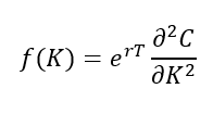
Long Out-of-the-Money (OTM) Call. An option is out-of-the-money when exercising it immediately would produce no value — the strike is above the current price for a call, or below it for a put. In the illustrative example, SPY trades at $540. A call with a $560 strike costs $5.20. Breakeven is $565.20, requiring a 4.7% move in the underlying just to recover the premium. Below $560 at expiry, the entire $5.20 is lost. Above $565.20, the trade turns profitable. The net profit or loss is positively skewed and theoretically unlimited, which explains its appeal. The structural problem is that an OTM call requires the underlying to move by more than the market already expects, because the premium reflects that expected move.

A worked example illustrates the arithmetic. Suppose SPY closes at $575 at expiry. The intrinsic value of the $560 call is $575 − $560 = $15. Net profit per share = $15 − $5.20 = $9.80, or $980 per contract (one contract = 100 shares) — a return of 188% on the premium paid. Now suppose SPY closes at $550 instead. The call expires worthless; the loss is the full premium of $5.20 per share, or −$520 per contract. These two outcomes — $980 profit vs. −$520 loss — illustrate the asymmetry. The upside is real, but the full loss scenario is far more probable: SPY must rise more than 4.7% simply to break even, and more than that to generate meaningful profit.

Long OTM Put. A $520 put on SPY trading at $540 costs $4.80. Breakeven is $515.20, requiring a 4.6% decline. Like the OTM call, the put must overcome both the out-of-the-money gap and the premium cost before generating any return. In calm markets, the probability of hitting breakeven by expiry is well below what the payoff diagram implies.

Bull Call Spread. Buying the $550 call and selling the $570 call reduces the net cost to $5.30 (long premium $8.50 minus short premium $3.20). Breakeven falls to $555.30, and maximum profit is capped at $14.70 per share if SPY finishes above $570. The spread trades unlimited upside for a lower entry cost and a higher probability of profit compared to the naked call. The payoff formula is:

Bull call spread payoff formula

It is a more disciplined structure, but it still requires a meaningful directional move, and the profit ceiling is fixed regardless of how far the underlying moves above the upper strike.

Covered Call. An investor who holds 100 shares purchased at $540 sells a $560 call for $5.20. Breakeven falls from $540 to $534.80. If SPY finishes below $560, the investor keeps the premium and the position. If SPY finishes above $560, the shares are called away and the investor captures only $25.20 per share in total profit, regardless of how far the stock has risen. The strategy generates income but structurally caps the upside.

Figure 1. Payoff diagrams at expiry for the four strategies (illustrative inputs).
Option payoff diagrams
Source: computation by the author.

The Structural Sources of Underperformance

Three structural factors — theta decay, the volatility risk premium, and breakeven mechanics — explain why retail option strategies systematically underperform, independently of any behavioral bias.

Theta decay. Options lose value over time as expiry approaches. This decay is not linear; it accelerates sharply in the final weeks before expiry. A 30-day option that has lost 30% of its value in the first two weeks may lose the remaining 70% in the last two. Retail investors who buy short-dated options and hold them without a clear exit plan are running against the clock. The underlying must move quickly and decisively; a slow drift in the right direction is often not enough to overcome the daily erosion in time value. De Silva, So and Smith (2024) document that retail investors systematically purchase options ahead of anticipated volatility spikes, only to suffer double-digit percentage losses as volatility collapses and time value erodes post-announcement.

The volatility risk premium. Implied volatility — the level of volatility priced into an option’s premium — is persistently higher than realized volatility on average. This gap is the volatility risk premium, and it represents a systematic transfer of wealth from option buyers to option sellers. When you buy an option, you are paying for a level of volatility that, on average, does not materialize. Market makers and institutional sellers collect this premium consistently over time; retail buyers pay it. Broadie, Chernov and Johannes (2009) show that the apparently large returns to put-selling strategies are fully explained by compensation for bearing this volatility risk — what looks like alpha is largely a risk premium that option buyers are systematically on the wrong side of.

Breakeven mechanics. The breakeven calculation makes the structural difficulty explicit. For a long OTM call with a 4.7% breakeven requirement, the underlying must rise by 4.7% before expiry simply to recover costs. Historically, the probability of a large-cap equity index moving 5% or more in a given month is well below 50%. The payoff diagram shows what happens if the move occurs; it does not show how often it does. Most retail option buyers look at the profit region of the diagram without adequately pricing in the probability of reaching it. Barber and Odean (2000) document a closely related pattern in equity trading: retail investors systematically overestimate their ability to generate above-market returns, a bias that is amplified in options markets by the apparent leverage and lottery-like payoffs.

Transaction costs and taxes. A fourth source of drag, often overlooked, is the cost of trading itself. Retail investors typically pay per-contract commissions, and bid-ask spreads on options are wide relative to the premium — particularly for short-dated or illiquid contracts. On a $5.20 premium, a $0.10 spread represents nearly 2% of the position cost before any price move occurs. Capital gains taxes on short-term option profits further reduce net returns. These costs do not appear on payoff diagrams but compound the structural disadvantages described above.

Excel Model

The Excel model below contains four sheets — Long OTM Call, Long OTM Put, Bull Call Spread, and Covered Call — each following the same structure: an input table with yellow input cells, a payoff table across a range of expiry prices, and a payoff diagram with a breakeven marker. All inputs are illustrative and can be modified freely. The payoff columns and chart update automatically when inputs change.

Figure 2. Bull Call Spread sheet: inputs table and payoff formula.
Bull Call Spread inputs table
Source: computation by the author.

Download the Excel file

Why should I be interested in this post?

Options appear in equity research, derivatives desk interviews, and structured product discussions at banks and asset managers. Beyond the professional context, understanding why certain strategies structurally underperform is relevant for anyone who trades independently or advises clients on portfolio construction. The payoff diagram is the beginning of the analysis, not the end. Knowing how to read the probability distribution behind it is what separates informed use from speculation.

Related posts on the SimTrade blog

   ▶ Shengyu ZHENG Pricing barrier options with simulations and sensitivity analysis with Greeks

   ▶ Luis RAMIREZ Understanding Options and Options Trading Strategies

   ▶ Alexandre VERLET Understanding financial derivatives: options

   ▶ Saral BINDAL Implied Volatility and Option Prices

   ▶ All posts about Financial techniques

Useful resources

Academic research

Barber, B.M. and Odean, T. (2000) Trading Is Hazardous to Your Wealth: The Common Stock Investment Performance of Individual Investors, Journal of Finance, 55(2), 773-806. Available at https://faculty.haas.berkeley.edu/odean/papers%20current%20versions/individual_investor_performance_final.pdf

de Silva, T., So, E.C. and Smith, K. (2024) Losing is Optional: Retail Option Trading and Expected Announcement Volatility, Review of Finance, 30(2), 489-535. Available at https://www.timdesilva.me/files/papers/losing_optional.pdf

Broadie, M., Chernov, M. and Johannes, M. (2009) Understanding Index Option Returns, Review of Financial Studies, 22(11), 4493-4529. Available at https://business.columbia.edu/sites/default/files-efs/pubfiles/3964/broadie_chernov_johannes.pdf

Hull, J.C. (2012) Options, Futures, and Other Derivatives, 8th edition, Pearson.

About the author

This post was written in April 2026 by Alexandre LANGEVIN (ESSEC Business School, Global Bachelor in Business Administration (BBA), 2022-2026). Alexandre is interested in derivatives markets, options trading, and quantitative approaches to portfolio analysis.

   ▶ Discover all articles by Alexandre LANGEVIN.

The Shiller P/E (CAPE) Ratio: Measuring Long-Run Market Valuation

Alexandre LANGEVIN

In this article, Alexandre LANGEVIN (ESSEC Business School, Global Bachelor in Business Administration (BBA), 2022-2026) explains the Shiller P/E ratio, also known as the CAPE ratio: a valuation tool that adjusts for the business cycle to give a more reliable picture of whether equity markets are cheap or expensive.

Introduction

Every investor knows the price-to-earnings (P/E) ratio: divide the current market price by earnings per share and you get a simple measure of how much the market is paying for each dollar of profit. It is one of the most widely quoted metrics in equity analysis. But it has a structural flaw: earnings are cyclical. In a recession, they collapse, making the P/E look artificially inflated even when prices have barely moved. In a boom, they surge, making markets appear cheap when they may not be. A single year of earnings is a poor basis for a long-term valuation judgment.

Robert Shiller, a Yale professor and 2013 Nobel laureate in economics, proposed a simple fix. His ratio replaces one year of earnings with the average of the past ten years, adjusted for inflation. The result is a smoother, more stable measure of valuation that filters out the noise of the business cycle and allows for meaningful comparisons across time.
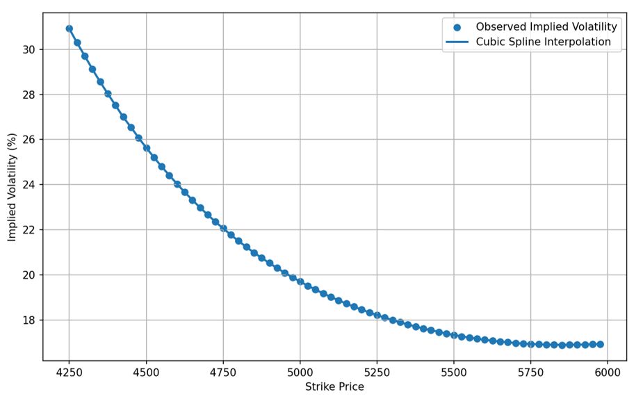
The Problem with Standard P/E

Consider the S&P 500 in 2009, shortly after the financial crisis. Prices had fallen sharply, but earnings had fallen even further, with many companies reporting losses. Standard P/E spiked above 100 at certain points, not because markets were expensive, but because the denominator had collapsed. An investor reading that number at face value might have concluded the market was dangerously overvalued, when it was near a generational buying opportunity.

The opposite problem occurs at cycle peaks. Strong earnings in boom years compress P/E ratios, making markets look reasonable just before a downturn. Standard P/E captures both price and the cyclical position of earnings simultaneously, making it hard to separate valuation from timing.

The CAPE Ratio: Construction and Formula

Shiller’s solution is to replace single-year earnings with the average of real earnings over the previous ten years. A ten-year window spans a full business cycle, smoothing out both recessions and booms. The formula is:

CAPE ratio formula

where P is the current market price, Et are reported earnings in year t, CPI0 is the current price index, and CPIt is the price index in year t. The inflation adjustment ensures that past earnings are expressed in today’s dollars, making them directly comparable to recent figures.

In the Excel model, each annual earnings figure is the average of the 12 monthly observations in Shiller’s dataset. Shiller himself constructs monthly earnings by interpolating S&P four-quarter totals, so the monthly series is a smooth continuous estimate rather than actual reported monthly results. The current S&P 500 price used is the April 9, 2026 closing price of $6,824.66, sourced from Yahoo Finance. The CPI reference is the February 2026 release from the U.S. Bureau of Labor Statistics.

Historical Record and Market Signals

Shiller’s dataset goes back to 1871, giving the ratio an exceptionally long historical record. The average CAPE over that full period is approximately 17.7 and the median around 16.6. These serve as rough benchmarks: readings significantly above the average suggest the market is expensive relative to long-run earnings capacity, while readings well below suggest the opposite.

The ratio’s most cited applications came before two of the largest crashes of the modern era. In December 1999, at the peak of the dot-com bubble, the S&P 500 CAPE reached 44.2, more than double its historical average. Shiller published Irrational Exuberance that same year, arguing on the basis of CAPE that US equities were severely overvalued. The S&P 500 subsequently fell by nearly 50% over the following two years. In August 2007, CAPE rose above 26 before the financial crisis and another major decline.

At the other extreme, CAPE dropped to around 8.5 in August 1982, one of its lowest post-war readings, preceding one of the strongest bull markets in US history. As of April 9, 2026, our model gives a CAPE of approximately 38.8, well above the historical average.

Figure 1. CAPE ratio at key historical market turning points (S&P 500, selected monthly readings). Source: Robert J. Shiller, econ.yale.edu; computation by the author.
CAPE historical chart
Source: computation by the author.

Excel Model

The Excel model below computes the CAPE ratio from Shiller’s raw data. It contains four sheets: a source data sheet copied directly from Shiller’s dataset, a CAPE Calculator that pulls ten-year annual averages and applies the inflation adjustment, a Historical Context sheet with key turning points, and a Read Me. The starting year of the ten-year window is adjustable, and the model updates automatically when price or CPI inputs are changed.

Figure 2. CAPE Calculator: ten-year window of inflation-adjusted earnings and resulting CAPE ratio.
CAPE calculator Excel screenshot
Source: computation by the author.

Download the Excel file

Interpretation and Limitations

What CAPE tells you. Shiller’s own research found a strong negative relationship between starting CAPE and subsequent 10-year real returns for the S&P 500: high CAPE tends to precede lower decade-long returns, and low CAPE tends to precede higher ones. The relationship is not mechanical and does not predict timing, but it is one of the more robust long-run return predictors in the academic literature.

The interest rate objection. The most common criticism is that CAPE ignores the level of interest rates. When rates are structurally low, investors rationally accept higher valuations because the alternatives offer little return. Some analysts argue that elevated CAPE readings since 2010 partly reflect lower rates rather than pure overvaluation. This debate is unresolved.
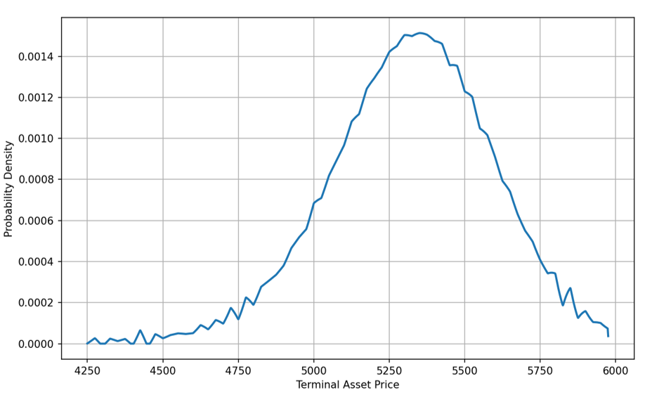

Accounting changes. Reporting standards for earnings have evolved significantly since the 1870s, particularly around goodwill and write-offs. Some researchers argue that modern reported earnings are not strictly comparable to historical figures, making century-long CAPE comparisons imperfect.

Not a timing tool. Investors who sold equities in 1996 because CAPE was already above its long-run average missed four more years of exceptional gains before the dot-com peak. CAPE is a signal about long-run expected returns, not a predictor of short-term price moves.

Why should I be interested in this post?

Valuation metrics appear in equity research, asset allocation decisions at investment managers, and macro discussions at private banks. The CAPE ratio is referenced in strategy notes, central bank research, and academic papers on return predictability. Understanding what it measures, how it is built, and what its limits are is practical knowledge for anyone working in equities or asset management — and one of the cleaner examples of how academic research translates directly into a practitioner tool.

Related posts on the SimTrade blog

   ▶ Hadrien PUCHE “The stock market is filled with individuals who know the price of everything, but the value of nothing.” – Philip Fisher

   ▶ Jorge KARAM DIB Multiples valuation method for stocks

   ▶ Bijal GANDHI Earnings per share

   ▶ All posts about Financial techniques

Useful resources

Academic research

Campbell, J.Y. and Shiller, R.J. (1988) Stock Prices, Earnings, and Expected Dividends, Journal of Finance, 43(3), 661-676. Available at scholar.harvard.edu.

Bunn, O. and Shiller, R.J. (2014) Changing Times, Changing Values: A Historical Analysis of Sectors within the US Stock Market 1872-2013, NBER Working Paper No. 20370. Available at nber.org.

Data sources

Shiller, R.J. Online Data, Yale University. S&P 500 price, earnings, CPI, and CAPE data from 1871 to present.

S&P 500 current price: Yahoo Finance.

CPI reference: U.S. Bureau of Labor Statistics, Consumer Price Index release.

SimTrade

SimTrade

SimTrade Courses

About the author

The article was written in April 2026 by Alexandre LANGEVIN (ESSEC Business School, Global Bachelor in Business Administration (BBA), 2022-2026).

   ▶ Discover all articles by Alexandre LANGEVIN.

Duration and Convexity: Measuring Bond Price Sensitivity to Interest Rates

Alexandre LANGEVIN

In this article, Alexandre LANGEVIN (ESSEC Business School, Global Bachelor in Business Administration (BBA), 2022-2026) explains how duration and convexity allow investors and risk managers to measure and anticipate how bond prices react to changes in interest rates, and why the distinction between the two matters in practice.

Introduction

Bond markets sit at the heart of the global financial system, with outstanding fixed income markets exceeding $145 trillion worldwide (SIFMA, 2025). Yet one of the most fundamental challenges in fixed-income investing is deceptively simple to state: when interest rates move, bond prices move in the opposite direction. The harder question is by how much, and how accurately can we predict it?

Two risk measures answer that question: duration and convexity. Duration provides a first-order, linear approximation of price sensitivity to yield changes. Convexity accounts for the curvature in the price-yield relationship, improving accuracy when rate moves are large. Together, they form the analytical backbone of fixed-income risk management, from portfolio construction to regulatory capital requirements at banks.

Bond Pricing: The Starting Point

The price of a fixed-rate bond is the present value of all its future cash flows: periodic coupon payments and repayment of the face value at maturity, discounted at the bond’s yield-to-maturity. The yield-to-maturity (YTM) is the single discount rate that equates the present value of all cash flows to the current market price. With nominal value N, annual coupon rate c, maturity T, and YTM r, the bond price P is:

Bond price formula

As r rises, each discount factor grows, reducing the present value of every future cash flow and pushing the total price down. A useful benchmark: when the coupon rate equals the YTM, the bond prices at par. When the coupon rate exceeds the YTM, the bond trades above par — this is a premium bond, identifiable directly from the parameters before computing anything.

Duration

Macaulay Duration

Duration was formalized by Frederick Macaulay in 1938. Macaulay duration is the weighted average of the times at which a bond pays its cash flows, where each weight is the share of total present value arriving at that date. It answers: on average, how long does an investor wait to receive their money back?

A zero-coupon bond has a duration equal to its maturity, since all cash flow arrives at the end. A coupon bond always has a shorter duration than its maturity, because intermediate coupon payments pull the weighted average forward. For a given maturity, a higher coupon rate or a higher yield both reduce duration.

Modified Duration

Modified duration is Macaulay duration adjusted by dividing by (1 + r). It has a direct use as a price sensitivity measure: a bond’s percentage price change is approximately equal to minus its modified duration multiplied by the change in yield.

Modified duration definition

Duration price approximation

If a bond has a modified duration of 6, a 1% rise in yield reduces its price by roughly 6%. This is practical and widely used, but it is only a linear approximation and loses accuracy as yield changes grow larger.

In practice, traders and risk managers also use DV01 (Dollar Value of a Basis Point): the monetary price change for a 1 basis point (0.01%) shift in yield, equal to D* × P × 0.0001. DV01 is the standard unit for setting position limits on bond desks and for computing interest rate risk under Basel III.

Convexity

Why Duration Is Not Enough

The price-yield relationship of a bond is not a straight line — it is a convex curve. Duration approximates this curve with a tangent line at the current yield. For small yield moves this works reasonably well, but for larger moves the error accumulates in a predictable direction: duration always underestimates the true price. When rates fall, the actual price gain is larger than duration predicts. When rates rise, the actual price loss is smaller. This asymmetry, always working in the bondholder’s favor, is the essence of convexity.

The Convexity Correction

Convexity is the second derivative of the bond price with respect to the yield, divided by the price. Adding it as a second-order correction gives a substantially more accurate estimate:

Duration and convexity price approximation

The convexity term is always positive regardless of yield direction, which creates the favorable asymmetry: it always adds to the price estimate, making gains larger and losses smaller than the duration-only figure.

A Numerical Illustration

Consider a 7-year bond with a face value of $1,000, an annual coupon rate of 4%, and a current YTM of 3.5%. Since the coupon exceeds the yield, this is a premium bond. The Excel model gives a bond price of $1,030.57, a Macaulay duration of 6.26 years, a modified duration of 6.04, and a convexity of 44.91.

Figure 1. Cash Flow Analysis table and key results (N = $1,000, c = 4%, T = 7 years, r₀ = 3.5%).
Excel bond calculator screenshot
Source: computation by the author.

Now suppose the yield rises 2 percentage points, from 3.5% to 5.5%. The exact bond price falls to $914.76, a decline of 11.24%. The duration approximation predicts $906.00, overestimating the loss by nearly $9. The duration-convexity approximation gives $915.26, bringing the error down to under $0.50. Figure 2 shows this comparison across the full yield range.

Figure 2. Bond price as a function of YTM (N = $1,000, c = 4%, T = 7 years, r₀ = 3.5%): exact price (blue), duration approximation (red), duration + convexity approximation (green).
Bond price vs yield chart T=7
Source: computation by the author.

Excel Model

The Excel file below replicates these calculations for any bond. It contains a Cash Flow Analysis sheet computing present value, duration contribution, and convexity contribution for each year; a Price-Yield Chart comparing all three methods; and a Read Me tab. All inputs are editable in yellow cells, and the model supports maturities from 1 to 20 years.

Download the Excel file

A Note on Long-Duration Bonds

The limitations of the duration approximation become more pronounced for longer-maturity bonds. A 20-year bond with the same 4% coupon carries a modified duration of roughly 13-14 years. Applied to a large yield shift, the linear formula can produce a negative estimated price, because the correction term eventually exceeds the bond’s starting price. This does not happen in reality. It is simply a demonstration of how far the linear approximation strays when pushed outside its valid range. The duration-convexity approximation remains far better behaved across the same range. For long-duration bonds in volatile rate environments, accounting for convexity is not optional.

Figure 3. Price-Yield chart for a 20-year bond: the duration approximation turns negative at high yields while the convexity approximation tracks the exact price.
Bond price vs yield T=20
Source: computation by the author.

Applications in Fixed-Income Risk Management

Portfolio immunization. A portfolio manager protecting a bond portfolio against parallel rate shifts will match portfolio duration to the investment horizon. Price losses from rising rates are offset by higher reinvestment income on coupons, leaving total return roughly unchanged.

Risk limits and regulatory capital. Banks use DV01 to set position limits for fixed-income traders and to estimate interest rate risk under Basel III. A trader might be authorized to hold a maximum DV01 of $50,000, meaning no more than $50,000 of profit or loss per basis point move.

Convexity as a source of value. In volatile rate environments, investors seek bonds with high convexity. The asymmetric payoff profile — larger gains than losses for equal rate moves in either direction — is a property the market prices accordingly. Long-dated government bonds are a typical example.

Limitations. Both measures assume a parallel shift in the yield curve. In practice, the curve can steepen, flatten, or twist. For more granular risk measurement, practitioners use key rate durations, which isolate sensitivity at individual maturities. Duration and convexity remain the essential starting point.

Why should I be interested in this post?

Duration and convexity appear in fixed-income interviews, in the CFA curriculum, and in the daily work of bond traders and risk officers. Whether you are targeting investment banking, asset management, or financial risk management, these are concepts you will encounter early. The distinction between linear and non-linear sensitivity also recurs throughout quantitative finance, from option Greeks to credit portfolio models. Being able to work through it from first principles and build a functioning model is a meaningful differentiator at the MSc Finance level.

Related posts on the SimTrade blog

   ▶ Nithisha CHALLA US Treasury Bonds

   ▶ Georges WAUBERT Bond risks

   ▶ Georges WAUBERT Introduction to bonds

   ▶ Georges WAUBERT Bond valuation

   ▶ All posts about Financial techniques

Useful resources

Academic research

SIFMA (2025) Capital Markets Fact Book 2025. Available at sifma.org.

Cerovic, S., Pepic, M., Cerovic, S. and Cerovic, N. (2014) Duration and Convexity of Bonds, Singidunum Journal of Applied Sciences, 11(1), 52-66. Available at journal.singidunum.ac.rs.

Winkel, M. (2011) Duration, Convexity and Immunisation, Lecture Notes, Department of Statistics, University of Oxford. Available at stats.ox.ac.uk.

Crack, T.F. and Nawalkha, S.K. (2000) Common Misunderstandings Concerning Duration and Convexity, Working Paper. Available at ssrn.com.

Jeffrey, A. (2000) Duration, Convexity and Higher Order Hedging (Revisited), Yale International Center for Finance, Working Paper No. 00-22. Available at ssrn.com.

SimTrade

SimTrade

SimTrade Courses

About the author

The article was written in April 2026 by Alexandre LANGEVIN (ESSEC Business School, Global Bachelor in Business Administration (BBA), 2022-2026).

   ▶ Discover all articles by Alexandre LANGEVIN.

Managing Corporate Risk: How Consulting and Financial Analysis Complement Each Other

Bochen LIU

In this article, Bochen LIU (Queen’s Smith School of Business, BCom 2023–2027; ESSEC BBA Exchange Program, Fall 2025) explains how corporate risk is understood, managed, and priced in practice, drawing on concrete experience from consulting frameworks and financial analysis at the Agricultural Bank of China.

What is corporate risk?

Corporate risk refers to the uncertainty that affects a firm’s ability to achieve its objectives. In practice, this includes credit risk, operational risk, market volatility, and strategic uncertainty. Rather than being purely theoretical, these risks directly influence financial performance, investment decisions, and long-term sustainability.

During my internship at the Agricultural Bank of China (ABC), risk was not treated as an abstract concept but as a measurable factor embedded in every lending decision. For example, when evaluating a corporate borrower, analysts examine cash flow stability, debt ratios, and industry exposure to determine the likelihood of default. This transforms uncertainty into a structured assessment.

From abstract risk to concrete decisions

One of the main limitations of theoretical discussions of risk is their level of abstraction. In practice, risk appears through specific operational situations. At ABC, I worked with customer financial data and observed how inconsistencies or missing information could directly affect credit evaluation. For instance, incomplete revenue records or irregular cash flows signaled higher uncertainty, which required further verification or stricter lending conditions.

This illustrates how risk is identified through data quality, financial transparency, and operational consistency. Rather than being a general concept, risk becomes visible through concrete indicators that influence real decisions such as loan approval, pricing, and collateral requirements.

Consulting: structuring and reducing uncertainty

Consulting plays a key role in transforming uncertainty into manageable components. In academic case work and consulting-style analysis, organizations improve risk exposure by refining reporting systems, standardizing processes, and strengthening internal controls.

A concrete example is the implementation of standardized reporting templates. During my internship, structured weekly reporting reduced inconsistencies in financial data and improved processing efficiency. This type of intervention does not eliminate uncertainty but reduces information asymmetry, making risks easier to monitor and manage.

Consulting therefore operates upstream: it improves the quality of information and decision-making structures, allowing firms to anticipate risks instead of reacting to them.

Financial analysis: measuring and pricing risk

While consulting structures risk, financial analysis quantifies and prices it. At ABC, credit assessment involved evaluating repayment capacity, industry volatility, and macroeconomic exposure. These factors were translated into measurable indicators such as probability of default and expected loss.

A concrete outcome of this process is interest rate determination. A firm with stable cash flows and low leverage receives favorable lending terms, while a firm with volatile earnings or weak financial transparency faces higher borrowing costs. In this sense, risk is directly converted into a financial price.

This demonstrates that risk is not only managed but monetized. Financial institutions assign a cost to uncertainty, aligning pricing with the level of exposure.

Risk vs uncertainty and the role of black swans

A deeper understanding of risk requires distinguishing it from uncertainty. Following Frank Knight’s framework, risk refers to situations where probabilities can be estimated, while uncertainty refers to events that cannot be predicted or quantified.

In practice, most financial models at ABC operate within the domain of measurable risk. Credit scoring, financial ratios, and industry benchmarks all assume that future outcomes can be approximated using historical data. However, these models have limits.

This is where the concept of “black swan” events, developed by Nassim Taleb, becomes critical. Events such as the 2008 financial crisis or the COVID-19 pandemic fall outside standard risk models yet have massive impacts on financial systems. These events expose the limitations of purely quantitative approaches.

From a practical perspective, this means that organizations must complement risk measurement with resilience. For example, banks require capital buffers and stress testing not because all risks can be predicted, but because extreme scenarios cannot be fully modeled.

From managing risk to building resilience

The interaction between consulting and financial analysis reveals a broader shift: firms no longer aim to eliminate risk but to manage and absorb it. Consulting improves internal structures and information quality, reducing controllable risks. Financial analysis evaluates and prices exposure, enabling informed decision-making.

However, neither approach fully addresses uncertainty. The presence of black swan events requires organizations to build adaptive capacity—through diversification, liquidity management, and strategic flexibility.

Risk management therefore evolves from a defensive function into a strategic capability. Firms that understand both measurable risk and unmeasurable uncertainty are better positioned to sustain performance in volatile environments.

Why should I be interested in this post?

For students and professionals in business and finance, understanding how risk operates in practice is essential. This post shows how theoretical concepts such as risk, uncertainty, and black swans translate into real-world decisions in consulting and banking.

It provides a concrete perspective on how organizations evaluate information, price uncertainty, and prepare for extreme events—skills that are directly relevant for careers in finance, consulting, and strategic management.

Related posts on the SimTrade blog

   ▶ Bryan BOISLEVE Principal Component Analysis (PCA) in Quantitative Finance

   ▶ Mathis HOUROU Client segmentation in private banking: marketing strategy or risk shield?

   ▶ Lokendra RATHORE Good-til-Cancelled (GTC) order and Immediate-or-Cancel (IOC) order

   ▶ Bochen LIU All posts by Bochen LIU

Useful resources

Agricultural Bank of China official website

Knight, F. H. (1921). Risk, Uncertainty and Profit. Houghton Mifflin.

Taleb, N. N. (2007). The Black Swan: The Impact of the Highly Improbable. Random House.

Hull, J. (2018). Risk Management and Financial Institutions. Wiley.

Bluhm, C., Overbeck, L., & Wagner, C. (2016). Introduction to Credit Risk Modeling. CRC Press.

Bank for International Settlements (BIS)

International Monetary Fund (IMF)

About the author

The article was written in April 2026 by Bochen LIU (Queen’s Smith School of Business, BCom 2023–2027; ESSEC BBA Exchange Program, Fall 2025).

   ▶ Discover all posts by Bochen LIU

Understanding the Order Book: Analyzing Market Liquidity

Bochen LIU

In this article, Bochen LIU (Queen’s Smith School of Business, BCom 2023–2027; ESSEC BBA Exchange Program, Fall 2025) explains the concept of the order book, how it functions in financial markets, and the insights it provides to traders.

What is an order book?

For anyone engaging in financial markets, understanding the order book is essential. The order book is a dynamic record of buy and sell orders for a given asset, reflecting the interaction between supply and demand in real time. Whether trading stocks, currencies, or digital assets, the order book allows market participants to visualize liquidity, identify potential price movements, and make informed decisions.

An order book lists all outstanding buy and sell limit orders for an asset, showing both the prices at which traders are willing to transact and the quantities they wish to trade. It provides a clear picture of market depth and the relative interest of buyers and sellers at different price levels. Unlike a simple price chart, the order book reveals where liquidity is concentrated and where potential support or resistance may occur, making it an indispensable tool for understanding short-term market dynamics.

How an order book functions

The order book is typically divided into two sections: the buy side (bid side) and the sell side (ask side). The buy side shows the highest prices buyers are willing to pay, while the sell side reflects the lowest prices sellers are willing to accept. Orders are listed by price and aggregated volume, and the book is continuously updated as trades are executed and new orders enter the market.

The difference between the best bid and best ask is known as the bid-ask spread, a key indicator of market liquidity. By monitoring changes in the spread and the distribution of orders, traders can gain insights into market sentiment and anticipate short-term price movements.

In practice, the organization of the order book allows traders to understand not just current prices but also the pressure from buyers and sellers at different levels. For example, a concentration of large buy orders may act as a support level, while clusters of sell orders can indicate resistance. The order book therefore acts as a living map of market intentions and is often used together with charts and other data sources.

Order book representation

The structure of the order book is often visualized through trading platforms that display the distribution of buy and sell orders at different price levels. A typical representation includes two columns: bids on the left and asks on the right. Each row shows the price level and the cumulative quantity available at that level.

Figure 1. Example of an order book (buy and sell parts presented side by side).
Example of an order book with buy and sell parts presented side by side
Source: screenshot from a trading platform.

Figure 1 presents one of the most common visual formats of the order book, in which bid orders are shown on the left and ask orders on the right. This side-by-side structure allows traders to compare the quantities available at different price levels and to identify the best bid and best ask immediately. It also makes the bid-ask spread visible, which is a key indicator of market liquidity and transaction cost.

Modern electronic trading platforms such as NASDAQ TotalView or cryptocurrency exchanges provide graphical representations of the order book. These interfaces often include a “depth chart,” where the cumulative buy and sell volumes are plotted against price levels. Such visualizations allow traders to quickly observe supply and demand imbalances.

Figure 2. Example of an order book (depth chart representation).
Example of an order book with a depth chart representation
Source: screenshot from a trading platform.

Figure 2 shows the order book in a format that combines tabular bid-ask information with a depth chart. The green area represents cumulative buy-side liquidity, while the red area represents cumulative sell-side liquidity. This representation helps traders visualize how orders are distributed across price levels and where supply-demand imbalances may emerge in the market.

Evolution of the order book

The order book constantly evolves as new orders arrive, existing orders are cancelled, and trades are executed. Two main types of orders influence this evolution: limit orders and market orders.

Limit orders add liquidity to the market by specifying both a price and quantity at which a trader is willing to buy or sell. When a trader places a buy limit order below the current market price or a sell limit order above it, the order enters the order book and waits to be matched.

Market orders, in contrast, remove liquidity. A market buy order immediately matches with the lowest available sell orders, while a market sell order matches with the highest available buy orders. As these trades execute, they reduce the quantities available in the order book and may shift the best bid and ask prices.

The interaction between incoming limit orders and market orders continuously reshapes the order book and drives short-term price movements.

Order priority rules

Electronic markets generally follow two key priority rules when matching orders: price priority and time priority.

Price priority means that orders offering better prices are executed first. For example, among buy orders, the highest bid has priority, while among sell orders the lowest ask has priority.

If multiple orders are placed at the same price level, time priority applies. The order that was submitted earlier will be executed before later orders. This rule encourages traders to submit orders quickly if they want to secure execution.

These priority mechanisms ensure fairness and transparency in electronic trading systems.

Price impact and transaction prices

The execution of orders can influence market prices, a phenomenon known as price impact. When large market orders consume multiple levels of liquidity in the order book, the transaction price may move significantly.

For example, if a large buy market order exceeds the quantity available at the best ask price, the trade will continue matching with higher ask prices. This process pushes the transaction price upward and illustrates how large orders can move markets.

Transaction prices and traded volumes therefore provide important information about market activity. High trading volumes often indicate strong participation and may reinforce price trends.

Liquidity characteristics of the order book

The order book provides several indicators that help measure market liquidity.

Bid-ask spread is the difference between the best bid and best ask price. A narrow spread typically indicates a liquid market with low transaction costs.

Market depth refers to the total quantity of buy and sell orders available at different price levels. A deep order book allows large trades to be executed without significantly affecting prices.

Market breadth describes how widely orders are distributed across price levels. A broad distribution indicates active participation from many traders.

Figure 3. Example of an order book (used to assess liquidity).
Example of an order book used to assess liquidity
Source: screenshot from a trading platform.

Figure 3 provides a mobile-style visualization of the order book, showing the best bid, the best ask, and the quantities available on both sides of the market. It is particularly useful for illustrating liquidity measures such as bid-ask spread, visible depth, and market breadth. By comparing the quoted quantities at different prices, traders can better evaluate the strength of buying and selling pressure.

Resilience measures how quickly the order book replenishes after large trades remove liquidity. A resilient market quickly attracts new orders and stabilizes prices.

These liquidity measures help traders evaluate the quality and stability of a market.

Why should I be interested in this post?

For ESSEC students interested in business and finance, understanding the order book is fundamental to analyzing financial markets and trading behavior. It provides practical insight into how prices are formed, how liquidity affects execution, and how real-time data informs strategic decisions.

Mastering order book analysis strengthens financial reasoning, improves understanding of market microstructure, and supports more informed investment or trading strategies. This knowledge is directly relevant for careers in finance, trading, investment analysis, and quantitative research.

Related posts on the SimTrade blog

   ▶ Federico DE ROSSI Understanding the Order Book: How It Impacts Trading

   ▶ Jayna MELWANI The impact of market orders on market liquidity

   ▶ Lokendra RATHORE Good-til-Cancelled (GTC) order and Immediate-or-Cancel (IOC) order

   ▶ Clara PINTO High-frequency trading and limit orders

Useful resources

SimTrade course — Trade orders

SimTrade course — Market making

SimTrade simulation — Market orders

SimTrade simulation — Limit orders

About the author

The article was written in April 2026 by Bochen LIU (Queen’s Smith School of Business, BCom 2023–2027; ESSEC BBA Exchange Program, Fall 2025).

   ▶ Discover all posts by Bochen LIU

AMM: market making dans la finance décentralisée

Calculateur AMM

Automated Market Making (AMM) à produit constant : calculateur de prix

Cette application calcule le prix moyen de transaction et le prix final (prix marginal après transaction) pour un AMM de type x × y = k avec la convention suivante : achat = l’utilisateur achète l’actif x et paie en y, vente = l’utilisateur vend l’actif x et reçoit en y.

Paramètres du pool

Transaction

Résultats

Graphique

Deal Structuring in Investment Banking: How Earn-Outs, Rollover Equity, and Contingent Consideration Shape M&A Outcomes

Ian DI MUZIO

In this article, Ian DI MUZIO (ESSEC Business School, Master in Finance, 2025–2027) examines how investment banks structure consideration in M&A deals through earn-outs, rollover equity, and other forms of contingent consideration, and how these tools redistribute risk and return between buyer and seller.

Context and objective

In most introductory valuation courses, M&A is presented as if deals were paid in a single block of cash at closing, with maybe some stock mixed in. In practice, especially for private targets, the consideration structure can be highly engineered: part cash, part vendor rollover, part earn-out, sometimes with ratchets, performance-based options, or contingent value rights. These instruments are not cosmetic. They shift economic exposure to future performance, mitigate information asymmetry, and can literally decide whether a deal is financeable and acceptable to both sides.

The objective of this article is to provide a practical, technical lens on deal structuring from an investment banking perspective. We will:

  • Define earn-outs, rollover equity, and other forms of contingent consideration.
  • Explain how they affect valuation, incentives, and risk allocation between buyer and seller.
  • Show, via simple numerical illustrations, how these structures change internal rate of return (IRR) profiles and downside protection.
  • Discuss how investment banks help clients choose among structures, negotiate terms, and document them.

The target reader is a student or junior analyst who already understands basic discounted cash-flow (DCF) analysis and valuation multiples (e.g., EV/EBITDA) and wants to see how real‑world M&A uses structuring to solve problems that pure valuation cannot.

Why should I be interested in this post?

For ESSEC students targeting investment banking or private equity, deal structuring is one of the clearest markers of “on-the-job” knowledge. Many candidates can explain EV/EBITDA; far fewer can articulate when you would propose an earn-out instead of a price cut, how much rollover equity is typical in sponsor-backed deals, or how contingent payments are discounted and recorded.

Understanding these tools matters for three reasons:

  1. Interviews: Questions on earn-outs and vendor rollover appear frequently in technical and case interviews. Being able to speak in terms of incentives and risk, not just definitions, differentiates you.
  2. Live work: As a junior in M&A, you will build models where 10–40% of consideration is contingent. Mis-modelling that leg can distort valuation, internal rate of return (IRR), and leverage metrics.
  3. Client dialogue: CEOs and founders often care more about earn-out mechanics, governance, and downside protection than about abstract DCF outputs. Structuring is where banking becomes advisory, not just arithmetic.

Earn-outs – pricing uncertainty with contingent payments

An earn-out is a contractual arrangement where part of the purchase price is paid in the future if the target achieves predefined performance metrics (such as revenue, EBITDA, or users) over a measurement period. Economically, it converts part of the fixed price into a state-contingent claim on future outcomes.

Suppose a buyer and seller disagree on the sustainable EBITDA level. The seller believes the business can reach EUR 20m of EBITDA in three years; the buyer is only comfortable underwriting EUR 15m. An earn-out can bridge this gap by paying a base purchase price consistent with EUR 15m, plus a contingent payment if actual EBITDA falls within (or above) a specified range.

From a valuation perspective, the earn-out has three key components:

  • Performance metric and definition (EBITDA, revenue, gross profit; GAAP vs adjusted; FX treatment).
  • Pay-out function mapping metric values to consideration (for example, linear, step, or capped).
  • Discounting and probability-weighting of future pay-outs to compute present value.

The payout curve below shows that earnout payments rise as EBITDA improves, with a floor below the threshold and a cap beyond which additional performance does not yield further payment.

Earn-out payout profile as a function of EBITDA performance
Figure 1 – Example earn-out pay-out curve linked to EBITDA: below a threshold, the earn-out pays zero; between the threshold and the cap, pay-out increases with EBITDA; above the cap, additional performance does not increase consideration.
Il would add value for your post if you can provide the Excel (with the parameters to play with) that you used to create the figure

As Figure 1 illustrates, the earn-out can be seen as a call option written by the buyer on the future performance of the business. The seller receives upside if results exceed the base case, but bears downside if performance disappoints. For the buyer, this reduces the risk of overpaying based on optimistic projections and aligns seller incentives to support post-closing integration and growth.

In practice, the main challenges with earn-outs are not mathematical but behavioural and legal: defining metrics that cannot be easily manipulated, setting governance rules (who controls capex, pricing, hiring), and designing mechanisms for dispute resolution. Investment banks help by modelling multiple scenarios, benchmarking structures to market practice, and ensuring that legal drafting matches the economics in the spreadsheet.

Rollover equity – keeping the seller in the game

Rollover equity refers to the portion of the seller’s equity that is not sold for cash at closing, but reinvested into the new capital structure. In sponsor-backed deals, it is common for founders and management to roll over 20–40% of their pre-deal ownership. The rationale is twofold:

  • The buyer reduces the immediate cash outlay and increases alignment: the seller remains exposed to future value creation.
  • The seller keeps a “second bite of the apple”: if the PE fund executes its value-creation plan, rolled equity may be sold at a higher multiple at exit.

From a modelling standpoint, rollover equity affects both valuation and IRR attribution. Consider a deal where the implied enterprise value is EUR 200m, funded by EUR 120m of debt, EUR 50m of new equity from the sponsor, and EUR 30m of seller rollover. If the business is later sold for EUR 300m, the allocation of proceeds between sponsor and seller depends on their respective equity stakes and any preferred or ratchet instruments.

IRR comparison between all-cash sale and partial rollover equity for the seller
Figure 2 – Stylised IRR for the seller in two structures: (i) all-cash sale; (ii) 70% cash + 30% rollover equity. With strong post-deal value creation, the rollover structure produces a higher overall IRR for the seller.

As Figure 2 suggests, for sellers who believe in the buyer’s ability to grow the business, accepting rollover can increase expected IRR, even though it reduces immediate liquidity. For buyers, requiring some rollover is a signalling device: if the seller refuses to keep any skin in the game, that may indicate scepticism about the forecast.

Investment banks advising the seller will therefore frame the decision not just in terms of headline price, but in terms of risk-adjusted value and liquidity preferences. For founder-led companies, personal risk tolerance and diversification needs matter as much as expected uplift.

Contingent consideration in the valuation model

From the perspective of a valuation or LBO model, contingent consideration (earn-outs, contingent value rights (CVRs), deferred payments with performance triggers) must be integrated explicitly into the cash-flow profile for both parties. Conceptually, you proceed in three steps:

  1. Define states of the world (for example, downside, base, upside) with associated performance metrics (EBITDA, revenue, net promoter score (NPS)).
  2. Apply the contractual pay-out function to each state to compute the contingent leg of consideration.
  3. Probability-weight and discount each state back to closing, using a discount rate consistent with the risk of the contingent claim (typically higher than the buyer’s WACC).

On the buyer’s side, the expected cost of contingent consideration affects both sources & uses at closing and post-deal leverage metrics. On the seller’s side, it determines expected proceeds and IRR, but with higher dispersion than a pure cash deal.

Sources and uses diagram including cash, rollover equity, and contingent consideration
Figure 3 – Simplified sources & uses for a deal combining cash, seller rollover equity, and contingent consideration. The expected value of the earn-out is modelled separately and may be financed from future operating cash flows rather than funded entirely at closing.

Figure 3 shows a stylized sources & uses table where the base cash consideration is funded at closing, while the expected value of the earn-out is treated as an off-balance-sheet liability that will be funded over time from cash flows. Modelers must decide whether to treat this as debt-like (affecting leverage) or equity-like (affecting valuation but not covenants), depending on accounting treatment and negotiation.

How investment banks use these tools in practice

In live mandates, investment banks use structuring levers to solve concrete constraints:

  • Bridging valuation gaps: Earn-outs and seller notes allow deals to clear when buyer and seller have different expectations about growth or margin expansion.
  • Managing financing constraints: Deferring part of consideration via contingent payments can make a deal financeable within leverage limits and rating constraints.
  • Aligning incentives: Rollover equity and performance-based instruments keep key management motivated post-closing.
  • Signalling and negotiation: Willingness to accept rollover or contingent pay-outs signals confidence in the business to the other party and to co-investors.

On the execution side, junior bankers support this by:

  • Building flexible models where earn-out parameters, rollover percentages, and discount rates can be sensitized.
  • Preparing deal decks that show IRR profiles and downside cases across alternative structures.
  • Coordinating with legal counsel so that the SPA drafting matches the model (definitions of EBITDA, caps, floors, baskets, dispute mechanisms).

The key mindset shift is that price and structure are not independent. A buyer can pay more headline value if a larger share of that value is contingent. A seller can accept a lower base price if the earn-out and rollover offer enough upside. Good bankers are those who can use these levers to construct an efficient trade that both sides can sign.

Related posts on the SimTrade blog

   ▶ Emanuele BAROLI Interest Rates and M&A: How Market Dynamics Shift When Rates Rise or Fall

   ▶ Ian DI MUZIO Valuation in Niche Sectors: Using Trading Comps and Precedent Transactions When No Perfect Peers Exist

   ▶ Roberto RESTELLI My Internship at Valori Asset Management

Useful resources

American Bar Association (2010) Model Stock Purchase Agreement – commentary on earn-out provisions and contingent consideration, Second Edition.

American Bar Association (2010) Model Stock Purchase Agreement – commentary on earn-out provisions and contingent consideration, Second Edition.

Koller, T., Goedhart, M., & Wessels, D. (2020) Valuation: Measuring and Managing the Value of Companies (7th edition). Hoboken, NJ: John Wiley & Sons.

McKinsey & Company (2025) Valuation: Measuring and Managing the Value of Companies 8th Edition, Wiley.

Rosenbaum, J., & Pearl, J. (2021) Investment Banking: Valuation, Leveraged Buyouts, and Mergers & Acquisitions (chapters on the M&A process and deal structuring).

Taleb, N. N. (2018) Skin in the Game: Hidden Asymmetries in Daily Life, Random House Publishing Group.

About the author

The article was written in January 2026 by Ian DI MUZIO (ESSEC Business School, Master in Finance (MiF), 2025–2027).

   ▶ Read all posts written by Ian DI MUZIO

Structured products: what’s behind them?

Jules HERNANDEZ

In this article, Jules HERNANDEZ (ESSEC Business School, Global Bachelor in Business Administration (GBBA), 2021-2025) writes about structured products, the different types of products sold to institutional and retail investors. This article aims to introduce structured products, explore their various types, and explain how these instruments are engineered by structurers. This article will also study the so-called Greeks, which are used by traders after the issuance of these products.

What is a structured product ?

A structured product is a type of financial investment whose return is tied to the performance of one or more underlying assets and defined by pre-specified features and scenarios. It is not a simple buy-and-hold portfolio in equities and bonds, but rather a customized investment instrument created by combining multiple financial products to achieve a particular risk-return profile (we will explore in detail, in further sections, how these combinations are built). According to BNP Paribas Wealth Management, in an article written the 27/07/2021, structured products can be broadly defined as “a savings or investment product where the return is linked to an underlying asset with pre-defined features (maturity date, coupon dates, capital protection level …)”. These instruments belong to the category of non-traditional investment strategies and are typically constructed by packaging together a bond, one or more underlying assets, and financial instruments such as derivatives. “It can serve as a tool for portfolio diversification and an alternative to traditional investments”, according to an article written on the Société Générale France Website by Yaël Eljarrat-Ouakni, Head of Structured Products offerings at Societe Generale Private Banking France. What makes structured products distinctive is that their payoff is conditioned on market outcomes rather than simply the passage of time. The return an investor receives (whether it involves coupon payments, principal protection, or participation in underlying asset performance) is determined at the product’s launch and depends on how the reference markets evolve relative to the conditions set in the product’s terms. In essence, structured products are tailor-made solutions that allow investors to express specific market views or achieve particular investment goals while defining the precise risk and return mechanics in advance. However, because they combine multiple financial instruments and scenarios, these products are considered more sophisticated than traditional securities and require careful understanding before investment.

Main parameters of a structured product

A structured product is defined by a set of key parameters that determine its payoff structure and risk-return profile. Each product has different settings that are tailored to the risk-return ratio wanted by the investor. The main components are the following:

Underlying asset

Each structured product is linked to an underlying asset whose performance determines the product’s payoff. The underlying can be a single stock, an equity index, a basket of shares, an interest rate, a credit entity, a commodity, or a currency pair. All asset classes can be underlying assets of a structured product. Some structured products may also be linked to a combination of two or more underlying assets. For instance, a product can be indexed on a basket of equities, such as Apple, Microsoft, and Tesla. More complex structures may even combine different asset classes, for example providing exposure to both a single stock and an interest rate, such as Apple and the French 10-year government bond yield (OAT 10Y). The characteristics of the underlying, such as volatility or correlation (in the case of a basket of two or more assets), and overall market conditions, play a key role in determining the product’s pricing, risk profile, and potential return. The nature of the underlying is therefore a central element in understanding the behavior of a structured product.

Coupons

Similarly to a bond, a coupon is the pre-agreed (before the product is bought) potential income paid to the investor during the life of the structured product. They may be fixed or conditional, and in many structures, they are paid only if the underlying remains above a predefined barrier on specific observation dates. The level of coupons offered depends on several market factors, including volatility of the underlying, interest rates, maturity, dividends in case of a stock or index underlying, and the level of protection embedded in the structure. We will see later in further details how these factors impact the level of the coupon.

Maturity

Maturity is the predetermined date on which the structured product expires, and its final payoff is calculated. It may range from short-term (around one year) to long-term (up to ten years or more). Any capital protection mechanism typically applies only at maturity. Certain products also include early redemption features, such as autocall mechanisms, which allow the product to terminate before its scheduled maturity if specific market conditions are satisfied.

Capital protection level

The capital protection level defines the extent to which the initial investment is protected at maturity. Protection may be full, partial, or conditional upon the underlying not falling below a specified barrier. If the protection condition is breached, the investor may be exposed to partial or total loss of capital. This parameter is fundamental, as it largely determines the downside risk embedded in the product. We will explore later why this protection matters and how by reducing the capital protection, an investor can increase its coupon.

Observation frequency

Observation frequency refers to how often the product’s conditions are assessed. Observations may occur annually, semi-annually, quarterly, monthly, or even daily, depending on the structure. Coupon payments, barrier monitoring, and early redemption triggers are evaluated on these predefined dates. For instance, the frequency of observation affects the probability of coupons being paid and the likelihood of early redemption.

Issuer

A structured product is issued by a financial institution, typically a bank. The most known issuers on the market are JP Morgan, Goldman Sachs, BNP Paribas and Société Générale. In France, a study from SRP Investors are therefore exposed to issuer credit risk, meaning that the repayment of capital and any coupons depends on the issuer’s financial strength and ability to meet its obligations. In the event of issuer default, investors may incur losses regardless of the performance of the underlying asset. Assessing the creditworthiness of the issuer is therefore essential.

Liquidity conditions

Liquidity conditions refer to the ability to sell the structured product before maturity. Although many issuers usually provide secondary market pricing under normal market conditions, liquidity is not guaranteed. The product’s market value before maturity can fluctuate significantly due to changes in the underlying asset, volatility, interest rates, and credit spreads. As a result, exiting early may lead to gains or losses that differ substantially from the payoff expected at maturity.

The different families of products

Capital growth products

Capital growth products are structured products designed primarily to enhance the value of the initial investment at maturity rather than to generate regular income during the life of the product. Returns are typically paid at maturity and depend on the performance of the underlying asset according to predefined participation rates, leverage factors, or payoff formulas. These products may offer full or partial capital protection, or they may provide enhanced upside participation in exchange for limited or conditional downside protection. They are generally suitable for investors seeking medium- to long-term capital appreciation and who do not require periodic income. Most of these products bear the name of “Athena products” and usually have autocall features, which we’ll explain in further sections.

Yield products

Yield or income products are designed to generate regular conditional coupons during the life of the investment. These coupons are typically paid periodically (for instance, quarterly, or annually) if certain market conditions are met. The income offered is usually higher than traditional fixed-income instruments because investors accept conditional and additional downside risk. In many cases, capital is only protected if the underlying asset does not breach a predefined barrier at maturity. Common examples of yield products are Phoenix products or reverse convertibles, which we will explain in further sections.

Main Types of Structured Products

This section will now explore what are the different types of structured products issued by banks. Many standardized products exist, and we will explore the main ones.

Autocall

Autocallable notes (often simply called “Autocalls”) are structured products that offer conditional coupons and include an automatic early redemption feature. On predefined observation dates, if the underlying asset trades at or above a specified level (the autocall barrier), usually the strike of the underlying, the product is redeemed early, and the investor receives the nominal amount plus the accrued coupon. As a reminder, the strike price is the price at which the underlying asset trades when the structured product is issued. The strike price is often expressed as a percentage of the initial level, which is always 100, representing the initial level set at inception. If the underlying does not trade above the strike level at the observation date, e.g. 90, the product continues until the next observation date or until maturity. Autocalls are among the most widely distributed structures in Europe. According to the AMF report “Markets and Risk Outlook” of 2025, “The most common structure for structured products distributed in Europe, as in the rest of the world, is the autocall” and “In France, in 2024, autocalls accounted for almost two-thirds of the structured products distributed.”

Let’s illustrate this product with a concrete example. Consider a retail investor purchasing an autocall linked to LVMH stock. The product has a 5-year maturity, pays an annual coupon of 5%, and features an autocall barrier set at 100% of the strike price. Additionally, the investor opts for capital protection at 50%, which limits potential losses in adverse scenarios. The three scenarios below demonstrate the possible outcomes under different market conditions.

Bullish Scenario : Early redemption of the product

In this first scenario, thanks to favorable market conditions, the price of LVMH at the year 1 observation date is above its initial level. As a result, the product is redeemed early, and the investor receives both the coupon and the nominal.

Bearish Scenario
Bearish Scenario

In this scenario, the market conditions didn’t allow an early redemption of the product, because the price of LVMH decreased. Since the product wasn’t redeemed, no coupon was paid. However, at maturity, since the price of LVMH is still within the “capital protected zone, the investor receives back the full nominal of his investment.

Market crash Scenario : The capital is at risk

The worst scenario happened for the investor. The price of LVMH dived, and it reached a price below the 50% capital protection barrier. Therefore, the investor did not receive any coupon and the investor suffered a loss of capital. At maturity, in this example, the price of LVMH observed at maturity was 45%, therefore the investor only got 45% back of his initial investment.

Worst of products

“Worst of” structured products are linked to a basket of underlyings, and their performance is determined by the worst-performing asset in the basket. Imagine a worst of product with 3 underlying assets, Apple, Microsoft, Amazon. At observation date, we will take into consideration for the payment of the coupon (and the autocall feature if the product is a Autocall worst of) the least performative asset. For instance, if Apple is at 70% of the strike, Microsoft at 80% and Amazon at 65%, only Amazon’s performance will be taken into account. While this structure allows for higher coupon payments due to increased risk, it also significantly raises downside exposure because capital protection and coupon conditions depend on the weakest underlying. It is in the investor’s interest to select a basket of underlyings whose correlation is as close as possible to 1. Ideally, all the assets should move in the same direction. A correlation of -1 would be completely detrimental to the investor since if one stock performs well, the other stock has a high probability of opposite performance. Some banks also issue “Best of” products which are less risky, because the underlying taken into account is, here, the strongest asset, reducing therefore the risk probability.

Bearish products

Bearish products are designed for investors with a negative or moderately bearish market view. In simpler words, the investor is going against the market, betting the market will go down. In these structures, coupons or early redemption may be triggered if the underlying remains below or declines toward certain predefined levels. They allow investors to monetize a non-bullish market scenario while still embedding conditional risk protection mechanisms. These products are not common, but for certain investors those can be interesting for tactical diversification or hedging positions.

Phoenix products

Phoenix products are income-generating structured products that pay periodic conditional coupons, often featuring an autocall barrier. However, unlike standard autocalls, coupon payments do not necessarily require early redemption. Coupons may accumulate and be paid later if conditions are subsequently met. At maturity, all the coupons accumulated are paid and the capital is refunded if the underlying is not below the capital protection barrier. Phoenix structures are widely used in private banking for investors seeking regular yield.

To illustrate this kind of products, let’s imagine the following product : a Phoenix product index on the NVIDIA stock is bought by an investor with the following parameters: a 5-year maturity, a coupon of 5%, an autocall barrier set at 100% of the strike, a coupon barrier of 70%, and a capital protection barrier set at 50%. The three scenarios below demonstrate the possible outcomes under different market conditions.

Bullish Scenario : Early redemption of the product

In this first scenario, thanks to favorable market conditions, the price of NVIDIA at the year 1 observation date is above its initial level. As a result, the product is redeemed early, and the investor receives both the coupon of 5% and the nominal.

Bearish Scenario
Bearish Scenario

In this scenario, the market conditions did not allow for early redemption of the product, because the price of NVIDIA decreased. However, the investor still received 4 out of 5 available coupons, since the price of NVIDIA lied above the coupon barrier every year except at the year 3 observation date. At maturity, even if NVIDIA is trading at 95% if its initial level, the entire nominal is totally refunded to the investor, thanks to the capital protection barrier. Therefore, in this scenario, at maturity, the investor received 120% of its initial investment.

Market crash scenario

The worst scenario happened for the investor. The price of NVIDIA dived to 45% of its initial level, a price below the 50% capital protection barrier. Here, we can observe that, despite this tremendous decline, two coupons were still paid to the investors (at year 1 and year 3). However, in this example, the price of NVIDIA observed at maturity was 45%, therefore the investor only got 45% back of his initial investment. Therefore, at maturity, the investor received 45% (adjusted nominal) + 10% (coupons) = 55% of its initial investment. The investor suffered a significant loss of capital.

Credit Linked Note (CLN)

Credit Linked Notes are structured products that provide exposure to the credit risk of one or several reference entities. Instead of being primarily linked to equity performance, CLNs are tied to the occurrence of predefined credit events (such as default or restructuring). Investors receive enhanced yield in exchange for assuming the credit risk of the reference entity. If a credit event occurs, the investor may suffer partial or total loss of capital depending on the recovery rate. On a more technical point of view, in the case of a CLN, the investor is selling Credit Default Swaps (CDS) to finance the coupon he’s supposed to receive if no credit default occurs. These CLN can be linked to more than one company and are tools commonly used for yield enhancement and credit diversification strategies.

Reverse Convertible

Reverse convertibles are yield-enhancement products that offer high fixed coupons in exchange for conditional exposure to the downside of an underlying asset. In these products, regardless of the performance of the underlying asset, the coupon will always be paid. But, on the other hand, if the underlying falls below the capital protection barrier, repayment may occur in shares (or at a value linked to the underlying’s final level), leading to potential capital loss. Otherwise, if the underlying remains above a predefined strike or barrier at maturity, the investor receives full nominal repayment. Therefore, these products always run until maturity. Depending on the maturity, the investor is taking an illiquidity risk (this risk is associated with every type of structured products, even if there might be liquidity conditions that can allow the investor to sell his position on a secondary market).

Let’s illustrate this product with a real example. Consider a retail investor purchasing a reverse convertible linked to Apple stock. The product has a 5-year maturity and pays an annual coupon of 5%. Additionally, the investor opts for capital protection at 70%, which limits potential losses in adverse scenarios. The three scenarios below demonstrate the possible outcomes under different market conditions.

Bullish Scenario
Bullish Scenario

In this first scenario, the investor received the 5 coupons and its initial investment since the price of Apple is trading at maturity at a higher level than at the inception of the product. Therefore, in this case, the investor has received, at maturity, 125% of its initial investment.

Bearish Scenario
Bearish Scenario

In this second scenario, all coupons have been paid to the investors and the investor received here also, at maturity, its full investment since the price of Apple, ended above the capital protection barrier of 70%. Therefore, in this case, the investor has received, at maturity, 125% of its initial investment.

Market crash scenario

The worst scenario happened for the investor. The price of Apple was trading at maturity at 60% of the initial level. Therefore, as always, all the coupons were paid, but the investor suffered a loss of capital of 40%. Indeed, only 60% of the nominal was refunded to the investor since the price of Apple ended below the capital protection barrier. Therefore, in this case, the investor has received, at maturity, 60% (adjusted nominal) + 25% (coupons) = 85% of its initial investment.

Key features of structured products

Structured products are engineered using specific mechanisms that shape their risk-return profiles. By playing with the parameters, we’ll explore in this section, an investor is able to shape an ideal product, that replicates its market view. By tailoring these mechanisms, an issuer can adjust the risk/return ratio of a structured product. Overall, taking more risks means greater coupons for the investor (as always, if the conditions for payment are met).

Capital protection barriers

A capital protection barrier is a predefined level of the underlying asset below which the investor may incur a loss of capital. If the underlying never breaches this barrier during its observation period (or at maturity, depending on the structure), the investor can benefit from full or partial protection of their initial investment. Barriers are usually expressed as a percentage of the initial underlying level (set at 100). For instance, if a structured product sets a capital protection barrier at 70%. This means that, at maturity, if the underlying lies below this barrier, the investor will suffer a capital loss, proportional to how deep he is. If the underlying is trading at 65% of the strike at maturity, the investor will lose 35% of its invested capital. Otherwise, if the underlying asset closes at 71%, the entirety of the nominal invested will be repaid to the investor.

Investors should understand that the lower the capital protection barrier, the “safer” the investment, and therefore the lower the coupon offered. Conversely, the higher the capital protection barrier, the riskier the product becomes, as the probability of incurring a capital loss increases, and accordingly, the higher the coupon offered. It is also possible to remove all kinds of capital protection, but this rarely the case since it offers full exposure to the underlying asset and is therefore very risky.

Total capital protection

Total capital protection means that the investor’s principal is guaranteed at maturity regardless of the performance of the underlying. In fully capital-protected products, the investor will receive at least the nominal amount back at maturity. The products with this feature are considered “safe”, but the investor bears a huge illiquidity risk depending on the maturity. Even though he can exit the product under certain liquidity circumstances but recall that these conditions are not always in favor of the investor. The issuer is not willing to lose money by providing these exit possibilities. Therefore, exiting a structured before maturity goes almost always with a discount.

Decrement indices as underlying

This feature is one the most complex features of structured products and is very often misunderstood by investors, but also by wealth managers. This feature is extremely risky as the Central Bank of Ireland tried to warn investors but also finance professionals with a letter in March 2023 to warn about these decrement indices. A decrement index is a type of financial index that gradually decreases by a fixed amount at regular intervals, such as daily, monthly, or annually. Often, this fixed reduction represents dividends paid by the underlying stocks or a pre-specified amount chosen by the index provider. Essentially, the index is designed to drift downward over time in a predictable way. To price a structured product, the issuer (the bank and its traders/structurers) must anticipate two parameters, the risk-free rate and the expected dividends of the underlying in case of a stock or an index. The issue with dividends is that their level is uncertain. They are rarely stable, and companies decide to adjust it depending on their results or their financing needs. This uncertainty makes the anticipation of the dividends really complex for structurers and this uncertainty must be paid by the investors. What offer the banks to avoid the investor to “pay” this uncertainty is to anticipate these dividends by decreasing by a fixed amount. The coupon for the investor becomes therefore more interesting for the investor but the investment becomes significantly riskier. As a matter of fact, let’s imagine that an investor buys a product linked to the European Stoxx 50 (SX5E), with a decrement of 5% yearly. Each year, 5 points will be removed from the performance of the SX5E. This reduction increases a lot the probability that, at maturity, the underlying asset lies under the capital protection barrier.

Autocall barriers

Autocall barriers are features used in every autocall products. An autocall barrier is a trigger level set for early redemption. On each observation date, if the underlying asset’s price is at or above this barrier, the product is redeemed early and the investor receives the nominal amount plus an accrued coupon. If the barrier is not reached, the product continues until the next observation date or maturity. The probability of early redemption is influenced by volatility, time to maturity, barrier level, and observation frequency. Lower volatility increases the likelihood that the underlying remains near its initial level and therefore increases the probability of being called. Higher observation frequency increases the number of opportunities for redemption. Lower autocall barriers raise the probability of early termination but reduce the coupon that can be offered, as the option budget must reflect the increased likelihood of payout.

Degressive or step-down barriers

Degressive barriers (also called step-down barriers) are barrier levels that decrease over time according to a predetermined schedule (not to be confused with decrement, which is totally different). This feature can affect coupon barriers and/or autocall barriers. This mechanism makes it easier for the product to maintain capital protection or coupon conditions as time passes, since the barrier getting lower, it becomes less risky for the investor and easier to get the coupon even if the underlying has a negative performance. Step-down features are commonly used to balance downside protection with attractive coupon levels.

Leveraged products

Leveraged products amplify the exposure to the underlying’s performance. Instead of offering a one-for-one participation in gains or losses, they provide a multiple (e.g., 2×) of the underlying’s movement above or below a certain level. Leveraged structures can offer higher potential returns but also involve significantly greater risk and complexity, especially in volatile markets. These investments are highly risky and are not common in France or in Europe due to legislation.

Memory effect

The memory effect is a feature found in some structured products, particularly Phoenix, where missed coupon payments can be “remembered” and paid later if conditions are subsequently met. For example, if the product fails to meet the coupon condition on one observation date but satisfies it on subsequent dates, the investor may receive the accumulated unpaid coupons at that later time. This mechanism enhances the probability of ultimately receiving the anticipated income. This feature makes the product less risky and therefore reduces the amount of the coupon.

Technical composition of a structured product: What’s behind the scene?

Structured products may appear complex, but from a financial engineering perspective, most of them can be broken down into two fundamental building blocks: a fixed-income component and a derivatives component. Understanding this decomposition is key to understanding pricing, risk, and payoff mechanics. The fixed-income component corresponds to a zero-coupon bond, and the derivatives component is made of one or multiple options.

Zero-coupon bond

The zero-coupon bond is the capital preservation engine of the structured product. To build a structured product, a zero-coupon bond is purchased at a discount and repays its full nominal value at maturity. In structured products, part of the investor’s initial capital is allocated to buying a zero-coupon bond issued by the bank. If held until maturity, this bond grows back to the nominal amount, thereby ensuring full or partial capital protection (depending on the structure). For example, if interest rates are positive, the issuer does not need to invest 100% of the investor’s capital to guarantee 100% repayment at maturity. A portion (say 85–95%) may be sufficient to secure the nominal amount at maturity, because when a zero-coupon is bought, it is bought a discount. Indeed, the formula for this instrument is as follows: PV = N/(1+r)T, with N, the nominal, r, the interest rate, T, the number of years, while PV is the present value or simply the price. For example, if interest rates are 3% and maturity is five years, the issuer needs approximately 86.3% of the invested capital to guarantee repayment of 100 at maturity. The remaining 13.7% constitutes the option budget that will finance the derivative component of the structure. This simple discounting mechanism explains why the interest rate environment plays a crucial role in structured product design. When interest rates are high, the present value of the guaranteed capital is lower, leaving a larger budget to purchase optionality. Conversely, in a low-rate environment, capital protection becomes more expensive, reducing the amount available to enhance coupons or upside participation. Moreover, the longer the maturity, the cheaper the bond. This allows the investor to have a greater budget for the other component, that shapes the payoff. The bigger budget for the options you have, the greater your coupon can be.

Finally the investor has to remember that the zero-coupon bond is not necessarily a risk-free investment. Since the issuer of the bond is the bank that also issues the structured product, the investor bears the issuer’s credit risk default. Therefore, a higher issuer credit spread reduces the cost of the funding leg and mechanically increases the option budget, which may result in more attractive coupons, although at the expense of higher credit risk for the investor.

Options

The performance component of a structured product is constructed through a portfolio of options. Once the funding leg has secured the desired capital protection level, the remaining capital is allocated to buying and/or selling derivative instruments that shape the payoff profile. The option portfolio may include long call options to provide upside participation, short put options to finance enhanced coupons, digital options to generate fixed conditional payments, and barrier options to create knock-in or knock-out features. We will now explore deeper how the mechanisms we explained before are replicated with options.

What about capital protection barriers?

Capital protection barriers are engineered primarily through put options. Consider a structure offering full capital protection as long as the underlying does not fall below 60% of its initial level at maturity. Economically, this is equivalent to the issuer being short a put down-and-in (PDI) option at 60% of the initial level. If the underlying finishes above that level, the put expires worthless, and the investor receives full nominal repayment. If it finishes below, the put is in the money and the investor participates in the downside beyond the strike, typically through physical delivery. Therefore, the sale of this PDI brings cash to the investor that allows to buy more options to increase the potential payoff. By bearing a downside risk with the investor being short a PDI, the premium of the option brings cash to finance other options. The price of these put options varies a lot depending on many factors: volatility of the underlying, maturity but also type of barrier. As a matter of fact, a PDI with a European barrier is cheaper than a PDI with an American barrier. Let’s break it down. European barriers can only be triggered at the end of the product life, at the maturity, but an American put can be exercised at any time before maturity. Ultimately, an American option gives more in-the-moneyness probabilities to the investor who is long the put.

Moreover, there is a concept that matters a lot for structurers: the skew. Skew simply states that the downside protection is more expensive than upward protection. In other words, put are more expensive than call for a same (opposite) strike. This is explained because investors fear more the loss than the gains. This concept affects therefore the price of a PDI option, in the advantage of the investor if he’s willing to take a riskier standpoint. Finally, another alternative to PDI to gain downside protection, is the Gear Put, which is a leveraged put. As I mentioned earlier, these protections are not common since the European and French regulators do not want that retail investors take leveraged downside positions.

How do structurers build autocall barriers ?

As an reminder, an autocall is triggered if, at the observation date, the underlying trades above the autocall barrier. This barrier is synthetized by structurers by using knock-out digital options, calls here, also called barrier options. These tools simply say that, at the observation date, if the underlying asset trades above the strike price, then the digital call is triggered and pays a fixed pre-determined amount. The payoff of these instruments is therefore simply 1 or 0 depending of the level of the underlying. Without going too deep into the technical side of these digitals. Due to the liquidity of these options, a structurer creates these barrier options using call spreads.

The Greeks, what sensitiveness do traders look at?

Structured products are not static instruments. Once issued, they are dynamically hedged by the structuring or trading desk. The risk of these products is managed through sensitivities known as “Greeks,” which measure how the product’s value changes in response to variations in market parameters. Because most structured products embed optionality, understanding these sensitivities is crucial for risk management. Traders continuously monitor delta, gamma, vega, and theta in order to hedge their positions and control their P&L (Profit & Loss).

Delta

The delta measures the sensitivity of the product’s price to small changes in the underlying asset. For instance, if a product has a delta of 0.4, a one-unit increase in the underlying leads approximately to a 0.4 increase in the product’s value. In structured products, delta is rarely constant. For capital-protected products with upside participation, delta is positive but typically less than one. For yield products such as autocalls or reverse convertibles, delta can vary significantly depending on proximity to barriers. Autocalls structures often shows complex delta behavior. When the underlying approaches the autocall barrier, delta may increase sharply due to the higher probability of early redemption (if the product is triggered, the product ends, and there is no more delta-hedging since the investor is paid). Conversely, if the underlying approaches the capital protection barrier, delta can become more negative, reflecting increasing downside exposure. Trading desks hedge delta dynamically by buying or selling the underlying asset (or futures). Because delta changes continuously, hedging must be adjusted frequently, especially in volatile markets.

Gamma

Gamma measures the sensitivity of delta to changes in the underlying price (it is the second derivative of the product value with respect to the underlying). Gamma reflects how quickly delta changes. High gamma means that delta is unstable and requires frequent rebalancing. Same as the delta, structured products with embedded barrier options often exhibit high gamma near barrier levels. For example, when the underlying trades close to a knock-in or knock-out barrier, small price movements can significantly change the probability of barrier activation, causing sharp shifts in delta. In summary, gamma risk is particularly acute near maturity or near barrier levels.

Vega

Vega measures sensitivity to changes in implied volatility. Implied volatility is not the historical volatility, but the volatility that is anticipated by the market. This implied volatility affects, by a lot, option prices. Vega indicates how much the product’s value changes when market-implied volatility moves by one percentage point. Most structured products distributed to investors are structurally short volatility. This is because enhanced coupons are financed by selling optionality, such as puts. When implied volatility rises, the value of those short options increases, negatively impacting the product’s market value. An investor has to remember that during market crises, volatility spikes can significantly deteriorate the value of structured product inventories due to their short vega profile.

Theta

Finally, the last Greek that an investor must understand is Theta. It measures the sensitivity of the product’s value to the passage of time. It represents time decay. For a long option position, theta is typically negative, as options lose value over time. For a short option position, theta is positive, reflecting the fact that the seller benefits from time passing without adverse movement. For autocall products, time decay also influences the probability of early redemption. As maturity approaches, the distribution of potential outcomes narrows, and risk becomes more concentrated around barrier levels.

Why should I be interested in this post?

You may be interested in this article for several reasons. It summarizes a wide range of key concepts related to financial products. It will therefore be particularly useful if you are an investor seeking investment solutions aimed at growing your wealth. This article provides a solid foundation for understanding these products, which are very often misunderstood. Naturally, these investments involve risks, and I strongly encourage you to fully acknowledge them, as partial or total loss of capital may be associated with this type of product. This article will also help you understand how issuers design and structure these products.

Moreover, the number of structured products sold and issued has increased a lot for few years. According to SRP and their report on the European market, in 2020, the sales volume of structured products in Europe was about more than USD$75 billion, for less than 50 000 structured products issued. In 2024, the number of structured products issued rose to more than 350 000 and the sales volume exploded to reach more than USD$250 billions. You can find below the sales volume evolution of structured products in Europe between 2020 and 2024 :


Structured products sales volume in Europe between 2020 and 2024 Structured products sales volume in Europe between 2020 and 2024

Finally, this article may prove highly valuable if you are a student looking to build your knowledge of these financial products. It will also be beneficial if you are preparing for interviews for trading floor positions at investment banks or for roles as a structured products broker. All the elements covered in this article provide relevant material to help you prepare for the technical questions typically asked by recruiters.

Related posts on the SimTrade blog

Professional experiences

   ▶ All posts about Professional experiences

   ▶ Mickael RUFFIN My Internship Experience as a Structured Finance Analyst at Société Générale

   ▶ Wenxuan HU My experience as an intern of the Wealth Management Department in Hwabao Securities

   ▶ Mathis HOUROU Client Segmentation and Private Banking: Marketing Strategy or Risk Shield?

   ▶ Lang Chin SHIU My internship experience at HSBC

Financial techniques

   ▶ Tianyi WANG Understanding Snowball Products: Payoff Structure, Risks, and Market Behavior

   ▶ Mahé FERRET Selling Structured Products in France

   ▶ Akshit GUPTA Equity structured products

   ▶ Shengyu ZHENG Reverse Convertibles

   ▶ Slah BOUGHATTAS Book by Slah Boughattas: State of the Art in Structured Products

   ▶ Shengyu ZHENG Capital Guaranteed Products

Useful resources

Yaël Eljarrat-Ouakni What is a Structured Product? Société Générale Private Banking France.

BNP Paribas Wealth Management (07/2021) Understanding Structured Products

Autorité des Marchés Financiers (AMF) (24/05/2025) 2025 Markets and Risk Outlook

SRP (18/03/2025) Global Market review 2024, Europe Market review 2024

Central Bank of Ireland (03/03/2023) MiFID Structured Retail Product Review – Supervisory Guidance (Decrement Index warnings)

About the author

The article was written in February 2026 by Jules HERNANDEZ (ESSEC Business School, Global Bachelor in Business Administration (GBBA), 2021-2025).

   ▶ Discover all articles by Jules HERNANDEZ.