How to download financial data with R

Hadrien Puche

Any financial analysis starts with data. Whether you want to analyze a stock, build a portfolio, measure risk, create a valuation model or develop trading strategies, the first step is always the same: obtaining financial data.

You could download data manually from websites such as Yahoo! Finance or Investing.com, but this quickly becomes tedious and time-consuming. It also limits the amount of data you can work with.

R allows us to automate this process and retrieve large amounts of financial information in just a few lines of code.

In this article, Hadrien PUCHE (ESSEC Business School, Grande École Program, Master in Management, 2023-2027) will help you to:

  • Download historical stock prices and market indices with R
  • Explore, clean, and visualize xts time-series data
  • Compute basic statistics and historical distributions
  • Compare multiple securities
  • Build the foundation needed for more advanced financial analysis

But first, what financial data can we actually download?

Financial professionals use many different categories of data across individual assets as well as portfolios and funds.

Market data (Easily downloadable for free via Yahoo! Finance)

  • Individual asset prices (e.g., individual stocks, corporate bonds)
  • Portfolios and funds (e.g., ETFs, mutual funds)
  • Currency exchange rates (e.g., EUR/USD)
  • Market indices (e.g., S&P 500)

Macroeconomic data (Available via the St. Louis Fed – FRED)

  • Inflation and Consumer Price Index (CPI)
  • Interest rates and bond yields
  • GDP growth and unemployment

Not all data sources are freely available. Many professional investors rely on paid platforms such as Bloomberg or FactSet to access fundamental accounting data (revenue, cash flows) and alternative data (satellite imagery, sentiment). Fortunately, market prices and macroeconomic indicators can easily be accessed for free using R for research and learning purposes.

While you can download macroeconomic data using specialized packages like fredr, we will keep things simple in this article and focus purely on extracting and modeling market prices using the open-source quantmod package.

A step-by-step guide

Follow the next steps to download your first financial dataset with R.

Step 1: Instal the required packages

If you have not yet installed R, refer to the setup guide published earlier in this series to configure your execution environment (RStudio).

Once your environment is ready, install the required packages by running this in your console (you only need to do this once):

install.packages(c("quantmod", "PerformanceAnalytics"))

Here is what these packages do:

  • quantmod: Short for Quantitative Financial Modelling Framework, it is a widely used R package for downloading and analyzing financial market data, including data from Yahoo! Finance.
  • xts: Short for eXtensible Time Series, this package is automatically installed with quantmod. It provides data structures specifically designed for time-indexed data.
  • PerformanceAnalytics: A package of econometric functions used to calculate returns and risk metrics.

Step 2: Import your R packages

Most financial analysis scripts begin by loading the packages required for the analysis using the library() function.

Create a new R script file. You can also save it wherever you want. Paste the following script and run it (as a reminder, you need to select the code you want with your mouse before running it):

library(quantmod)
library(PerformanceAnalytics)

Step 3: Download your first data

To download financial data, we use ticker symbols, which identify securities or market instruments within a given exchange or data provider. For example, AAPL represents Apple.

We will use the getSymbols() function. By passing arguments to the function, we can customize the output. Setting auto.assign = FALSE assigns the dataset directly to a variable that we can name aapl_data.

Let us download daily data for Apple’s stock price over the last five years (from 01/01/2019 to 31/12/2024 at that time)t.

# Download historical Apple stock data
aapl_data <- getSymbols("AAPL", src = "yahoo", from = "2019-01-01", to = "2024-01-01", auto.assign = FALSE)
 
# Display the first 5 rows
head(aapl_data, 5)

You will obtain this xts table with the following columns:

  • Open: opening price at the beginning of the trading day
  • High: highest price during the trading day
  • Low: lowest price during the trading day
  • Close: closing price at the end of the trading day
  • Volume: transaction volume during the trading day
  • Adjusted: closing price adjusted for stock splits and dividends
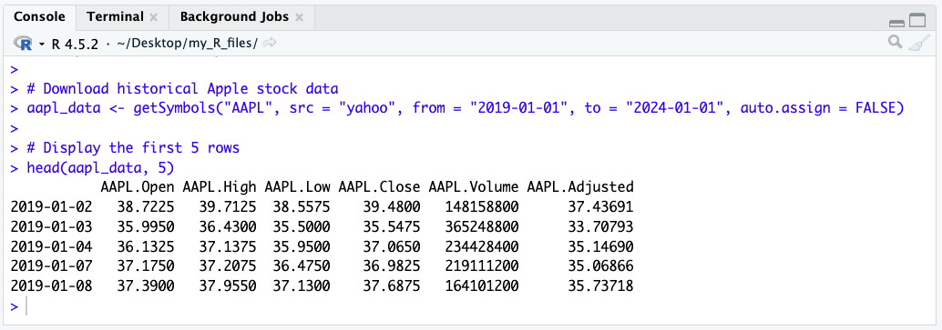
A screenshot from RStudio showing the output table of the getSymbols query

To keep things simple for this guide, we will focus strictly on the raw Close price. quantmod provides a convenient helper function called Cl() that instantly extracts just the closing price column from the dataset.

# Extract only the closing price
aapl_close <- Cl(aapl_data)
head(aapl_close, 3)

Add this code to your script, then highlight it with your mouse, and press run. Your RStudio should now display this:
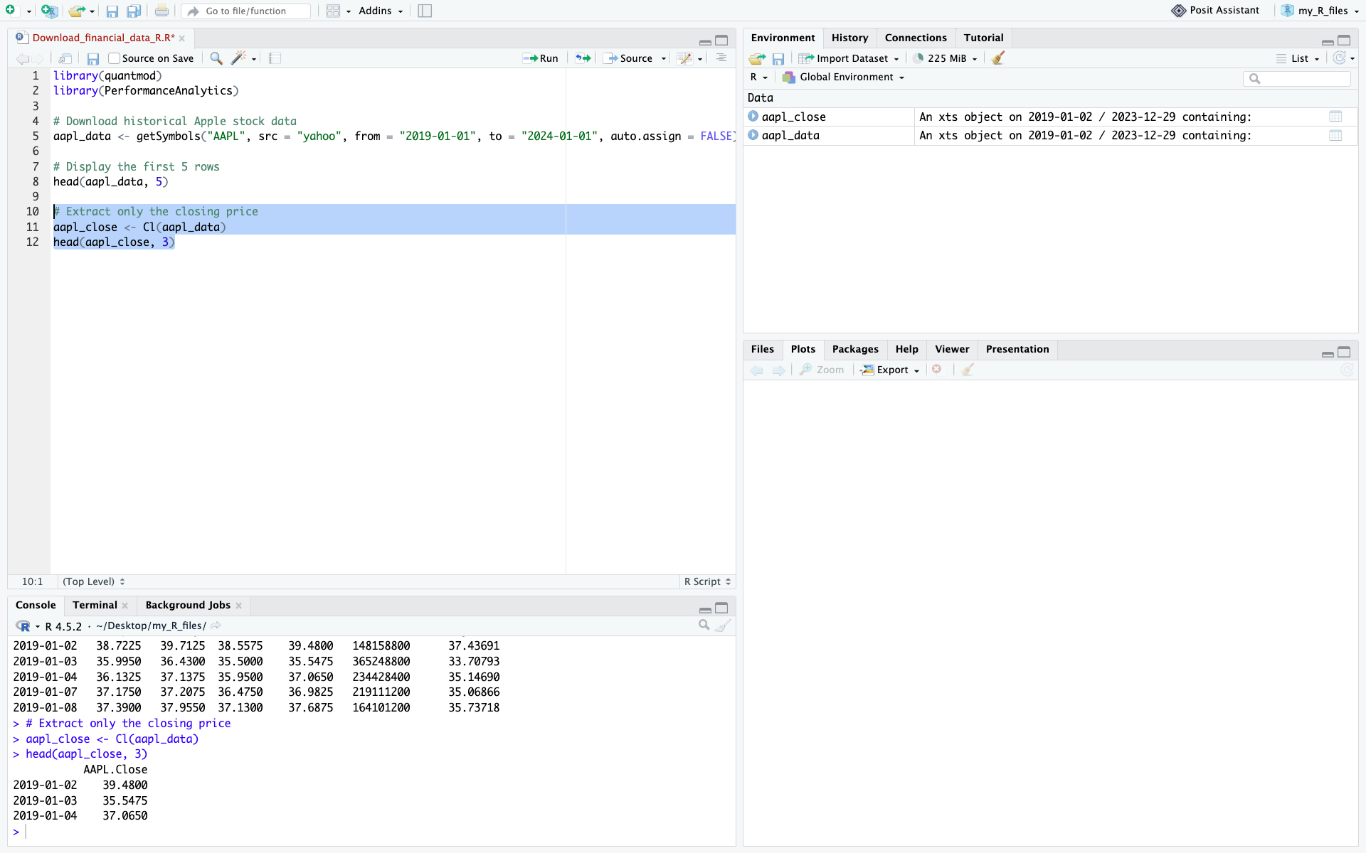
A screenshot from RStudio showing the new output

Step 4: Use more precise queries for historical context

As financial analysts, we routinely extract specific timeframes to understand how assets behave under macroeconomic stress. Because our data is stored as an xts object, R makes it incredibly easy to slice time-series data using date ranges.

For example, examining the COVID-19 market shock in early 2020 provides a useful illustration of extreme market volatility. Let’s isolate Apple’s stock specifically during the COVID-19 market shock and initial recovery (January to June 2020):

# Isolate the COVID-19 crash using xts date subsetting (YYYY-MM-DD/YYYY-MM-DD)
covid_crash <- aapl_close["2020-01-01/2020-06-30"]
 
# Plot the isolated data
plot(covid_crash, main = "AAPL Stock Price - COVID-19 Crash & Recovery", col = "red", lwd = 2)
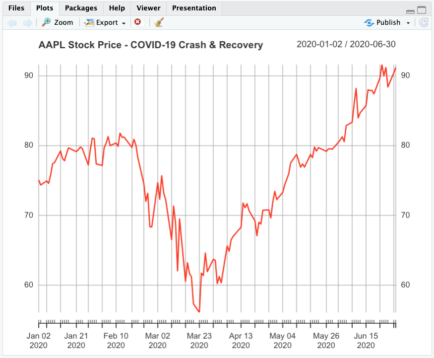
The output of the previous code cell showing the COVID crash

Step 5: Download the data for multiple stocks at the same time

Downloading multiple stocks is necessary for financial analysis that often requires comparing securities, analyzing sectors, or building a portfolio. Instead of issuing separate requests and risking misaligned dates, we can fetch all tickers at once.

Let’s download the data for six of the largest US banks: JPMorgan Chase, Bank of America, Wells Fargo, Citigroup, Goldman Sachs, and Morgan Stanley. Analyzing this sector is a classic way to measure the impact of interest rates on the broader economy.

# Define the major US bank tickers
bank_tickers <- c("JPM", "BAC", "WFC", "C", "GS", "MS")
 
# Download data into the global environment
getSymbols(bank_tickers, src = "yahoo", from = "2019-01-01", to = "2024-01-01")
 
# Extract only the closing prices and merge them into a single matrix
bank_prices <- merge(Cl(JPM), Cl(BAC), Cl(WFC), Cl(C), Cl(GS), Cl(MS))
 
head(bank_prices, 3)

The result is an xts object in which each column represents a stock and each row corresponds to a trading date.
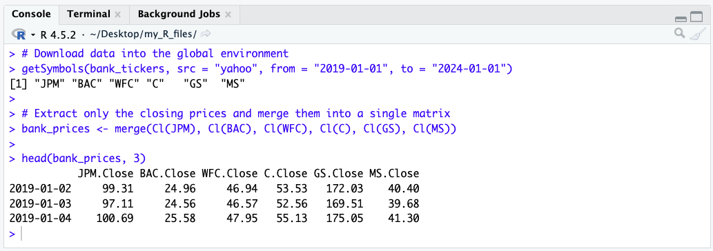
Screenshot of the output of the previous cell showing the US Banks matrix

This table format is ideal for portfolio analysis and benchmarking. To save it for external use, you can export it as a CSV file:

# Save the data frame as a CSV file
write.csv(as.data.frame(bank_prices), file = "us_banks_data.csv")

Now that you have successfully downloaded your financial data, let’s see how you can clean it and then use it.

Inspecting and cleaning the dataset

Financial datasets may contain missing values (NA) for various reasons, including trading suspensions, differences in trading calendars, listing dates, or data-provider issues. Missing observations should be identified before computing returns or risk measures, as they may affect subsequent calculations. For this introductory example, we simply remove rows containing missing values using na.omit(). In applied financial analysis, however, the appropriate treatment depends on the source of the missing data and the objective of the analysis.

In R, we can easily remove any rows containing missing data using the na.omit() function.

# Check for missing values (returns the total count)
sum(is.na(aapl_close))

# Clean missing values by dropping rows with NAs
aapl_close <- na.omit(aapl_close)

# View the last few rows of the cleaned data
tail(aapl_close, 5)
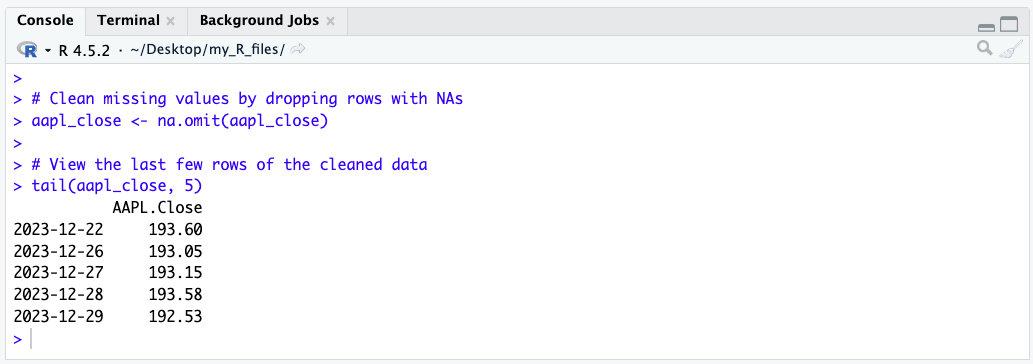
A screenshot from RStudio showing the output of the tail function

Vizualizing your data

Let’s create our first chart to visualize the evolution of Apple’s stock price using the chartSeries() function, which is built specifically for financial time series.

chartSeries(aapl_close, 
            name = "Apple Stock Price", 
            theme = chartTheme("white"), 
            TA = NULL) # TA = NULL removes technical indicators for a clean chart
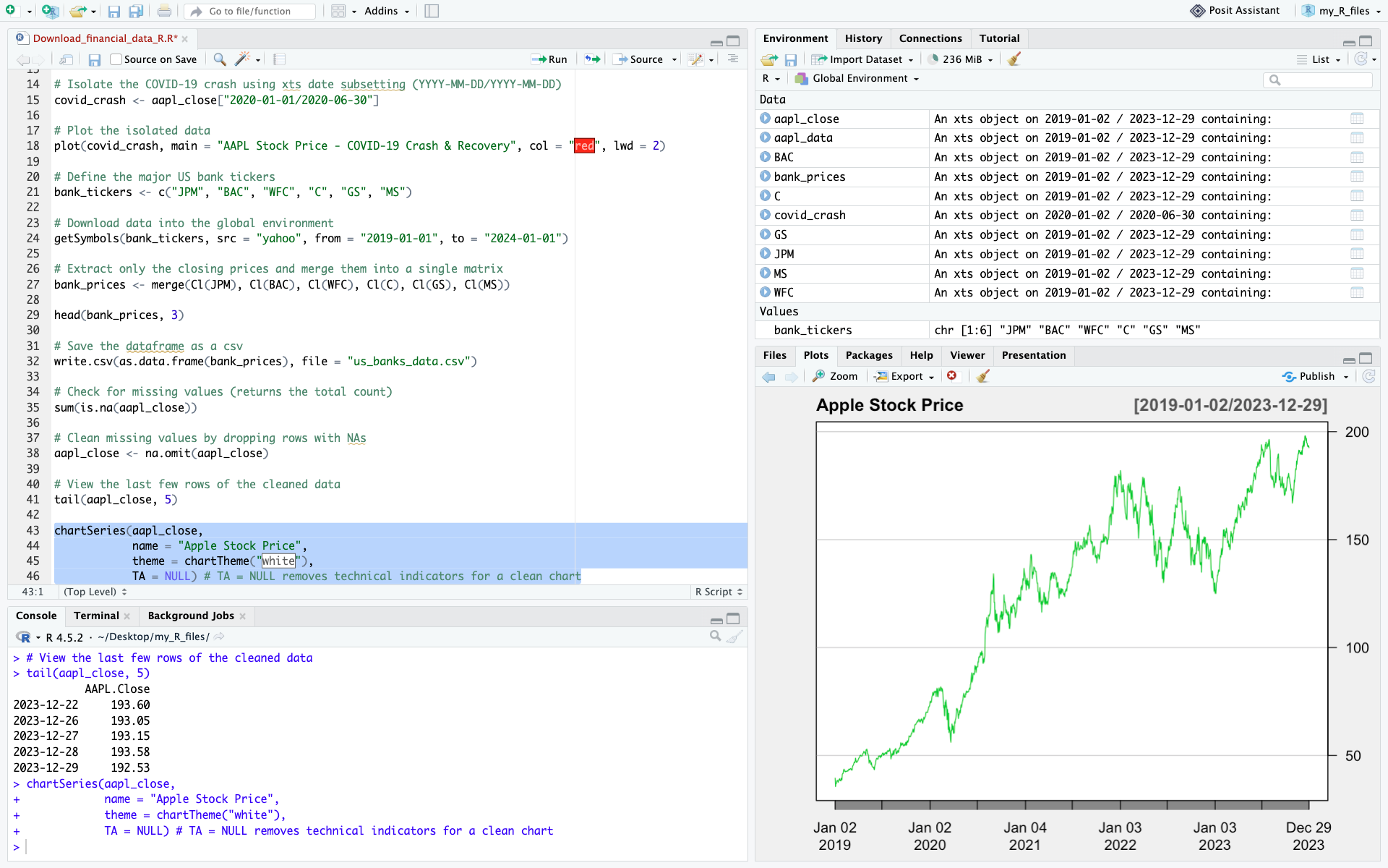
A screenshot of RStudio with the stock price visualization chart output

We have now:

  • Downloaded market data from Yahoo! Finance
  • Extracted the closing price and cleaned the data
  • Created a time-series plot to visualize stock prices

These core steps form the basis of empirical financial research and quantitative models.

Computing basic statistics and historical distributions

To evaluate stock performance and risk, we compute basic descriptive statistics. First, we calculate daily returns using the Return.calculate() function from the PerformanceAnalytics package.

# Calculate daily percentage returns (and remove the first NA row)
aapl_returns <- Return.calculate(aapl_close)
aapl_returns <- na.omit(aapl_returns)
 
# Compute summary statistics
mean_return <- mean(aapl_returns)
volatility <- sd(aapl_returns)
skew <- skewness(aapl_returns)
kurt <- kurtosis(aapl_returns)

print(paste("Mean Daily Return:", round(mean_return, 5)))
print(paste("Daily Volatility (Std Dev):", round(volatility, 4)))

Plotting historical distributions

Histograms display the frequency distribution of daily returns, helping us inspect distribution symmetry and tail risks.

# Return distribution histogram
hist(aapl_returns, breaks = 50, col = "salmon", main = "Historical Daily Return Distribution", xlab = "Daily Return")
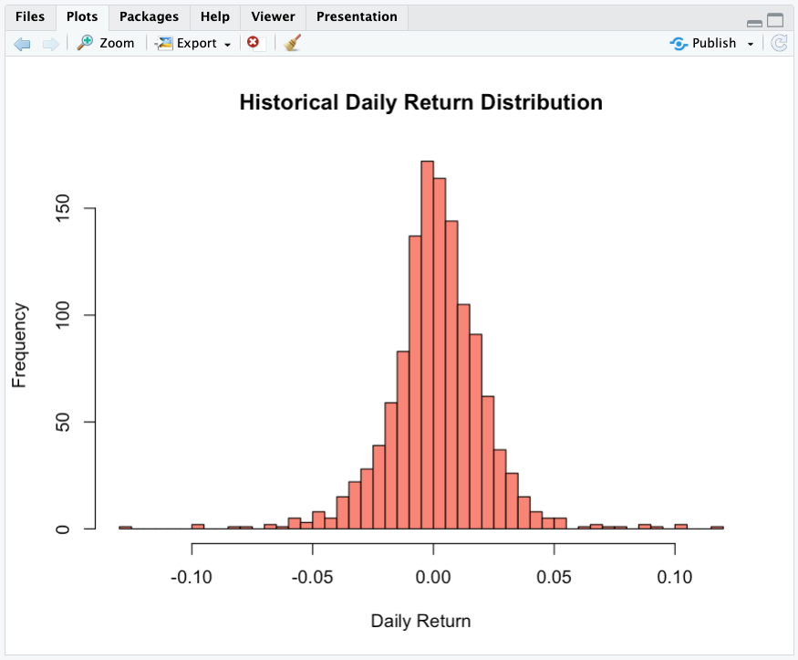
The output of the previous cell – distribution histogram

Normalizing stock prices and computing returns

All stocks have different nominal prices. If Tesla trades at $350 and Nvidia at $220, it does not mean that Tesla performed better. To establish an accurate comparison, we execute two fundamental computations:

  1. Price normalization: We normalize all historical time series to a base index of 100, ensuring a standardized starting point.
  2. Return calculation: We compute periodic returns to measure performance independently of the nominal price level.
# Clean any missing data
bank_prices <- na.omit(bank_prices)

# Harmonize prices to Base 100 (Divide every row by the first row, multiply by 100)
normalized <- sweep(bank_prices, MARGIN = 2, STATS = as.numeric(bank_prices[1,]), FUN = "/") * 100
 
# Plot the performance comparison
plot(normalized, legend.loc = "topleft", main = "Performance Comparison (Base = 100)", ylab = "Growth of $100")
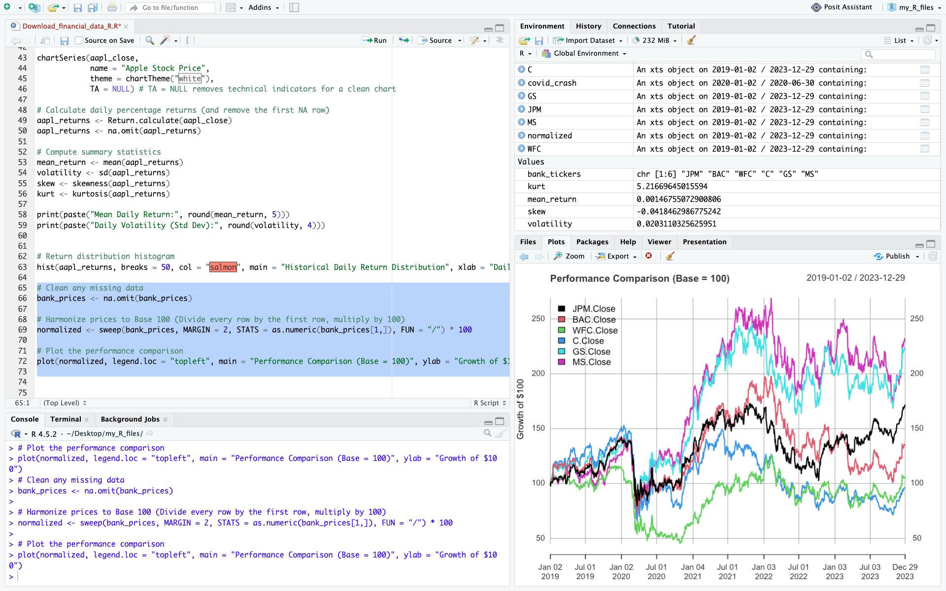
The output of the previous cell showing normalized prices

We can also compute daily returns across all stocks in one line:

bank_returns <- na.omit(Return.calculate(bank_prices))
head(bank_returns, 3)

This is a standard technique used by portfolio managers and equity analysts to compare growth trajectories.

Common pitfalls

When working with market data in R, beginners often run into the same issues:

  • Using the wrong ticker symbol
  • Comparing stocks without normalizing prices (Base 100)
  • Forgetting that markets are closed on weekends and holidays
  • Failing to clean and handle missing values (NA) using na.omit()
  • Using raw closing prices when adjusted prices are required: for long-term performance analysis, adjusted prices are generally preferable because they account for stock splits and dividends.

Overall, don’t forget to always inspect and clean your data before starting your analysis.

Exercises

Exercise 1: Basic data retrieval and price visualization (RACE)

Ferrari N.V. (RACE) presents an interesting case study in market dynamics: it is a car manufacturer that acts as a high-end luxury franchise. Its deliberate production scarcity, multi-year order backlogs, and immense pricing power decouple it from typical automotive boom-and-bust cycles.

Using the ticker symbol RACE, download the last five years of daily market data.

Your tasks:

  • Use the appropriate R functions to display the first 5 rows and the last 5 rows of the dataset to verify data integrity.
  • Extract the closing price and generate a line chart plotting the price over the entire 5-year period. Observe how its price trajectory reflects Ferrari’s distinctive positioning at the intersection of the automotive and luxury industries.

Exercise 2: time-series extraction and volume analysis on Tesla (TSLA)

Tesla is renowned for its high historical volatility and massive retail trading interest. The 2022-2024 window was particularly eventful for growth and electric vehicle stocks, marked by shifting supply chains and a rapid rise in interest rates.

Using the ticker symbol TSLA, extract the market data for the precise calendar period from January 1, 2022, to December 31, 2024 (using the from and to parameters).

Your tasks:

  • Identify the peak (highest closing price) and the trough (lowest closing price) over this period using the max() and min() functions.
  • Extract the Volume column (using Vo()) and calculate the average daily trading volume, a fundamental metric used by analysts to assess market liquidity.

Exercise 3: Comparative performance and risk profiling on Chinese tech companies

Chinese technology stocks often experience unique market cycles driven by distinct domestic regulatory environments and macroeconomic factors. Using the last five years of daily market data, compare the performance and risk characteristics of the following three US-listed ADRs:

  • Alibaba (BABA)
  • Baidu (BIDU)
  • PDD Holdings (PDD)

Questions:

  1. Which stock achieved the highest total cumulative return?
  2. Which stock was most volatile (highest standard deviation of daily returns)?
  3. Which one offered the best risk-adjusted profile over the period? Use the harpe ratio or any risk-adjusted measure

Download the solutions

To help you check your work and experiment further, you can download the complete R Script containing the full code, charts, and commentary for all exercises.

Download Solutions (.R Script)

What’s next?

Now that you know how to download financial data, compute returns, and analyze basic performance and risk measures in R, you are ready to delve into more advanced quantitative and corporate finance topics.

If you want to learn more about other programming languages, check out these two articles to learn how to install Python on your computer and use it to download financial data:

   ▶ Hadrien PUCHE How to Install and Run Python on Your Computer (A Step-by-Step Guide)

   ▶ Hadrien PUCHE How to download and model financial data with Python

About the Author

This article was written in September 2026 by Hadrien PUCHE (ESSEC Business School, Grande École Program, Master in Management, 2023-2027).

   ▶ Discover all posts by Hadrien PUCHE
How to download and model financial data with Python

Hadrien Puche

Any financial analysis starts with data. Whether you want to analyze a stock, build a portfolio, measure risk, create a valuation model or develop trading strategies, the first step is always the same: obtaining financial data.

You could download data manually from websites such as Yahoo! Finance or Investing.com, but this quickly becomes tedious and time-consuming. It also limits the amount of data you can work with.

Python allows us to automate this process and retrieve large amounts of financial information in just a few lines of code.

In this article, Hadrien Puche (ESSEC Business School, Grande École Program, Master in Management, 2023-2027) will help you understand how to:

  • Download historical stock prices with Python
  • Explore and visualize market data
  • Compute basic statistics and historical distributions
  • Compare multiple securities
  • Learn more about the CAPM
  • Build the foundation needed for more advanced financial analysis

What financial data can we download?

Financial professionals use many different categories of data across individual assets as well as portfolios and funds.

Market data

  • Individual asset prices (e.g., individual stocks, corporate bonds)
  • Portfolios and funds (e.g., ETFs, mutual funds)
  • Currency exchange rates
  • Commodity prices
  • Bond yields

Company fundamentals

  • Revenue
  • Earnings
  • Margins
  • Cash flows

Macroeconomic data

  • Inflation
  • Interest rates
  • GDP growth
  • Unemployment

Alternative data

  • News
  • Social media sentiment
  • Satellite imagery
  • Credit card spending

Not all data sources are freely available. Many professional investors rely on paid platforms such as Bloomberg, FactSet, Capital IQ or Morningstar to access standardized, high-frequency, and point-in-time data.

Fortunately, stock market data specifically can easily be accessed for free using Python for research and learning purposes.

In this article, we will use the open-source yfinance library to download historical market data that you will then be able to model and use for any financial analysis project you may have.

A step-by-step guide

Follow the next steps to download your first financial data with Python 🙂

Step 1: Installing the required libraries

If you have not yet installed Python, refer to the setup guide to configure your execution environment (such as Jupyter Notebook or Anaconda).

Once your environment is ready, install the required packages:

pip install yfinance pandas numpy matplotlib

or inside Jupyter Notebook:

!pip install yfinance pandas numpy matplotlib

We will use:

  • yfinance to retrieve market data
  • pandas to manipulate data structures
  • numpy for financial and mathematical operations
  • matplotlib to create charts

Step 2: Import our Python packages

Most data analysis scripts begin by importing the packages required for the analysis. In Python, packages provide reusable code and functionality that extend Python’s core capabilities.

import yfinance as yf
import pandas as pd
import numpy as np
import matplotlib.pyplot as plt

The aliases (yf, pd, np, plt) make the code shorter and easier to read.

Step 3: Download our first data set

To download financial data, we use ticker symbols, which identify securities or market instruments within a given exchange or data provider. For example, AAPL represents Apple.

When calling a Python function, we can customize its behavior by passing arguments such as period (e.g., "5y" for 5 years) or specific start and end dates.

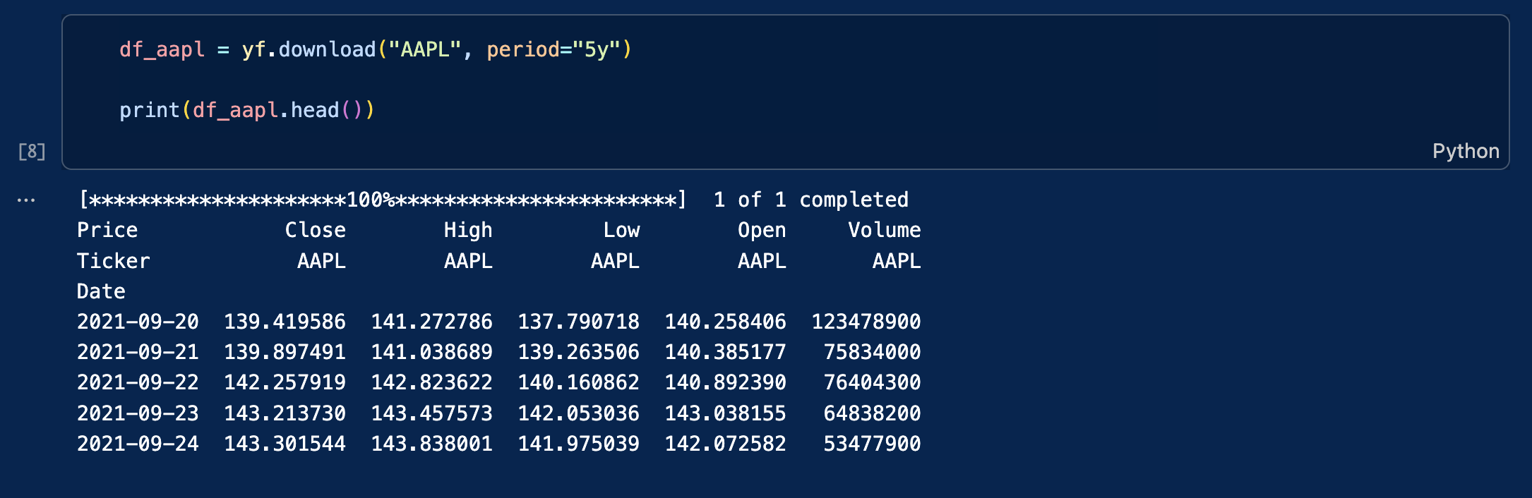
As an example, let us download daily data for Apple stock price over the last five years (Yahoo! Finance ticker: AAPL). The data will be stored in a data frame (df) that we can name df_apple.

df_aapl = yf.download("AAPL", period="5y")

print(df_aapl.head())

You will obtain this table with the following columns:

  • Close: closing price at the end of the trading day
  • High: highest price during the trading day
  • Low: lowest price during the trading day
  • Open: opening price at the beginning of the trading day
  • Volume: transaction volume during the trading day

An screenshot from VSC showing the output table of this Yfinance query

The data is stored in a Pandas DataFrame. This is a popular two-dimensional, tabular data structure with labeled axes (rows and columns).

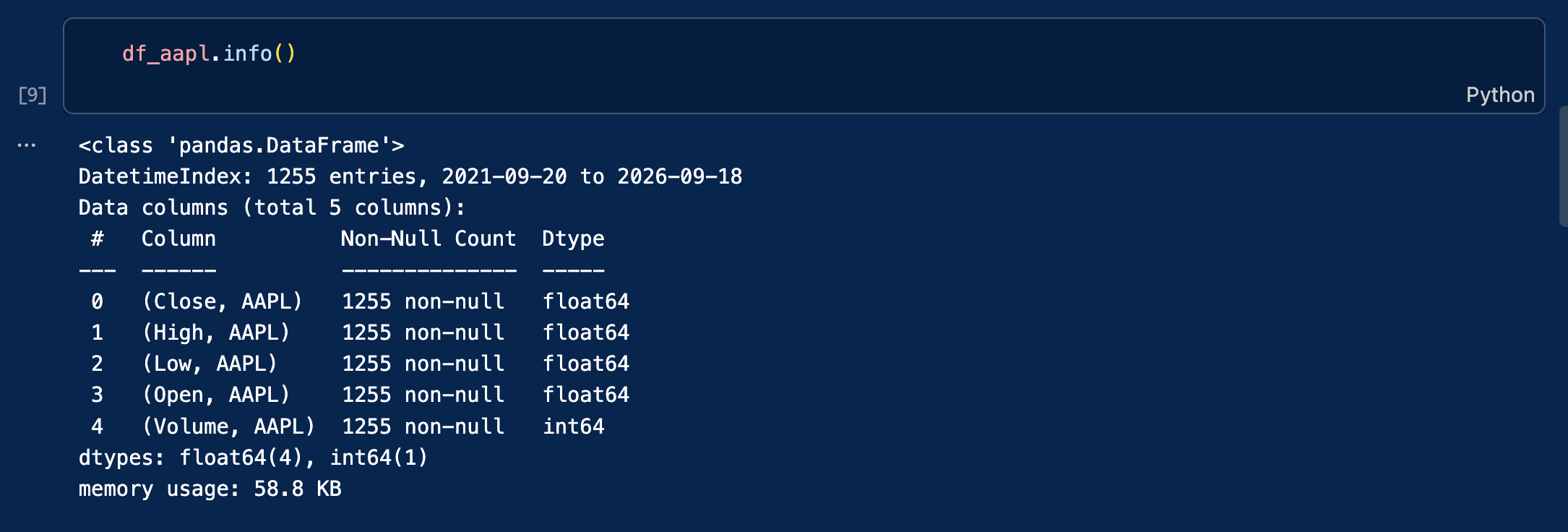
To inspect its structure, type the following code:

df_aapl.info()

A screenshot from VSC showing the output of df_aapl.info()

Step 4: Using more precise queries for historical context

Instead of downloading a rolling period (like “5y”), we can isolate specific market events by passing exact start and end dates to the download function. As financial analysts, we routinely extract specific timeframes to understand how assets behave under macroeconomic stress.

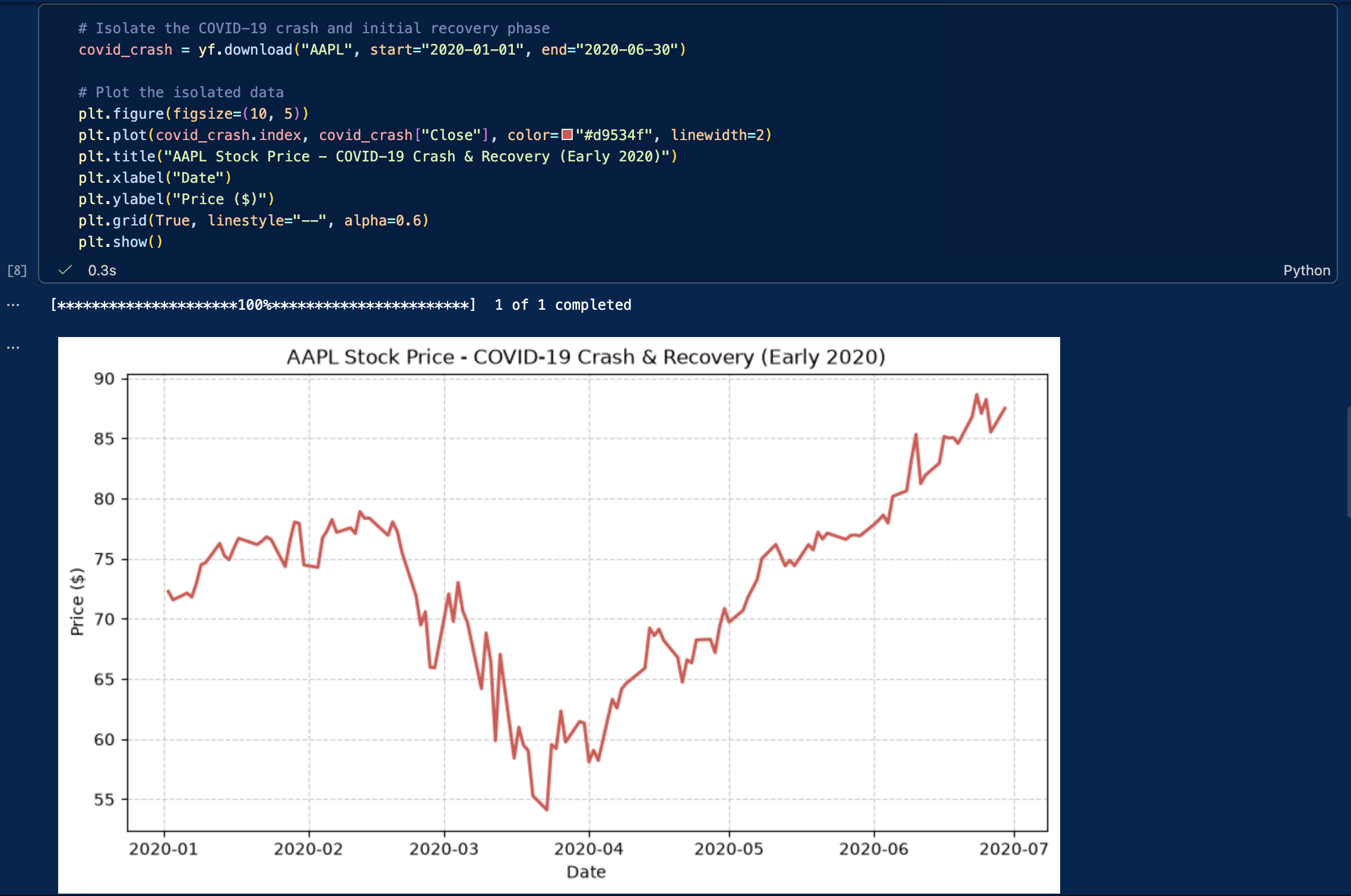
For example, analyzing the COVID-19 market crash in early 2020 offers invaluable insights into extreme volatility, liquidity crunches, and rapid V-shaped recoveries. Let’s download and plot Apple’s stock specifically during the height of the pandemic shock (January to June 2020):

# Isolate the COVID-19 crash and initial recovery phase
covid_crash = yf.download("AAPL", start="2020-01-01", end="2020-06-30")

# Plot the isolated data
plt.figure(figsize=(10, 5))
plt.plot(covid_crash.index, covid_crash["Close"], color="#d9534f", linewidth=2)
plt.title("AAPL Stock Price - COVID-19 Crash & Recovery (Early 2020)")
plt.xlabel("Date")
plt.ylabel("Price ($)")
plt.grid(True, linestyle="--", alpha=0.6)
plt.show()

The output of the previous code cell

We could use this same technique to analyze other pivotal periods, such as:

  • A central bank interest rate tightening cycle (e.g., the Fed’s 2022-2023 rate hikes)
  • The 2008 Global Financial Crisis (if analyzing older datasets)
  • Specific earnings announcement windows

Step 5: Downloading multiple stocks at the same time

Downloading multiple stocks is necessary for financial analysis that often requires comparing securities, building a portfolio, or testing trading strategies like pairs trading.

Instead of issuing separate requests for each stock (which risks hitting API rate limits or misaligning dates), it is far more efficient to fetch all tickers at once in a single batch query.

To make this practical, let’s download the data for the “Magnificent Seven”. These seven mega-cap tech companies (Apple, Microsoft, Alphabet, Amazon, Meta, Nvidia, and Tesla) have heavily dominated market capitalization and driven a massive portion of the S&P 500’s returns in recent years.

# Define the Magnificent 7 tickers
mag7_tickers = ["AAPL", "MSFT", "GOOGL", "AMZN", "META", "NVDA", "TSLA"]

# Download the closing prices for all 7 stocks simultaneously
prices = yf.download(mag7_tickers, period="5y")["Close"]
 
print(prices.head())

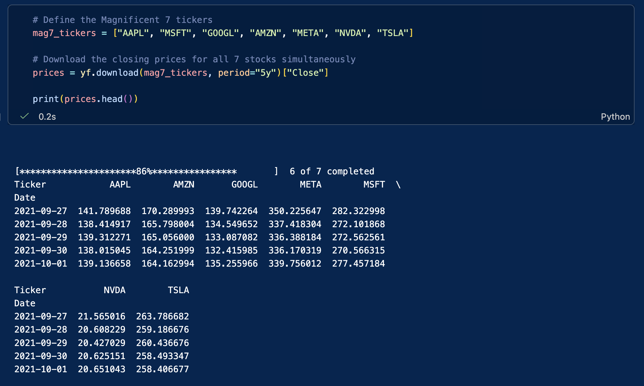
The result is now again a matrix where each column represents a stock, and each row represents a trading day.

Screenshot of the output of the previous cell

This table format is ideal for portfolio analysis, benchmarking, and performance comparisons, and can be used to draw any kind of graphs.

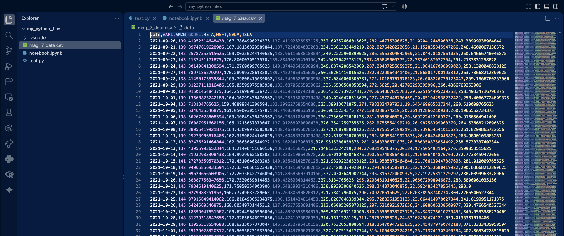
Note that the table’s columns are displayed in two groups. Depending on the display width, Jupyter Notebook or VS Code may wrap or truncate wide DataFrames. You can export the DataFrame to a CSV file if you prefer to inspect the complete dataset in a spreadsheet application.

# save the dataframe as a csv
prices.to_csv('mag_7_data.csv')

Screenshot of the output of the previous cell

Now that you successfully downloaded your financial data, let’s see how you can clean it and then use it.

Inspecting and cleaning the dataset

Financial datasets may contain missing values (NaN) for various reasons, including differences in trading calendars, trading suspensions, listing dates, or data-provider issues. Missing observations should be identified before computing returns or risk measures. For this introductory example, we simply remove rows containing missing values. In applied financial analysis, however, the appropriate treatment depends on the source of the missing data and the objective of the analysis.

If left unaddressed, these missing data points will break your mathematical functions and severely distort your return and volatility calculations. The code below checks how many missing values exist in each column, and then removes (drops) any rows containing them. In some situations you might want to forward-fill these gaps to preserve the timeline, but dropping them is the safest thing to do for now.

# Check for missing values
print(df_aapl.isnull().sum())
# Clean missing values by dropping rows with NaNs
df_aapl = df_aapl.dropna()
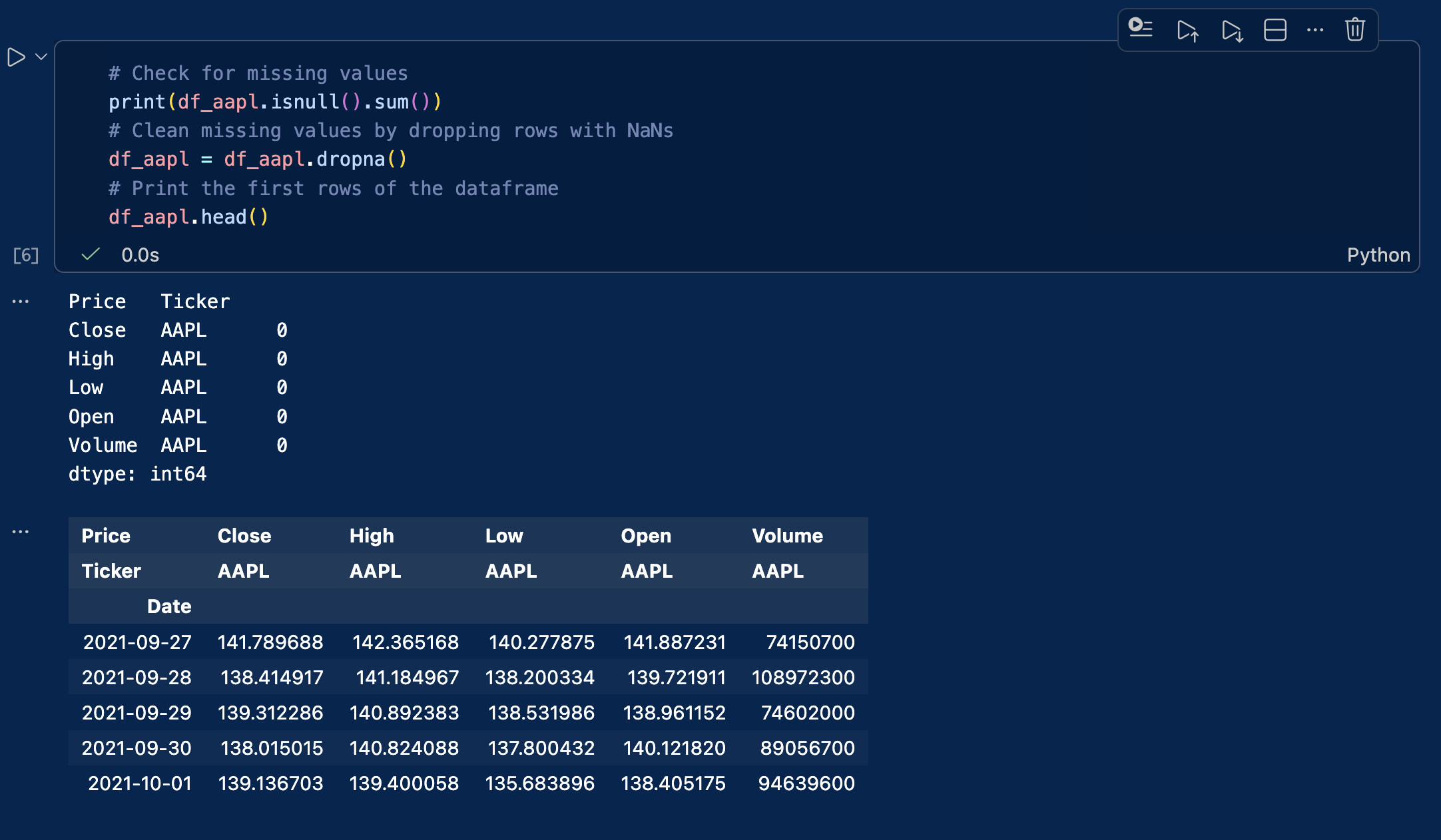
# Print the first rows of the dataframe
df_aapl.head()
df_aapl.head()

A screenshot from VSC showing the output of the cleaning code cell

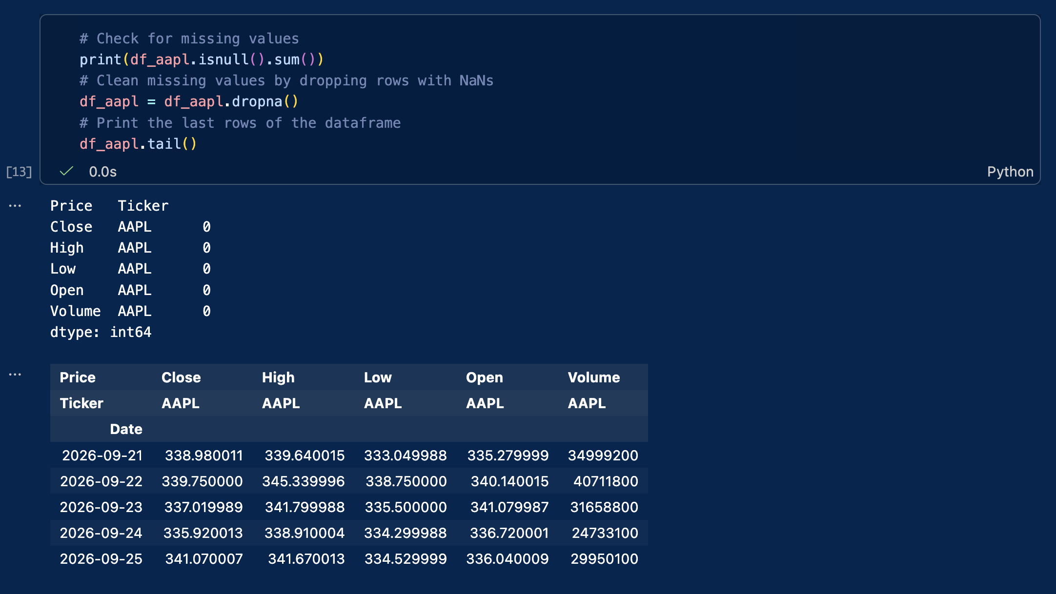
To view the last rows of the dataframe, replace head() by tail():

Output of the VSC cell when we switch to tail()

Visualizing the stock price with graphs or charts

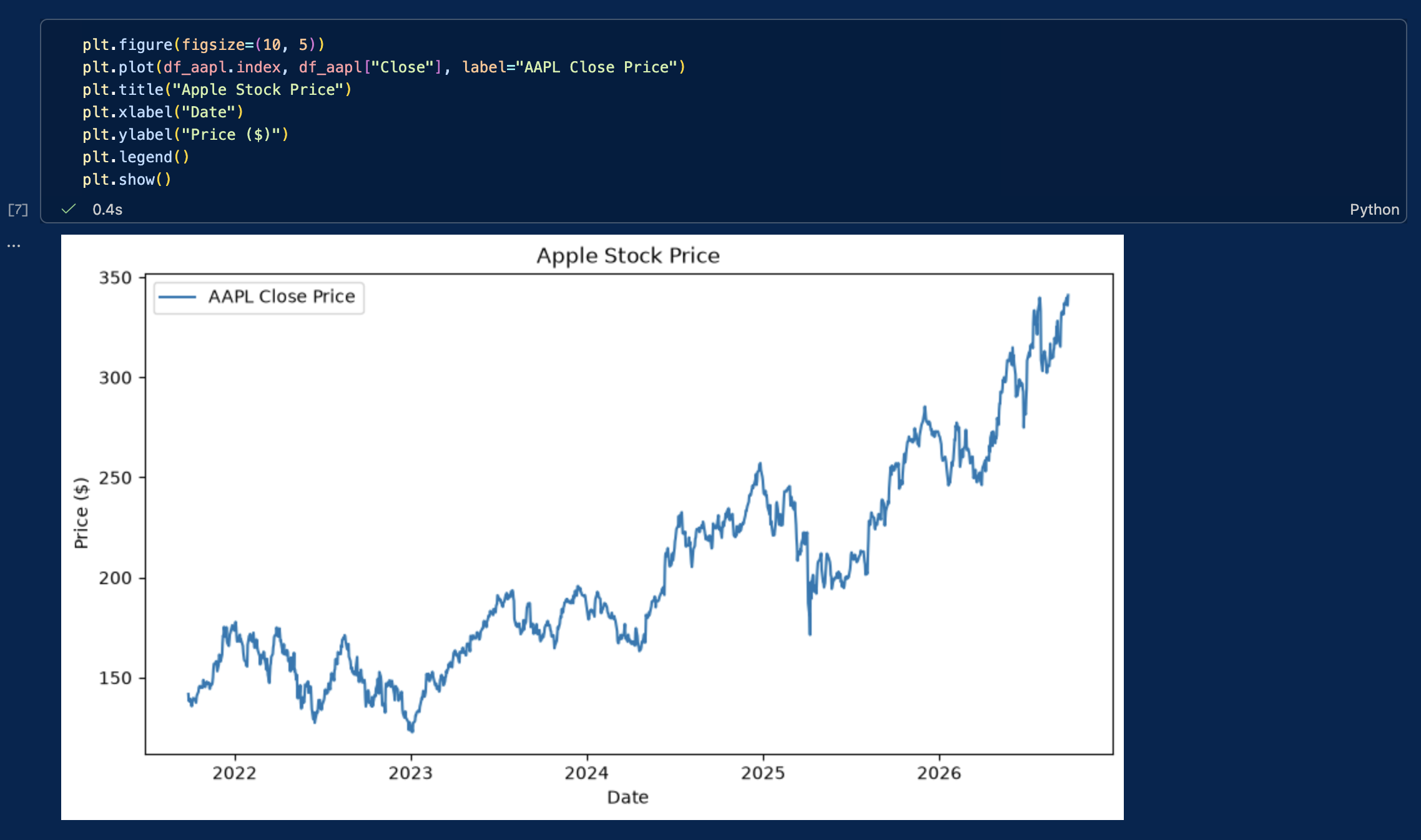
Let’s create our first graph to visualize the evolution of Apple’s stock price.

plt.figure(figsize=(10, 5))
plt.plot(df_aapl.index, df_aapl["Close"], label="AAPL Close Price")
plt.title("Apple Stock Price")
plt.xlabel("Date")
plt.ylabel("Price ($)")
plt.legend()
plt.show()

A screenshot of VSC with the stock price visualization cell output

We have now:

  • Downloaded market data from Yahoo! Finance
  • Stored and cleaned the data in a dataframe
  • Created a time-series plot to visualize stock prices

These core steps form the basis of empirical financial research and quantitative models.

Computing basic statistics & historical distributions

To evaluate stock performance and risk, we compute basic descriptive statistics for both prices and financial returns: minimum, maximum, mean, variance, standard deviation, skewness, and kurtosis. Although descriptive statistics can also be computed for price levels, risk analysis generally focuses on returns, whose distributions are more economically meaningful.

# Calculate daily percentage returns
df_aapl['Return'] = df_aapl['Close'].pct_change()

# Compute summary statistics for Price and Returns
stats_df = pd.DataFrame({
    'Metric': ['Min', 'Max', 'Mean', 'Variance', 'Std Dev', 'Skewness', 'Kurtosis'],
    'Price ($)': [
        df_aapl['Close'].min().item(),
        df_aapl['Close'].max().item(),
        df_aapl['Close'].mean().item(),
        df_aapl['Close'].var().item(),
        df_aapl['Close'].std().item(),
        df_aapl['Close'].skew().item(),
        df_aapl['Close'].kurtosis().item()
    ],
    'Daily Return': [
        df_aapl['Return'].min().item(),
        df_aapl['Return'].max().item(),
        df_aapl['Return'].mean().item(),
        df_aapl['Return'].var().item(),
        df_aapl['Return'].std().item(),
        df_aapl['Return'].skew().item(),
        df_aapl['Return'].kurtosis().item()
    ]
})

print(stats_df)

Plotting historical distributions

Histograms display the frequency distribution of prices and daily returns, helping us inspect price trends, distribution symmetry, and tail risks.

fig, axes = plt.subplots(1, 2, figsize=(14, 5))

# Price distribution
axes[0].hist(df_aapl['Close'].dropna(), bins=30, color='skyblue', edgecolor='black')
axes[0].set_title('Historical Price Distribution')
axes[0].set_xlabel('Price ($)')
axes[0].set_ylabel('Frequency')

# Return distribution
axes[1].hist(df_aapl['Return'].dropna(), bins=50, color='salmon', edgecolor='black')
axes[1].set_title('Historical Daily Return Distribution')
axes[1].set_xlabel('Daily Return')
axes[1].set_ylabel('Frequency')

plt.tight_layout()
plt.show()

Normalizing stock prices and computing returns

All stocks have different nominal prices. If Tesla trades at $350 and Nvidia at $220, it does not mean that Tesla is worth more than Nvidia or performed better.

To establish an accurate comparison across these assets, we must execute two fundamental computations:

  1. Price harmonization: we normalize all historical time series to a base index of 100, to ensure a standardized starting point.
  2. Return calculation: we compute the periodic returns to get the actual performance in % rather than the absolute variation.
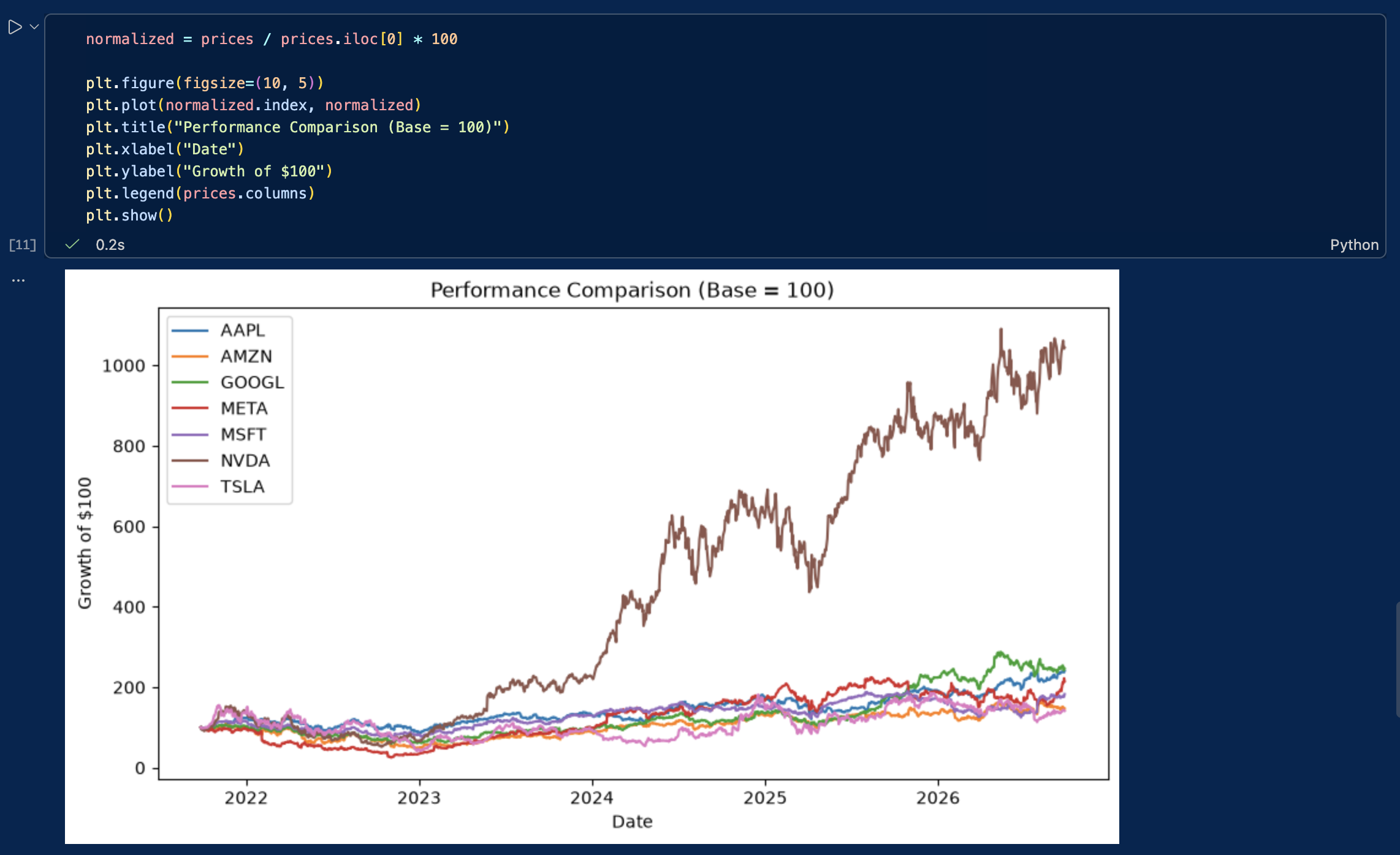
normalized = prices / prices.iloc[0] * 100

plt.figure(figsize=(10, 5))
plt.plot(normalized.index, normalized)
plt.title("Performance Comparison (Base = 100)")
plt.xlabel("Date")
plt.ylabel("Growth of $100")
plt.legend(prices.columns)
plt.show()

the output of the previous cell

We can also compute daily returns across all stocks:

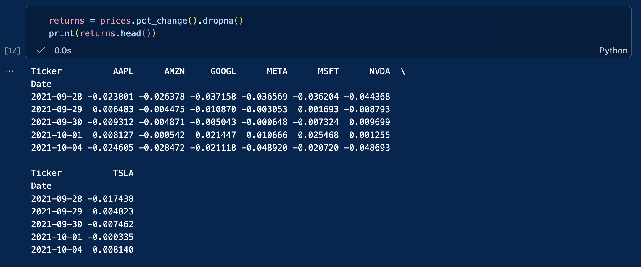
returns = prices.pct_change().dropna()
print(returns.head())

the output of the previous cell

The chart now shows how much each investment would have grown from the same starting value.

This is a standard technique used by portfolio managers and equity analysts.

Case study: the Capital Asset Pricing Model (CAPM)

In empirical finance, evaluating an individual asset requires isolating the return generated by the broader market from the return specific to the company itself. The Capital Asset Pricing Model (CAPM) provides the foundational framework to decompose this risk.

The model decomposes the return of an individual asset over a given time period into three components: the risk-free rate, a market systematic factor and a firm-specific factor. The model is expressed through the following equation:

rt = rf + β(rm – rf) + εt

Where:

  • rt is the return of the stock (e.g., Apple).
  • rf is the risk-free interest rate (e.g., the 13-week Treasury Bill, ^IRX).
  • β (Beta) represents the stock’s sensitivity to market movements (systematic risk).
  • rm – rf is the excess return of the market index (e.g., the S&P 500, ^GSPC).
  • εt (Epsilon) represents the idiosyncratic return associated with firm-specific risk not explained by the market.

By downloading these three time series simultaneously, we can calculate the stock’s Beta and isolate its firm-specific residual risk.

# Download asset (AAPL), market benchmark (S&P 500), and risk-free rate (13-week T-Bill)
market_data = yf.download(["AAPL", "^GSPC", "^IRX"], start="2022-01-01", end="2024-12-31")["Close"].dropna()

# Compute daily percentage returns for the stock and the market
returns_df = market_data[["AAPL", "^GSPC"]].pct_change().dropna()
 
# Convert the annualized risk-free yield (^IRX) to a daily rate
daily_rf = (market_data["^IRX"] / 100) / 252
returns_df["Rf"] = daily_rf
 
# Calculate the excess returns: (r_t - r_f) and (r_m - r_f)
excess_aapl = returns_df["AAPL"] - returns_df["Rf"]
excess_market = returns_df["^GSPC"] - returns_df["Rf"]
 
# Compute Market Beta: Covariance(stock, market) / Variance(market)
cov_matrix = np.cov(excess_aapl, excess_market)
beta = cov_matrix[0, 1] / cov_matrix[1, 1]
 
# Isolate Epsilon (the firm-specific residual risk)
# Rearranging the CAPM equation: epsilon = (r_t - r_f) - beta * (r_m - r_f)
epsilon = excess_aapl - (beta * excess_market)
 
print(f"Calculated Beta: {beta:.4f}")
print(f"Mean Firm-Specific Return (Epsilon): {epsilon.mean():.6f}")
print(f"Idiosyncratic Risk (Epsilon Std Dev): {epsilon.std():.4f}")

Common pitfalls

When working with market data, beginners often run into the same issues:

  • Using the wrong ticker symbol
  • Comparing stocks without normalizing prices
  • Forgetting that markets are closed on weekends and holidays
  • Failing to clean and handle missing values (NaN) in the dataset
  • Failing to check whether price series are raw or adjusted for stock splits and dividends

Overall, always inspect and clean your data before starting your analysis.

Exercises

Exercise 1: Basic data retrieval and price visualization (MSFT)

Microsoft is a mature mega-cap technology company, and a cornerstone of most global equity portfolios. Retrieving and inspecting its historical data is a perfect starting point to practice basic YFinance commands.

Using the ticker symbol MSFT, download the last five years of daily market data.

Your tasks:

  • Use the appropriate pandas functions to display the first 5 rows and the last 5 rows of the dataset to verify data integrity (checking for correct start/end dates).
  • Generate a line chart plotting the closing price over the entire 5-year period to visualize its long-term market trend.

Exercise 2: time-series extraction and volume analysis on Tesla (TSLA)

Tesla is renowned for its high historical volatility and massive retail trading interest. The 2022-2024 window was particularly eventful for growth and electric vehicle stocks, marked by shifting supply chains and a rapid rise in interest rates. Isolating this exact timeframe allows us to analyze the stock’s behavior under changing macroeconomic conditions.

Using the ticker symbol TSLA, extract the market data for the precise calendar period from January 1, 2022, to December 31, 2024 (using the start and end parameters).

Your tasks:

  • Identify the peak (highest closing price) and the trough (lowest closing price) over this period to grasp the magnitude of the stock’s price swings.
  • Calculate the average daily trading volume, a fundamental metric used by analysts to assess market liquidity and ongoing investor interest.

Exercise 3: Comparative performance and risk profiling on Chinese tech companies

Chinese technology stocks often experience unique market cycles driven by distinct domestic regulatory environments and macroeconomic factors. Using their US-listed ADRs (American Depositary Receipts), compare the performance and risk characteristics of three major players over the last five years:

  • Alibaba (BABA)
  • Baidu (BIDU)
  • PDD Holdings (PDD)

Questions:

  1. Which stock achieved the highest total cumulative return?
  2. Which stock was most volatile (highest standard deviation of daily returns)?
  3. Which one offered the best risk-adjusted profile (e.g., highest Sharpe ratio) over the period?

Download the solutions

To help you check your work and experiment further, you can download the complete Jupyter Notebook containing the full code, charts, and commentary for all exercises.

Download Solutions (.ipynb)

Once downloaded, change the file’s extension from .txt to .ipynb and open it in Visual Studio code.

What’s next?

Now that you know how to download financial data, perform basic computations, and control for market risk, you are ready to delve into advanced quantitative and corporate finance topics.

About the author

This article was written in September 2026 by Hadrien PUCHE (ESSEC Business School, Grande École Program, Master in Management, 2023-2027).

   ▶ Discover all posts by Hadrien PUCHE