Bollinger Bands

In this article, Jayati WALIA (ESSEC Business School, Grande Ecole Program – Master in Management, 2019-2022) presents the popular Bollinger bands used in technical analysis.
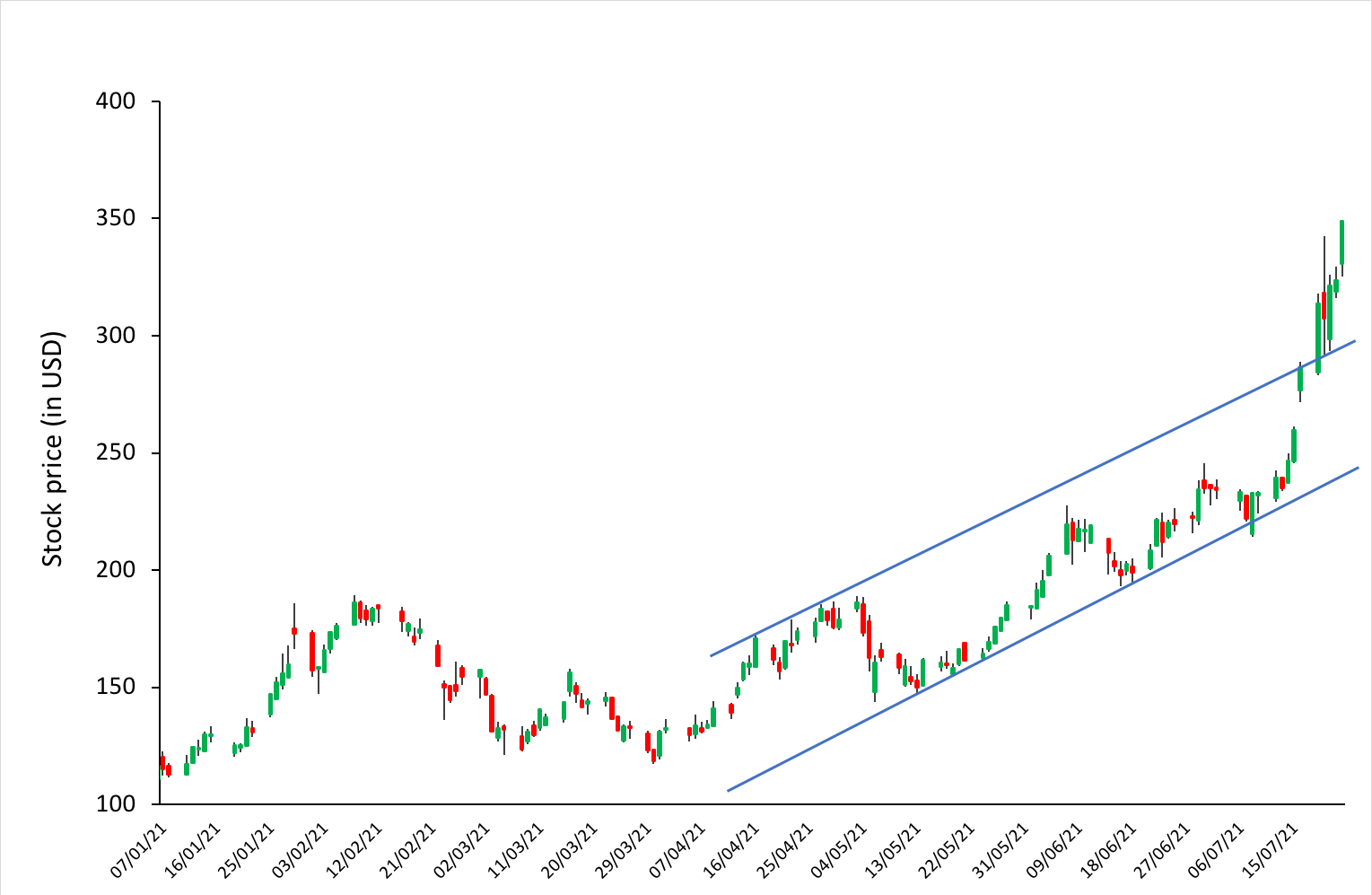
This post is organized as follows: we introduce the concept of Bollinger bands and provide an illustration with Apple stock prices. We delve into the interpretation of Bollinger bands as port and resistance price levels used to define buy and sell trading signals. We then present the techniques to compute the Bollinger bands and finally discuss their limitations.
Introduction
In the 1980s, John Bollinger, a long-time market technical analyst, developed a technical analysis tool for trading in securities. At that time, it was presumed that volatility was a static quantity, a property of a security, and if it changed at all, it would happen in a long-term period. After some experimentation, Bollinger figured that volatility was indeed a very dynamic quantity and a moving average computed on a time period (typically 20 days) with bands drawn above and below at intervals could be determined by a multiple of standard deviation.
Unlike a percentage calculation from a simple moving average, Bollinger bands simply add and subtract a standard deviation (or a multiple of the standard deviation, usually two). The tool thus represents the volatility in the prices of the security which is measured by the standard deviation of the prices of the security. The bands are used to understand the overbought or oversold levels for a security and to follow the price trends. The indicator/tool comprises of three main bands, an upper band, a lower band, and a middle band.
The middle band is a simple moving average (SMA), which is usually computed over a rolling period of 20 trading days (about a calendar month). The upper and the lower bands are positioned two standard deviations away from the SMA. The change in the distance of the upper and lower bands from the SMA determine the price strength (which is the strength of price trend of stock relative to overall market trend) and the lower and the upper levels for the stock prices. Bollinger bands can be applied to all financial securities traded in the market including equities, forex, commodities, futures, etc. They are used in multiple time frames (daily, weekly and monthly) and can be even applied to very short-term periods such as hours.
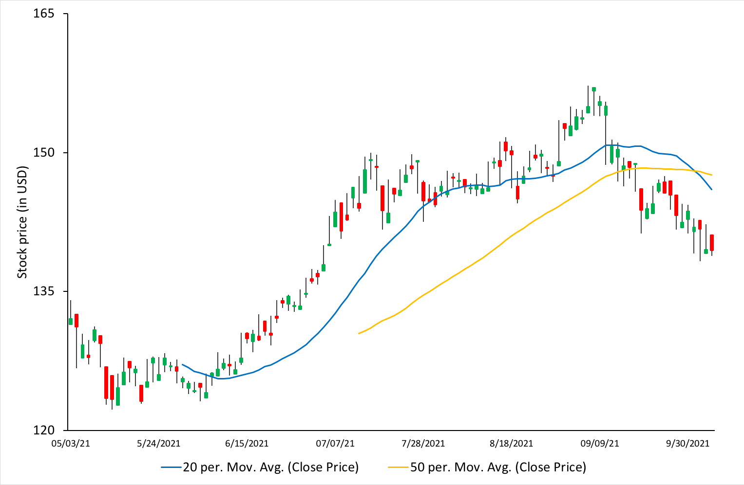
Figure 1 represents the evolution of the price of Apple stocks with the Bollinger bands for the period January 2020 – September 2021.
Figure 1. Bollinger bands on Apple stock.
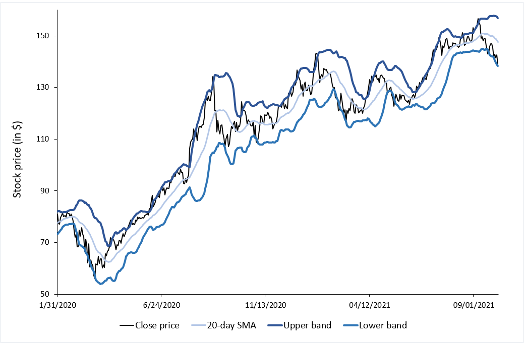
Source: computation by the author (data source: Bloomberg).
Figure 2 illustrates for the price of Apple stocks the link between the Bollinger bands and volatility measured by the standard deviation of prices. The lower the volatility, the narrower the bands.
Figure 2. Bollinger’s bands and volatility
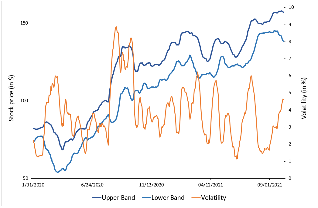
Source: computation by the author (data source: Bloomberg).
How to interpret Bollinger bands
Traders use the Bollinger bands to determine the strength of the price trend of a stock. The upper and lower bands measure the degree of volatility in prices over time. The width between the bands widens as the volatility in the stock prices increases and indicates a strong trend in the price movement. Conversely, the width between the bands narrows as the volatility decreases, indicating that the price of the security is range-bound. When this width is extremely narrow and contracting, it indicates that there can be a potential breakout in the price movement soon and is referred to as “Bollinger squeeze”. If the price crosses the upper band, it may indicate that the movement will be in an uptrend, and If the price crosses the lower band, it may indicate that the movement will be in a downtrend.
If the price hits the upper band, it indicates an overbought level in the security, and when the price hits the lower band, it indicates an oversold level. When the price crosses the upper band, traders consider it to a positive signal to buy the stock as the price trend is in an upward direction and shows great strength. Similarly, when the price crosses the lower band, traders consider it to a positive signal to sell the stock as the price trend is in a downward direction and shows great strength.
In other words, Bollinger bands act as dynamic resistance and support levels for the price of the security. Thus, once prices touch either of the upper or lower band levels, they tend to return back to the middle of the band. This phenomenon is referred to as the “Bollinger bounce” and many traders rely extensively on this strategy when the market is ranging and there is no clear trend that they can identify.
Calculation
The three bands of the Bollinger bands are calculated using the following formula:
Middle Band
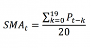
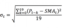
The middle band is the simple moving average (SMA) over a 20-day rolling period. To calculate the SMA, we compute the average of the closing prices of the stock over the past 20 days.
To compute the upper and lower bands, we need first to compute the standard deviation of prices.
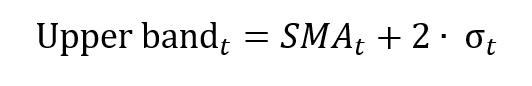
Upper band
The upper band is calculated by adding the SMA and the standard deviation times two:
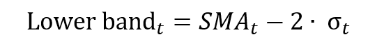
Lower band
The lower band is calculated by subtracting the standard deviation times two from the SMA:
Limitations of Bollinger bands
Bollinger bands are considered to be lagging indicators since they represent the simple moving average which is based on the historical stock prices. This means that the indicator is not very useful in predicting the future price patterns as the indicator signals a price trend when it has already started to happen.
To benefit from the Bollinger bands, traders often combine this indicator with other technical tools like the Relative Strength Index (RSI), Stochastic indicators and Moving Averages Convergence-Divergence (MACD).
Related Posts
▶ Jayati WALIA Trend Analysis and Trading Signals
▶ Jayati WALIA Moving averages
▶ Jayati WALIA Standard deviation
Useful resources
Fidelity: Technical Indicators: Bollinger Bands
About the author
The article was written in November 2021 by Jayati WALIA (ESSEC Business School, Grande Ecole Program – Master in Management, 2019-2022).