

In this article, Jayati WALIA (ESSEC Business School, Grande Ecole Program – Master in Management, 2019-2022) presents an overview of trend analysis and trading signals in stock price movements.
This post is organized as follows: we introduce the concept of trends used in technical analysis and its link with support and resistance price levels used to define buy and sell trading signals. Then, we present the different types of trends and discuss the time frame for their analysis. Trends based on straight lines, moving averages and the Fibonacci method are presented in detail with examples using Moderna, Intel, Adobe and Apple stock prices.
Introduction
Trend Analysis is one of the most important areas of technical analysis and is key to determining the overall direction of movement of any financial security. The analysis of trends in asset prices is used to find support and resistance price levels and in fine generate buy and sell trading signals when these support and resistance price levels are broken.
Support and resistance
The support and resistance are specific points on the price chart of any security which can be used to identify trade entry and exit points. The support refers to the price level at which price generally bounces upwards and buying trend is strongest. Likewise, the resistance price is a price level at which selling power is strongest and the price of the security struggles to break above the resistance. The support and resistance levels can act as potential entry and exit points for any trade since it is at these levels that the price can either “break-out” of the current trend or continue moving in the same direction. The support and resistance can be determined by using prices or Japanese candlesticks.
Ways to define trends
The two main ways to define trends in financial markets are straight lines and moving averages. Straight lines simply give static support and resistance levels that do not change over time. Moving averages give dynamic support and resistance levels that are continuously adjusted over time. Another popular method to define trends is the Fibonacci method.
Trends based on straight lines
Overview
Trend lines are indicators to identify the trends in the price chart of a security within a time frame (say one week or one month). Trend analysis using trend lines takes specific price levels or zones that correspond to support and resistance. An uptrend is based on the principle of higher highs and higher lows; similarly, a downtrend is based of lower highs and lower lows.
These price levels are the major zones where the market seems to respond by making a strong advance or decline. If the stock prices are in an uptrend, it shows an increasing demand for the stock and if the stock prices are in downtrend, it shows an increasing supply for the stock.
Trend lines can be built by connecting two or more prices (peaks or troughs) in either direction of a stock price movement on a time frame determined by the trader (1 hour, 1 day, 1 week, etc.) over a period (3 months, 6 months, 12 months, etc.). For a trend line to be valid, a minimum of two highs or lows should be used. The more times price movement touches a trend line, the more accurate is the trend indicated by the line.
Different types of trends using straight lines
The use of market trends in technical analysis in financial markets is based on the concept that past movements in the prices of the stock provides an overview of the future movement. Note that such an approach is in contradiction with the Market Efficiency Hypothesis (EMH) developed by Fama (1970), which states that the best prediction of the price of tomorrow is the price of today (past prices being useless).
The prices of any financial asset in the market follows three major trends: up, down and sideways trends.
Up trend
When the stock prices follow an uptrend, it means the prices are reaching higher highs and higher lows on a pre-determined time frame (decided by the trader). The higher high of a stock price is the highest it reaches in each time frame and the lower lows is the lowest it reaches in that time frame. The constant rise and fall in the stock prices show that the market sentiments are bullish about the stock and the trader tries to buy the stock when it is at its lowest in the uptrend.
The following figure shows an upward channel trend in Moderna stock prices using Japanese
candlesticks. As observed in the graph, both the upper and lower trend lines connect minimum two peaks and troughs respectively. As the price crosses the upper trend line (resistance level), it enters an uptrend (or a bullish trend) indicating a buy signal.
Figure 1. Uptrend in Moderna stock.
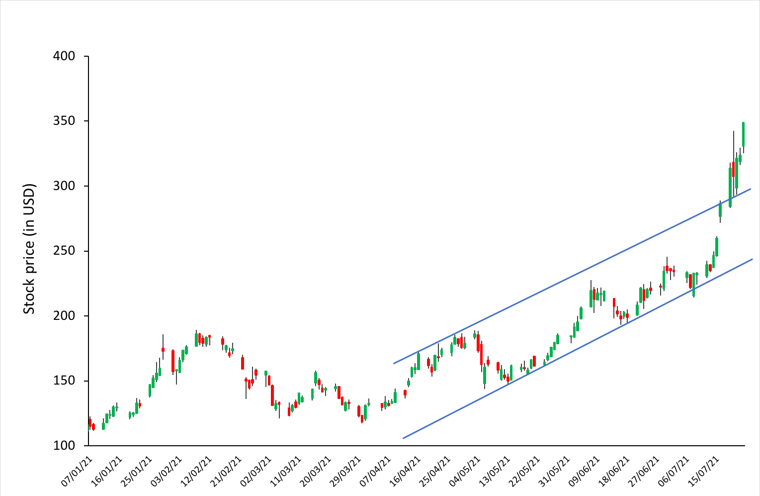
Source: computation by the author (data source: Bloomberg).
Down trend
A downtrend comprises of lower highs and lower lows in the prices of the stock. The stock prices follow a downward sloping trend, which shows a bearish sentiment in the stock. The traders resist to enter in a long position when the stock prices are in down trend.
The following figure shows Intel stock prices in a downtrend (or bearish trend) represented by upper and lower straight trends lines. When the price crosses the lower trend line (support level), it will enter into a downtrend indicating a sell signal.
Figure 2. Downtrend in Intel stock.
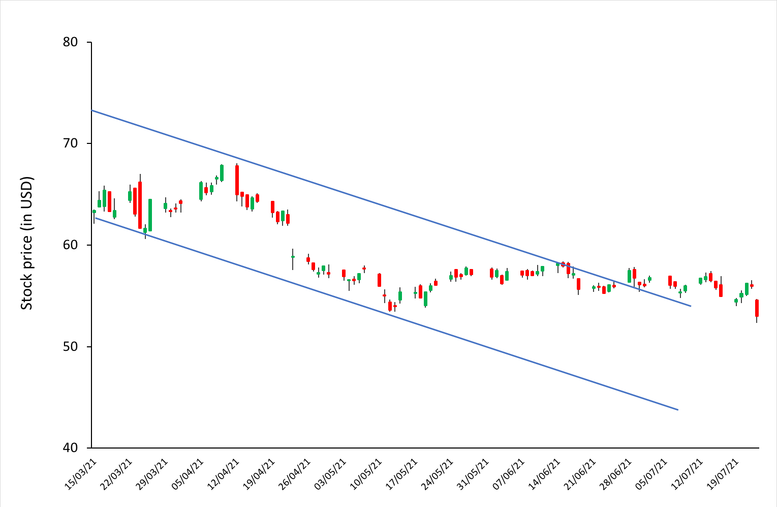
Source: computation by the author (data source: Bloomberg).
Sideways trend
In such a trend, the stock prices move in a sideways direction and the highs and lows of the stock price are constant for a period of time. Such price movements make it difficult for the trader to predict the future price movements of the stock. The trader trading in this stock tries to anticipate potential breakouts above the resistance level or below the support level. He or she enters in a long position when the price of the stock breaks the upper resistance level. Also, he or she can benefit from the sideways movement by entering in a long position when the stock prices retrace from the support level, to enjoy the stream of profits till the price reaches the resistance level.
Figure 3. Sideways trend in Adobe stock.
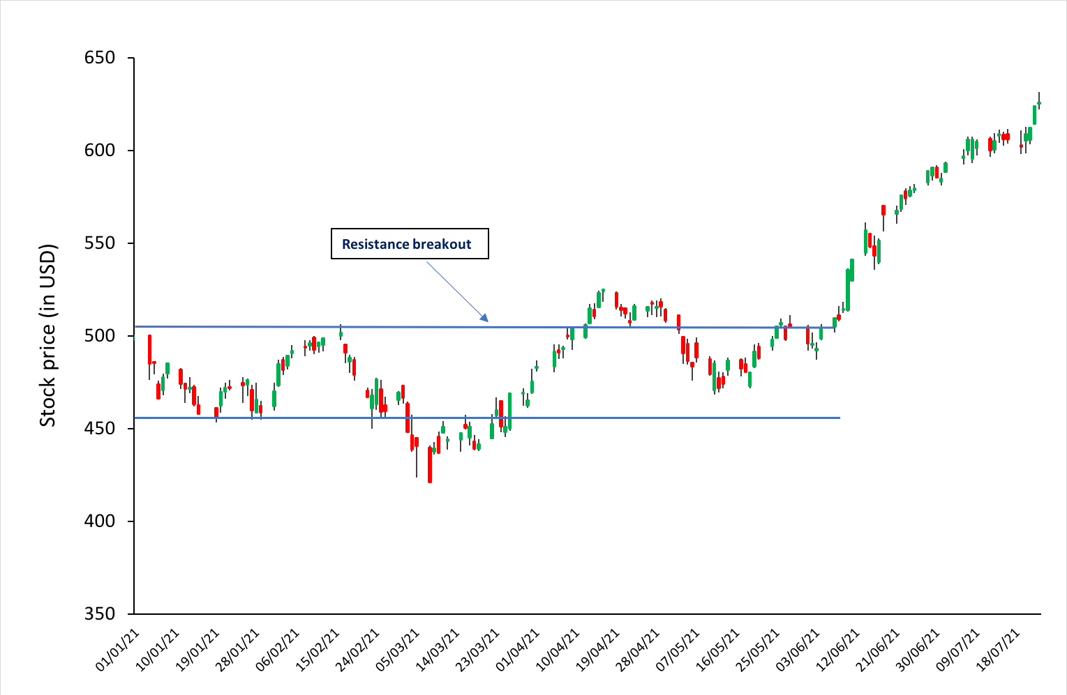
Source: computation by the author (data source: Bloomberg).
Trends based on moving averages
Overview
A moving average is an indicator to interpret the current trend of a stock price. A moving average basically shows the price fluctuations in a stock as a single curve and is calculated using previous price, hence it is a lagging indicator.
To measure the direction and strength of a trend, moving averages strategy involves price averaging to establish a baseline. For instance, if price moves above the average, the indicated trend is bullish and if it moves below the average, the trend is bearish. Moving averages are also used in development of other indicators such as Bollinger’s bands and Moving Average Convergence Divergence (also known as MACD).
The moving average indicator can be of many types, but the simple moving average (SMA) and exponential-weighted moving average (EWMA) are most commonly used. An n-period SMA can be calculated simple by taking the sum of the closing prices of a stock for the past ‘n’ time-periods divided by ‘n’.
Crossovers of moving averages is a common strategy used by traders wherein two or more moving averages can help determine a more long-term trend. Basically, if a short-term MA crosses above a long-term MA, the crossover indicates a downtrend and vice-versa indicates an uptrend. Traders can utilize it establish their position in the stock.
Example: Apple stock
Consider below the APPLE stock price chart using Japanese candlesticks. The lines in blue and yellow indicate 20-day (or 20-period) SMA and 50-day SMA respectively. We can observe that while the 2 lines are indicative of the movement of stock price fluctuations, the 20-day SMA is closer to the actual price movement and responds more quickly to price change.
We can also observe a crossover in the moving averages wherein the 20-day MA is crossing below the 50-day MA indicating a down trend in price movement.
Figure 4. Moving averages on Apple stock.
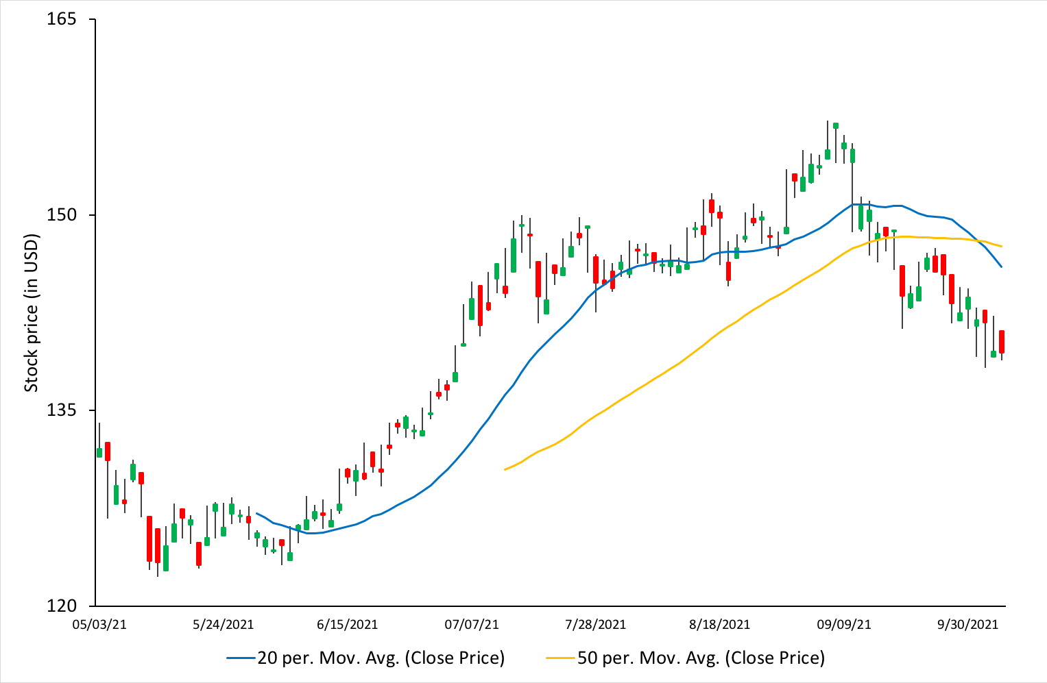
Source: computation by the author (data source: Bloomberg).
Fibonacci Levels
Fibonacci levels are a commonly used trading indicator in technical analysis that provides support and resistance levels for price trends. These levels can be used to determine more accurate entry and exit points by measuring or predicting the retracements before the continuation of a trend.
Fibonacci retracement levels are counted on numbers of the Fibonacci sequence (0, 1, 1, 2, 3, 5, 8, 13, 21, 34, 55 and so on). Each number (say 13) amounts to approximately 61.8% of the following number (13/21=0.618), 38.2% of the number after (13/34=0.382), and 23.6% of the number after (13/55=0.236).
Fibonacci analysis can be applied when there is an evident trend in prices. Whenever a security moves either upwards or downwards sharply, it tends to retrace back a little before its next move. For example, consider a stock that moved from $50 to $70, it is likely to retrace back to, say, $60 before moving to $90. Fibonacci levels can be used to identify these retracement levels and provide opportunities for the traders to enter new positions in the trend direction.
Example: Moderna stock
Consider below the Moderna stock price chart using Japanese candlesticks. We can see an evident uptrend (indicated by the straight trendlines in blue). The Fibonacci retracement levels have been plotted and we can notice that the ‘61.8% Fibonacci level’ intersects the rising trend line. Thus, it can serve as a potential support level. Further, it can also be observed that the price bounces from the 61.8% level before rising up again and it would have been a good entry point for a trader to take up a long position in the stock.
Figure 5. Fibonacci levels on Moderna stock.
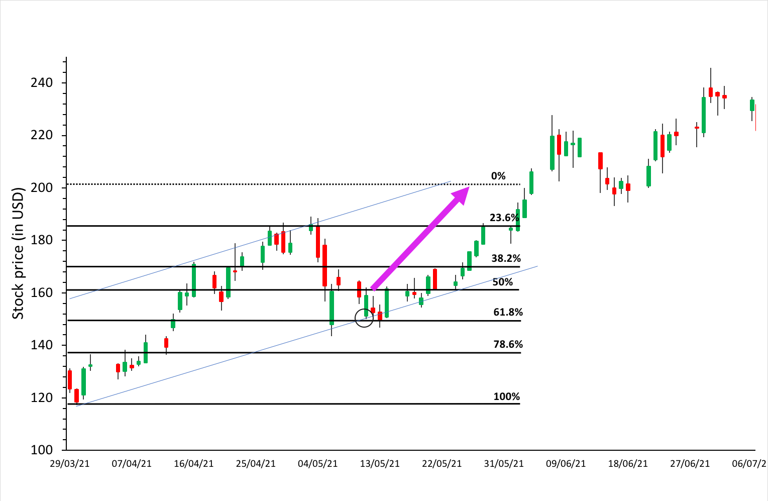
Source: computation by the author (data source: Bloomberg).
Time frame
Trends also can vary among different time frames. For example, an overall uptrend on the weekly time frame can include a downtrend on the daily time frame, while the hourly is going up. Multiple time frame analysis can thus help traders understand the bigger picture. Some trends are seasonal while others are part of bigger cycles.
The trend analysis can be done on different time horizons (including short term, intermediate term, and long term) to identify the price trends for different trading styles.
Related posts on the SimTrade blog
▶ Jayati WALIA Bollinger Bands
▶ Jayati WALIA Moving averages
▶ Akshit GUPTA Momentum Trading Strategy
Useful resources
Academic articles
Fama E.F. (1970) Efficient Capital Markets: A Review of Theory and Empirical Work, The Journal of Finance 25(2): 383-417.
About the author
The article was written in November 2021 by Jayati WALIA (ESSEC Business School, Grande Ecole Program – Master in Management, 2019-2022).