Momentum Trading Strategy

This article written by Akshit GUPTA (ESSEC Business School, Master in Management, 2019-2022) explains the momentum trading strategy.
Introduction
The momentum trading strategy is a strategy where a trader buys a security when its market price starts to rise and then sells it when its price seems to have reached a top. Similarly, a trader sells (or short sells) a security when its market price starts to fall and then buys it back when its price seems to have reached a bottom. In other words, if we observe a positive price change or return today, we are long tomorrow, and if we observe a negative price change or return today, we are short tomorrow.
This trading strategy is based on the direction of the price trend (up or down) in the market and its relative strength. The rationale behind the momentum trading strategy is that, for an upward trend, if there is enough buying force behind the rise in the price of an asset, it will keep on rising until a strong selling pressure is seen in the market to reverse the trend. Similarly, for a downward trend, if there is enough selling force behind the fall in the price of an asset, it will keep on falling until a strong buying pressure is seen in the market to reverse the trend.
Momentum trading is a trading strategy with a short-term horizon where traders try to capture and profit from the price trend. The period for implementing a momentum strategy can range from a trend forming within a day or over several days. Momentum traders try to identify the strength of an ongoing trend in a particular direction and take a position. The strength can measured by different technical indicators discussed below. Once the strength of the trend begins to fall, the trader exits the position at a profit.
Momentum traders are least concerned about the fundamentals of the company for which the stock is to be traded. They rather use various technical indicators to understand the trend in the stock price, especially its strength.
Implementation
Figure 1 below illustrates the implementation of the momentum trading strategy for Apple stock over the period from April 1, 2020 to March 31, 2021.
Figure 1. Implementation of the momentum trading strategy for Apple stock.
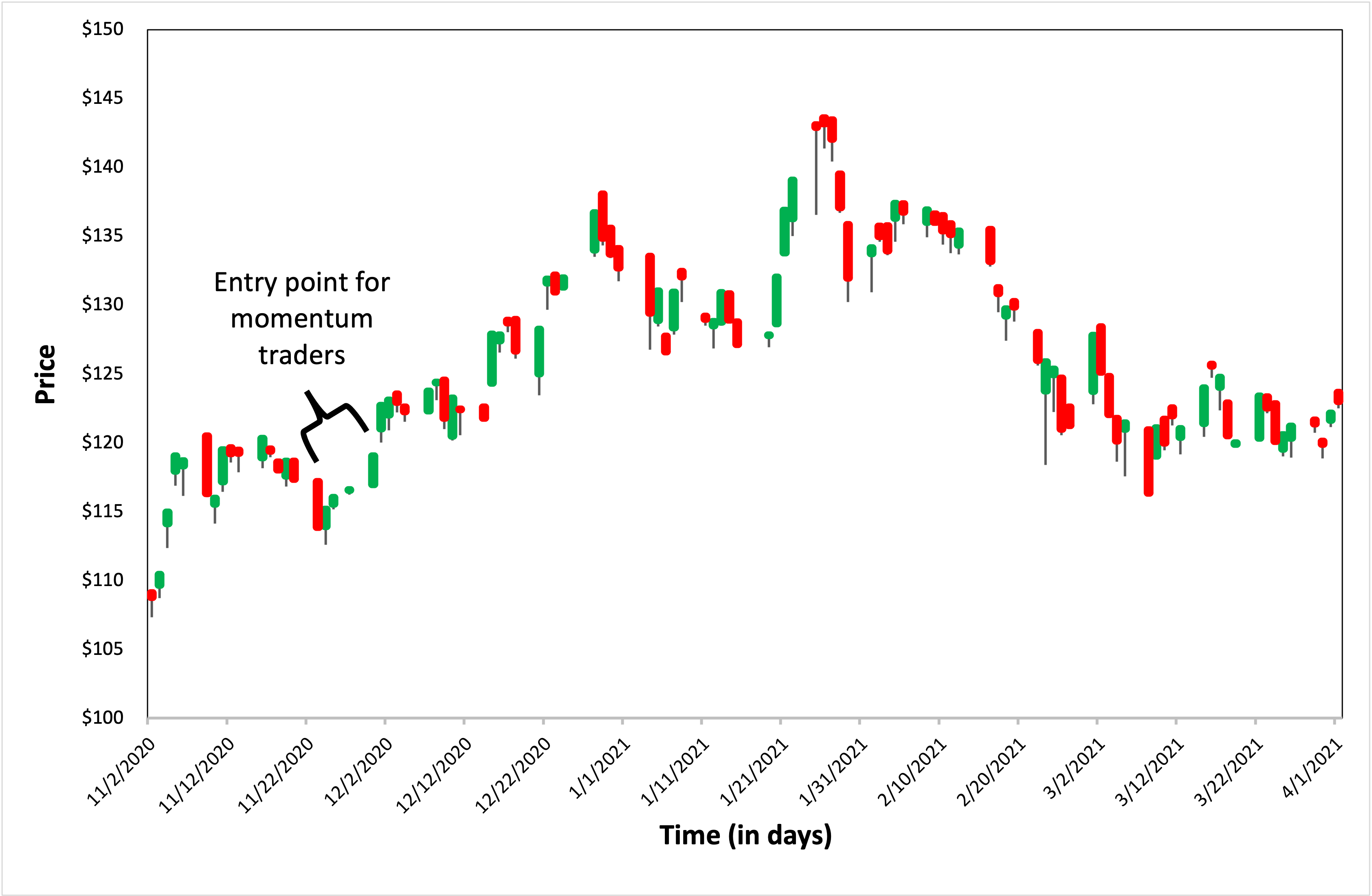
Source: computation by the author (data source: Yahoo Finance).
In Figure 1, an upward trend can be seen forming in the period from November 22, 2020 to November 25, 2020 in the price of Apple stock. The trader following a momentum strategy will go long on the Apple stock till the momentum is in the upward direction. The right time to exit the long position is around December 2, 2020. By following this trend, the trader can capture a price movement of around $10 which is approximately 8%-9%, by going long on the Apple stock.
Momentum trading indicators
Momentum trading indicators help the trader to look for the formation of a trend and the signal of an entry/exit point, and also indicate the strength of that signal. We present below some of the most common indicators used to assess the strength of the trend: relative strength index (RSI), moving-average convergence-divergence (MACD) and Bollinger bands.
Relative Strength Index (RSI)
The RSI indicator is a technical indicator and is plotted on a chart which ranges from 0 to 100. It helps a trader in knowing the relative strength of a trend formation. The indicator is an oscillator which provides overbought or oversold signals based on the positioning of the line in the chart. During the uptrend, if the line crosses the 70 mark, an overbought signal is considered for the given security. Symmetrically, during a downtrend, if the line crosses the 30 mark, an oversold signal is considered. Momentum traders generally take a position in between in the indicator instead of waiting for a price reversal when the line crosses the given thresholds. For example, a trader can use the halfway mark of 50 to get an idea about the formation of a trend. If the RSI line crosses the 50 mark and is moving in an upward direction, it can show the high strength of the upward forming trend and the trader can take a long position in the respective stock.
Figure 2. Relative Strength Index of Apple stock.
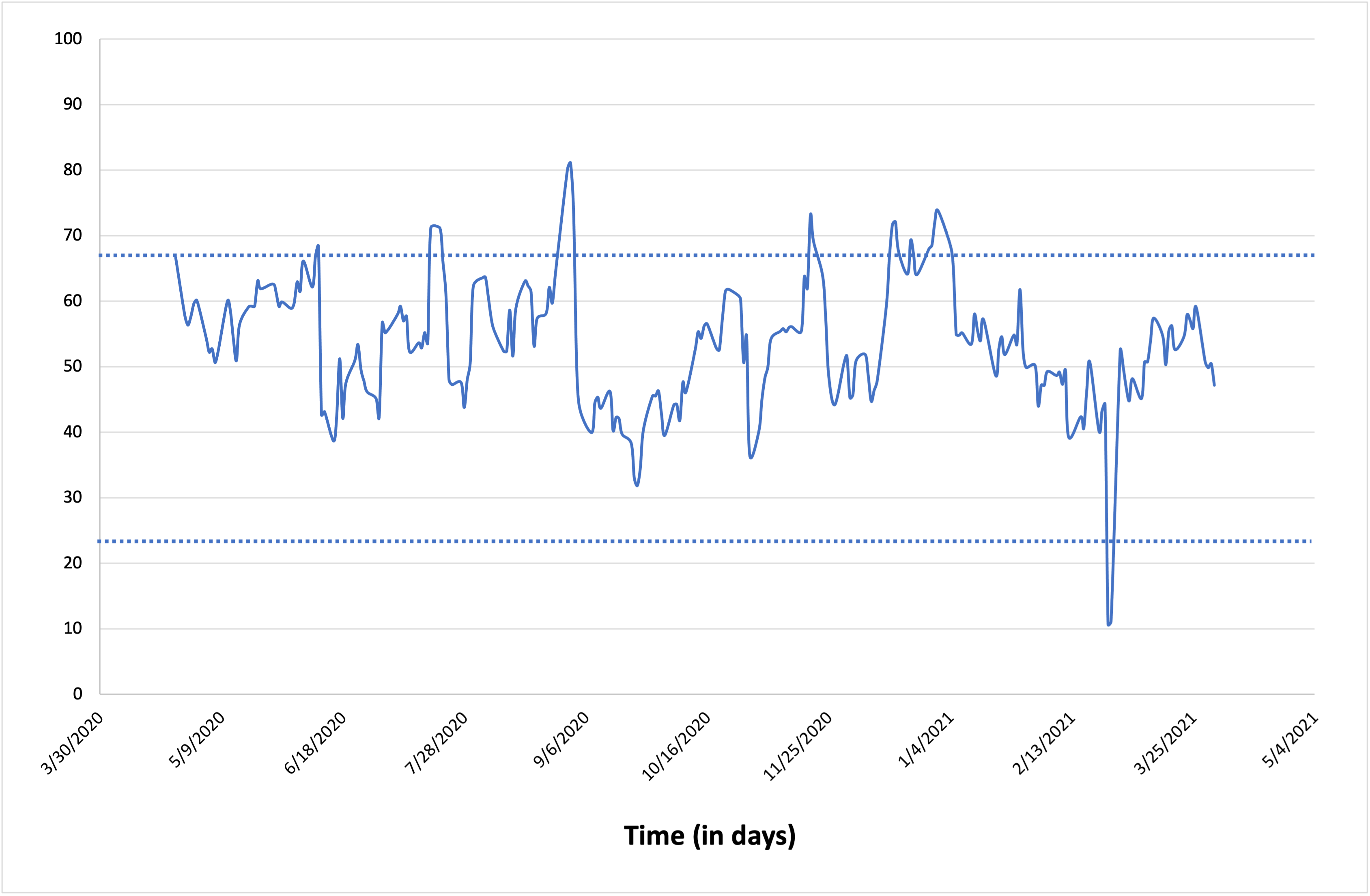
Source: computation by the author (data source: Yahoo Finance).
Moving-average convergence-divergence (MACD)
The moving-average convergence-divergence (MACD) is a technical indicator based on the moving averages of prices over a period of time. The indicator helps in understanding the direction and strength of a trend. It also helps in understanding the rate at which the change in trend is happening.
The indicator is shown by two lines namely, the MACD line and the signal line. The MACD line is the difference between two exponential moving-averages, a long-term moving-average like a 26-day moving average and a short-term moving-average like the 12-day moving average. The signal line is made up of the 9-day exponential moving-average of the MACD itself and is placed on the same graph. A bar graphs plotted on the zero-line (X axis) showing the difference by which the MACD line is below/above the signal line. Generally, the indicator is used to understand the degree of the bullish or bearish sentiments in the market. If the MACD line crosses the signal line from below the zero-level moving upwards, it indicates a bullish trend. In such a scenario, a trader practicing momentum strategy would take a long position in the market seeing the trend.
Figure 3. Moving-average convergence-divergence of Apple stock.
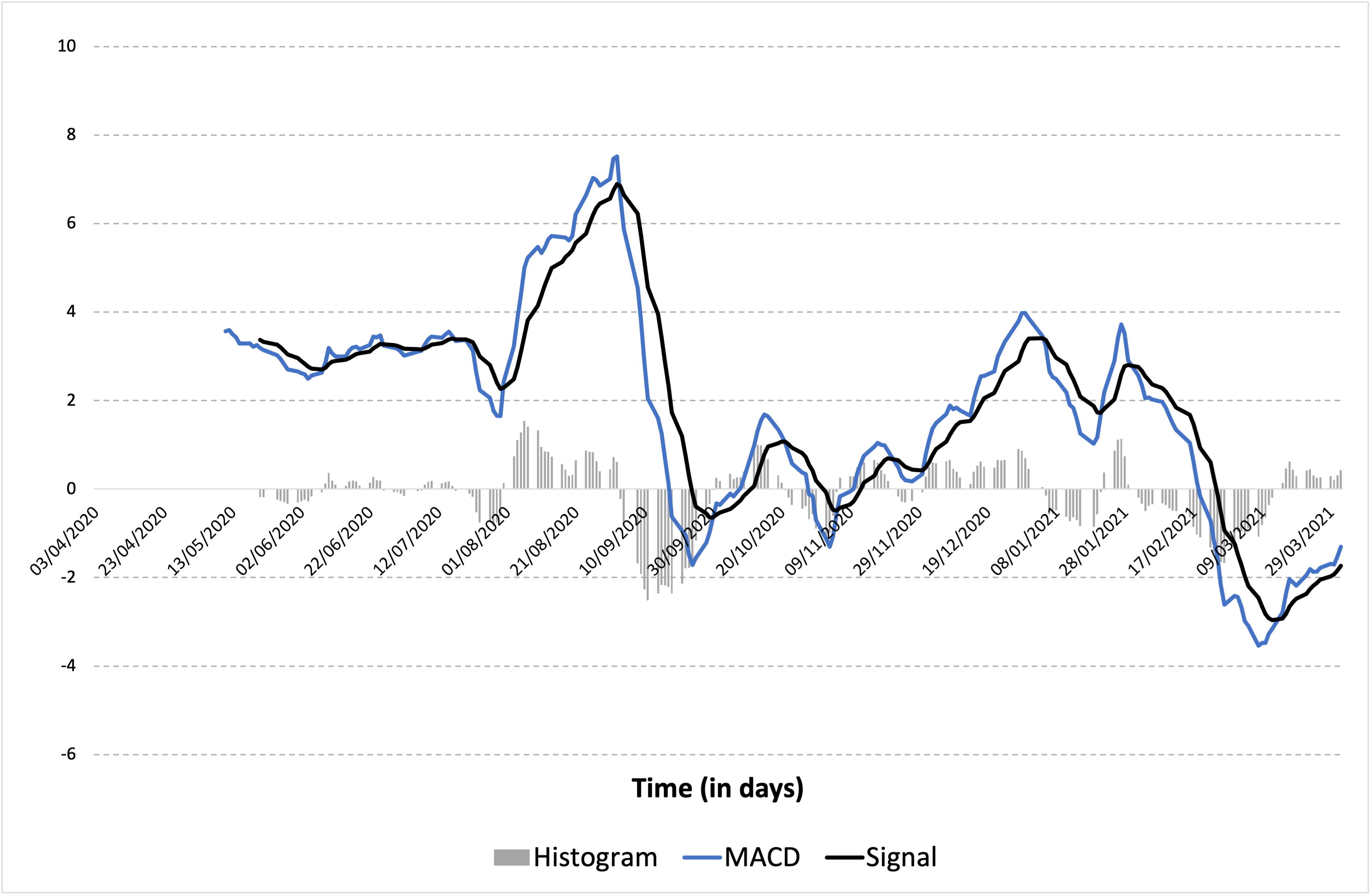
Source: computation by the author (data source: Yahoo Finance).
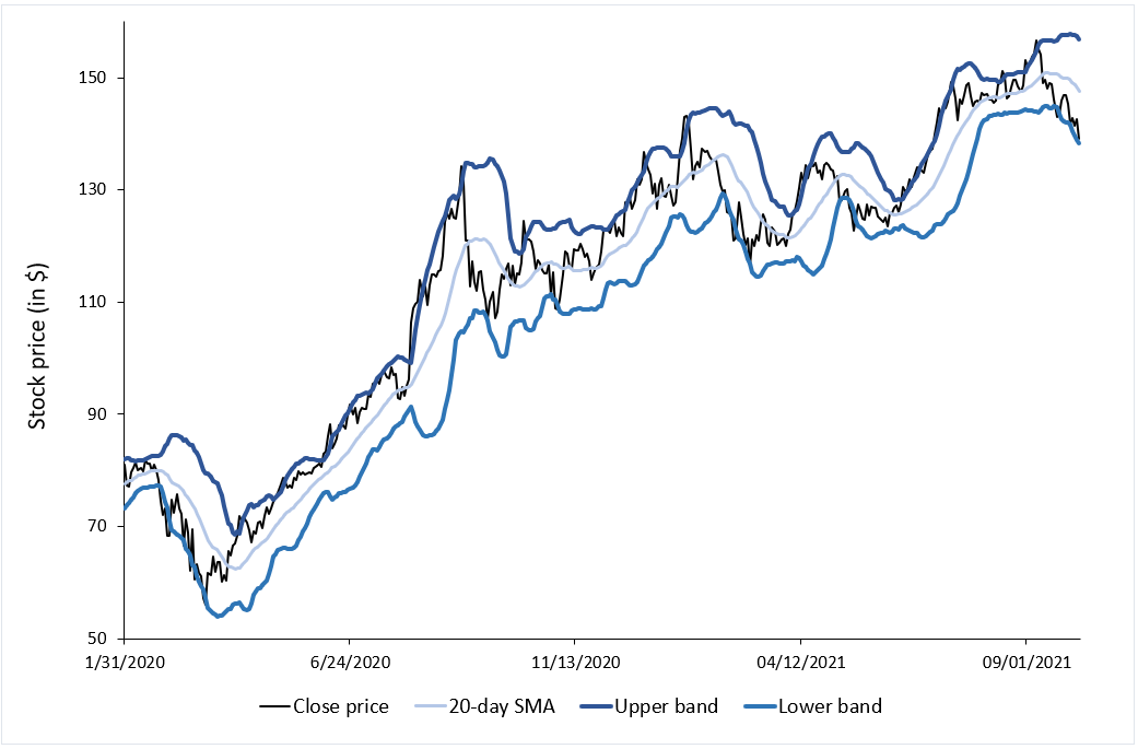
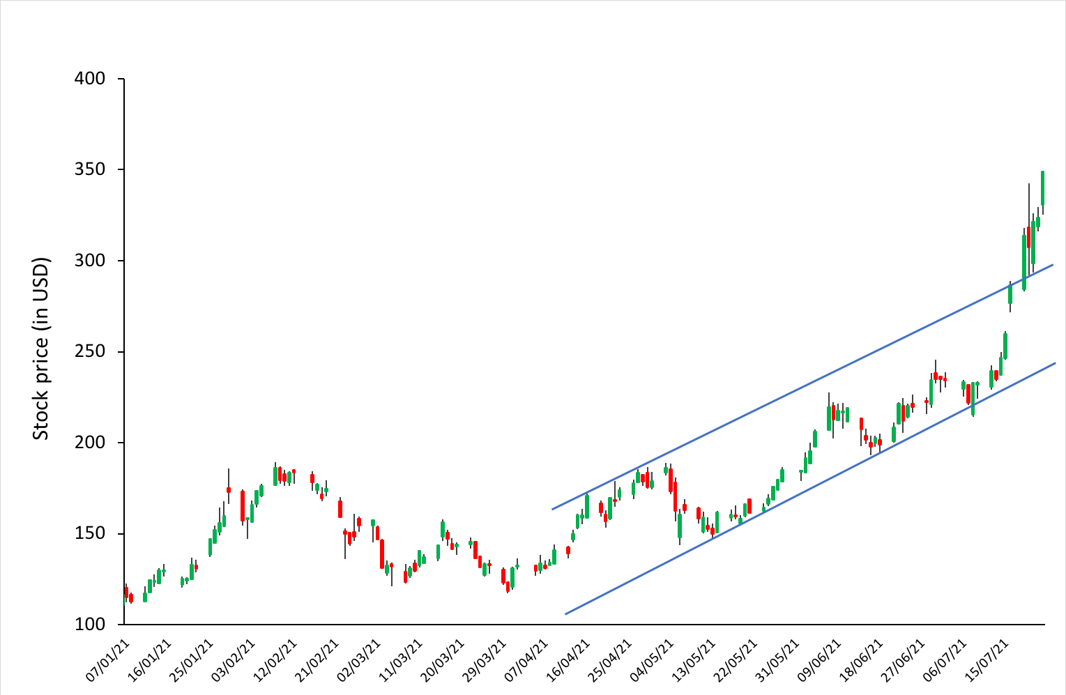
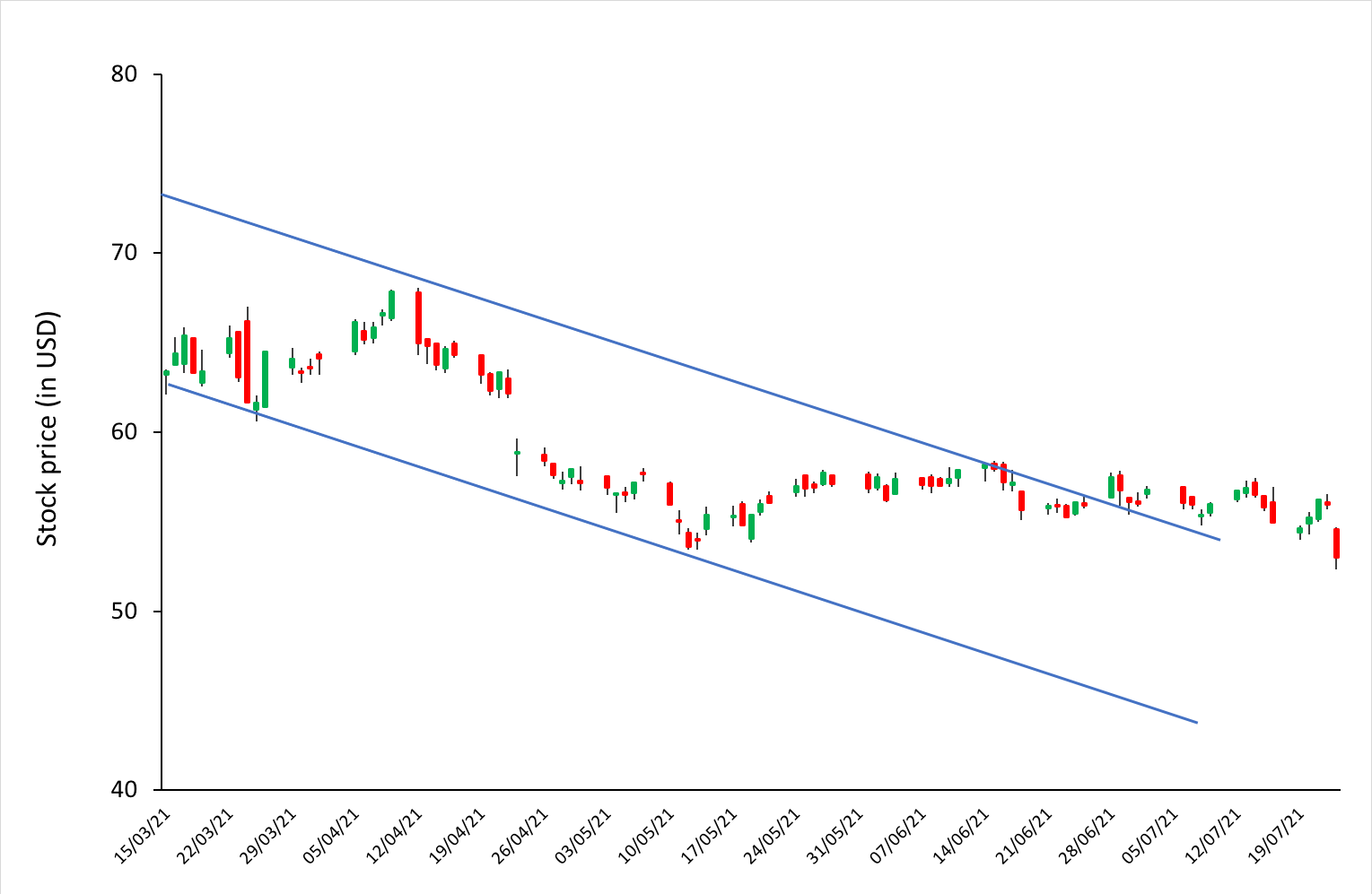
Bollinger bands
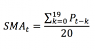
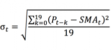
The Bollinger bands is a very popular technical indicator that represents the volatility in the prices of a financial asset. The indicator consist of three lines, namely, a simple moving-average (SMA), and an upper band and a lower band. The simple moving average is usually computed over a rolling period of 20 trading day (about a calendar month for the equity market). The upper and lower bands are usually set by default to two standard deviations away from the simple moving average.
The width between the upper and lower Bollinger bands provides a range for price changes in the market (an indicator of volatility). The bands help to identify the overbought or oversold situations in the market for an asset. They can be used by a trader to identify possible entry or exit prices to implement the momentum trading strategy.
Figure 4 represents the Bollinger bands for Apple stocks. The price of the Apple stock is touching the lower band on November 2, 2020 and reverting just after that. This can be a signal for the momentum trader showing a trend reversal and the trader can take a long position in this stock till the price touches the 20-day SMA line which happens around November 5, 2020, thereby capturing a price movement of $8 approximately.
Figure 4. Bollinger bands of Apple stock.
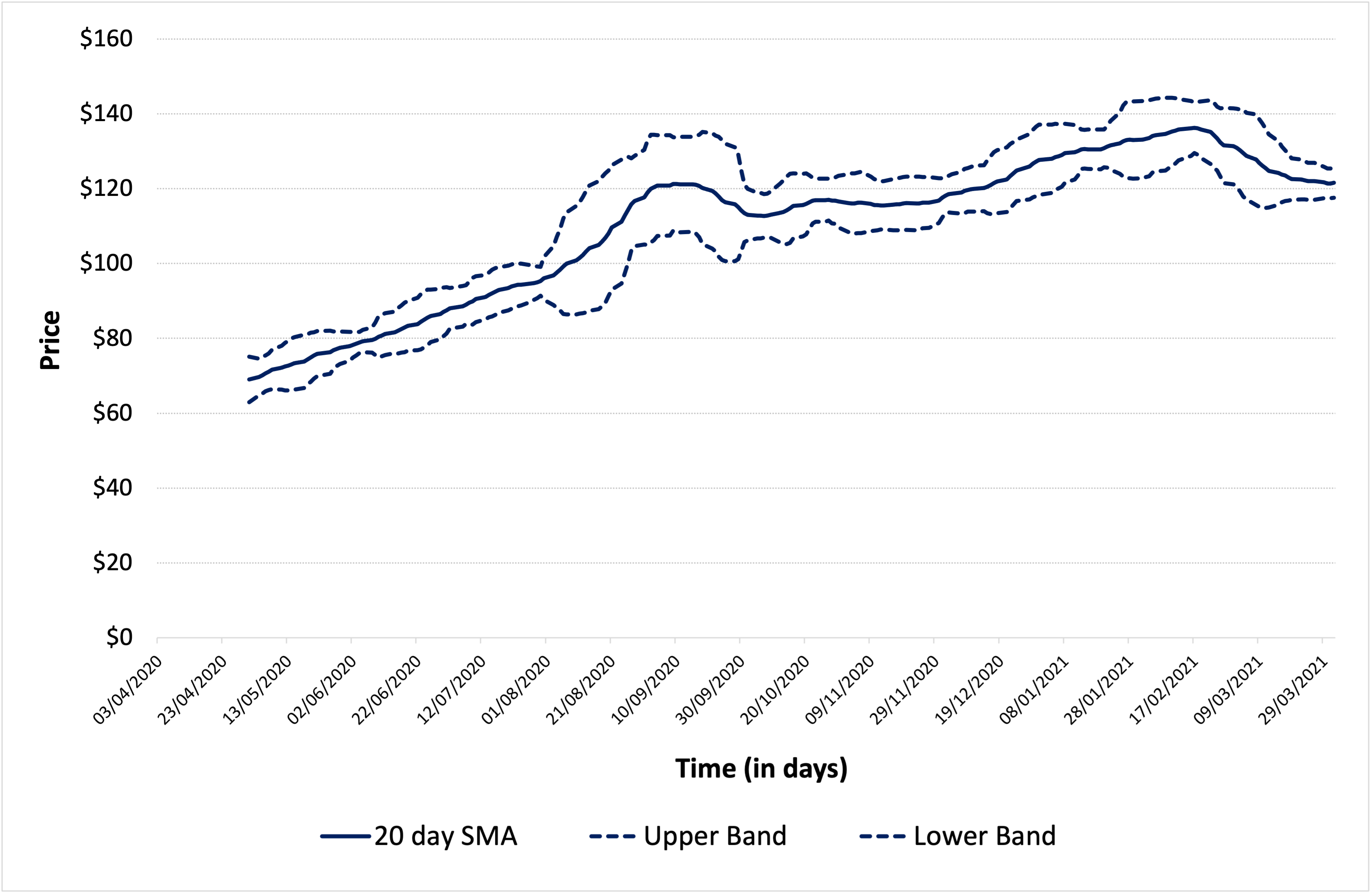
Source: computation by the author (data source: Yahoo Finance).
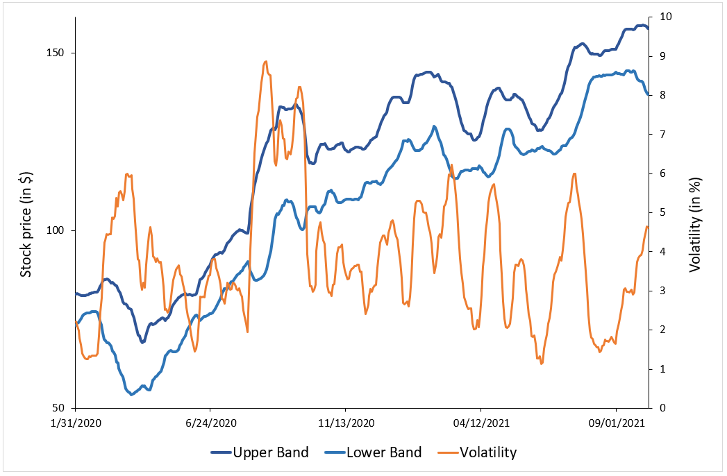
Market conditions
Market liquidity and market volatility play a major role in the implementation of a momentum strategy.
A liquid market is generally preferred by traders in order to quickly enter and exit the market.
Stock price volatility is a major factor affecting a momentum trader’s decision to enter/exit a trade. A highly volatile stock can provide a good opportunity for a trader to earn high profits using this strategy as the asset prices can change dramatically in a short period of time. But a high stock volatility can also lead to huge losses if the prices move in an unfavorable direction.
The figure below represents the historical daily volatility (standard deviation of returns over rolling 10-day periods) of Apple stock over the period from April 1, 2020 to March 31, 2021.
Figure 5. Volatility of Apple stock.
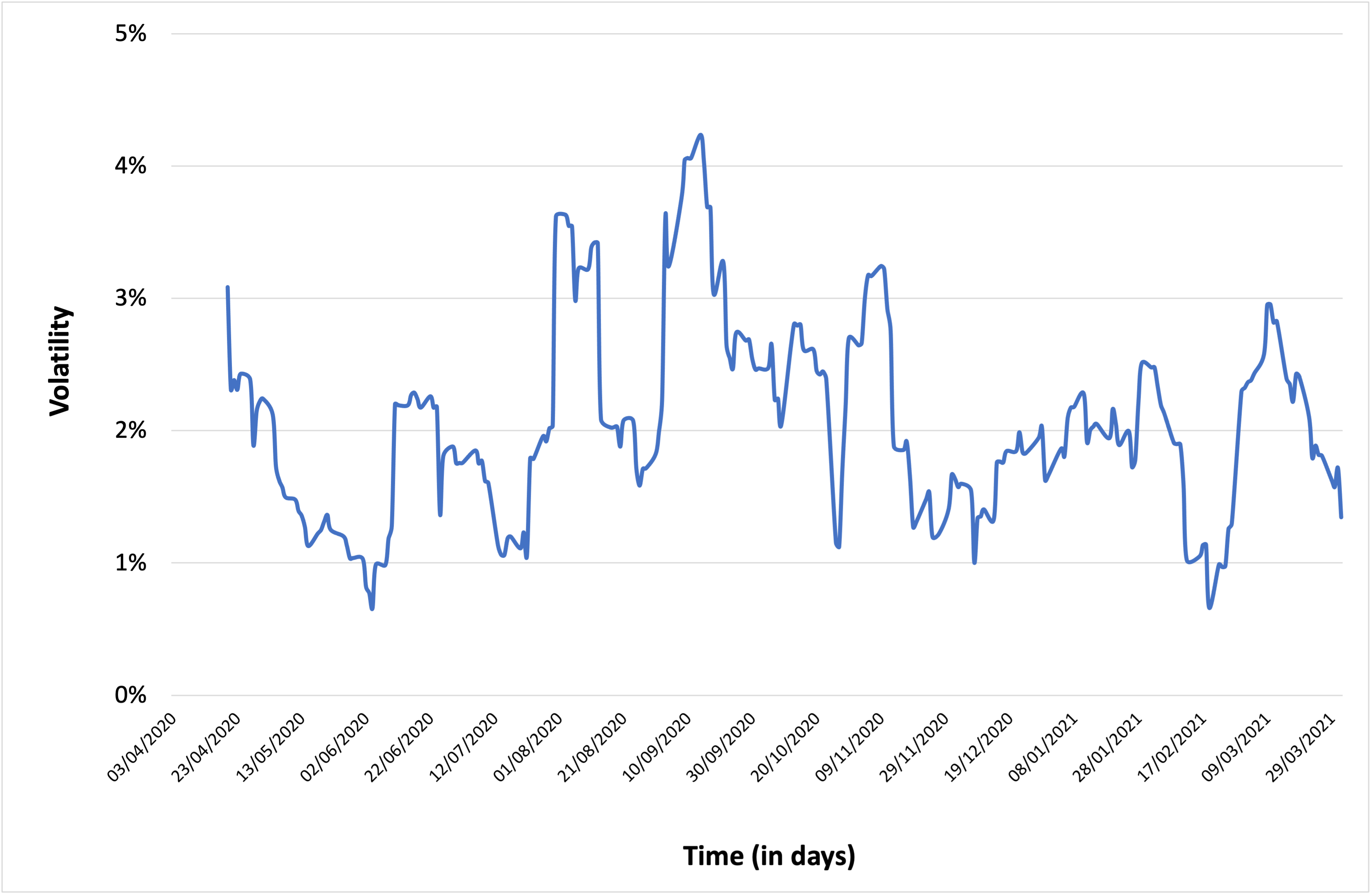
Source: computation by the author (data source: Yahoo Finance).
You can download below the Excel file for the computation of the different momentum trading indicators mentioned above.

Risks associated with momentum trading
Although momentum trading is a commonly used strategy, the risks associated with it are quite high. The trader using this strategy should be careful about:
- Entering the position too early
- Exiting the position too late
- Relying on rumors and fake news
- Missing the indication of a reversal in the direction of the trend
- Not applying a strict stop loss rule
Link with market efficiency
Market efficiency refers to the degree to which all the relevant information about an asset is incorporated in the market prices of that asset. Fama (1970) distinguished three forms of market efficiency: weak, semi-strong, and strong according to the set of information considered (market data, public information, and private information).
In the weak form of the market efficiency hypothesis, the current market price of an asset incorporates all the historical market data (past transaction prices and volumes). The current market price of the asset is then the best predictor of its future price.
In a market efficient in the weak sense, the autocorrelation of asset price changes or returns is close to zero.
A positive autocorrelation coefficient would imply that after a price increase, we should likely observe another price increase, and symmetrically, after a price decrease, we should likely observe another price decrease, leading in both cases to price trends.
The implementation of a momentum strategy assumes that the autocorrelation of price changes is positive, which contradicts the efficient market hypothesis.
In a market which is efficient in the weak sense (implying an autocorrelation close to zero), momentum trading strategies should not exhibit extra profit as traders are not be able to beat the market on the long run.
Related posts
▶ Jayati WALIA Bollinger bands
▶ Jayati WALIA Moving averages
▶ Akshit GUPTA Growth investment strategy
Useful resources
Academic research
Fama E.F. (1970) Efficient Capital Markets: A Review of Theory and Empirical Work, The Journal of Finance 25(2): 383-417.
Fama E.F. (1991) Efficient Capital Markets II: A Review of Theory and Empirical Work, The Journal of Finance 46(5): 1575-1617.
Business analysis
Fidelity Learning center: Momentum trading strategy
About the author
Article written in May 2022 by Akshit GUPTA (ESSEC Business School, Grande Ecole – Master in Management, 2019-2022).