
My Marketing Developer Experience

In this article, Jérémy PAULEN (ESSEC Business School, Global Bachelor of Business Administration, 2019-2023) shares his experience as a marketing developer at the Tennis Club of Rosheim.
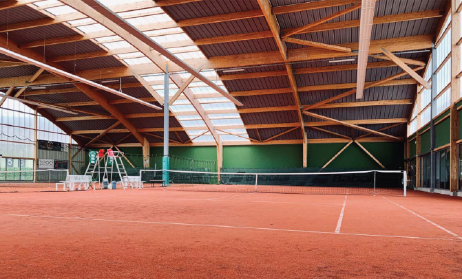
Tennis Club of Rosheim
Tennis Club of Rosheim was founded in 1970 and is owned by David Livernais. The premises are located in the sports center of Rosheim, in Alsace. The Tennis Club had 191 members in 2021 and several partners. The Club therefore organizes many events every year.
The club wishes to create a relationship of trust with its members as well as a friendly atmosphere.
My internship at the Tennis Club of Rosheim
During my studies at ESSEC Business School, I had the opportunity to undertake an internship as a marketing developer at the Tennis Club of Rosheim.
I was involved with the marketing department, which is in charge of promoting the club to potential new members. The promotion of a business takes place in several stages. First of all, through the development of a visual identity. The visual identity or graphic identity is a set of coherent visual elements which make it possible to identify the same entity through the different communication media that it uses. Example: Coca-Cola and the color red are almost synonymous with each other. The company uses its signature color on all of its products and all of its marketing materials.
Given my experience in the visual field and my different skills, I was given the responsibility of developing a new visual identity. The only restriction I had was to use the orange color.
I first had to create a logo. The logo is the pillar of a company’s image. A professional logo allows a company to stand out from its competitors, to convey its values and to tell a story. It therefore needs to be studied. The logo I created is made up of three elements:
- A tennis ball in the center of the image to evoke the main activity of the club
- The date the club was founded: 1970. Integrating a date reassures potential customers Because it implies professional knowledge and experience acquired over the years.
- And last but not the least: the name of the club.
I wanted a simple and uncluttered logo to reach as many people as possible.
I also had to create multiple posters to announce the different events. Each of my creations had a similar color code: orange, green and yellow. Orange is the color of cheerfulness, generosity, ambition, and abundance, but more importantly the color of the company. Green symbolizes hope and nature. Yellow is associated with joy, good humor, and radiance.
Promotion also passes through word, including emails or flyers. On several occasions I had to communicate by email with members and partners. Communicating through this media involves many codes. We must respect the codes of politeness and avoid any awkwardness. The emails are written and thus visible at all times.
Every day, the club president organized a general meeting where he talked about global debriefing. The various meetings make it possible to clarify the week’s objectives and to distribute the tasks to the workforce. They also present an opportunity to give feedback and to integrate each employee in the decision-making process. For my part, I took this opportunity to propose a new method of communication: Tiktok.
During my time at the TC Rosheim, I also had the opportunity to organize a large-scale event. Many competitors meet each year for a big competition. It was therefore necessary to find sponsors to finance this event, in our case the main partner was KARANTA. I also had to find volunteers to supervise the event and ensure it was smoothly run.
My key learning outcomes
During my internship at the Tennis Club of Rosheim, I had the opportunity to develop the following (soft) skills:
- To manage a team
- To meet deadlines
- To improve communication skills
- To understand the needs and to listen to the expectations of (internal) clients
- The ability to learn and to improve my different skills
Three key terms
I develop below three key terms to understand my work.
Visual identity
The visual identity or graphic identity is a set of coherent visual elements which make it possible to identify the same entity through the different communication media that it uses.
A participatory leader
The participatory leader likes to study all the proposals before making a decision. He or she encourages his or her employees and values their work and achievements. A key element is feedback.
Feedback
Feedback is a step back, a testimony on an event that occurred. It allows time to check if the meaning of a message is understood, determine if help is required and verify if everybody is involved.
Useful resources
Related posts on the SimTrade blog
▶ All Professional experiences
About the author
The article was written in November 2021 by Jérémy PAULEN (ESSEC Business School, Global Bachelor of Business Administration, 2019-2023).